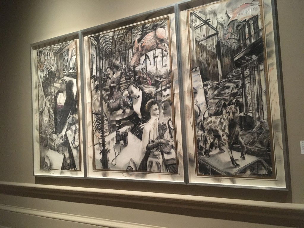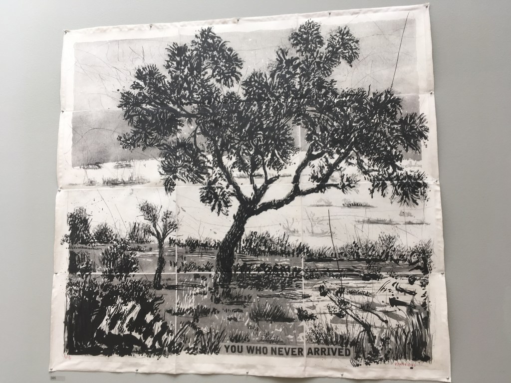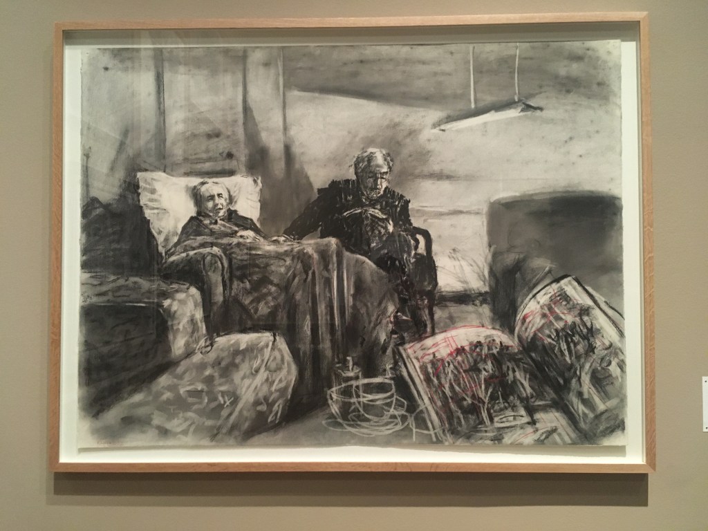
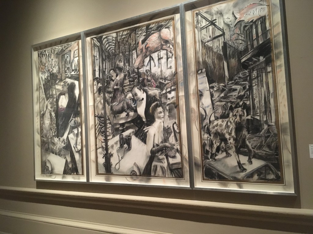
William Kentridge fills the Royal Academy galleries with such strong, graphic images that you feel he has only just put down his stick of charcoal and moved onto something else. This astonishing show give us a chronological view of this important South African artist’s development.

I first encountered William Kentridge’s work at the Marian Goodman gallery in Soho and was blown away by the bold, energetic works which really show a hand at work with drawing in charcoal at its heart.

In fact, you can see where Kentridge has actually been in the RA gallery because he’s drawn directly onto the wall and you can see all the black charcoal dust on the dado below.
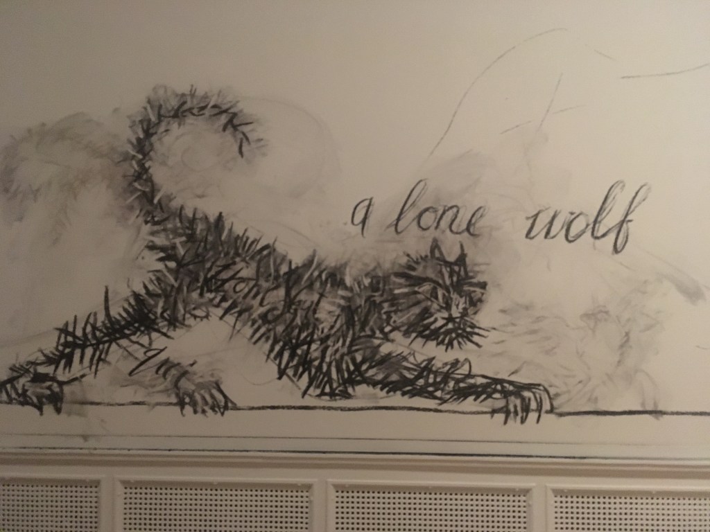
Kentridge is an artist who’s go-to is paper. He clearly loves all kinds of paper and uses it to create collages, smudged and scribbled impressions on all kinds of paper and combines his work with occasional splashes or streaks of colour. Some of his work has been developed into new media – animation, films and tapestry.
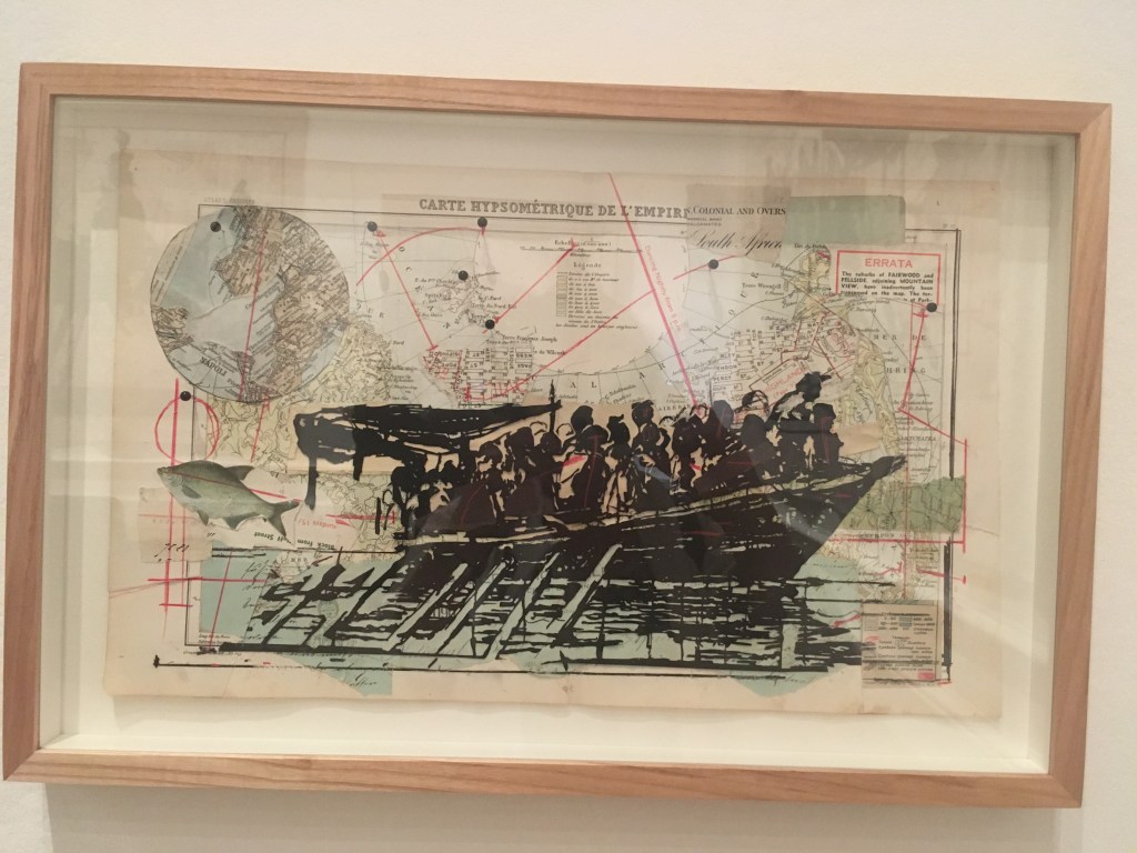
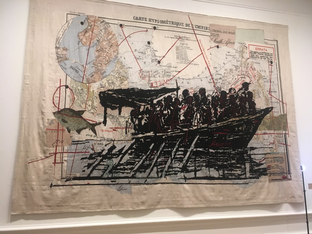
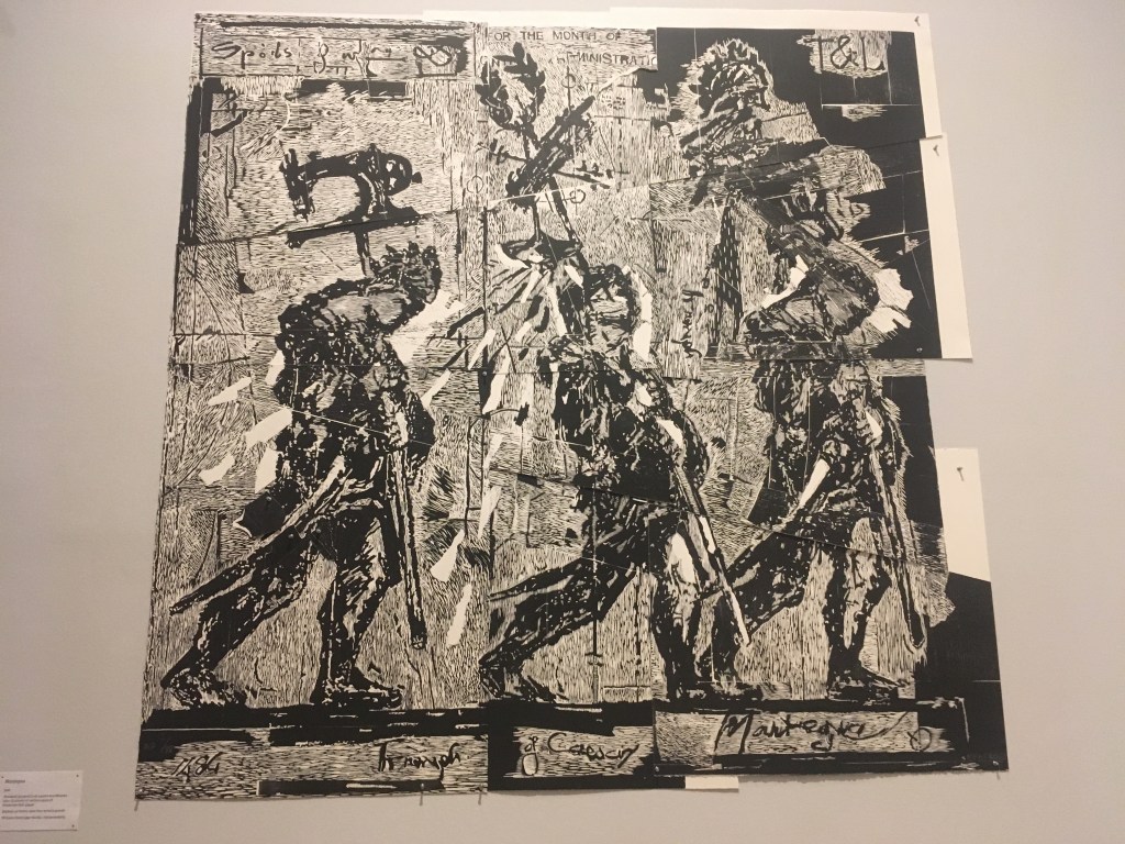
Above is a woodcut, entitled Mantegna, printed from twelve woodblocks onto 21 sheets of various sizes of Somerset Soft paper. 2016
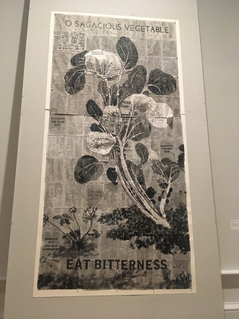
Kentridge’s work is often on a huge scale. I loved the work done with Indian Ink on fragments of newsprint and have added a detail of this one, Eat Bitterness, made on found paper in 2014. He demonstrates that you don’t need expensive canvases, paints and pricey materials to create artwork which dazzles and beguiles. As a paper collage artist myself I feel so pleased when I see artists choosing to work with such modest and ‘throwaway’ materials and making something magical with them.

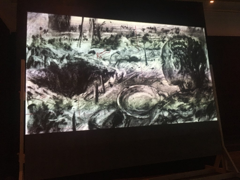
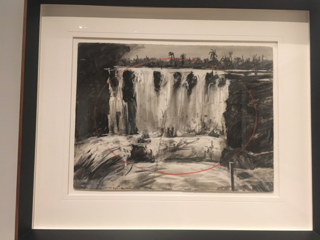
Below are a few snaps taken from some of the animated films in the show. Kentridge seems to create the movement by drawing in charcoal and then smudging and redrawing. The effect is mesmerising and it’s fascinating to see the scratches and echoes of the earlier drawings under the top layer. It’s not often you get to use the word pentimento but that’s what we’re looking at.

This is a wonderful show, a great celebration of a remarkable contemporary artist. Kentridge, born into a family in Johannesburg and growing up in the time of apartheid, has used his art to argue for political change in that country while at the same time showing us the beauty of the land.

It’s on at the Royal Academy until 11th December 2022.
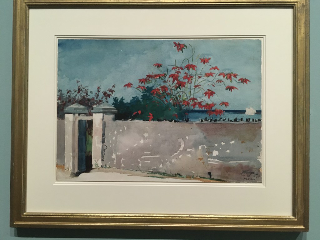
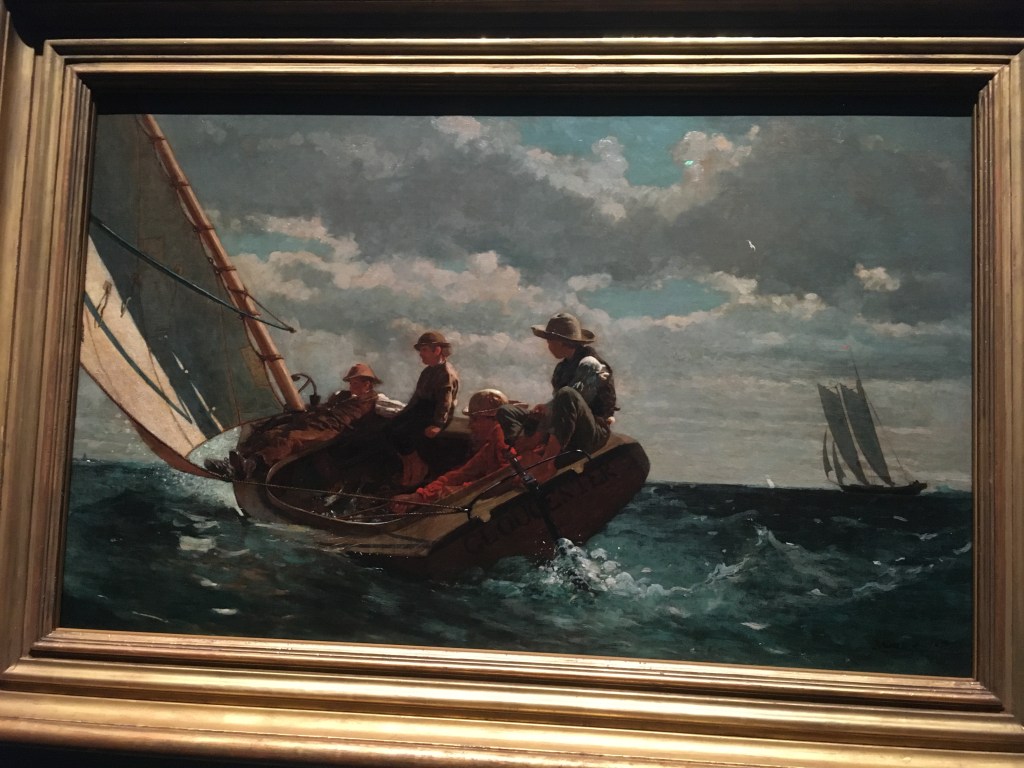
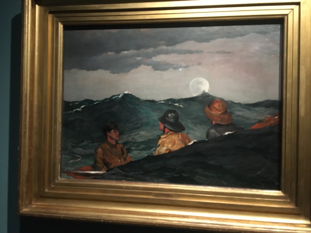
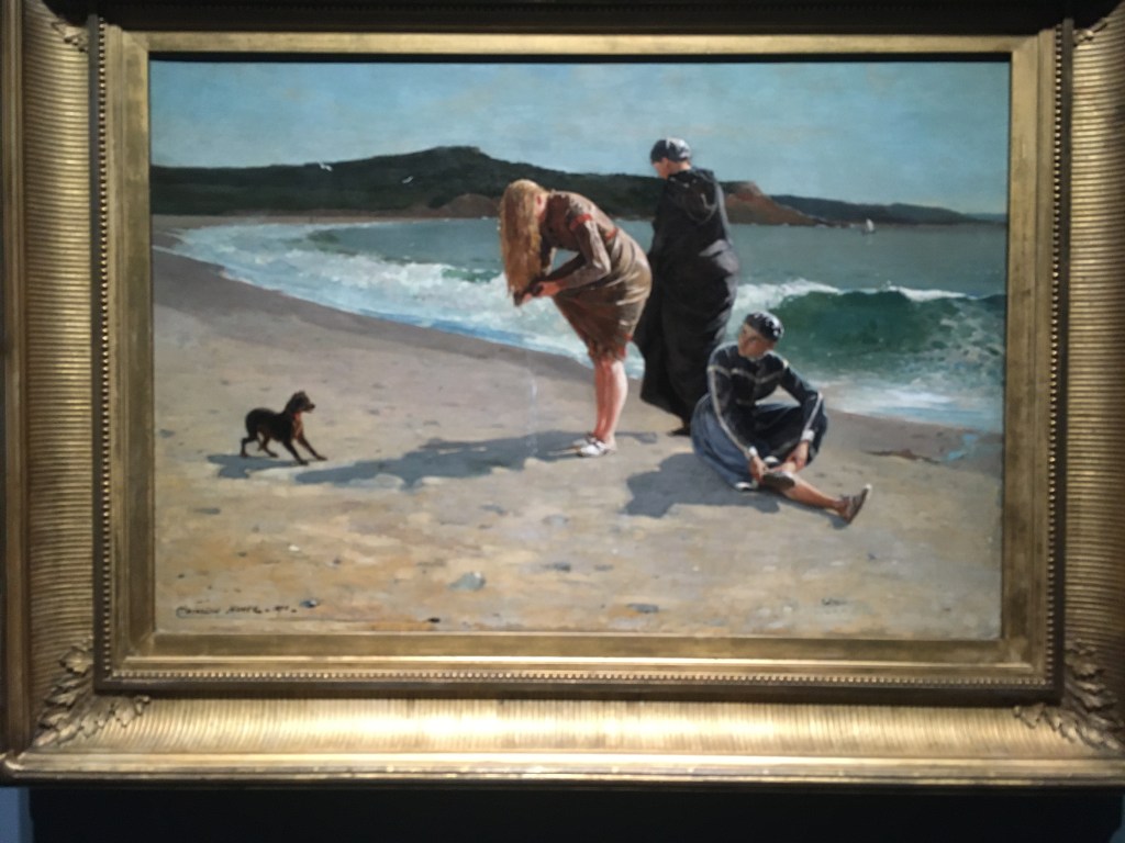
The National Gallery offers a fascinating introduction to American artist Winslow Homer with a terrific exhibition of his paintings from the time of the American Civil War to observations of a fishing village in Northumberland in the 1880s. A self-taught artist, Homer is technically brilliant in oils and watercolours and presents an enigmatic portrayal of people at times of transition, trouble and contemplation and is masterful at capturing the power of nature.

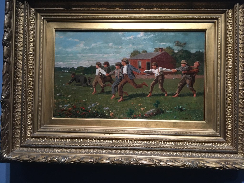
Snap the Whip – 1872. The pleasures of childhood in a running and tugging game.

Winslow Homer, Force of Nature. Well, this turned out to be a real treat. I was unfamiliar with the artist Winslow Homer but keen to find out more at the press view at the National Gallery. Homer was an American artist who never had a formal training but began his career as a printmaker and journalist. He was active for newspapers during the American Civil War, getting himself ’embedded’ in both sides of the war recording the conflict between the Union Army – wanting to abolish slavery – and the Confederates who were desperate to preserve the status quo in Southern States. In the early 1860s photography existed but newspapers still needed artists to create plates for the presses to publish. Clearly Homer was a very talented draughtsman who could draw from life, from models and from photographs. He later used his newspaper illustrations as source material for studio-made oil paintings depicting the Civil War and its aftermath and began his career as a fine artist.

This painting of The Veteran in a New Field (1865) shows a farmer who had spent time as a Unionist soldier casting down his old army jacket and getting back to work scything his field.

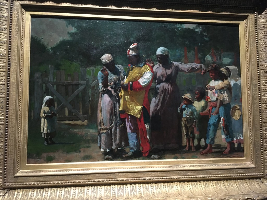
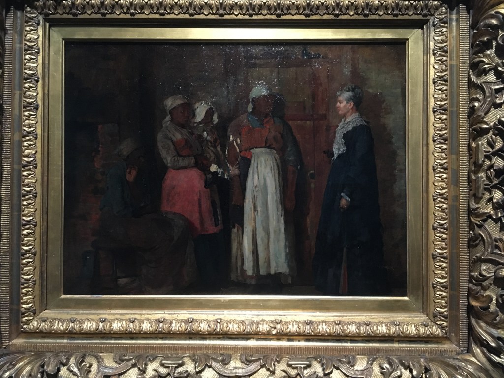
Homer was keen to represent the status of Black Americans following the Civil War and the end of their enslaved status. The painting on the left is called Dressing for the Carnival (1877) when Independence Day celebrations became a commemoration of Black liberation. On the right is A Visit from The Old Mistress. This depicts three freedwoman and a child as they meet an elderly woman – presumably their onetime enslaver who now pays for their labour.

Winslow Homer visited England 1881 and to spend a year and a half at a small fishing village of Cullercoats near Newcastle. The curators suggest there was an artists’ colony established there. This painting depicts a fisherwoman on the seafront, battered by gales and the lash of the sea but stalwart against the elements.

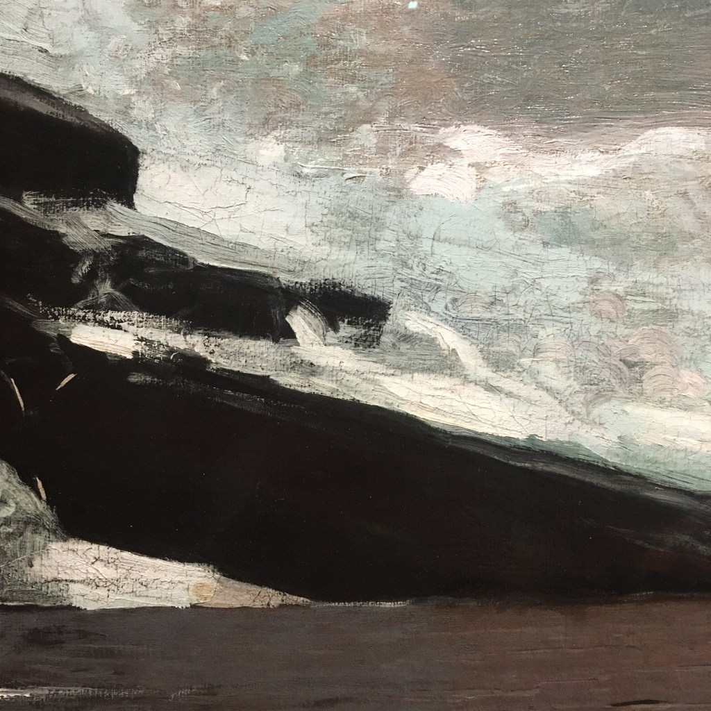
I’ve added a detail from the painting of the woman showing the freely painted rocks and the crash of the sea presented with great vigour. Apparently the painting was originally made with the Watch House on the left but it was criticised when exhibited so he painted over the building and made the woman and her child the focus of the composition.

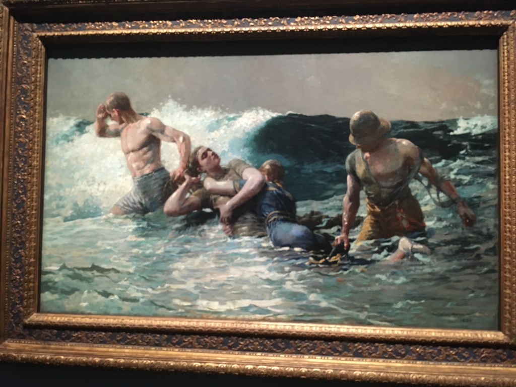
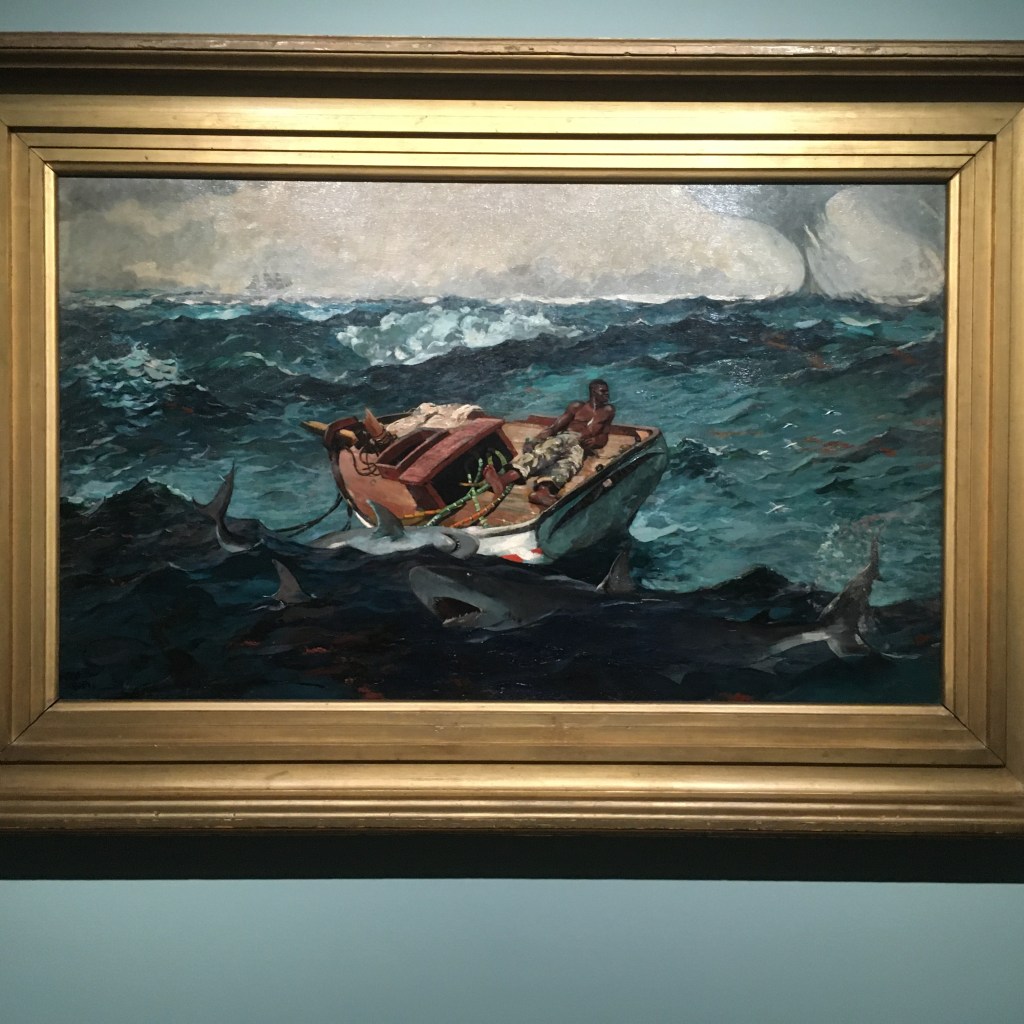
His paintings are inheritors of the ‘genre’ paintings of the 18th century in that he is telling stories but leaving many of the narrative elements unfinished. The painting entitled The Gulf Stream is filled with drama and threat. Will the lone Black sailor meet his death in the shark infested sea, be drowned by the encroaching storm or perhaps be rescued by the sailing ship on the horizon? It’s a very moving image.

What a great show. It’s on at the National Gallery until 8 January 2023 and well worth seeing.

Art goes figurative at City & Guilds of London Art School. At the show of work by MA students it was heartening to see so many artists being inspired by the need to make figurative and narrative images the abundance of seriously impressive work.

I love any opportunity to return to my old alma mater, City & Guilds of London Art School in Kennington. I can hardly believe it was over 20 years ago that I was preparing to be an art student embarking upon a Post-Graduate course in Fine Art. It changed my life. I finally felt able to define myself as an artist and the time I spent in the college really help solidify a new direction my life would take. With a passion for paper I wasn’t sure that my interest in collage would be acceptable. I’d signed up as a student with the aim of learning how to be a proper oil painter. But the kind and creative tutors were enthusiastic about my passion and said, ‘if paper is your language then learn to speak in it.’ So I did.

Anyway, I’m just going to show a few photos of the works I saw which caught my eye. I thought the standard was very high – technically and creatively – and send congratulations to all the MA students of 2022 who have created such impressive work.

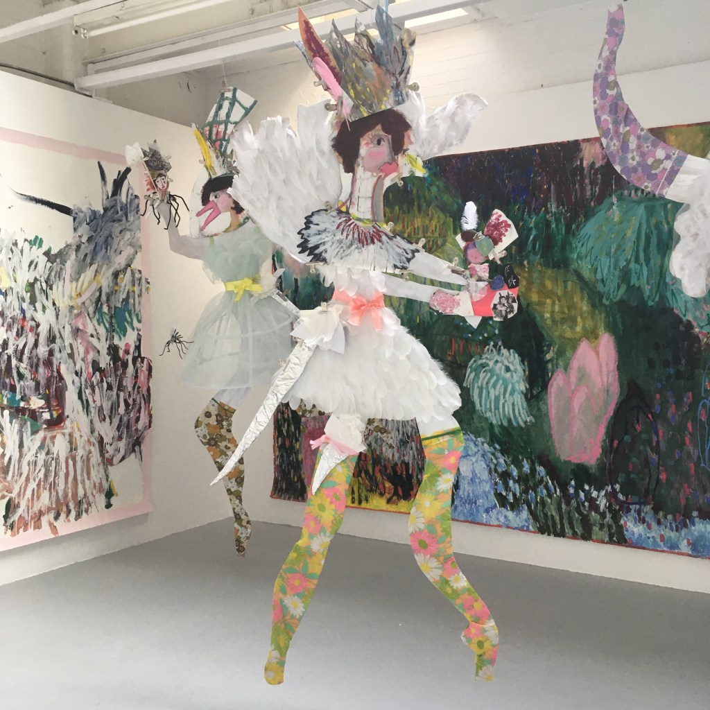
Liz Crossfieldhttp://www.lizcrossfield.com

Of course I was drawn to this lively piece by Liz Crossfield. It’s paper collage on steroids – wacky, fun, eye-catching and very clever. I liked the way the paper figures were held together with bulldog clips and looked so arresting against the big floral background painted on paper.

Lovely work from Thomas Cameron who makes paintings of everyday scenes. There’s an Edward Hopper feel to some of the works but they are satisfyingly done in limited palettes.

http://www.harrietgillet.co.uk

I liked the gentle narrative feel to Harriet Gillett’s pieces of interiors with limited lighting. The works give a sense of times past and domestic spaces which stay the same for years.

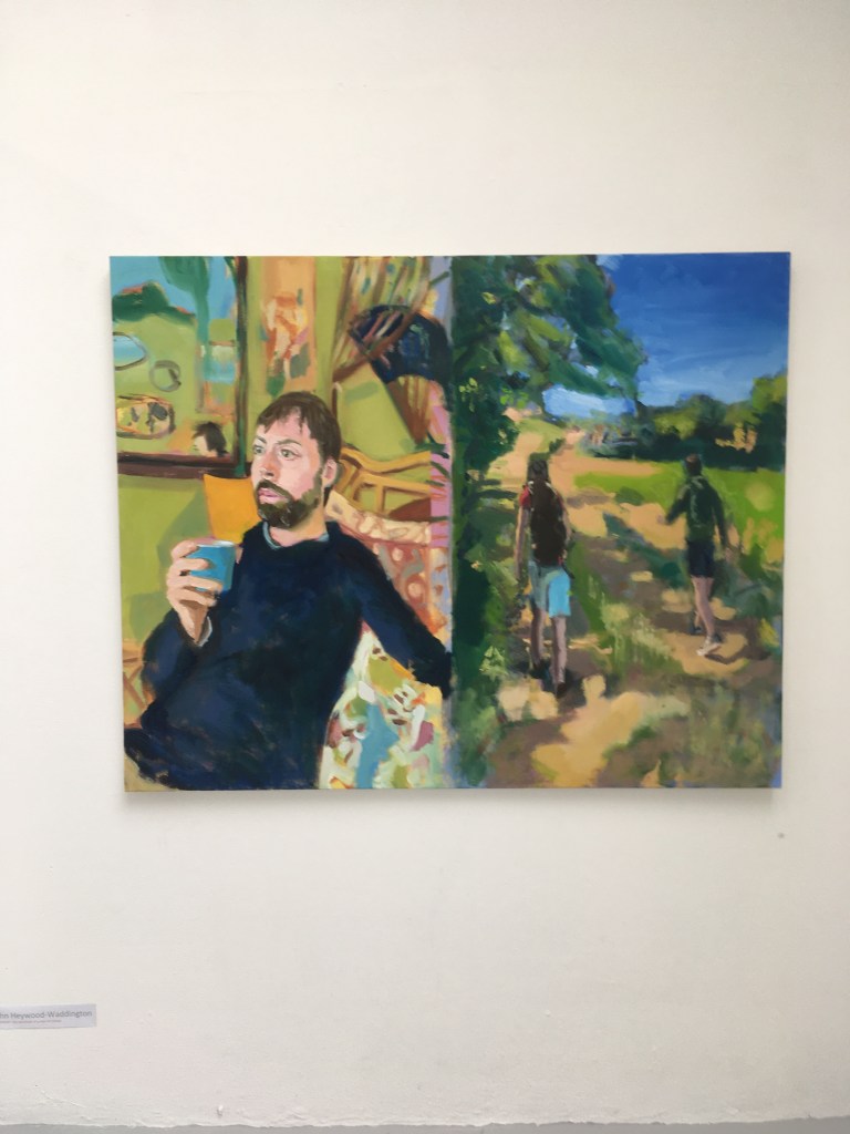
http://www.mrjohnw.com

The portraits by John Heywood Waddington are very charming and wistful. You get the feeling there’s a backstory of narrative yet to be told, which the painting is just hinting at. As the viewer, you can imagine the scenarios and fill in the gaps.

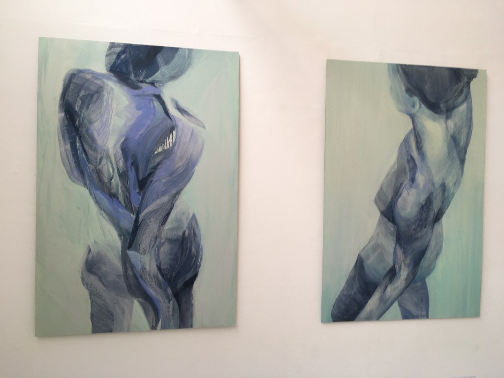
I liked the work of these two artists who focus on the human body, activity and the notion of bodies pushing themselves in challenging directions. And I liked the use of paint too, the way the pigment is wiped away or swished onto the canvas with confidence.

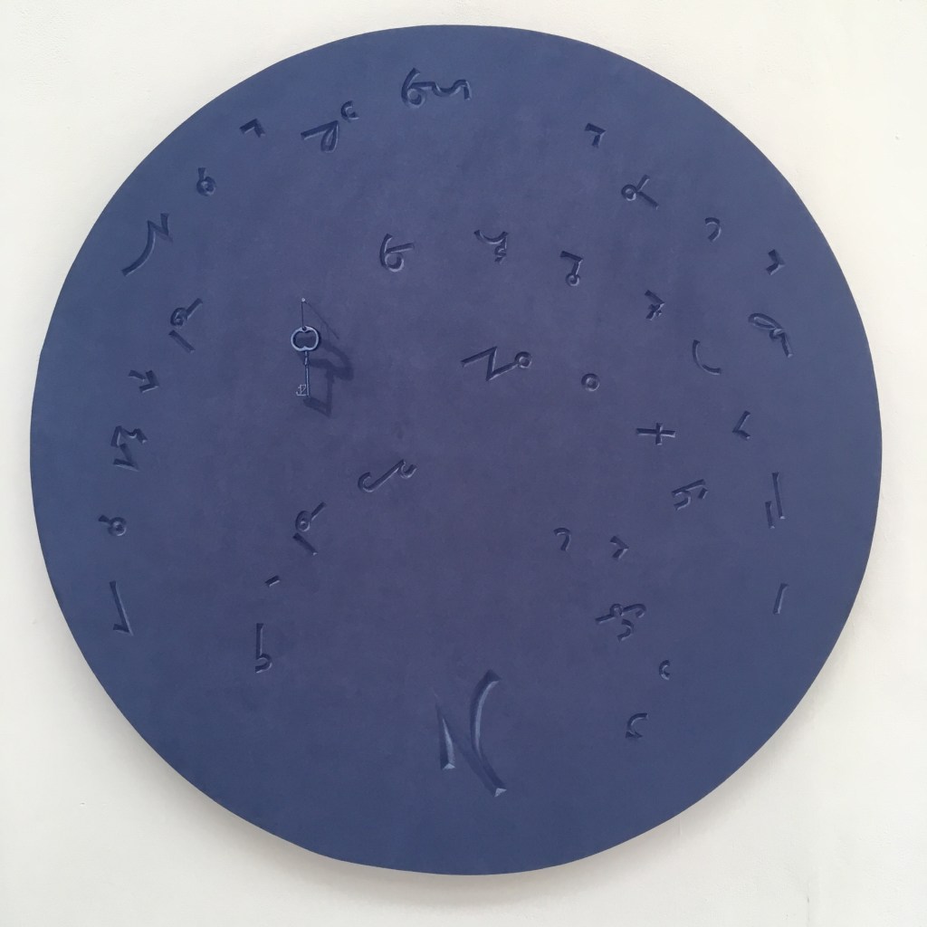
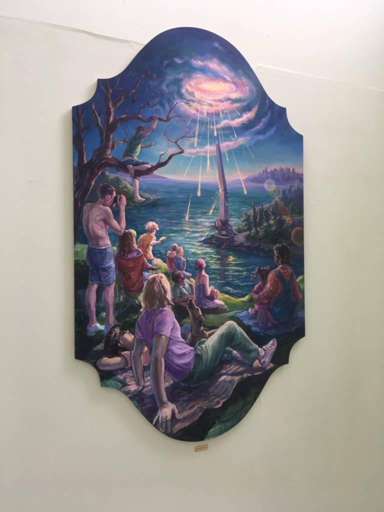
I’m concluding with these two – Nicholas Yau creates beguiling runic symbols on blue suede and Simon Bejer gives us a contemporary twist on epic renaissance paintings with dramatic scenes painted with terrific panache.

Basically I loved this show. In my dreams I too would have been busy in an attic room at the college creatingnew figurative and narrative works for an MA show. But I’ve not had a bad time of it in my own studio tearing up paper and creating my own work. Seeing all this accomplishment makes me want to push my own practice that bit further. Now, let’s get those old oil paints out!!

The MA show at City & Guilds of London is on until 10th September 2022.
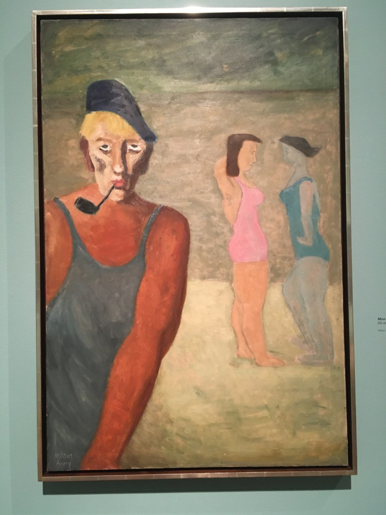
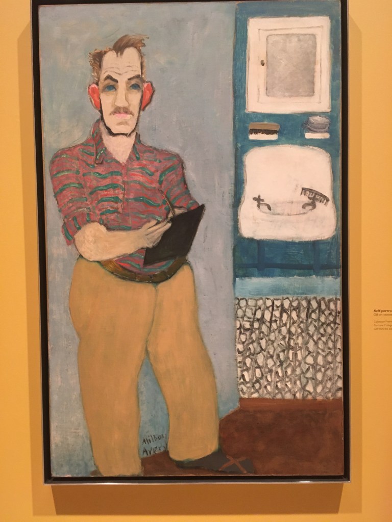
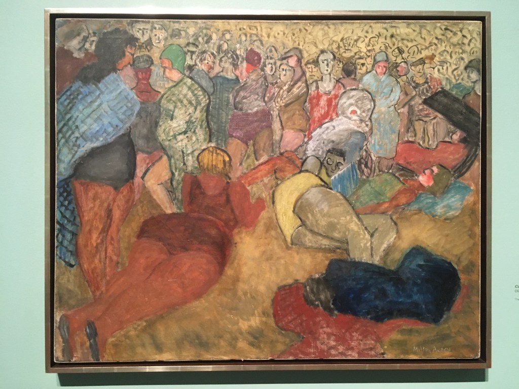
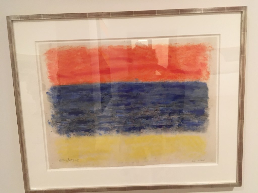
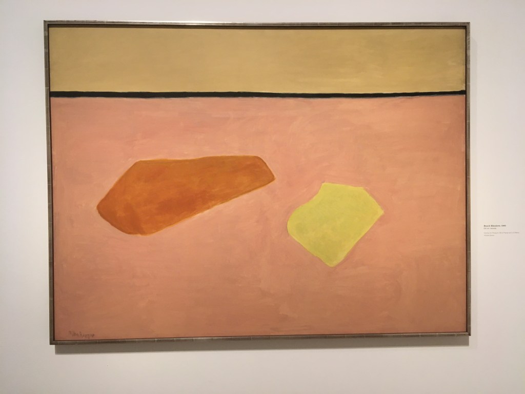
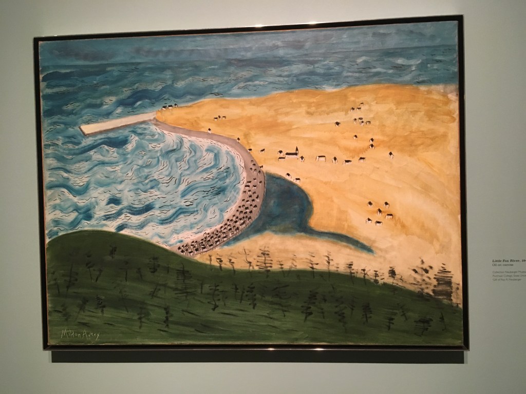
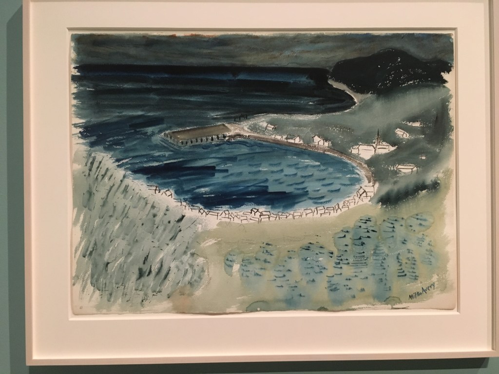
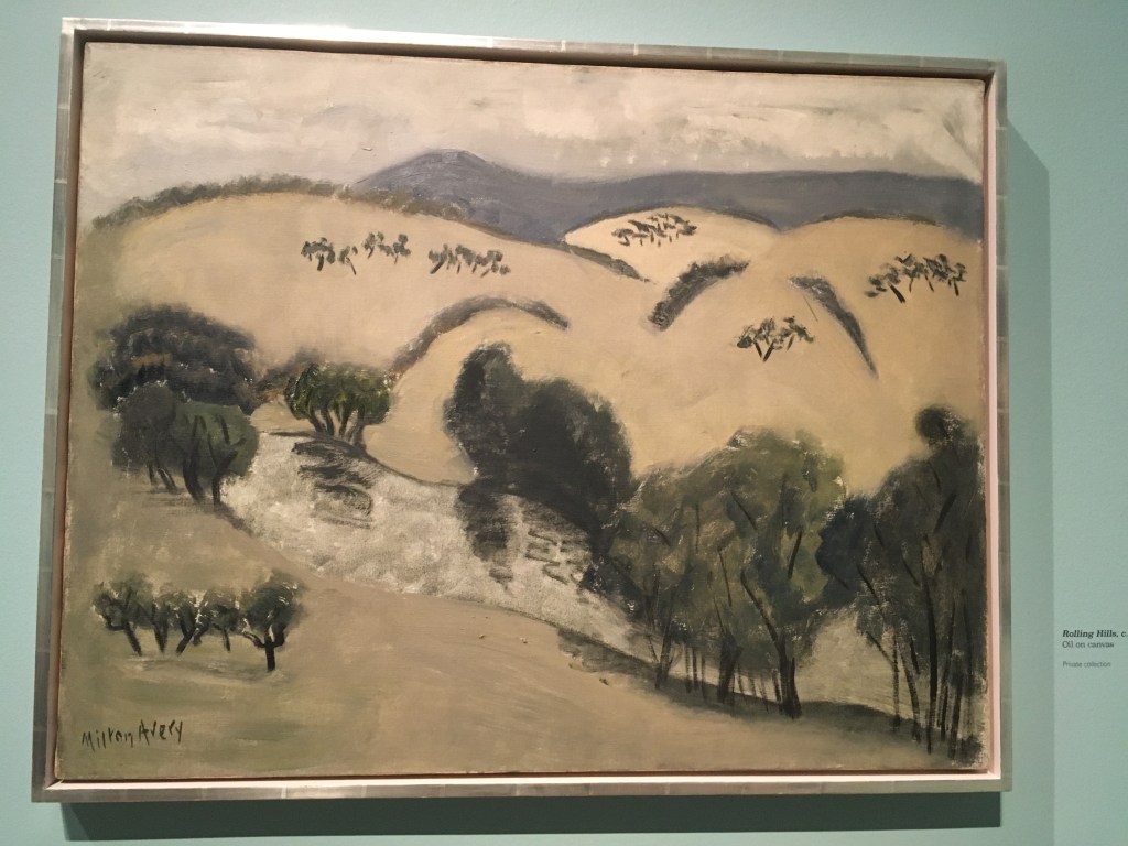
Delighted to be introduced to Milton Avery at the Royal Academy’s new show celebrating the ‘American Colourist’ and to see just how influential the artist was. He was a key player in the shift from a post-impressionist thrall into the new, whizzy world of Abstract Expressionism and found an inspiring new way to use colour to capture the ‘feel’ of a subject.

This new show at the Royal Academy really gives you the chance to see the evolution of a fascinating artist. I always find it encouraging when I hear about people who develop their art later in life. Milton Avery, born in 1885, in Altmar, New York left school at sixteen to work in a factory. Clearly, he was interested in art but thought he’d attend evening classes in commercial lettering but found that drawing was his passion.

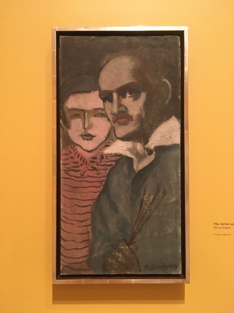
The first room in this exhibition has a collection of his early works, many on bits of old board, fragments of canvas or card and you can see how he’s having a go at producing landscapes in the style of the European post-impressionists such as Van Gogh or Matisse and the use of impasto and colour-rich paint is impressive. But he continues pushing his art and becomes really interested in the ‘sensation’ that colour and shape on canvas can convey.

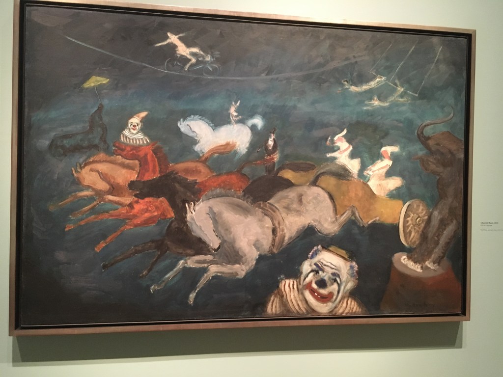
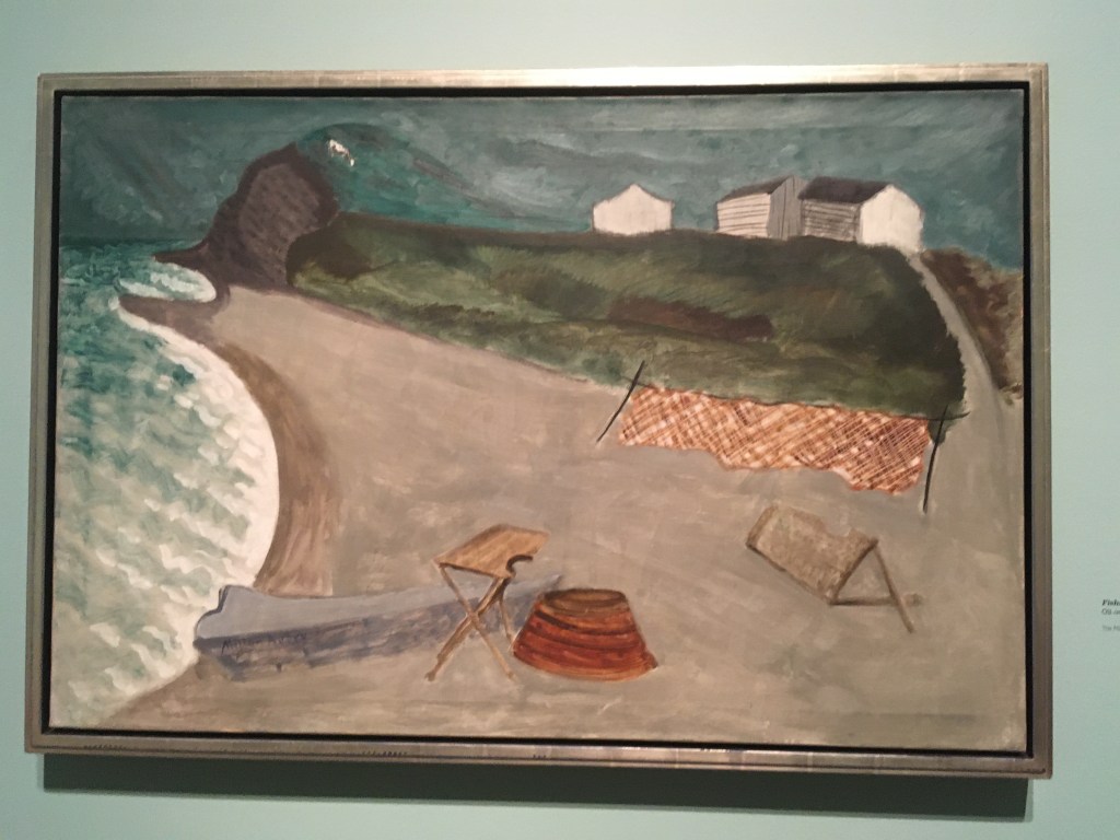
Below are two of my favourite paintings in the show. Apparently they were painted at high speed, and the scale is huge, capturing tremendous action and story-tellilng. You really get the feeling that he’s just witnessed these sites and wants to record the ‘feeling’ rather than exactly what he saw. Oh, they are inspirational.

As we move through the exhibition chronologically you can see how the surface of the paintings flatten, he strips out all unimportant information and concentrates on the blocks of colour and shapes which he can see. As his work progresses he is finally able to see beach towels on the sand and convey them with minimal detail but the ‘feel’ of the image is all there. I really love these works.

I thought I’d put these two paintings (below) together. I’m assuming they are of the same scene but made several years apart. On the left is the early version, a bit more literal but still evoking scene and the atmosphere created by the weather. On the right, the later one, there is less detail but it’s still got a terrific sense of place and you also feel that it must have been made on the spot at high speed.

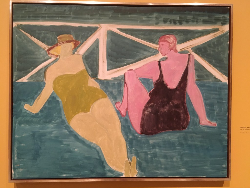
I liked his paintings of women together. He manages to convey a sense of energy and movement in his most static of situations. The women in these pictures may be still, possibly posing, but you feel that there is an interior world being seen too and the images are full of action and narrative.

As you can gather, this exhibition was hugely pleasurable and I’d love to go back for another look. It’s on at the Royal Academy until 16th October 2022.
https://wordpress.com/post/paperplaces.co.uk/6242

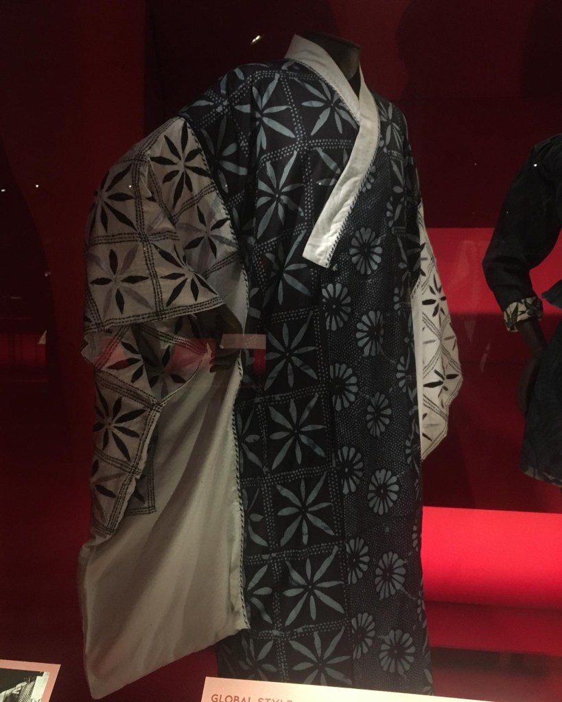
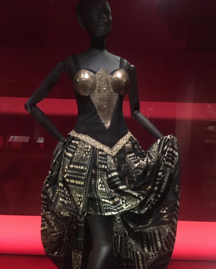
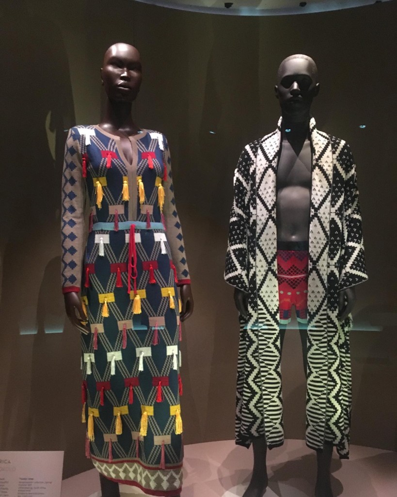
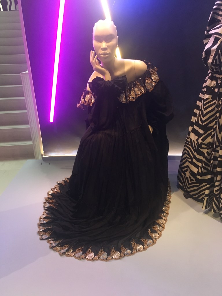
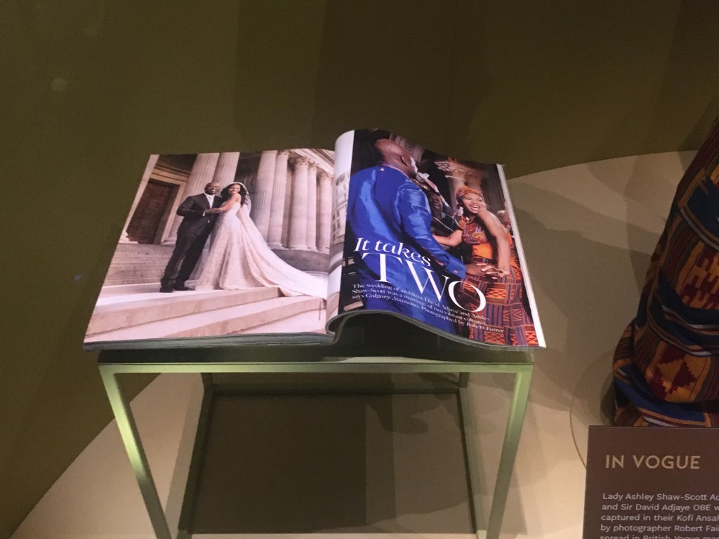
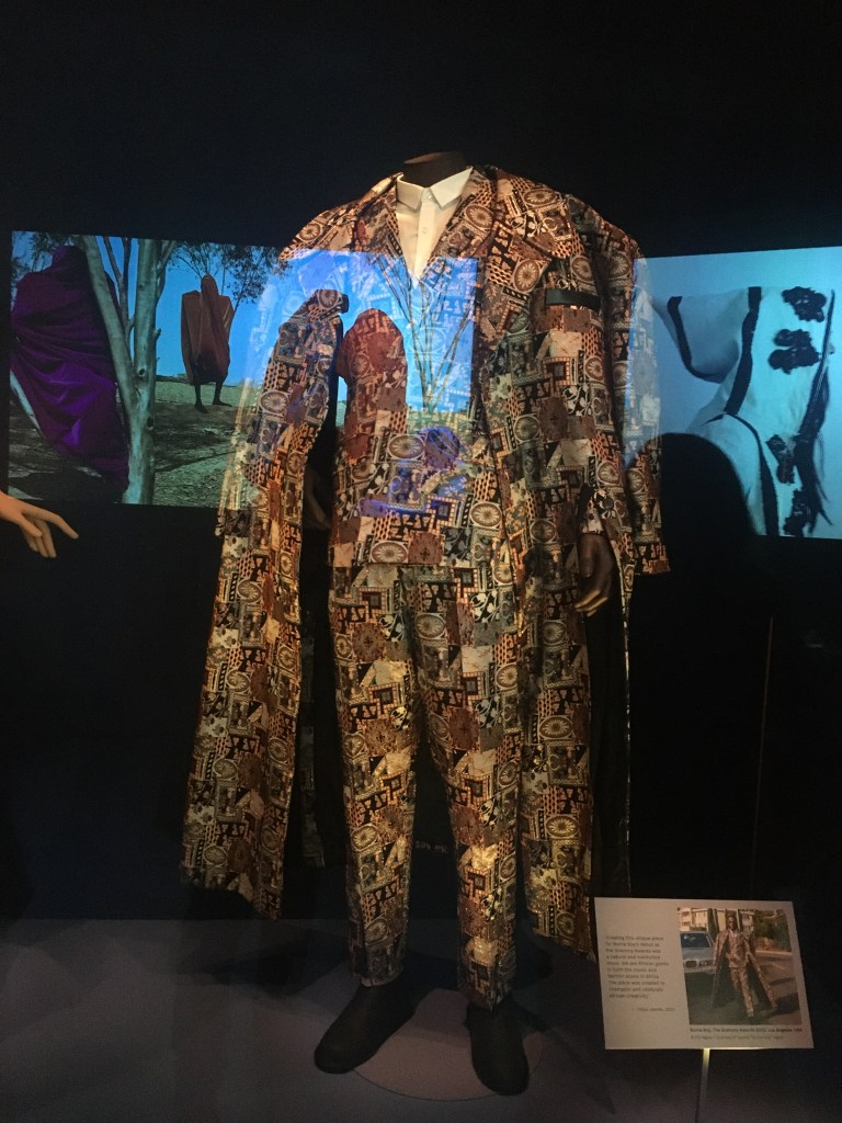
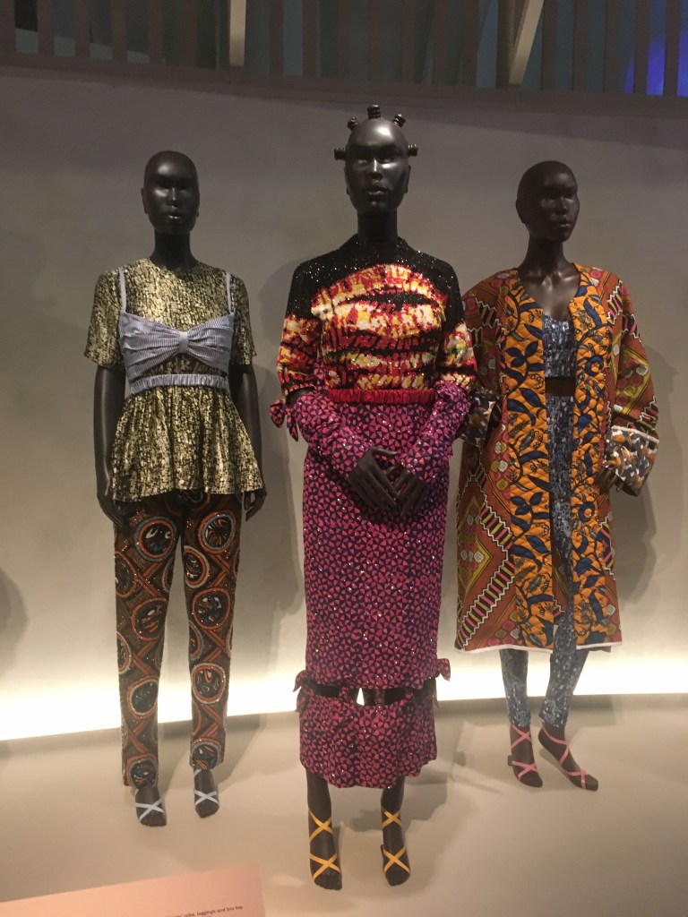
African Fashion at the Victoria and Albert Museum offers a really impressive view of the vibrant contemporary design creativity emanating from Africa and African designers. It also charts the history of textiles, weaves, fashion statements and decorative wear and shows how African style has been adapted and adopted by western designers and fashionistas.
I don’t feel knowledgeable enough about fashion to give an opinion of the pieces apart from to say that they were amazing. So instead I’ll provide a gallery of the clothes which really caught my eye. I do love colour and bold statements and seeing how natural fibres and textiles are employed in a unique kind of haute couture.

African Fashion at the Victoria and Albert Museum is on show until April 2023.

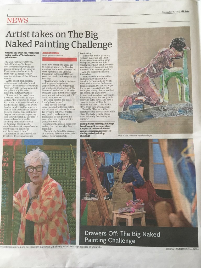
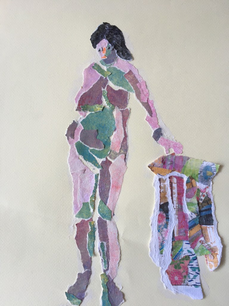
I’m on the telly next week as an artist in the 4th week of Drawers Off on Channel 4 at 5.30pm. And I’m delighted to see this full page spread in the Ham&High about my appearance. It talks about being in the studio and ignoring the fact that a camera would be peering over your shoulder while you’re trying to capture the life model on the plinth. I use paper to make my art but the table of art materials was too much of a temptation and I loved trying out different inks, paints and pastels during my week. You’ll have to watch the show from Monday 20th to Friday 24th to see how I got on. I loved getting to know my brilliant fellow artists and Jenny Eclair was a joy as our presenter. She kept the energy going and was sympathetic to the artistic agonies of making sense of the human body. Here’s the piece in print.

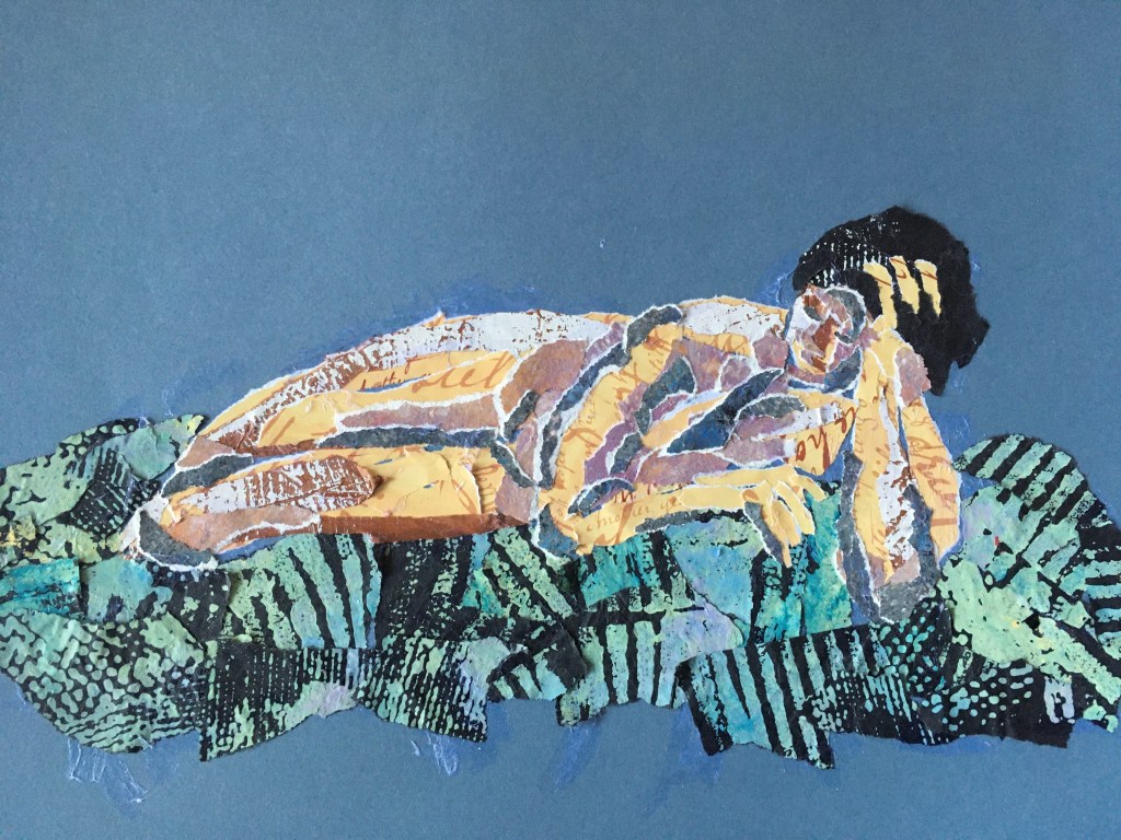
And here are just a few more examples of my paper collage artwork. I attend a life class every Monday run by The Moon and Nude at the Victoria Stakes in Muswell Hill. It helps keep my eye in and the models are always fantastic. Thank you Jenny Eclair and the Drawers Off team at Multistory and Channel 4. And thank you to Bridget Galton at the Ham&High for the terrific piece.

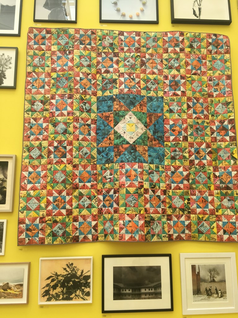
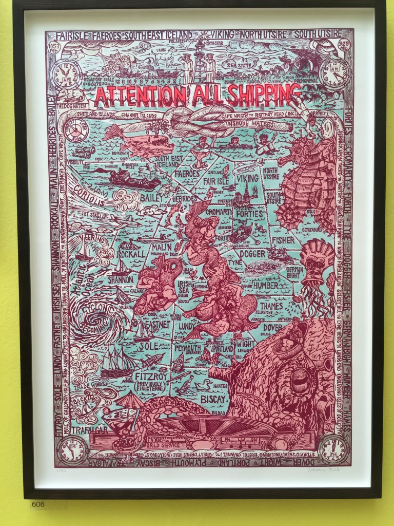
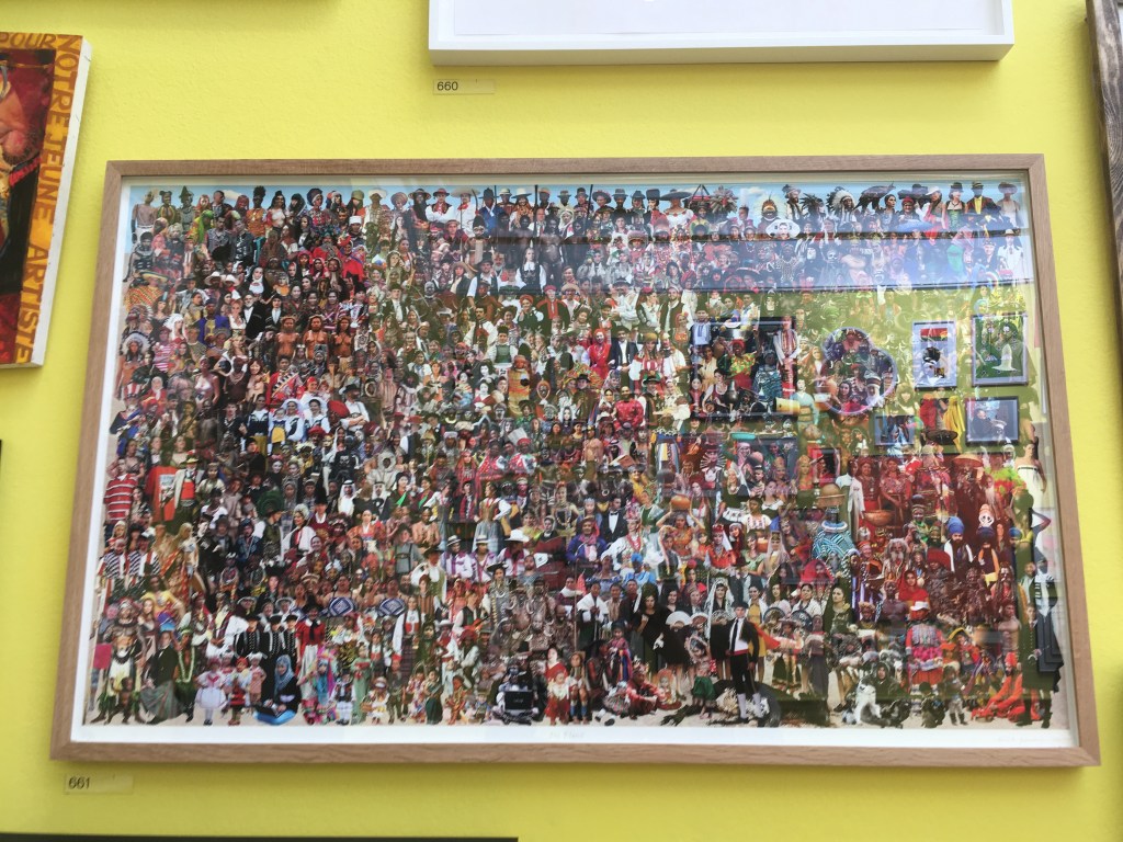
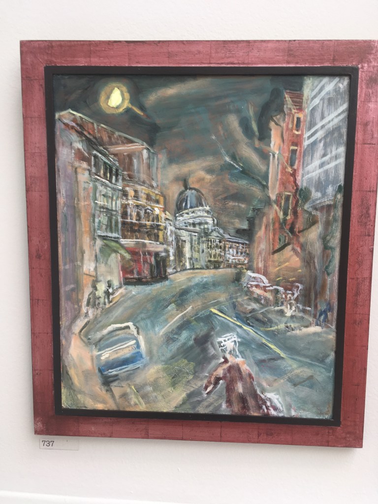
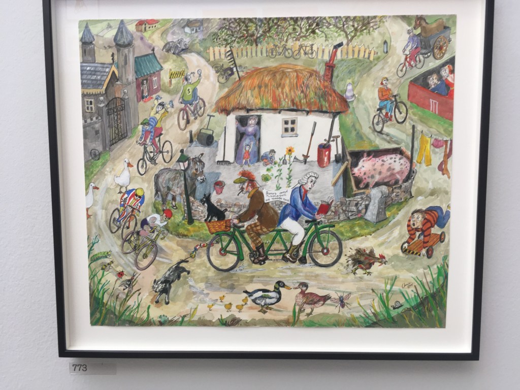
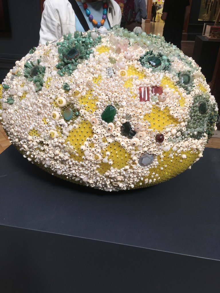
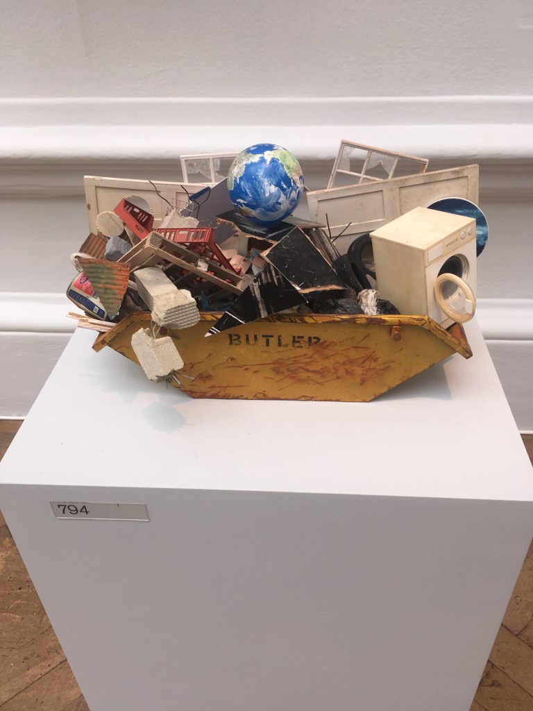
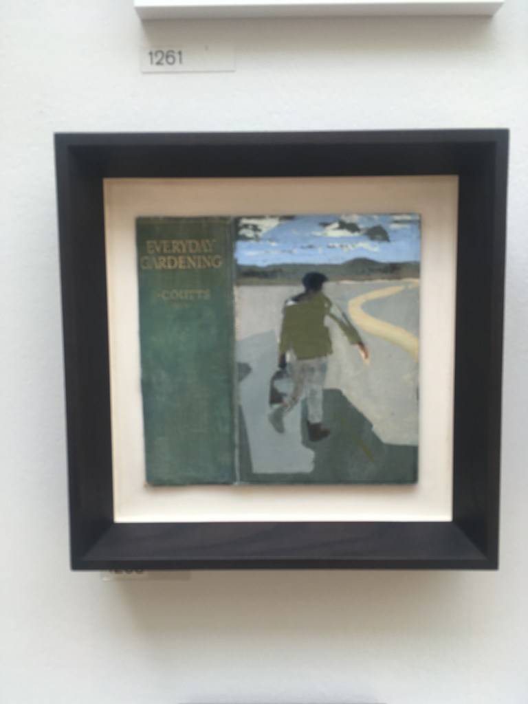
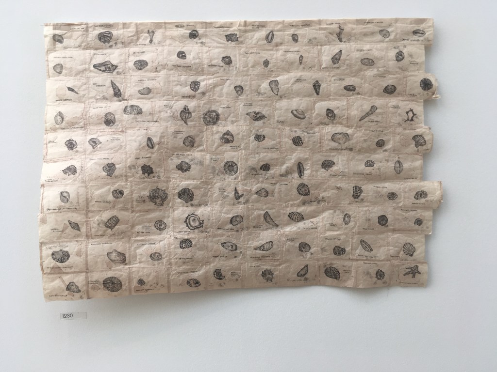
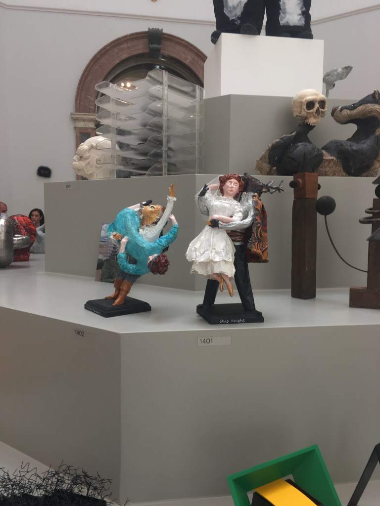
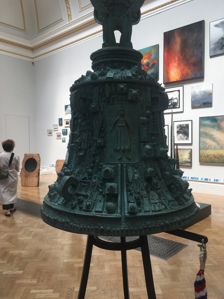
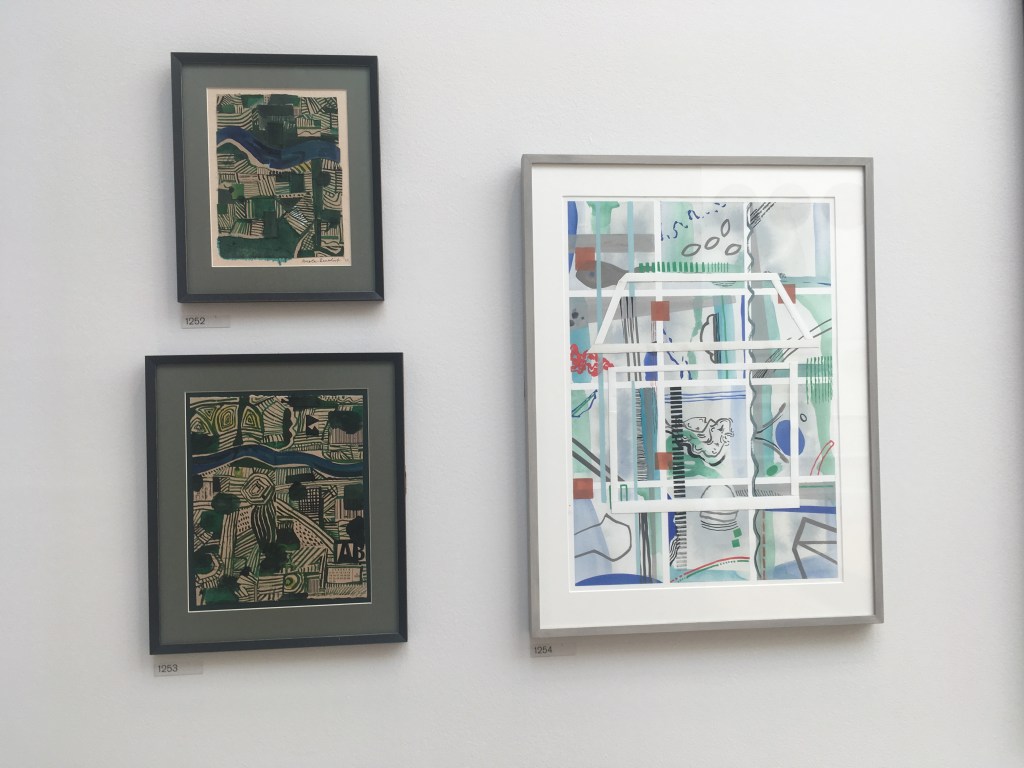
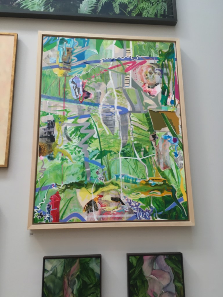
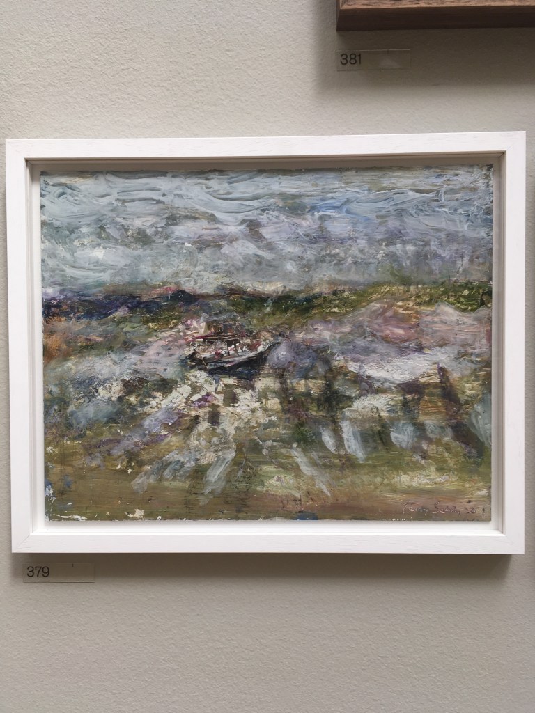
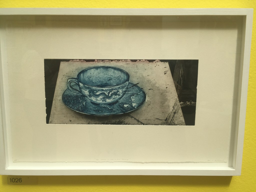
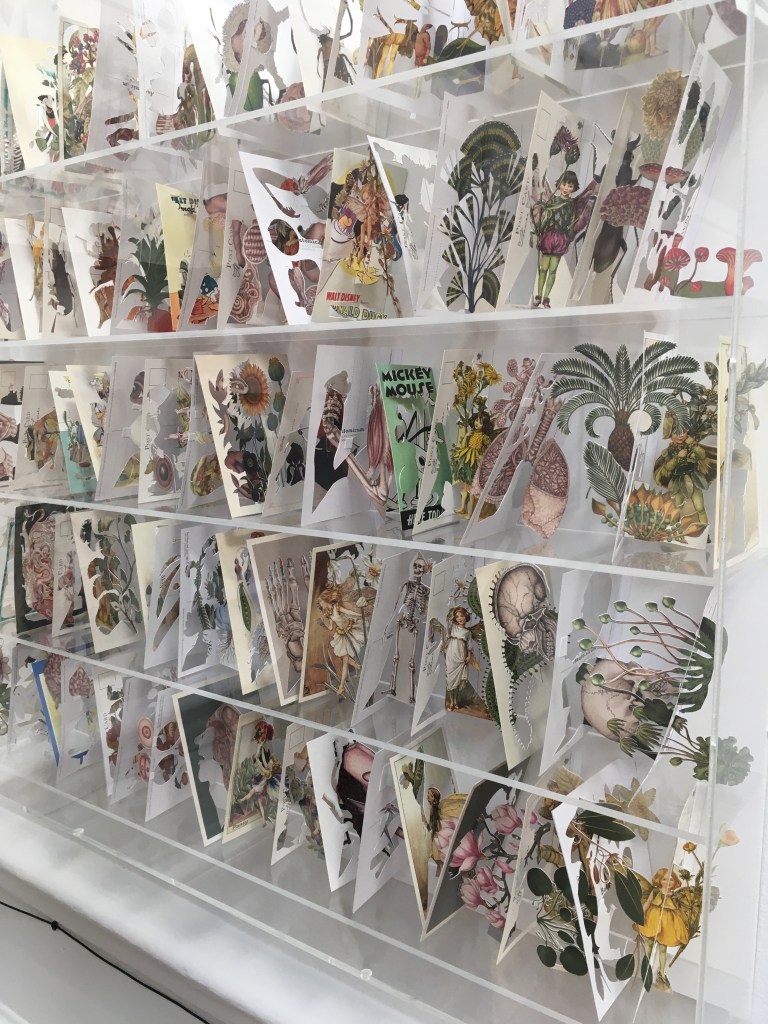
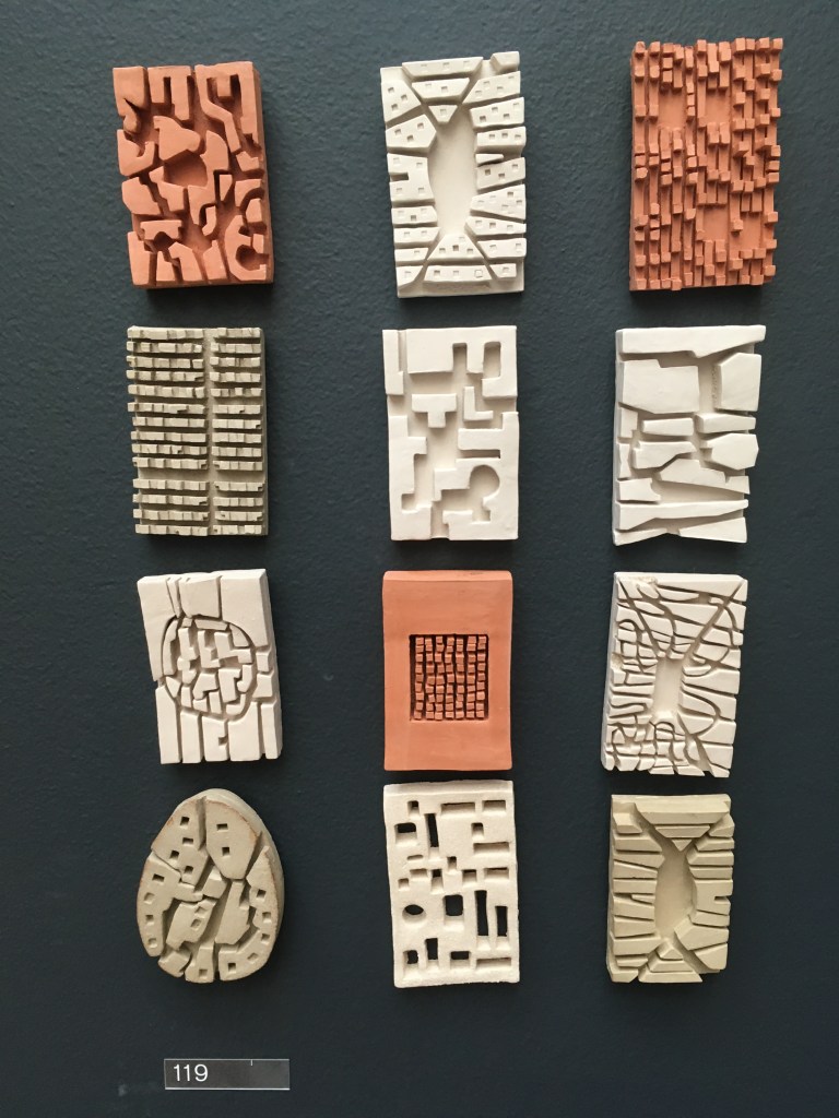
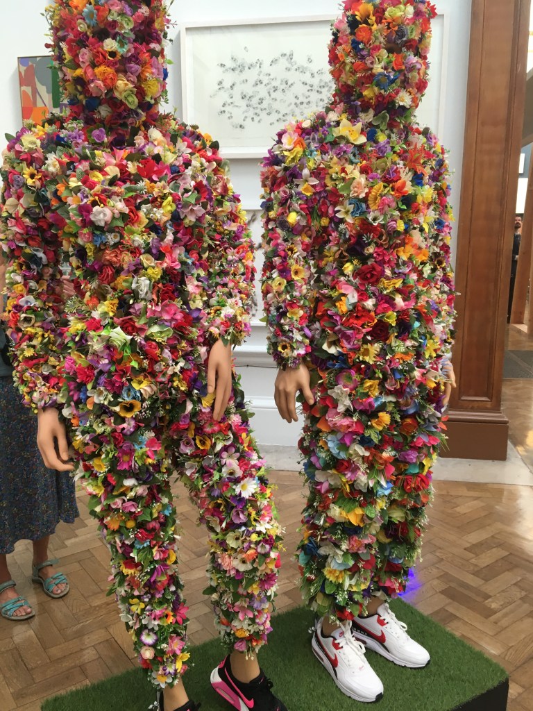
The Summer Exhibition at the Royal Academy opens next week. I was lucky enough to be at a press preview today and felt delighted that this great show is happening (after Covid hiatus) The show if filled with the usual pick and mix of art from humble artists mingled with the work of Royal Academicians and invited artists. The theme, the environment, is clear to see and there are lots of references to global warming, to the bad behaviour of humans and the way the weather dominates so much of our life. There are also a lot of very witty and clever images. Of course I was on the look out for works on paper, or with collage, but I do love a good painterly painting and there were lots on offer. I’m simply going to add a gallery of the pictures which caught my eye. I particularly enjoyed the galleries curated by Grayson Perry; all the work is arranged over bright lemon yellow walls. You can’t help but smile.

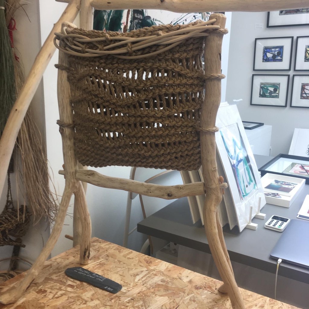
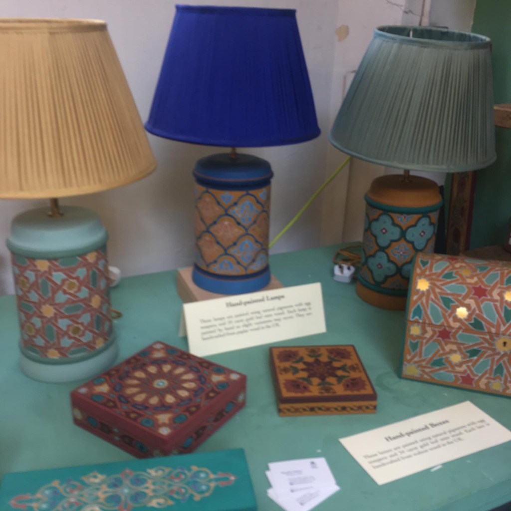
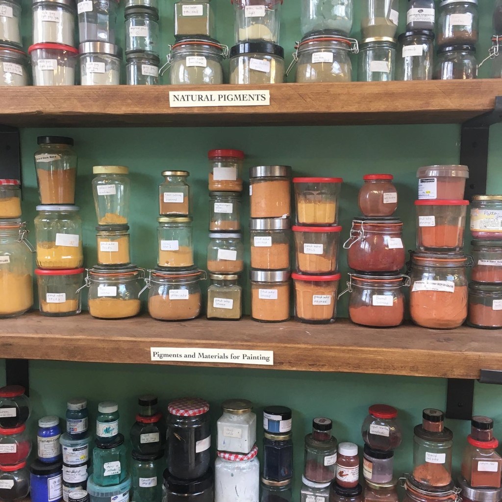
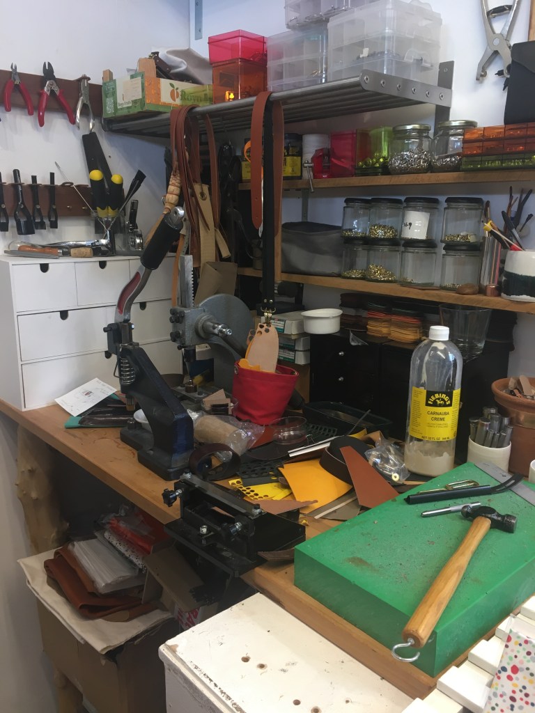
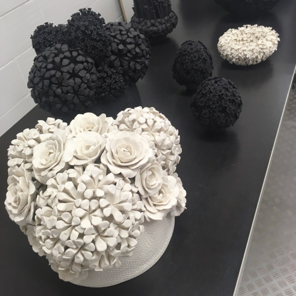
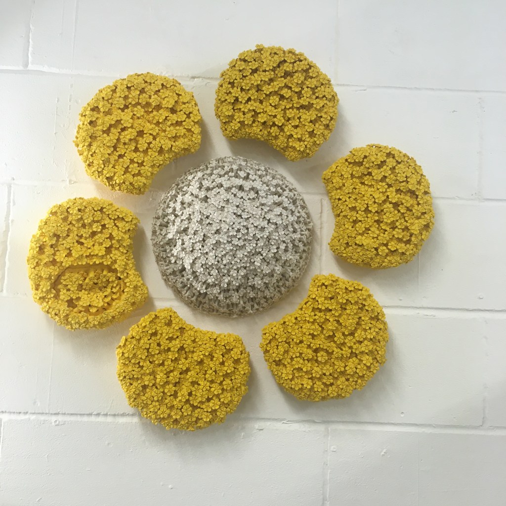
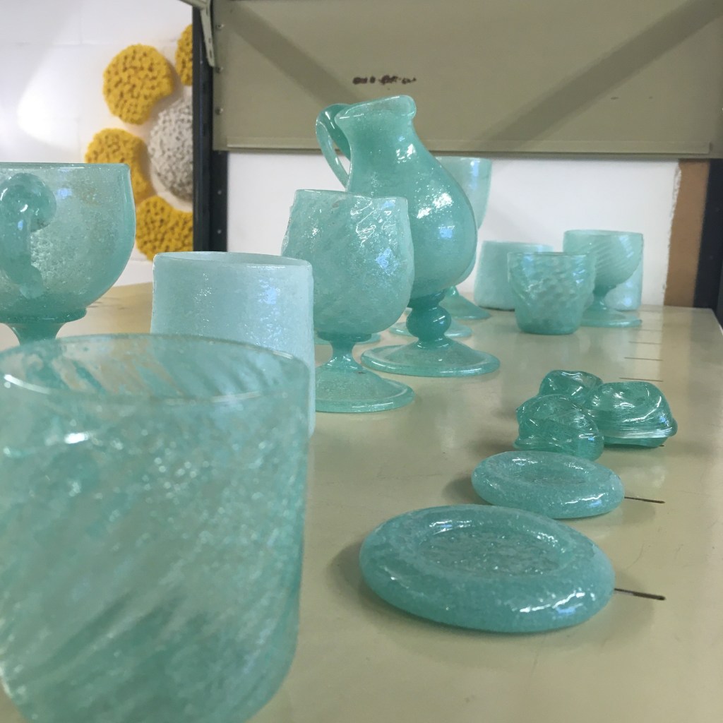
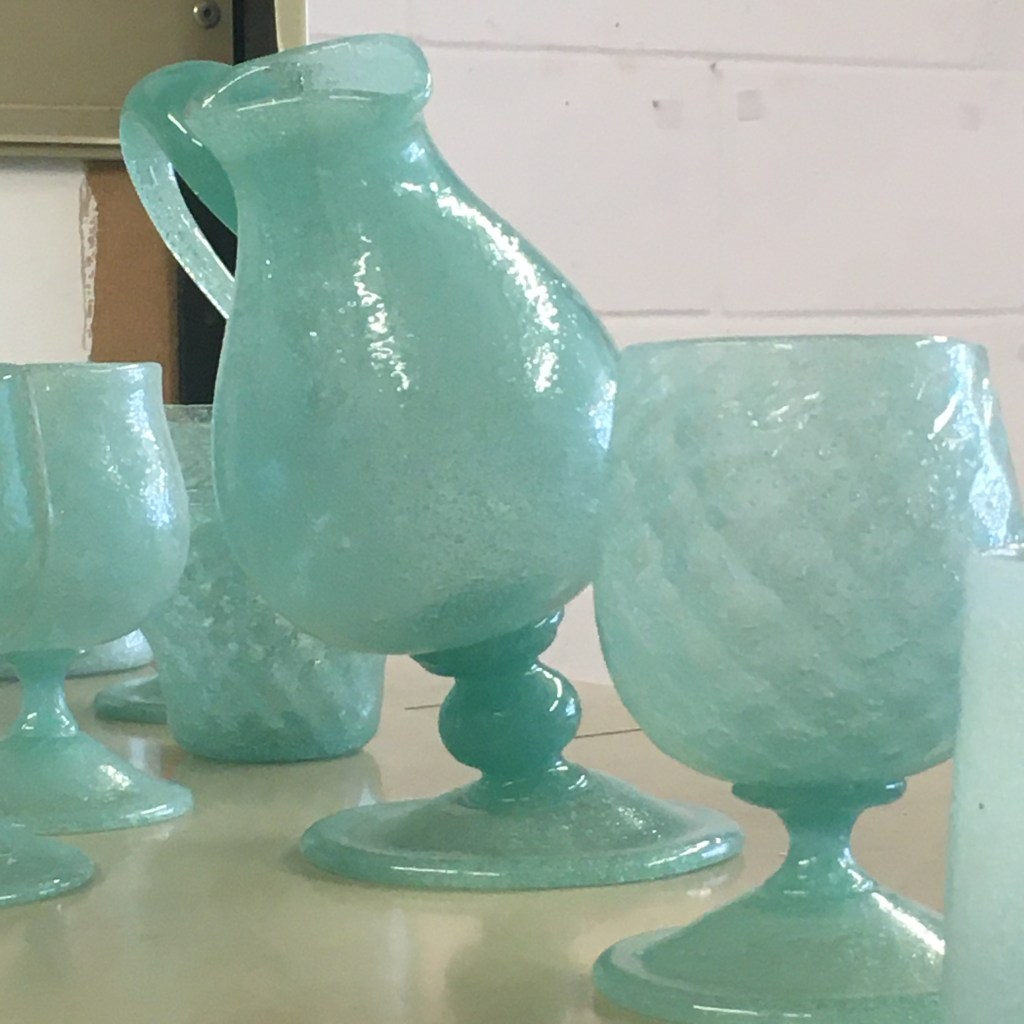
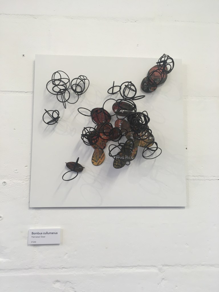
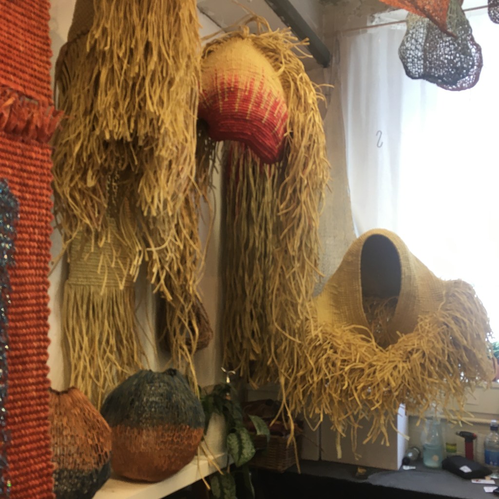
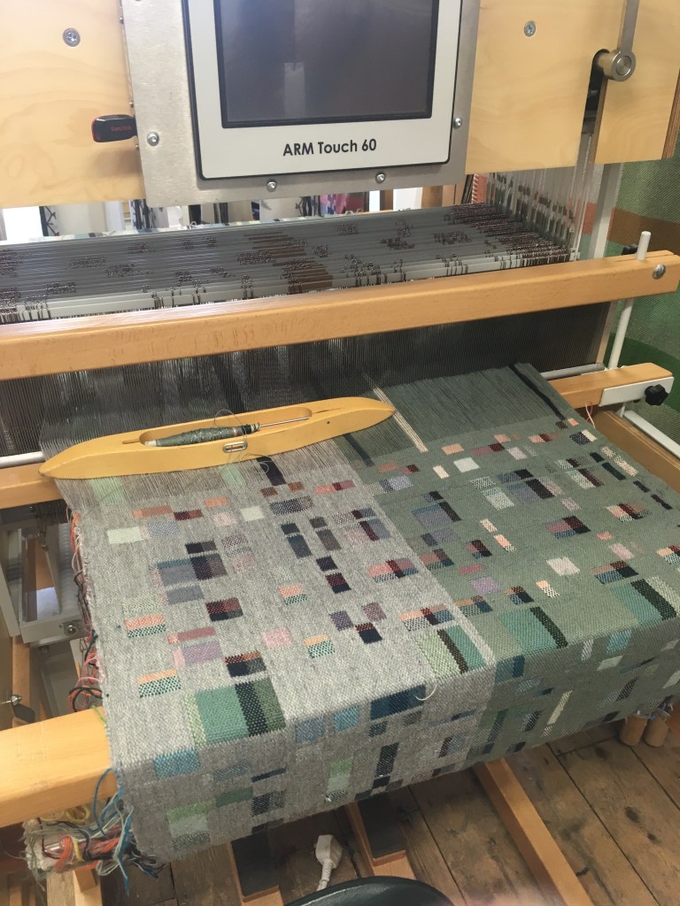
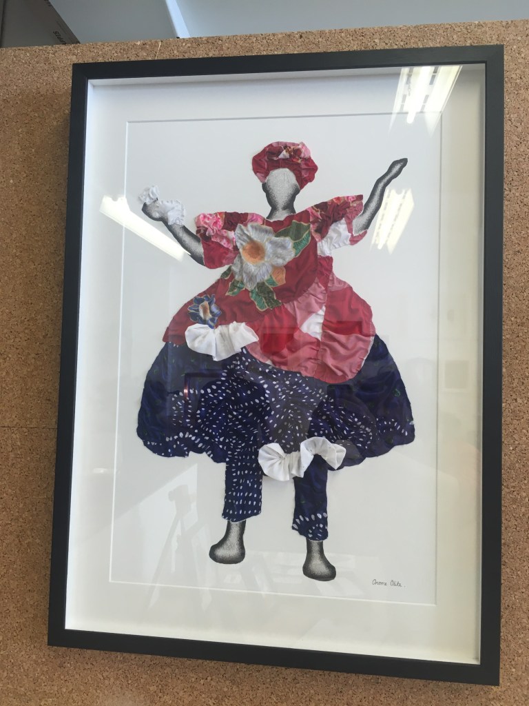
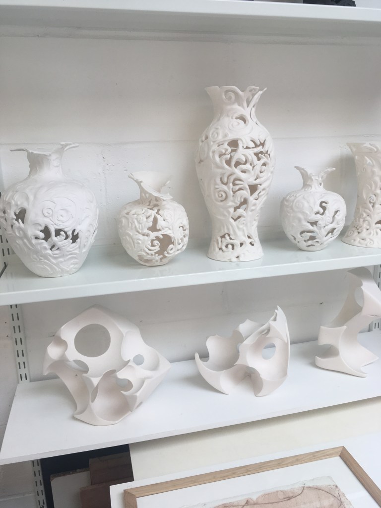
It’s always a joy to get inside artists’ studios and when Cockpit Arts have their Open Days, I’m there like shot. I went to the Bloomsbury site in Northington Street and was blown away by the fabulous creativity going on. I loved chatting to the artists and craftspeople who were there in their spaces ready to greet visitors. Rather than do a lot of chat, I’m just posting the photos I took and have captioned the images where I have the details. Enjoy the tour!

There were so many more amazing works I saw but I simply can’t include everything. Look forward to returning next year and seeing how everyone has progressed at Cockpit Arts.

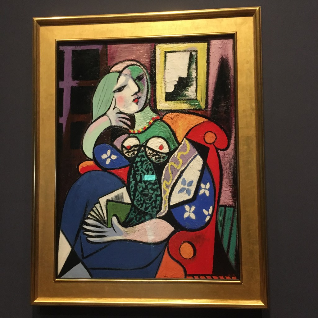
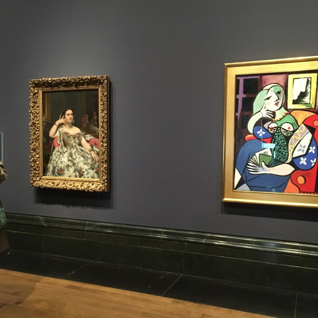
“All artists borrow from each other, great artists steal,” said Picasso, who was clearly so taken by the sumptuous Ingres portrait of Madame Moitessier that he ‘stole’ it by closely referencing it in his affectionate portrait of his lover Marie-Therese Walter who strikes the same thoughtful pose. Both paintings are on show, side by side for the first time, at the National Gallery, London.

You get almost a visceral hit when entering Gallery 46 at the National Gallery and encountering two utterly stunning portraits placed side by side in the space. Your eye is initially drawn to the hot, bold and striking colours used by Picasso and then you slide to the left and are seduced by the gorgeous, smooth porcelain skin created by Ingres along with a bravura depiction of sumptuous floral silk fabric and a rich interior.

It was fascinating to hear that the pose Ingres chose was, itself, ‘stolen’ from a painting found on the walls of the buried Roman city of Herculaneum depicting the Roman goddess Arcadia with her right hand placed near her face, her finger to her head representing intelligence, thoughtfulness and education. That image, in turn, can be found in even older images from Greek civilisation. Artists do indeed ‘borrow and steal’ and have done for millennia.

Where Madame Moitessier is holding a fan, Marie-Therese is holding a book. They are both seated in comfortable chairs or chaise-longue and the background is dark. Apparently Ingres took many years to complete his portrait and, at one stage, changed the fabric of the dress from yellow to the gorgeous floral design which was the fashion of the day. Picasso’s portrait oozes speed and urgency and the brush strokes and thickly layered paint gives the piece tremendous drama and appeal.

It’s great to see the two pictures side by side. It’s the ultimate artistic compare and contrast.

Clerkenwell Design Week is back in action after a two-year break and it’s great to wander around the ancient streets and alley-ways of this ancient part of London popping into showrooms and checking out installations.

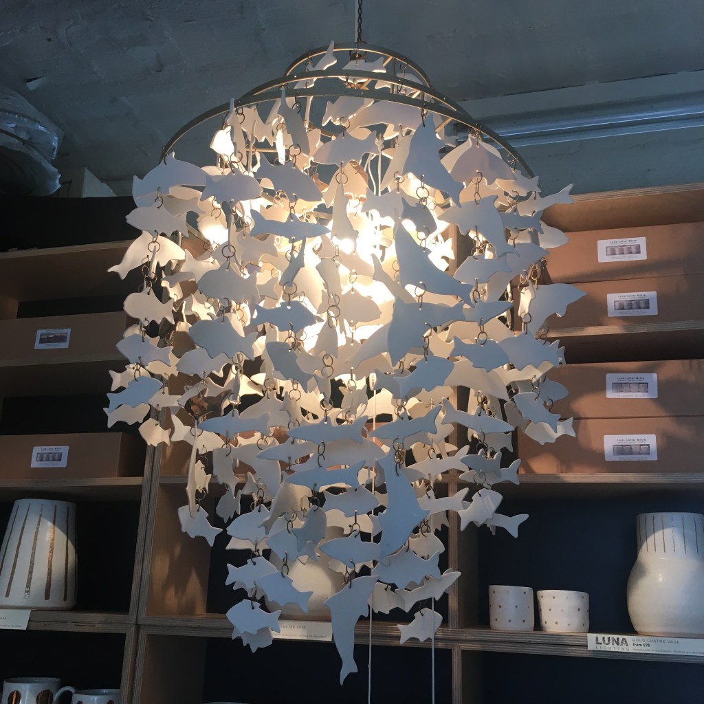
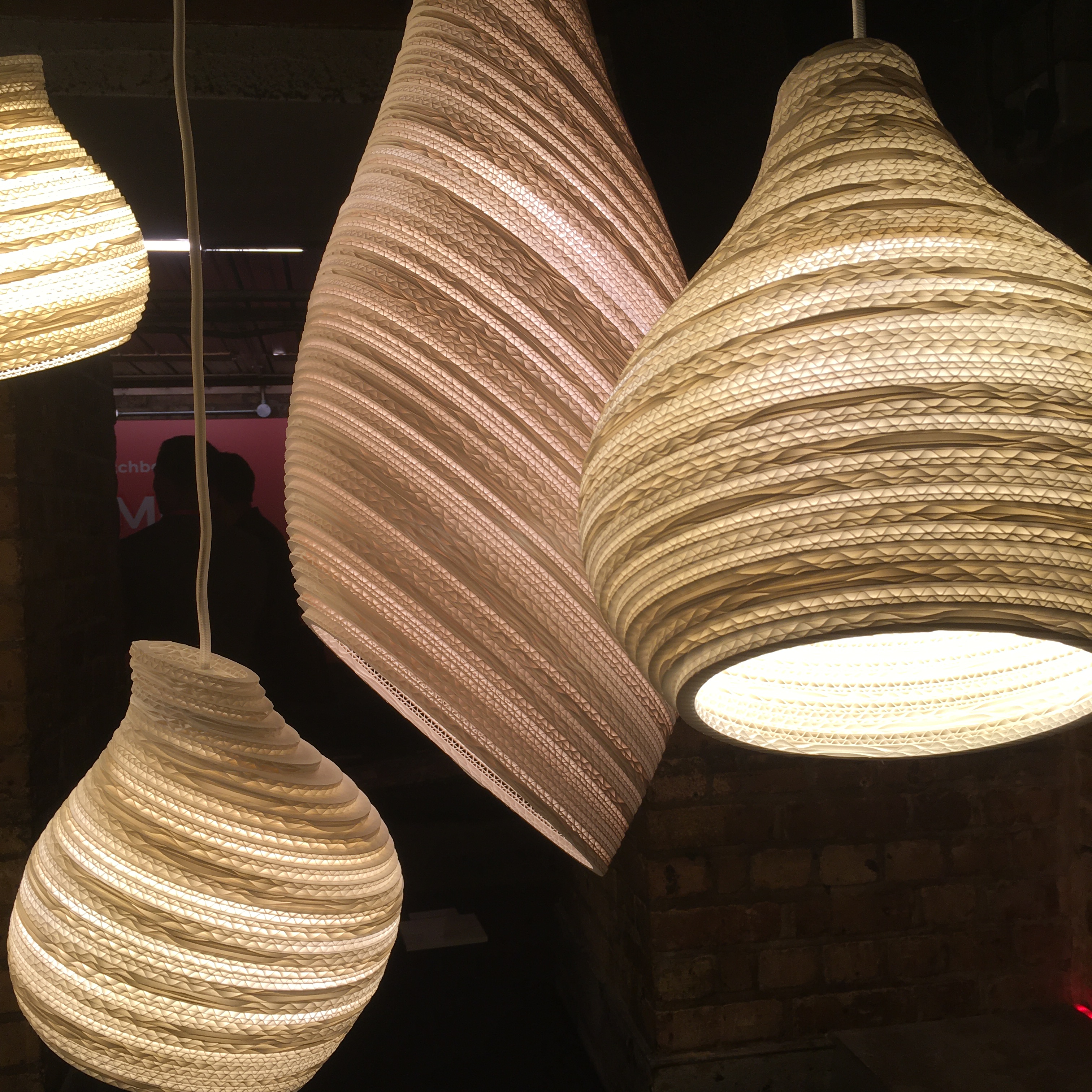
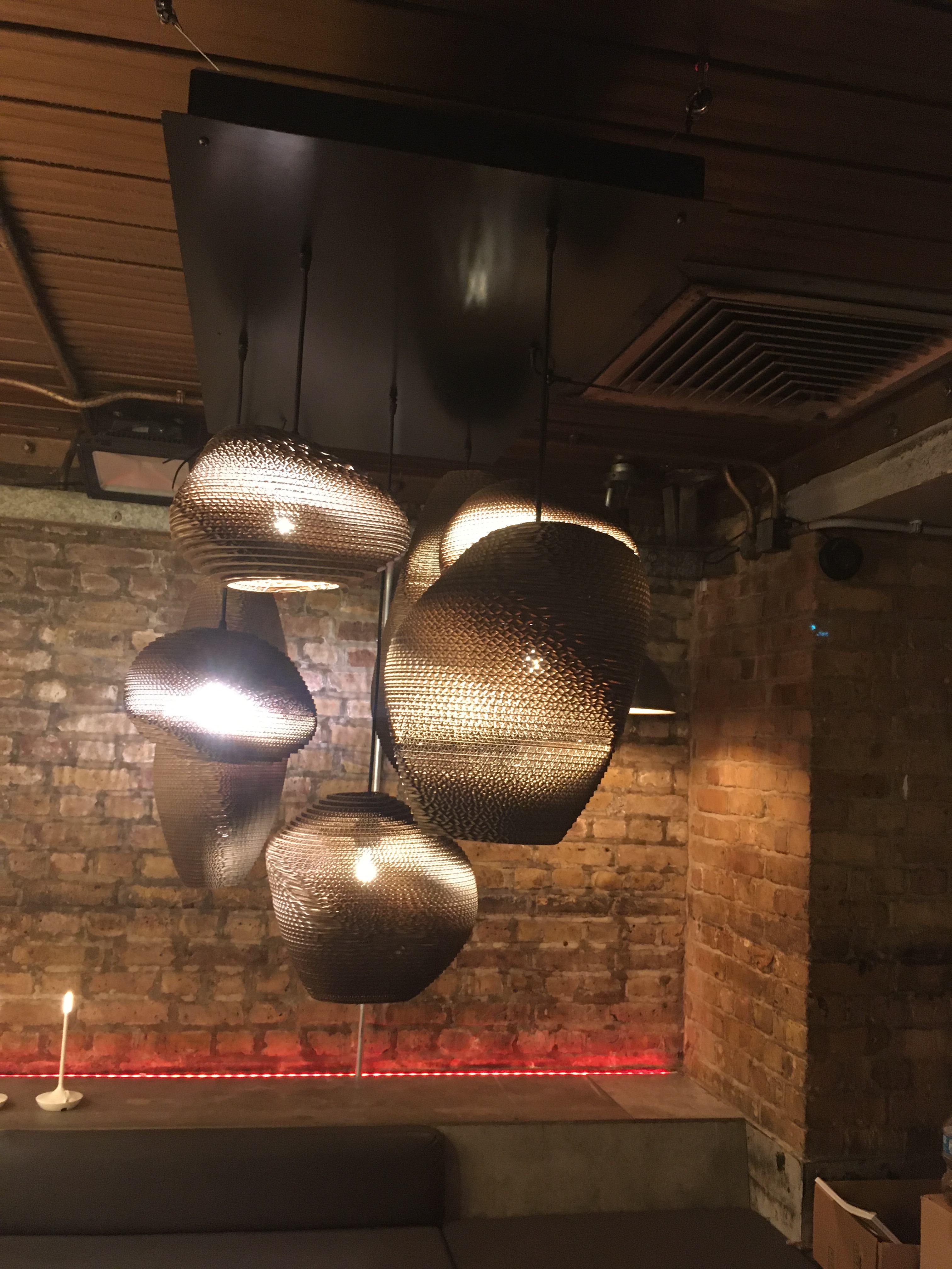
It’s great to be back in Clerkenwell and even more exciting to be there the day after the brand new Elizabeth Line opened. So, of course I had to explore the new whizzy concourse at Farringdon Station, hop onto one of the the sleek, swift, silent new trains and take a modest ride to Tottenham Court Road before returning to Clerkenwell to start my tour of Clerkenwell Design Week. There was lots to see in this fascinating part of London. I’m always drawn to paper in any form and was delighted to see these charming paper lampshades at Pad Home. They’re made from layers of corrugated card and look really cool with their curvy, organic shapes and they shed a beautiful light too.

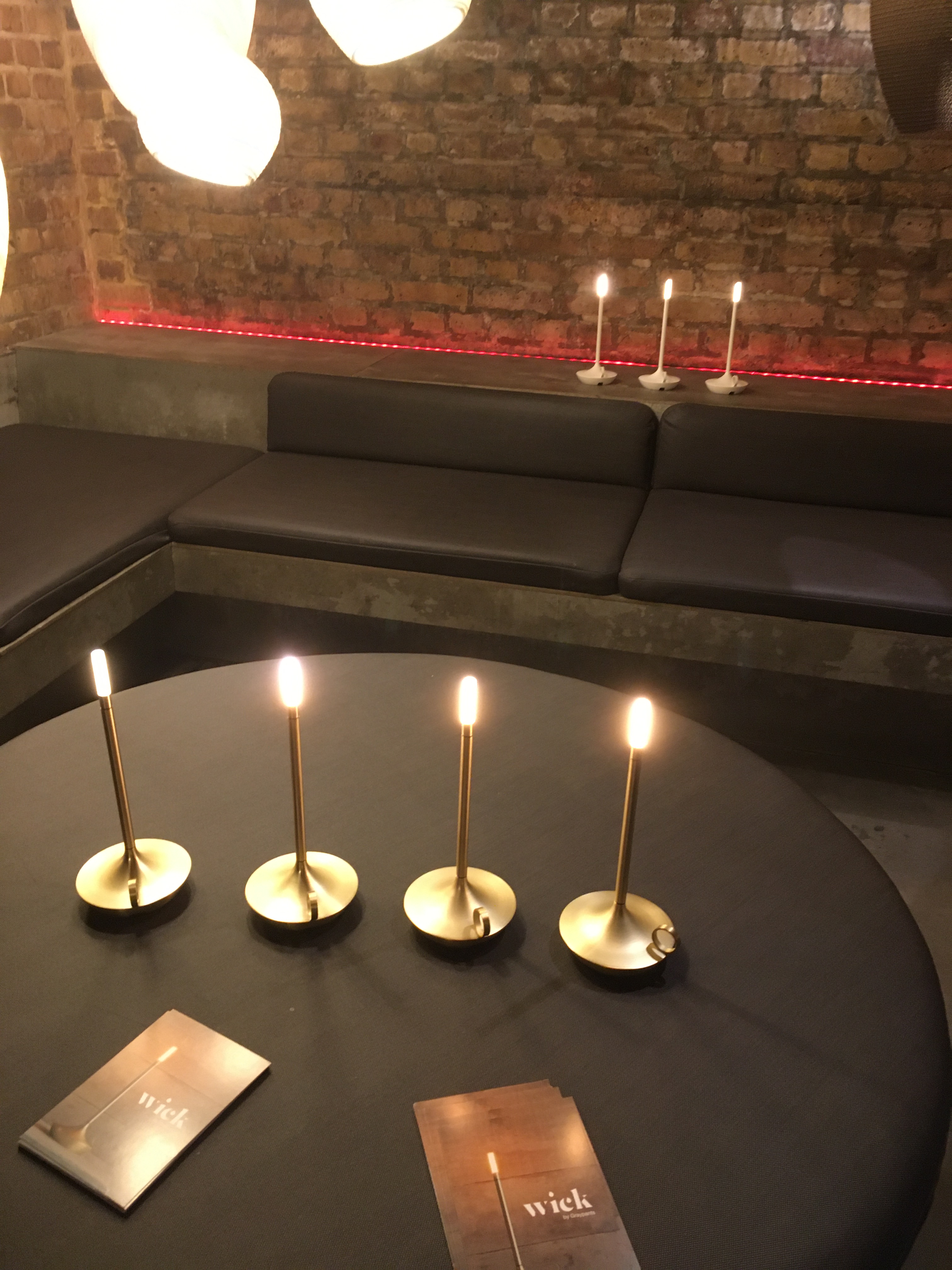
I was also taken by the little Wick Candlesticks which are LED lights which you can charge up and will keep going for around 100 hours. Given the current crisis over energy I think we may well be returning to a time of darkened homes when we will just have a ‘candle’ to light you to bed rather than spending a fortune on keeping the entire house in a blaze of light all night long.

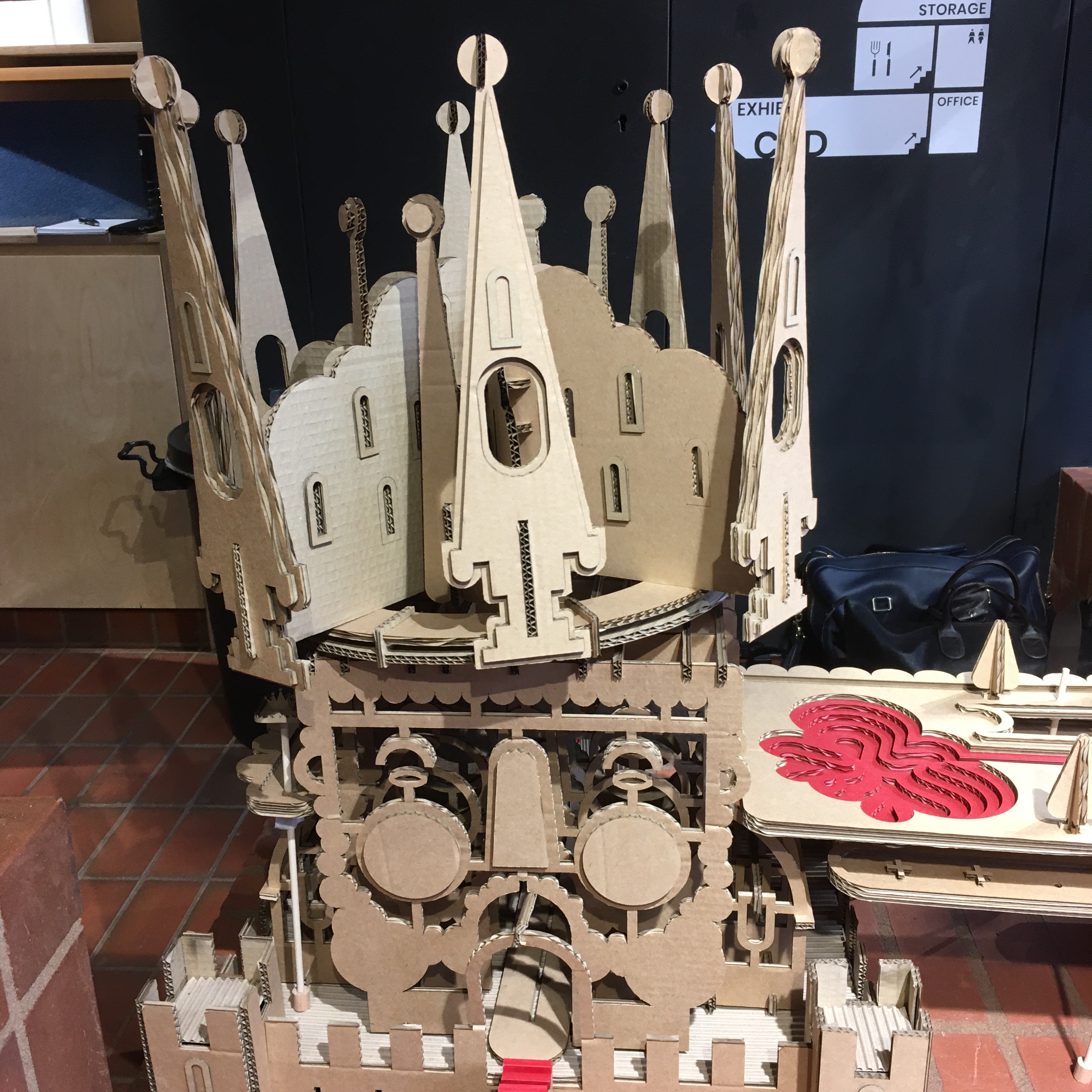
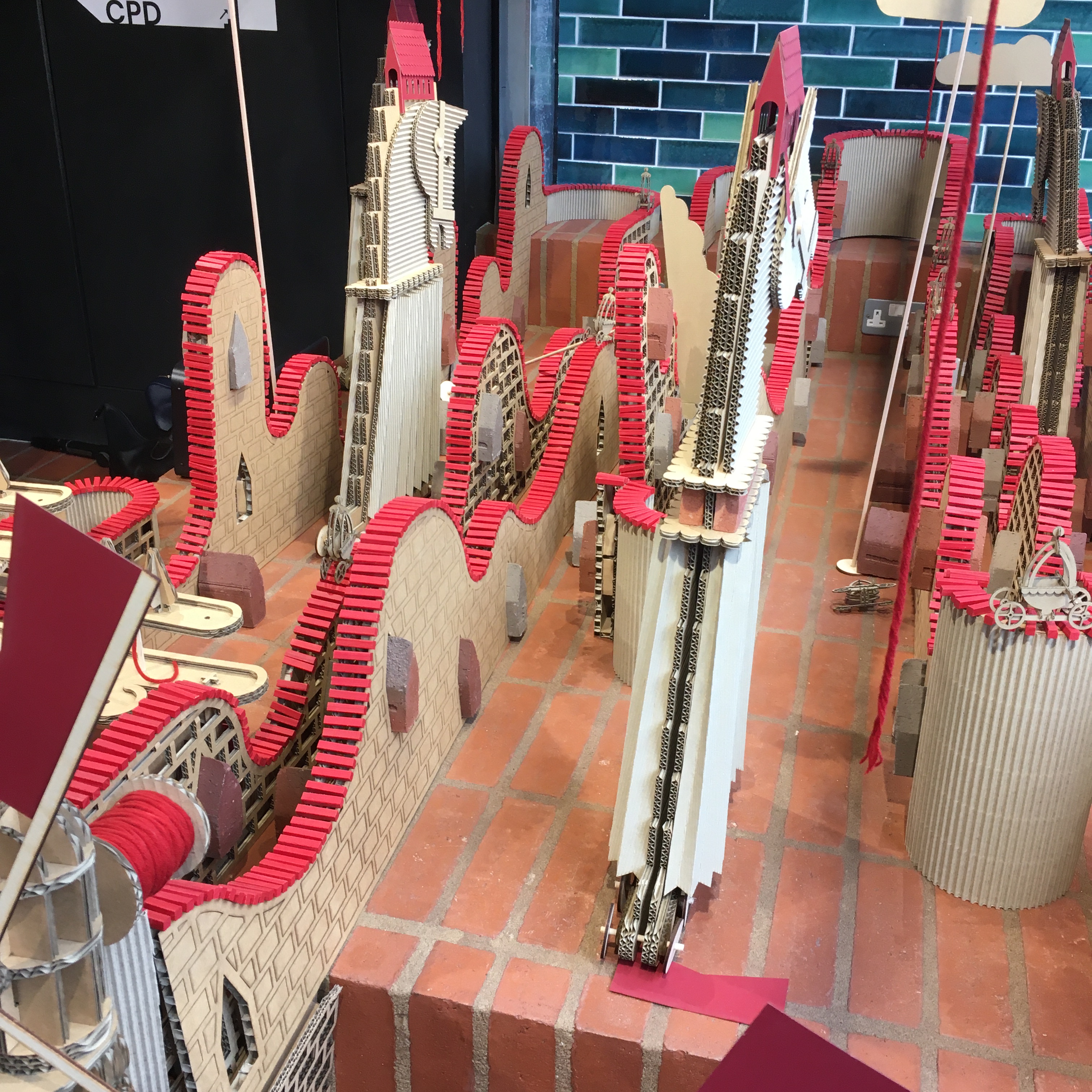
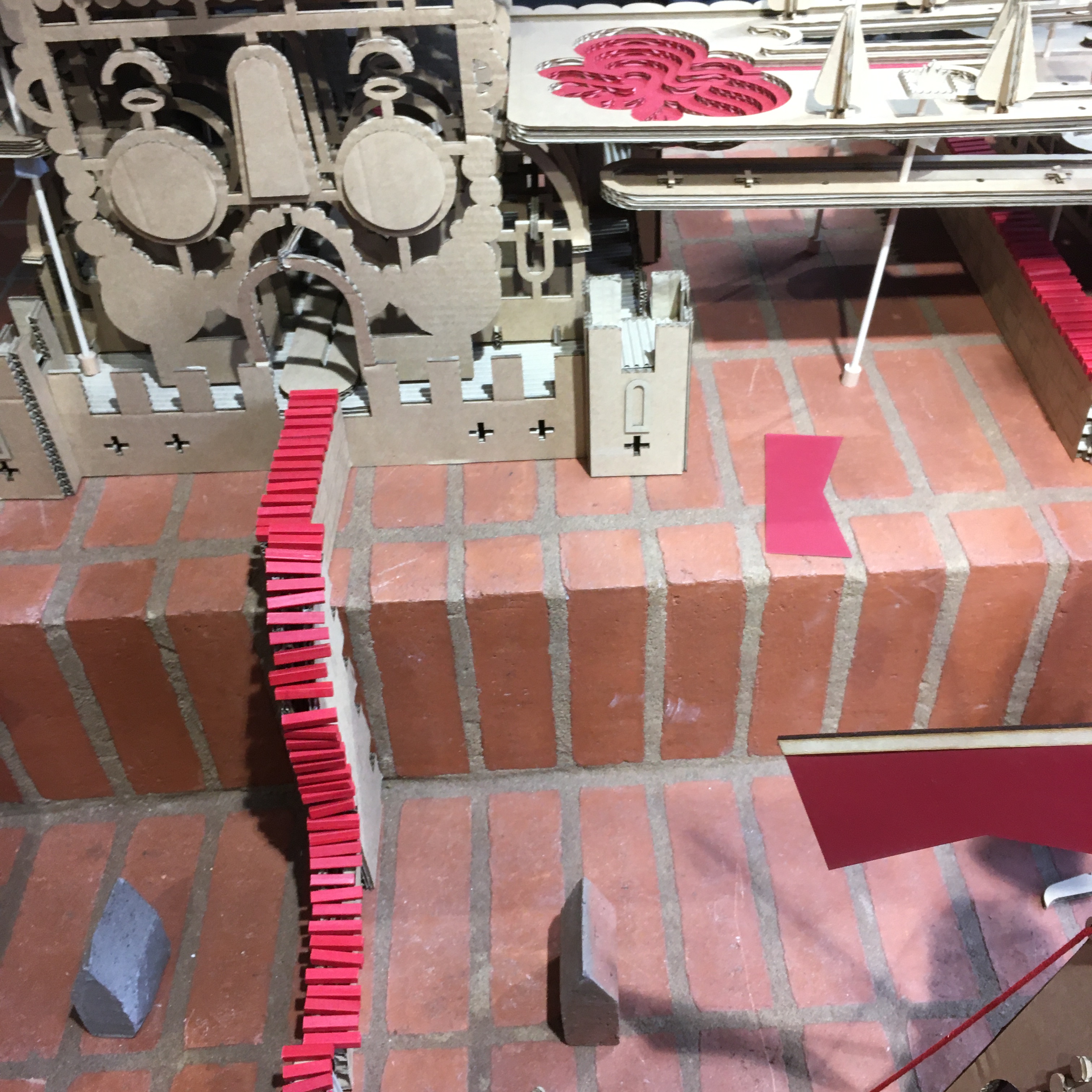
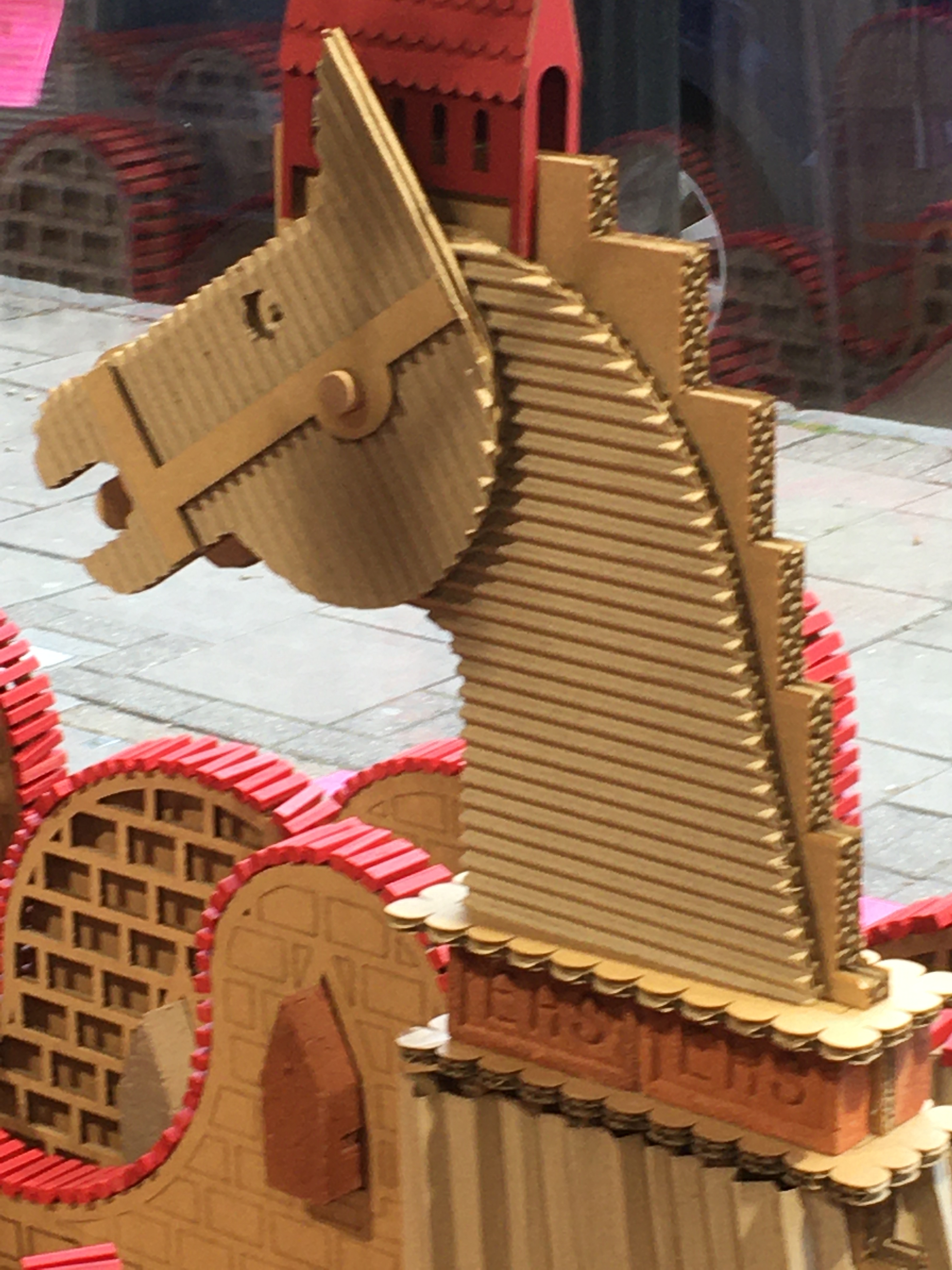
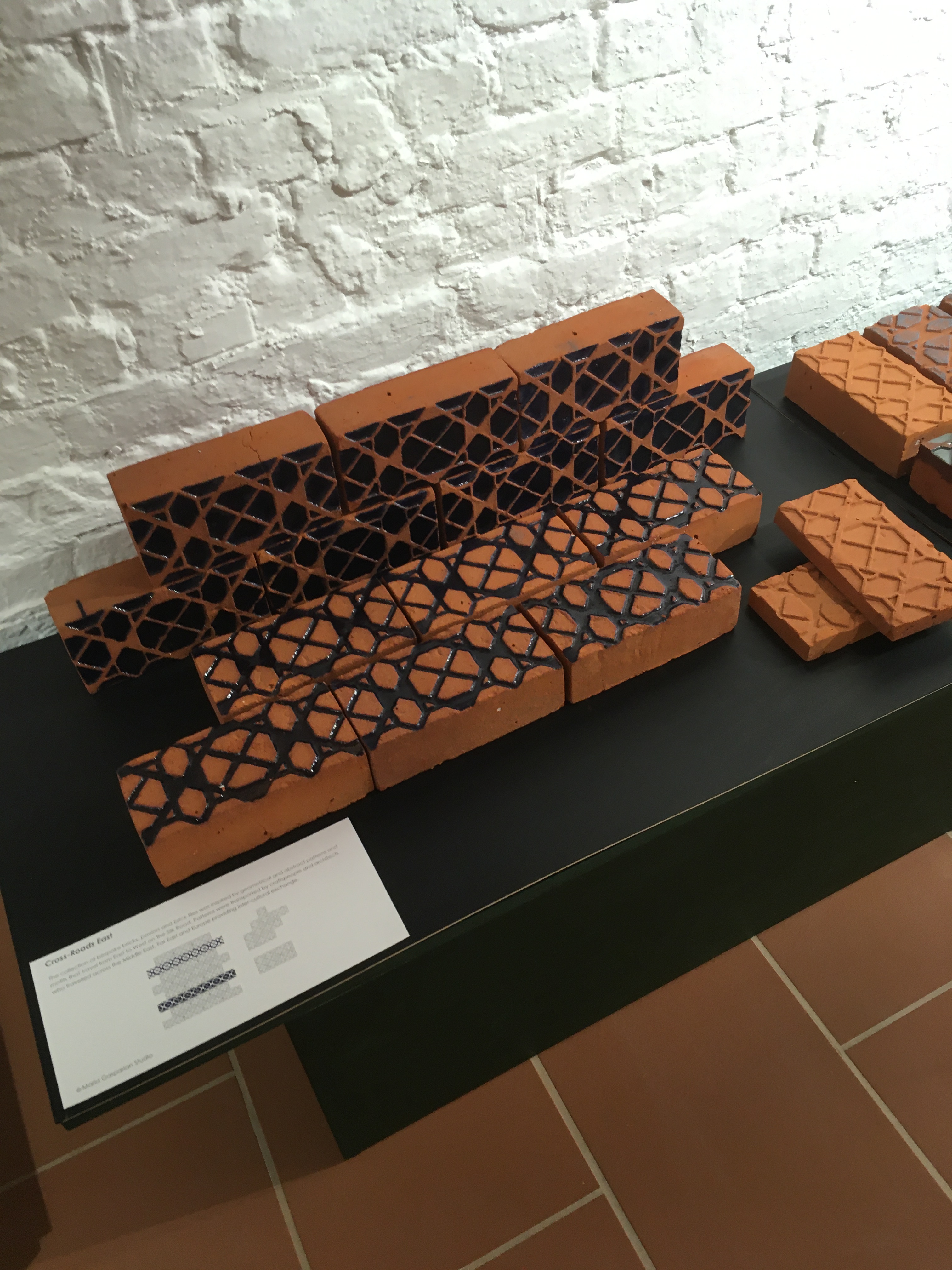
I popped into EH Smith Architectural Solutions. The showroom in St John Street is really all about bricks, which was fascinating to see, but in the window was a great display made entirely from laser cut corrugated cardboard. It depicts Humpty Dumpty and is full of intricately cut and very playful freestanding figures which I loved.

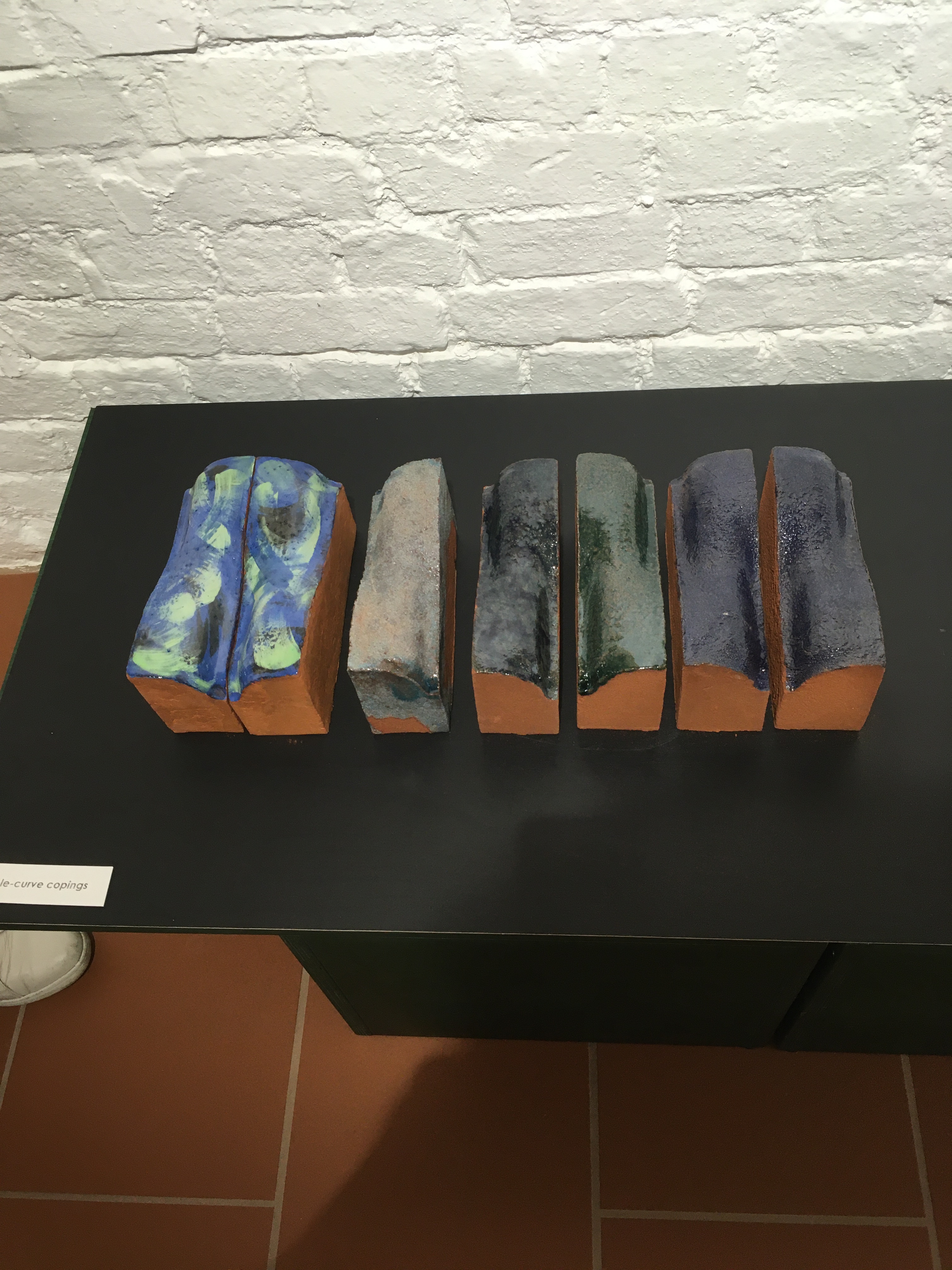
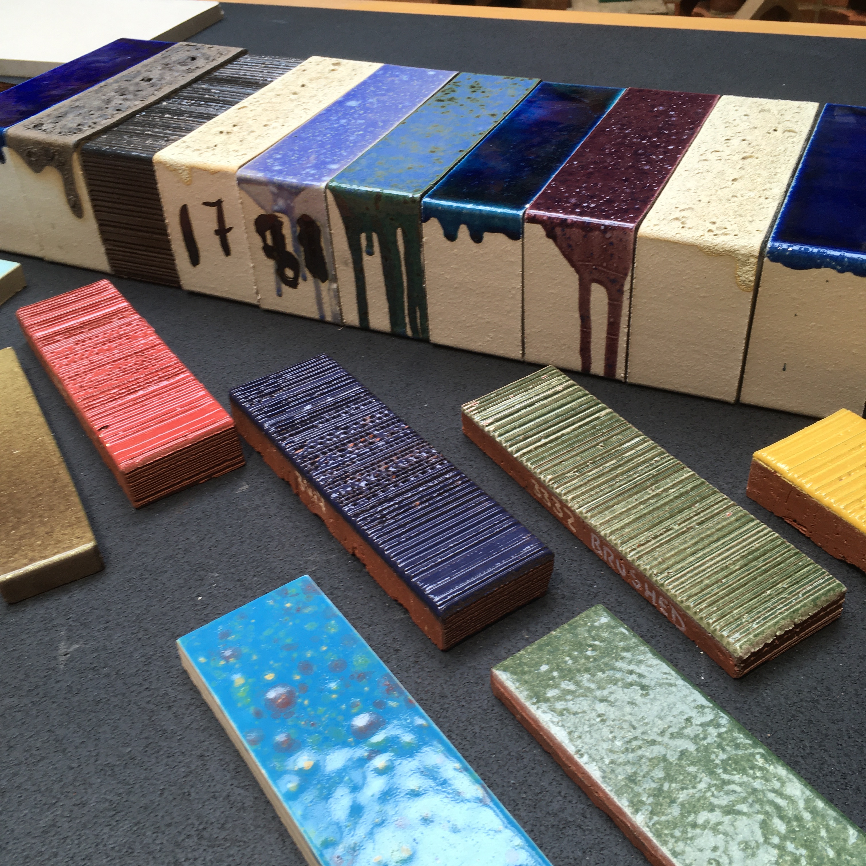
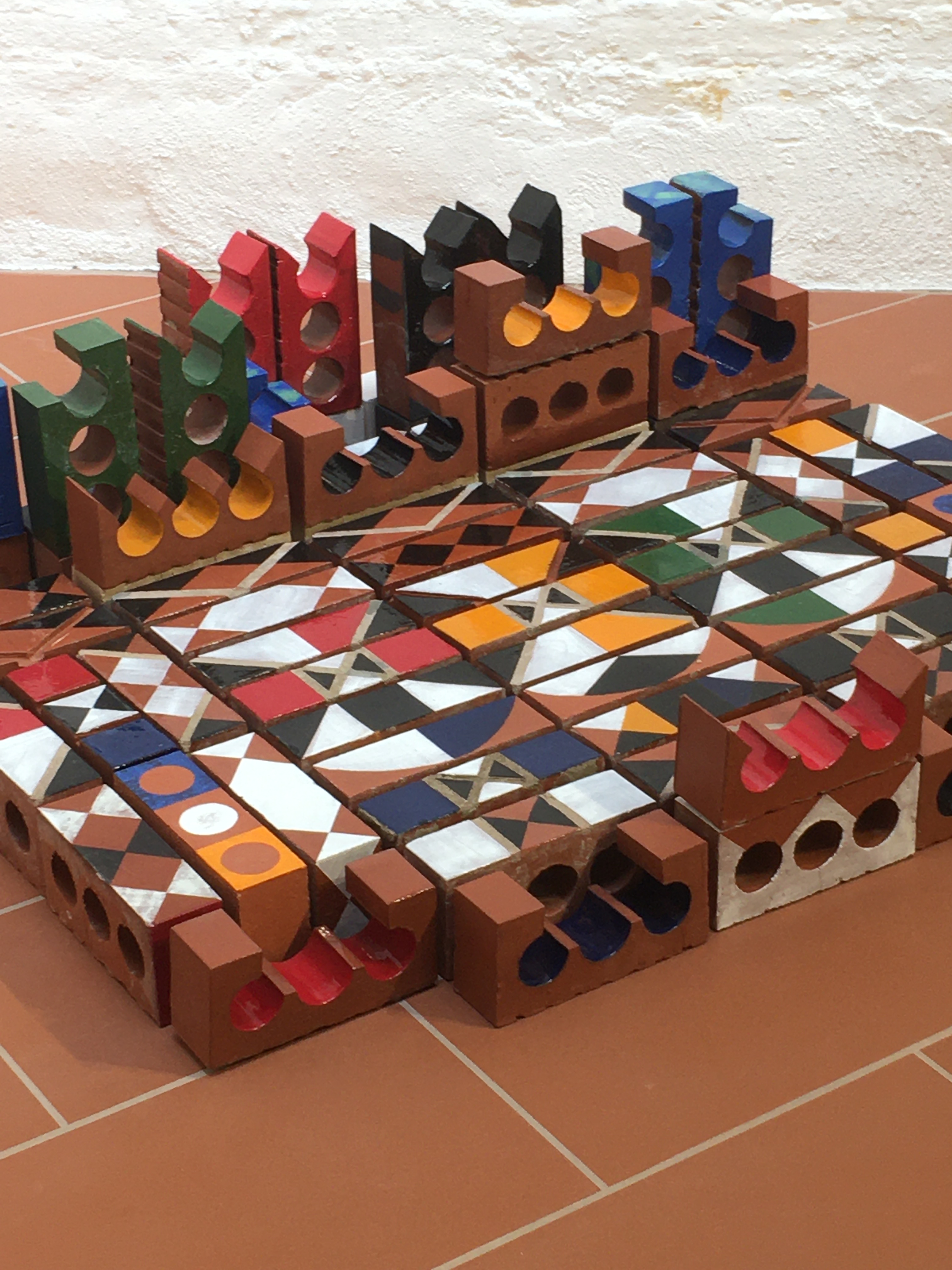
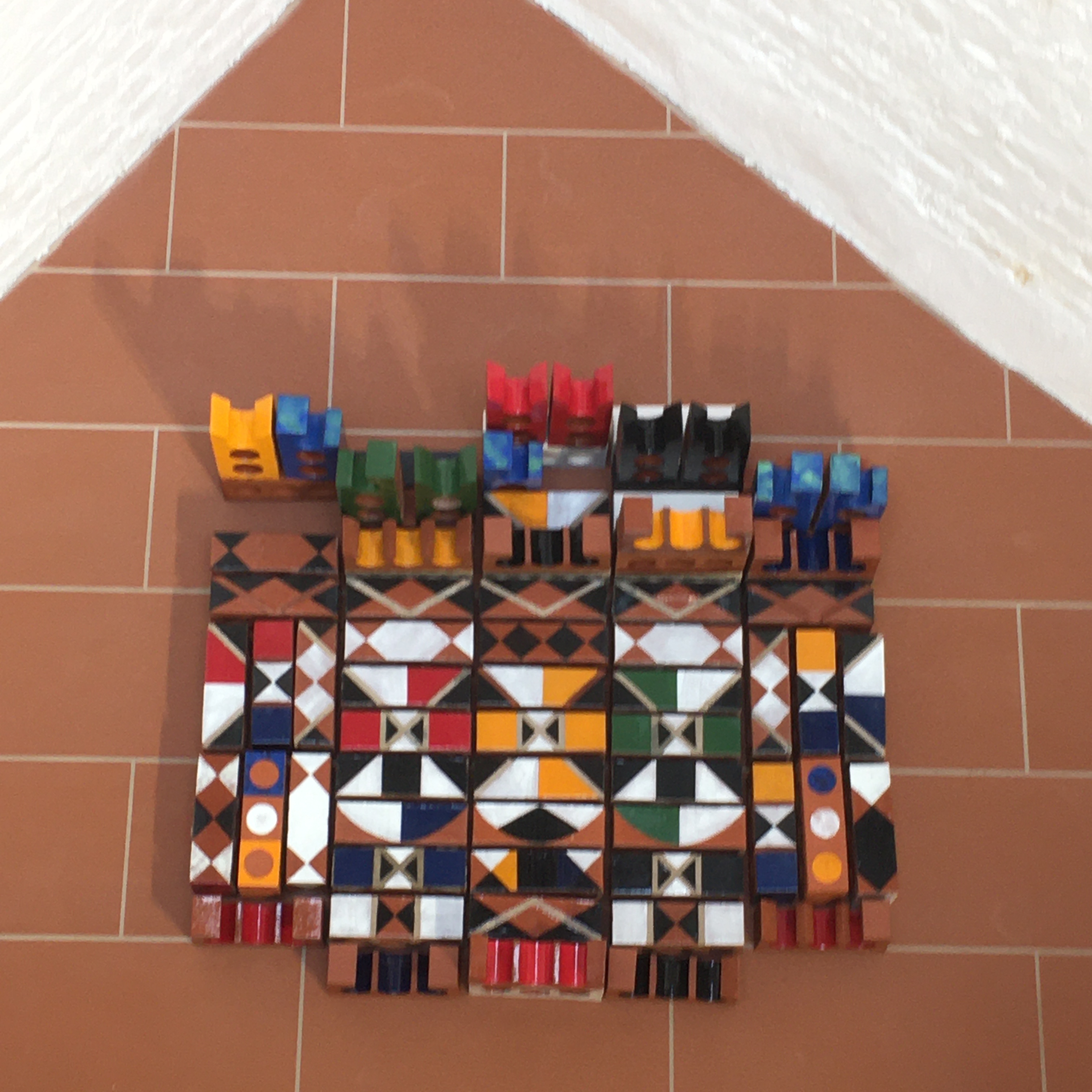
And here are some examples of the fabulous bricks on display at EH Smith. You come away thinking that no architect should ignore the creative, practical and decorative potential of bricks. They really don’t have to be boring, they can be colourful, shiny, patterned, indented or just quirky and still do a perfectly good job keeping the occupants of a building secure.

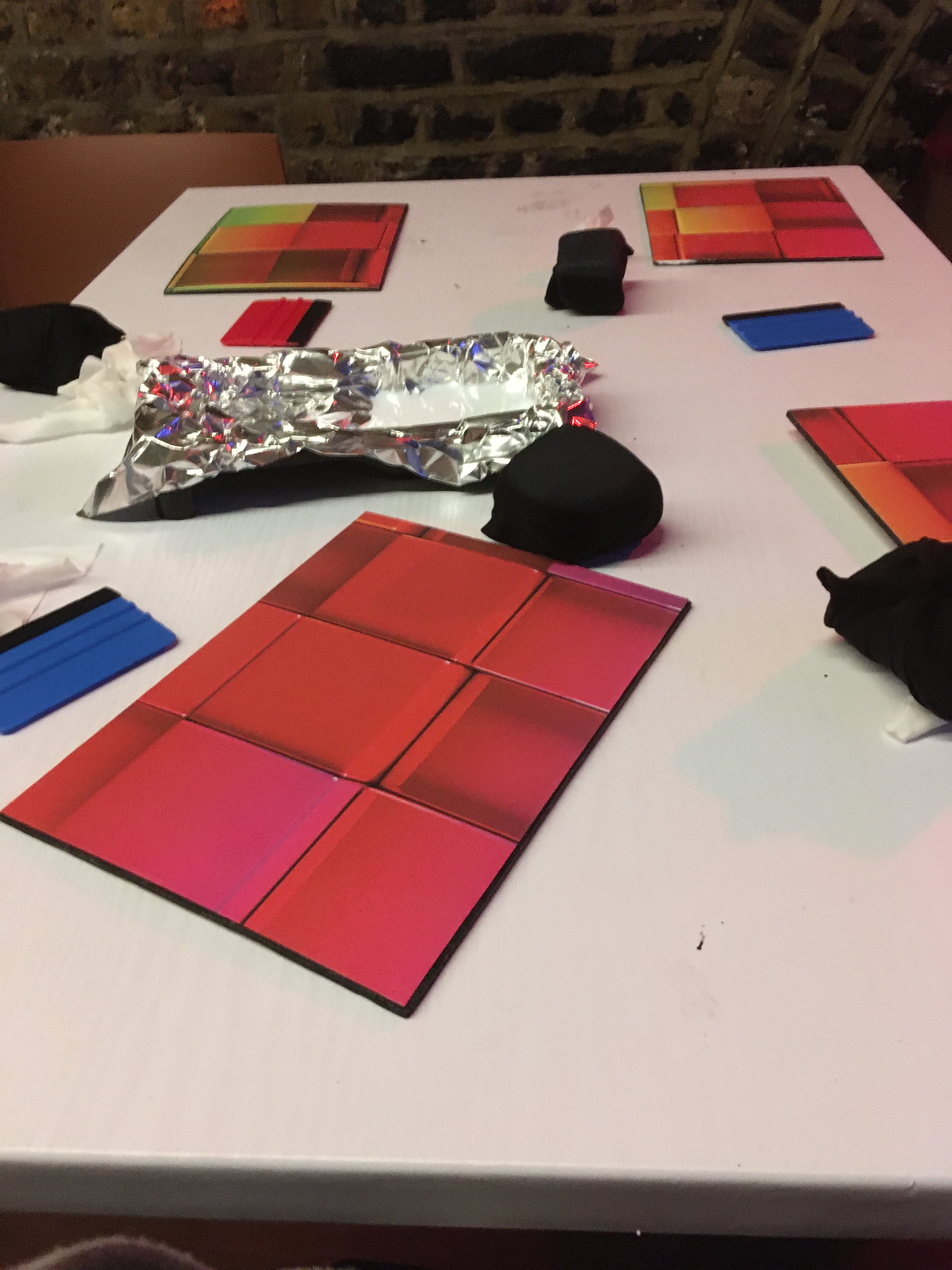
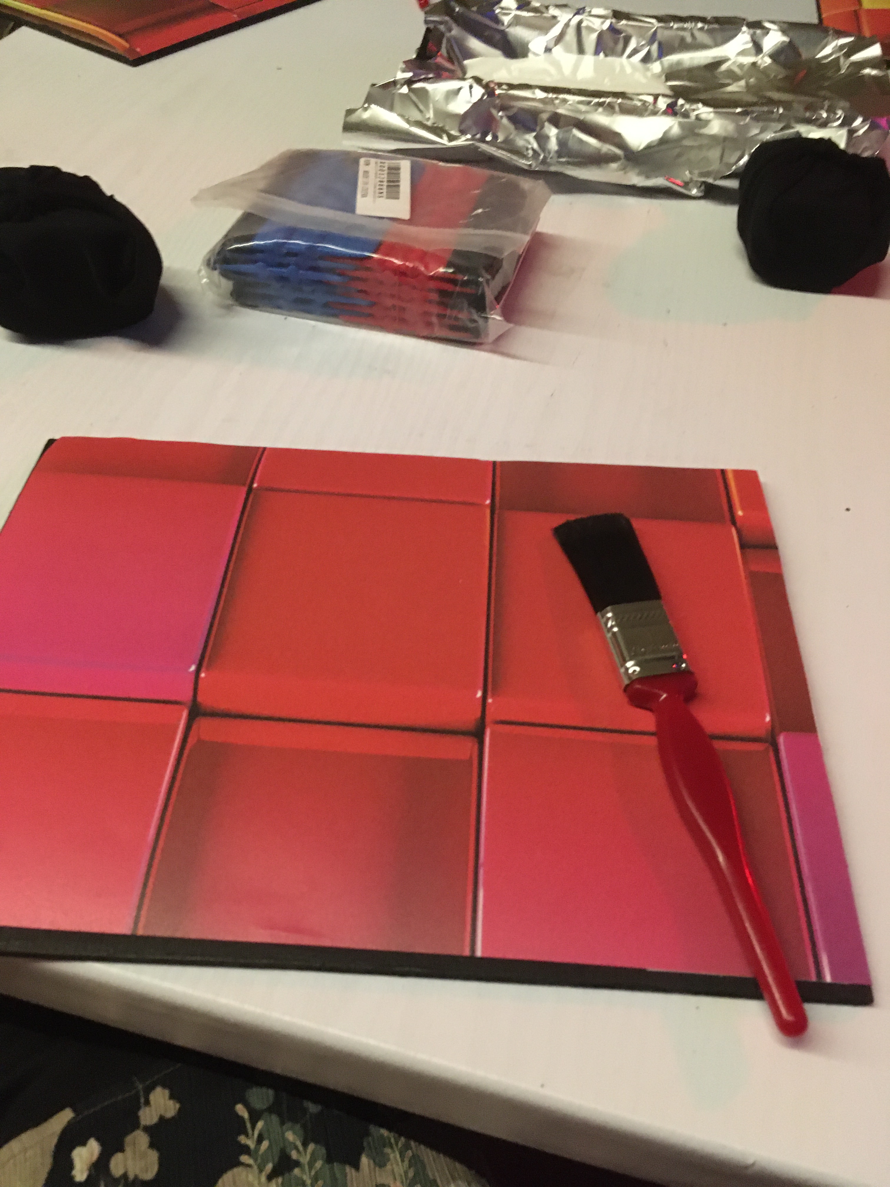
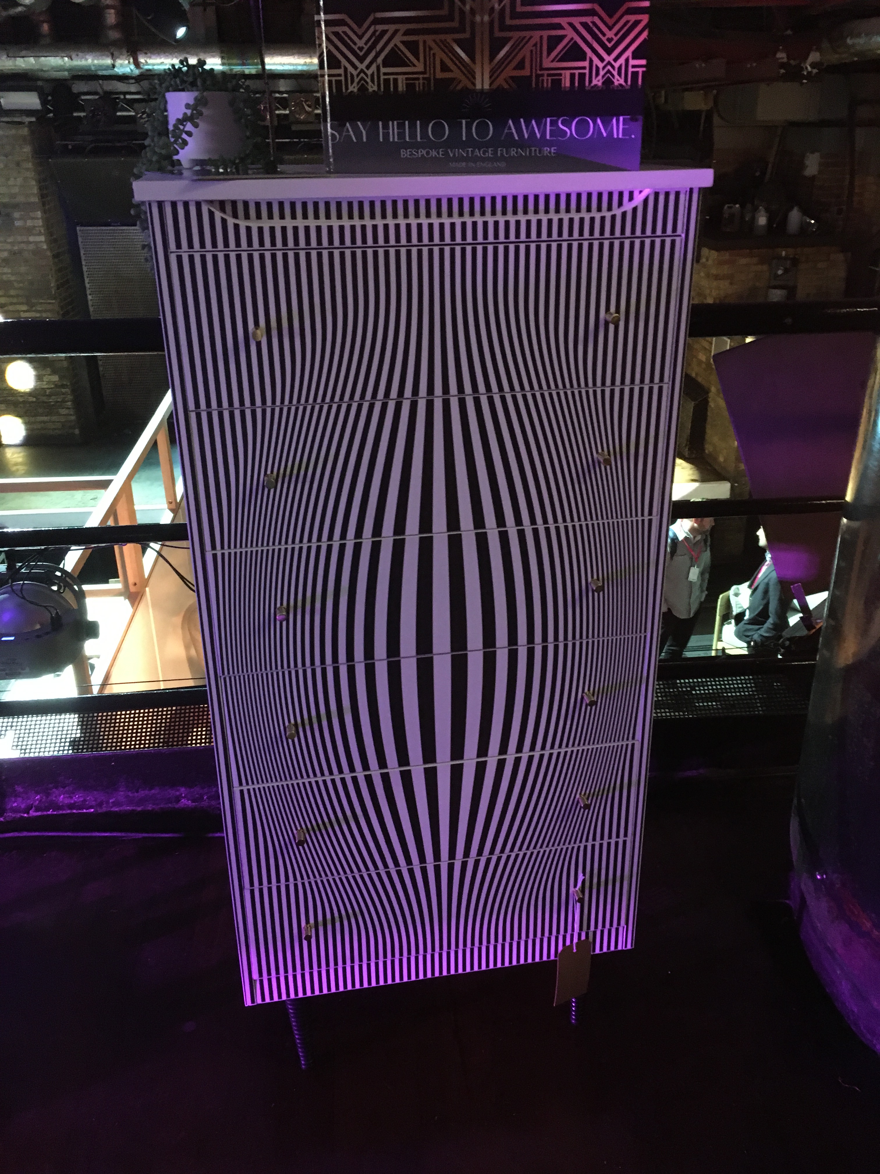
Then it was over to Fabric (yes, the nightclub- but in daytime) to check out The House of Upcycling. Again, I’m very interested in paper and how you can use it to transform old or everyday items. I joined a masterclass/workshop with Kata from Studio Twenty Seven and learned a bit about decoupage. Kata used to have a job in the city but gave it up to pursue something more creative and rewarding. She sources old furniture and turns it into smart contemporary pieces which are much sought after. She also runs workshops for professionals and anyone with an interest in upcycling. Yes, I have an interest, and certainly in using paper in an imaginative way. A small group of us learned how to successfully glue paper to board and give it a coat of varnish. Great to have information on the materials to use and the techniques to develop.

CDW is on until end of play tomorrow, 26th May and there’s so much to see, do and learn about. Oh, and you can check out London’s newest train line too!