Elizabeth Peyton: Aire and Angels – a major exhibition of her portraits has opened at the National Portrait Gallery. Paintings made in the last ten years have been distributed amongst the permanent collection provoking interesting opportunities to compare and contrast.

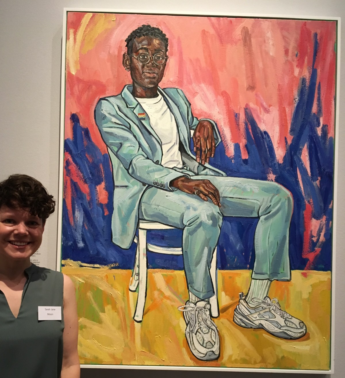
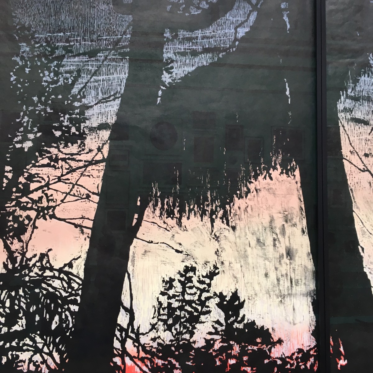
I like the speedy look to Elizabeth Peyton‘s work.  Brisk brushstrokes of liquid oil paint are energetically dashed onto wooden boards which have been painstakingly prepped with sanded and polished layers of gesso.  The materials really suit her style for bold, sketchy drawing and, very often, whole areas of the surface are left plain.  Many of the paintings on show are very personal to her – a mix of portraits of friends, family and people and painters she admires. The use of photographs is very apparent; for example she made portraits of David Bowie in life and after he had died.


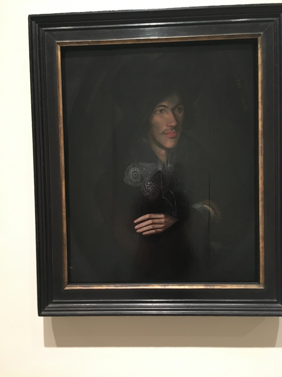
This show is entitled Aire and Angels in reference to a John Donne poem. When the exhibition was planned she chose, as her starting point, the portrait of the metaphysical poet circa 1595.  Apparently she liked the notional manipulation of his image, which encouraged the artist to produce a dark and brooding portrait of romantic young man full of sensuous thoughts and a mysterious mind.

IMG_8717

Peyton likes the idea of the portrait artist as collaborator in promoting an image. She paints from life but, more frequently, it seems, uses stills from films, photographs and magazine images as her reference material.  And this can sometimes be problematic. What you see is a replica of a familiar scene from a film or an already famous image.  There’s an almost cartoonish feel to many of the pieces, as if somehow received, repeated, reformed.

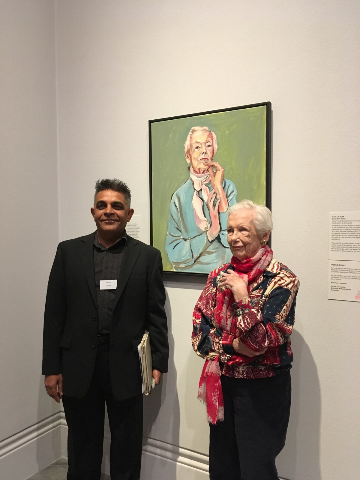
However, it’s always a joy to tour the gallery and it’s certainly not difficult to spot the Peyton paintings inserted amongst the Tudor grandees or Victorian literary masters. It felt a little odd seeing celebrities such as Liam Gallagher, Jarvis Cocker and Keith Richards in amongst the regal portraits of kings, queens, lords and ladies.  I wasn’t always entirely sure of the thinking behind these placements.  But I do enjoy seeing a contemporary artist who has trumpeted the joy of paint throughout her career given such a prestigious platform.

Above: portrait of Angela, Self-portrait, portrait of Napoleon

The Show is on until 5th January 2020. FREE

Pushing Paper: contemporary drawing from 1970 to now and a fabulous show of prints by Käthe Kollwitz make a trip to the British Museum (Room 90) 
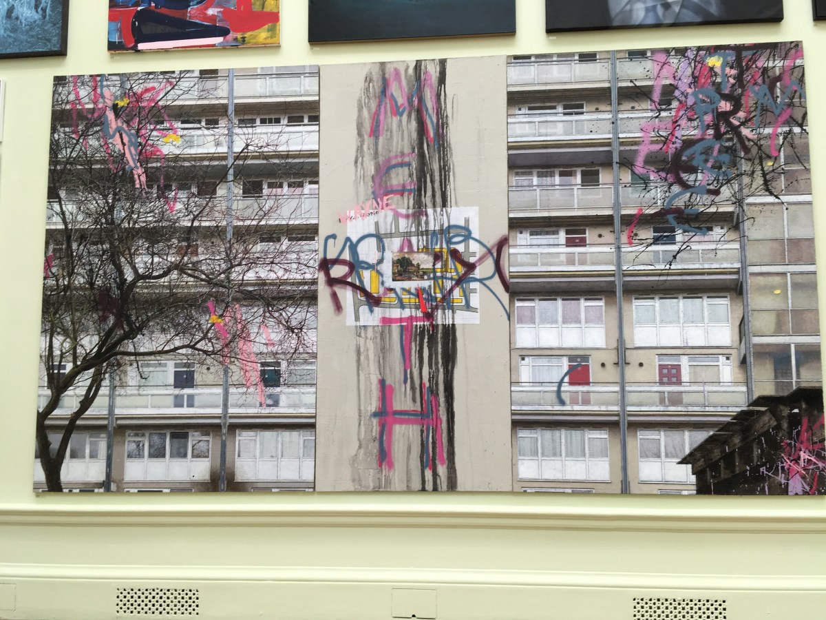
a must for anyone who is as fascinated as I am by the potential of paper and the power of drawing.

The British Museum presents wonderful shows which are often tucked away at the back of the building. So I urge anyone in London to climb those steps around the old reading room, battle their way through the hoards of noisy children swarming around the tombs of mummys and keep going until you get to Room 90 on the 4th floor. Here all is calm and quiet and the content is superb.

First you’ll encounter a collection of prints and drawings by the German artist Käthe Kollwitz (1867 – 1945). These works have been travelling around the country and will be in place until 12th January. Anyone who stands in front of these visceral, powerful images will be moved. They tear at the heart-strings.  There is such sadness and fury in many of them which will make you cry.  One of the most extraordinary images is a self-portrait she made representing a mother’s grief. She drew herself holding her seven year old son, hugging him to her breast, almost devouring him.  And it was a miserably prescient image because her adored son Peter died at the age of 18, as the First World War began.

IMG_8338

Living in Berlin with her husband, a doctor tending some of the city’s most impoverished people, she made it her artistic challenge to depict the struggles of women – struggles which so often included dreadful poverty, hardship and loss.

IMG_8344

I love her self portraits too. They are so well observed and honest – there is no artifice.

And in the room next to this exhibition is Pushing Paper.  It’s wonderful to see such variety of art on paper. The glory of paper is that is comes in so many shapes, sizes and textures and can be used with charcoal, pencil, paint, print and, of course, more paper in the shape of collage. I find this sort of show very satisfying and loved seeing work by a roll call of contemporary artists such as Grayson Perry, David Hockney, Tracy Emin, Richard Hamilton, Peter Doig and Judy Chicago.

IMG_8365
Grayson Perry c. 1984 coloured crayons, watercolour, gouache, pen and kin with collage of photographs, magazine illustrations and silver glitter.

The works are grouped into themes such as place and space, time and memory, but it’s not really necessary to feel the works mapped out. It’s just a joy to see so much work done with pure joy on paper.

IMG_8374
Richard Hamilton (1922 – 2011) In Horne’s House – study 111 1981 Graphite and wash with collaged piece of black paper.
IMG_8386
Peter Doig

So, brave the crowds at the British Museum and breathe in the excellence of art on paper. As I mentioned, you’ve got until 12th January 2020 to enjoy them.

Hackney Wicked lives up to its name with a wicked summer arts festival which takes place in the shadow of the Olympic Park and offers a chance for artists occupying studio space in crumbling warehouses to fling open their doors and allow us to survey, review and delight in the creativity that blooms in east London.

I love open studio days. There’s nothing better than poking your nose around the door of an artist’s studio and being welcomed into their world with a cheery wave and the opportunity to hear, at close hand, the background, inspiration and process involved with their art. I’ve yet to meet an artist who doesn’t like talking about their work – is eager to indicate a piece and describing the narrative of its creation. (If anyone stumbles into MY studio it’s exactly the same – and for the artist it’s as though you are seeing your work for the first time too.)

IMG_7871

So, I just love the annual Hackney Wicked Weekend.  It started just before the London Olympics when this rough and tumble area of east London found itself, literally, in the shadow of the fabulous stadium and all the whizzy, shiny buildings which appeared for that glorious summer of 2012.

IMG_7852
Olympic Park

Of course the price artists ultimately pay for colonising an area where the buildings are ramshackle and the rents are cheap is that the developers start circling pretty soon.  And you can see that’s exactly what’s happened in Hackney Wick. Where ten years ago we might have meandered along cobbled streets next to ancient brick walls encasing crumbling warehouses and industrial spaces, there are now shiny new apartment blocks and artfully paved communal spaces. Hey, ho, I suppose it’s progress but it is still a delight to know that there is a patch of London where artists can work (and live!) and produce their work in good sized spaces which are boiling in summer and freezing in winter and know that they can concentrate on whatever creative endeavour needs pursuing without minding whether paint splashes on the floor or noxious fumes emanate from the windows.

IMG_7865

Getting off the Overground at Hackney Wick there’s not much to tell you what goes on inside these buildings. Yes, there’s a lot of graffiti and a bit of signage but the trick is to just march in, penetrate those corridors, heedless of the peeling paint and damp patches, and look for an open door to a studio space.  I only saw a fraction of what was on show but it was fascinating. There is such a variety of work going on and some serious talent on show. So here’s a little gallery of my own which I have created for your delectation.

Above: portraits by Beau Gabriel   and Julian Perry, who is concerned with coastal erosion.

IMG_7876
Paul Dash

Fabulous impression of a market in Barbados by Paul Dash

IMG_7870
Anastasia Beltyukova

Great to meet Anastasia Beltyukova whose strong red and black print was chosen as a main image to promote the festival.


Above: detail of work by Rikki Turner,  and print by Tessa Horrocks


Above: portraits of toys and stuffed animals by Peter Jones – toys thrown out of prams and collected by him.


IMG_7874
Gethin Evans


Rainy cafe scene by Gethin Evans.


Félix Vallotton: Painter of Disquiet is the subject of a major exhibition at the Royal Academy of Art. This curious artist was Swiss by birth and Parisian by nature; he evolved from a precise, conventional painter into a witty and original observer of his adopted city’s life, paying special attention to the naughtiness of the 5.00pm assignations between men and their mistresses and capturing the hurly burly of human life in a series of fabulous, spare, black and white wood blocks which made his name.

It was quite a revelation to walk around this intriguing exhibition of work at the Royal Academy and realise that the real Vallotton was a witty, very clever, modernist painter who absorbed the spare narratives of Japanese art and applied it to depictions of hectic city life in Paris. He started out as a prodigiously clever artist with a great feel for oil paint and observation.  His early portrait shows a serious young man with no hint of the humour which clearly lay within.IMG_7386

He was a great admirer of the French painter, Ingres, renowned for his precision and detail but this aspect of his work was soon abandoned when he discovered Japanese art, and the impact that can be achieved using wood block prints. His prints of Parisian life are utterly wonderful.  They were primarily illustrations so the need for narrative is obvious but they are so full of action, character and caricature.  I’d not seen those before.

And then we get the rather more saucy series of prints depicting the habits of the roués and cads about town who would be sure to call by their mistress’s home at around 5.00pm – on the way home from work.  Did this really happen?  Well, I guess it must have, but what fun for Valletton to poke fun at these uneasy relationships in a series of prints which depict the ups and downs, stresses and strains of these affaires.

Error
This video doesn’t exist
Error
This video doesn’t exist

Valletton’s life changed dramatically when he married Gabrielle, a wealthy widow with children.  He returned to painting – interestingly his support of choice was cardboard for many of his works – and captured domestic life with uneasy accuracy.  Just how happy was family life, one wonders.

This exhibition provides an intriguing glimpse into his life. I hadn’t thought of Valletton as a stand-alone artist – he’s usually lumped together with Vuillard and Bonnard who were great friends and concerned with similar themes. But I’m so pleased to have seen those woodcut prints, they are really something.

The exhibition is on at the Royal Academy until 29th September.

Just who is Cindy Sherman and how does she manage to become so many fictional people? She convincingly portrays imagined histories of invented characters created by the clever use of make-up, wigs, prosthetics, props and costumes. The UK’s first retrospective of her work is now on show at the National Portrait Gallery. It presents a fascinating array of oddness, wit, manipulation, playfulness and unsettling impressions of imagined ‘selves’.

This exhibition of photographs by and of Cindy Sherman is quite unsettling.  You know that the person in the image is just one person but, goodness, the variety of faces and expressions which are captured is breathtaking.  Cindy Sherman is a human chameleon; she uses make-up, prosthetics, props, clothing, wigs, false teeth and her own remarkable acting ability to conjure hundreds of different people in her photographs.  Old, young, female, male…. the pictures all convey impressions of fictional people with believable settings and expressions which conjure back stories of misery, abuse, abandonment or just an imagined idea of ‘normal’.

Her approach to portraiture is unconventional, original and hugely compelling. After ploughing a very distinctive groove for 40 years, she is an internationally renowned artistic superstar.

IMG_7352

I liked the early photographs made soon after she graduated from the State University College in Buffalo, especially these ones which show the evolution of the look she is trying to achieve.  But what made her first stare at her face in the mirror, explore ways of painting it and decide to set it in poses….? We don’t really get an answer; and why should we? I guess she’d be the first person to say that it’s just ‘what she does’.  And this way of doing and seeing has taken her art in some fascinating directions.

For example, she corrupts the idea of the magazine cover with great aplomb. These images make you smile, chuckle a little and also feel uneasy. How extraordinary that she has managed to transform her face so that it so closely resembles the blandly smiling models and then ‘goofs them up’.


No portrait image, selfie or accidental shot of a face is safe from Cindy Sherman’s scrutiny or corruption.  It seems that the more difficult the challenge the more she relishes it.  I did like the series of photographs she made of fictional ‘society ladies’.  These images are of imagined women who display their wealth and status through their expensive clothes, their opulent surroundings and their manufactured faces.  These women believe that they look young and desirable but what the viewer really sees is a painted  mask on an ageing face which conveys confidence but hides a vulnerability and fear of losing that notion of power and beauty.

IMG_7380

I loved her interpretation of the fabulous portrait by Ingres of  Madame Moitessier  and conjured a similar woman but in contemporary clothing, seated in the same pose.

The exhibition incorporates an impression of Cindy Sherman’s studio in Greenwich Village, New York, where she has assembled a vast array of props, clothes, wigs and make-up and spends her time painting, adorning and adapting her face and body to make it into anyone she wants.

IMG_7379


I’ve seen her work but I’m still not sure I’ve seen the REAL Cindy Sherman.

The exhibition is at the National Portrait Gallery until 15th September 2019.


The BP Portrait Award at the National Portrait Gallery opens with a heartening abundance of painterly portraits which celebrate the true art of painting – brush strokes, smudges are clear to see and gladden my heart.

Call me old-fashioned but I’ve always believed that a painting should look like a painting, not a glossy, photorealistic copy of a polaroid or photograph which has been cleverly reproduced using paint.  I love the sensation of art which is full of daubs and dashes, colour and clashes and the sense that a human hand has flourished its style upon a piece of canvas or board and used this humble material in a vigorous and lively way to capture a likeness.  OK, so I use paper in my own art, but a fragment of paper is like a blob of paint on a brush and that is the style I have created.

So, I’m always interested to see what the judges of the BP Portrait Award have chosen and this year I’m very pleased to say that there is an abundance of splashy, plashy portraits which absolutely use the viscous nature of oil or acrylic.

IMG_7231

I was delighted to meet Sarah Jane Moon by her excellent portrait of Dr Ronx.  Deliberately ambiguous, this portrait of a woman is beguiling – the stance and gaze is quite male but her features are feminine – but it was the joyful use of paint which attracted me. Paint was applied with enthusiasm, colour contrasts working well and the pale green ground, which comes through in the suit, breaks through the layers of strong colour.

IMG_7245

Likewise, I loved Gandee Vasan’s Aunty Therese.  It was a joy to chat to both artist and subject in front of the portrait.  The use of paint is clear to see, the gaze of the subject and the nod of her head fixes you – she judges us, the viewer, as much as we judge her.  Apparently it was painted in an eight hour sitting and the artist wanted to capture his Irish/Canadian aunt’s ‘indomitable spirit’.

Bridget Cox’s Chinese Cloth is reminiscent of Matisse with the busy, painterly background and the delightfully ruddy cheeks and nose of the subject. I liked Dieja by Scott Lancashire. Apparently it was done in a two-hour sitting. I like a bit of speedy painting.

And the full size nude of Marcus by Vanessa Garwood was a great depiction of a professional life model comfortable posing within a mix of fabrics all painted with big, broad brushstrokes.


I’ll just add in a few more photos I took of paintings which particularly caught my eye.

The exhibition at the National Portrait Gallery is on until 20th October.

Art to reflect the world we live in – this year’s Summer Exhibition at the Royal Academy of Art in London puts the focus on the natural world, animals, plants, people, portraits and the built environment. Curator Jock McFadyen RA brings a serious message to the creation of art and, with his team of fellow curators, has filled the Piccadilly gallery with a glorious mix of art which is well worth a visit.

Visitors to the Royal Academy’s 251st Summer Exhibition will enter the first gallery to find themselves initially surrounded by quite the menagerie of animals, real, imagined and fanciful.  The star turn was definitely David Mach RA’s ‘Easy Tiger’ a life size sculpture of a pacing tiger covered with wrappers from M&S Tunnock tea cakes – playful, eye-catching and deliciously original.

IMG_7068

At the press preview for the show the co-ordinator, Jock McFadyen RA  told us that he, and a stalwart team of RA judges, had viewed 16,250 submissions, whittled them down to 2,300 and selected 1573 to appear.  That’s a lot of disappointment for many artists but huge cudos and glamour for the chosen few. And the selection did not disappoint; in fact I was really impressed by the huge variety on show and scale too.

David Hepher, who has been depicting urban high rise building for many years, contributed at vast painting: Hey Wayne on the Meath Estate.

IMG_7094

Anything involving paper or mixed media catches my eye and there were several really intriguing pieces. I liked the sculpture by Hew Lock of Albert, Prince of Wales, adorned with beads and jewels and Rod Melvin’s knitted yarn portrait.

IMG_7081

Blonde on Blonde, oil by Grace O’Connor. I liked the impressions of paper and bits of tape with this amusing portrait.

IMG_7070

Above: The Call, by John Wragg RA

IMG_7072

Above: An Austere Beauty, Iceberg off Cape Mercy, Baffin Island by Nicholas Jones

IMG_7073

Above: Species: Coelacanth (Diptych) monotype by Stuart Mackenzie.

IMG_7077

|Above: The Painter Van Gogh by Hughie O’Donoghue RA

IMG_7076

Above: Dance of the Couds and Breezes V11 monotype by Bill Jacklin RA

IMG_7075

Channelling thoughts of Bruegel, I liked this  etching by Mychael Barratt entitled Richmond Park.

IMG_7101

Above: detail from Calera Overlook, a four-part woodcut on Japanese paper by Emma Stibbon RA

IMG_7078

|Above: About to Get Up Again by Ray Ward (acrylic on card)

IMG_7080

Above: Beautiful Boy by Deniz Huysal, acrylic on paper.  A really compelling portrait.

IMG_7083

Above: detail from The Garden of Earthly Delights by Claire Douglass – a massive painting depicting park life, very fantastical park life.

So many great pictures.

The Summer Exhibition is open from Monday 10th June to 12th August.  http://www.royalacademy.org.uk


Clerkenwell Design Week notches up a decade of design in an area of London which is home for a concentration of some of the coolest and most talented makers, designers and marketers of contemporary design.

Every May for the past ten years Clerkenwell has sprung to life with a festival of design which brings a flutter of pink flags, enticing pink lines and arrows on pavements and paths and a wealth of design originality on many street corners.  Clerkenwell has long been an area of London which has attracted designers, architects, makers and craftsmen as well as showrooms with an abundance of showrooms and studios.

The design week is a celebration of this concentration of design brilliance and, historically, the sun has always shone upon the proceedings – this year was no exception.  In warm, summery weather, I joined the press tour around the historic streets and loved hearing about the history of the area and the way today’s designers (and the installations commissioned by Media Ten, organisers of the week) reflect the history.  There are fascinating and witty vinyls on walls – take a trip down ‘Pissing Alley’ – now more delicately named  Passing Alley and hear about its past as a place where convicted prisoners drank their last pint and relieved themselves there before being clapped in irons in one of the many prisons which used to exist within the area.


Around every corner there are fascinating things to see and spectacles to marvel at. It was fun to pause by the Aeron Hockey space in Brewhouse Yard, presented by Herman Miller, where teams  played a bonkers version of hockey whilst coursing around on wheeled office chairs.

IMG_6927Within St John’s Gate there is a timber structure designed by scalerule.org which reflects the geometry of the gate and plays with the idea of space and enclosure.

I loved the Bottle House – a clever new way to recycle empty plastic bottles. This simple structure made with just bamboo and twine, plus hundreds of bottles provides a kind of greenhouse or even a small shelter.

The handsome Moth Pavilion has been set up within Design Fields on Northampton Road has a great line up of speakers. I was lucky enough to hear Neisha Crosland being interviewed by Bethan Ryder about her life and career – fascinating stuff.

Clerkenwell Design Week run from today until 23rd May http://www.clerkenwelldesignweek.com #CDWfestival #CDW10 #CDW2019

The world of the ‘London Look’, swinging sixties and ‘cool’ seventies comes sharply to life through the fashion design and brand brilliance of Mary Quant. An impressive show at the V&A charts the evolution of a style which liberated women, democratised fashion and defined the look of two decades.

I was never quite old enough to enjoy the full impact of Mary Quant’s fashions and also, rather too plump for the leggy, mini-skirted fashions which I pored over in the pages of my Jackie magazine. As a child and young teenager, I was aware that there was an energetic world out there full of grown-ups with sports cars, coffee bars, girls with short-cropped hair, small dresses with big flower motifs who swung handbags with abandon as they sauntered down the King’s Road in Chelsea.

Mary Quant made the fantasy possible for all of us.  I did eventually get a Mary Quant dress – it was purple with a swingy-drop waist skirt with collar and cuffs in bright yellow. It know, it sounds ghastly but I absolutely loved it and wore it to all the after-school events I could and always felt confident and ‘cool’. These things are so important when you’re growing up. The dress disappeared a long time ago but I hung onto a small pot of eye makeup called Ink Pot.  I wanted to look wounded and tragic with bruised blue eyelids like models who looked deep and contemplative in sylvan wood settings, but it never suited me. I’m far too cheerful. The pot stayed with me – and most of the contents too – and I was delighted to dig it out of an old box of childish things and bring it with me when I went to the press preview of a retrospective on legendary fashion designer Mary Quant at the Victoria and Albert Museum.


I was holding up my pot of makeup by the museum exhibit when, by amazing serendipity, I found myself standing next to Dame Mary Quant herself!  Well, I just had to ask for a photo and showed her the little pot. She was amused and delighted and I felt fifteen years old again.

The show at the V&A is a joy from start to finish.  The evolution of the Mary Quant style is fascinating to review.  Mary was clearly a talented girl with a very good eye and a huge talent for art and design.  The was lucky to have a husband and confederates who helped mould her brand and take her unique look around the globe. Who knew that she would create clothes and a brand which would define a generation.  That haircut (thank you Vidal Sassoon), those nifty little dresses, dainty shoes, swingy bags and oh that five petalled flowers which adorned everything – I only have to look at it and feel happy.

IMG_6113

The curators at the V&A must have had fun when the put the shout out for Mary Quant clothing and products. Like me, there must have been thousands of women who have hung onto dresses long after their figures expanded too far for further wearing but couldn’t bear to part with these fabric treasures. What joy, here was an opportunity for the much loved garments to be taken out of storage and given their moment behind museum glass. I loved seeing the black and white and faded colour photos of women wearing their beloved Mary Quant fashions back in the day. It makes the fashion feel so real, so accessible, so owned.

IMG_6119

And I did enjoy the films of Mary in her studio working on designs, dressing models, testing fabrics. What a role model for all of us.  So, hasten ye down to the V&A to see this great show. It’s on until 16 February 2020 so no panic and tickets are £12.

Van Gogh and Britain – a new show at Tate Britain puts the spotlight on the way art and culture Van Gogh encountered during his three-year stay in London (from 1873 -76) influenced his life. The show also looks at the way Van Gogh’s work influenced the work and ideas of subsequent artists.

It’s a bit like seeing old friends at a party.  I’ve always admired Van Gogh’s ‘portrait’ of his boots – trusty lace-ups which he pulled on daily and trudged the streets and countryside. It’s a treat to see them on the walls of Tate Britain.  This blockbuster show  gathers together some of Van Gogh’s most familiar and best-loved paintings and puts them in the context of his own artistic development – and how important his time in London was in forming him as an artist – and how later artists have viewed his work, emulated, been inspired by and ‘translated’ it.

Van Gogh didn’t actually do much painting during his time in London. He lived in Stockwell from 1973-4 (there’s recent research that he fell in love with his landlady’s daughter but she was not interested). But spending time in the capital, walking everywhere, visiting art galleries, talking to people and reading quantities of Dickens, John Bunyan and the popular authors of the day was clearly a huge influence on his creative spirit. He identified with the common man, the poor, the dispossessed and, through his ambitions to work within the church, wanted to actively help people in both body and soul.

He earned little money whilst in London (he had a menial job at an art gallery) but he could afford magazines such as the Illustrated London News which was full of prints, engravings and news about art and culture. These he collected, squirrelled away, and used throughout his life as reference or inspiration.

It’s perhaps a little fanciful to believe that every painting he later made, once he’d moved back to the Netherlands and then France to be a full time painter,  could be traced back to some influence from those London days but the curators have had a good go at joining up the dots. And it’s a great excuse to bring together a lovely collection of paintings by other artists which are always a joy to see.

IMG_5891
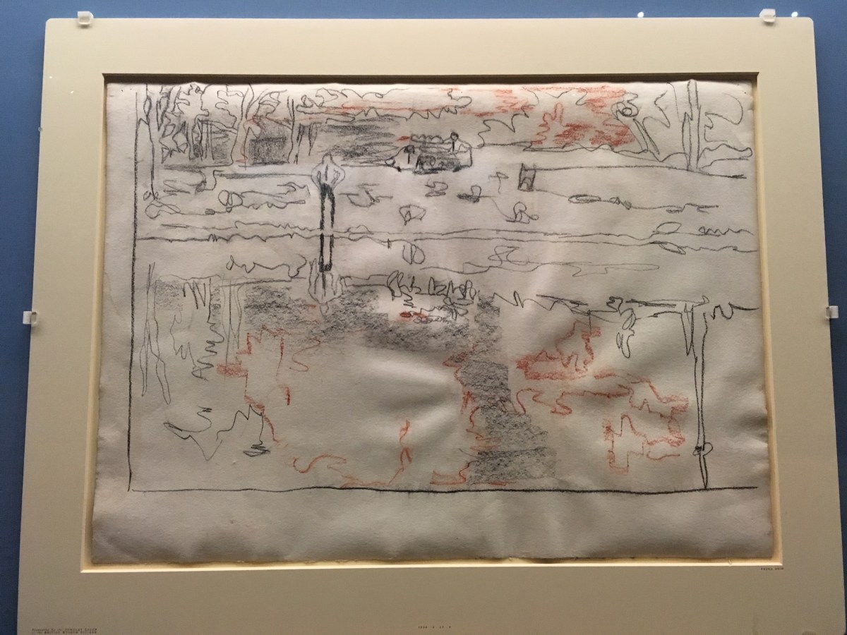
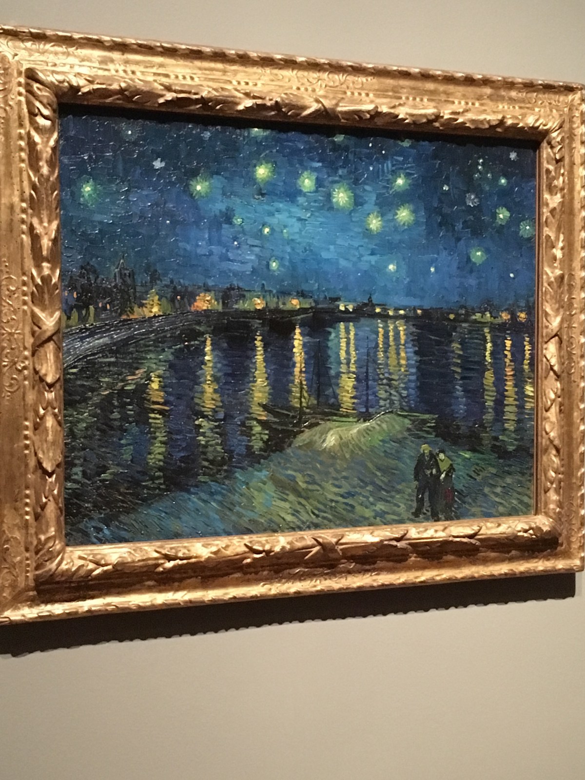
For example, we are able to view Starry Night – absolutely fabulous with those strong, zingy colours and the glow of stars and streetlight.  Yes, perhaps he had gazed at Whistler’s river paintings (Nocturne) but I’m not sure he was consciously channelling that image when he created that magnificent picture.

What I loved was the way Van Gogh ‘translated’ some of the prints saved from magazines or which he saved up to buy.  The famous engraving by Doré of convicts exercising in a prison yard is a very compelling image and Van Gogh worked it up into a full colour painted version which retains the misery of the subjects but also challenges the viewer through the direct gaze of one of the inmates who draws you in to the pitiful march.

All artists steal from other artists; it’s what we do. I really enjoyed seeing the way the famous Sunflowers have been reinterpreted or ‘translated’ by other painters and the room full of these examples lets in a metaphorical and literal light into the collection.

And then there are the self-portraits.  He was masterly at studying his own face. Apparently he did most of his painting in the days just after a mental breakdown and fuelled by a sense of recovery.  These paintings convey that vigorous desire to make a statement and seem lucid and focussed.

This huge show is on at Tate Britain until 11th August. It’s quite a treat.