Art to reflect the world we live in – this year’s Summer Exhibition at the Royal Academy of Art in London puts the focus on the natural world, animals, plants, people, portraits and the built environment. Curator Jock McFadyen RA brings a serious message to the creation of art and, with his team of fellow curators, has filled the Piccadilly gallery with a glorious mix of art which is well worth a visit.

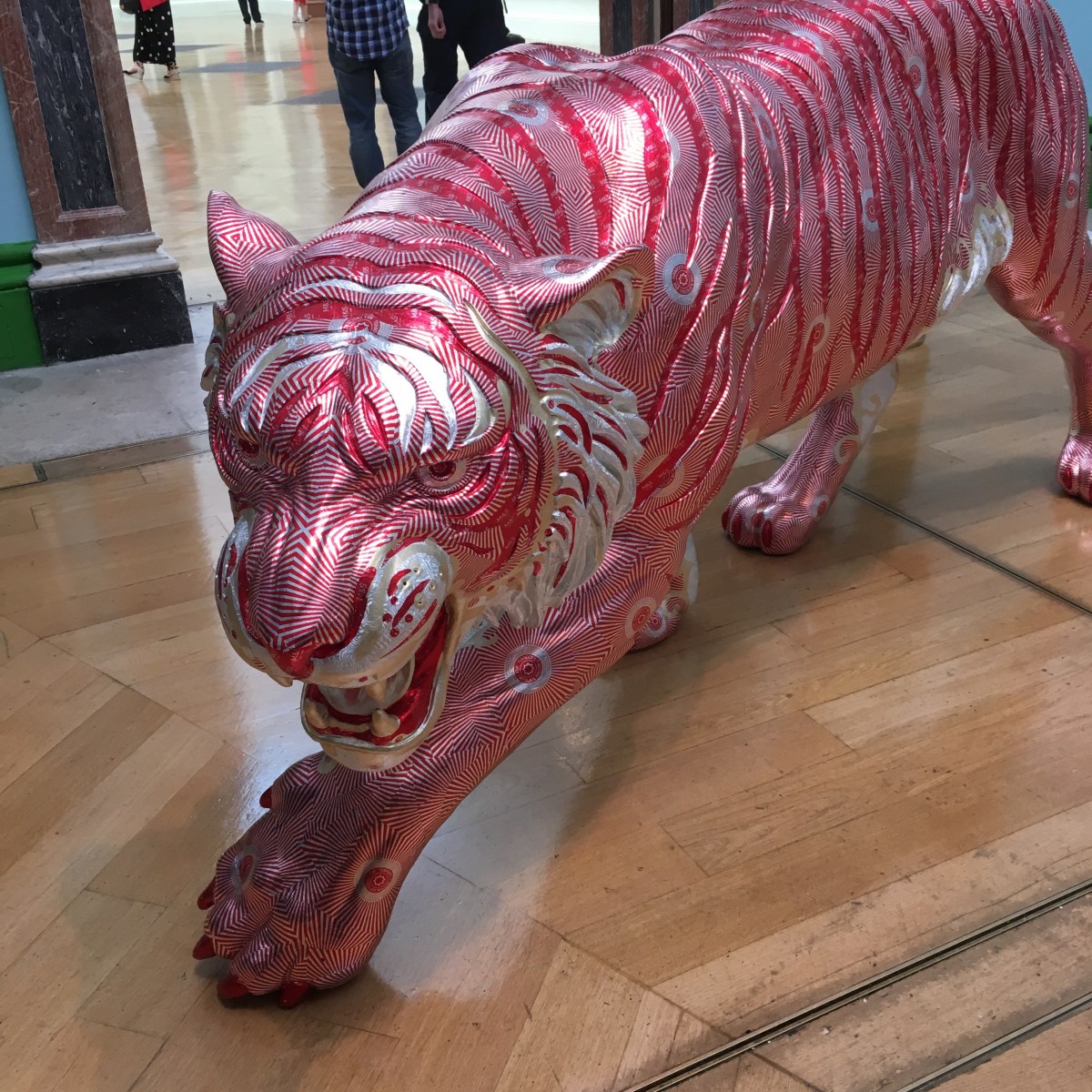
Visitors to the Royal Academy’s 251st Summer Exhibition will enter the first gallery to find themselves initially surrounded by quite the menagerie of animals, real, imagined and fanciful.  The star turn was definitely David Mach RA’s ‘Easy Tiger’ a life size sculpture of a pacing tiger covered with wrappers from M&S Tunnock tea cakes – playful, eye-catching and deliciously original.

IMG_7068

At the press preview for the show the co-ordinator, Jock McFadyen RA  told us that he, and a stalwart team of RA judges, had viewed 16,250 submissions, whittled them down to 2,300 and selected 1573 to appear.  That’s a lot of disappointment for many artists but huge cudos and glamour for the chosen few. And the selection did not disappoint; in fact I was really impressed by the huge variety on show and scale too.

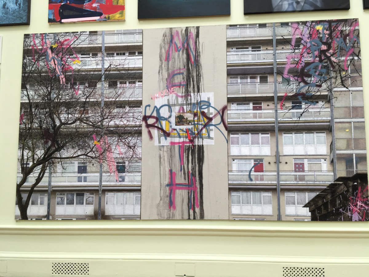
David Hepher, who has been depicting urban high rise building for many years, contributed at vast painting: Hey Wayne on the Meath Estate.

IMG_7094

Anything involving paper or mixed media catches my eye and there were several really intriguing pieces. I liked the sculpture by Hew Lock of Albert, Prince of Wales, adorned with beads and jewels and Rod Melvin’s knitted yarn portrait.

IMG_7081

Blonde on Blonde, oil by Grace O’Connor. I liked the impressions of paper and bits of tape with this amusing portrait.

IMG_7070

Above: The Call, by John Wragg RA

IMG_7072

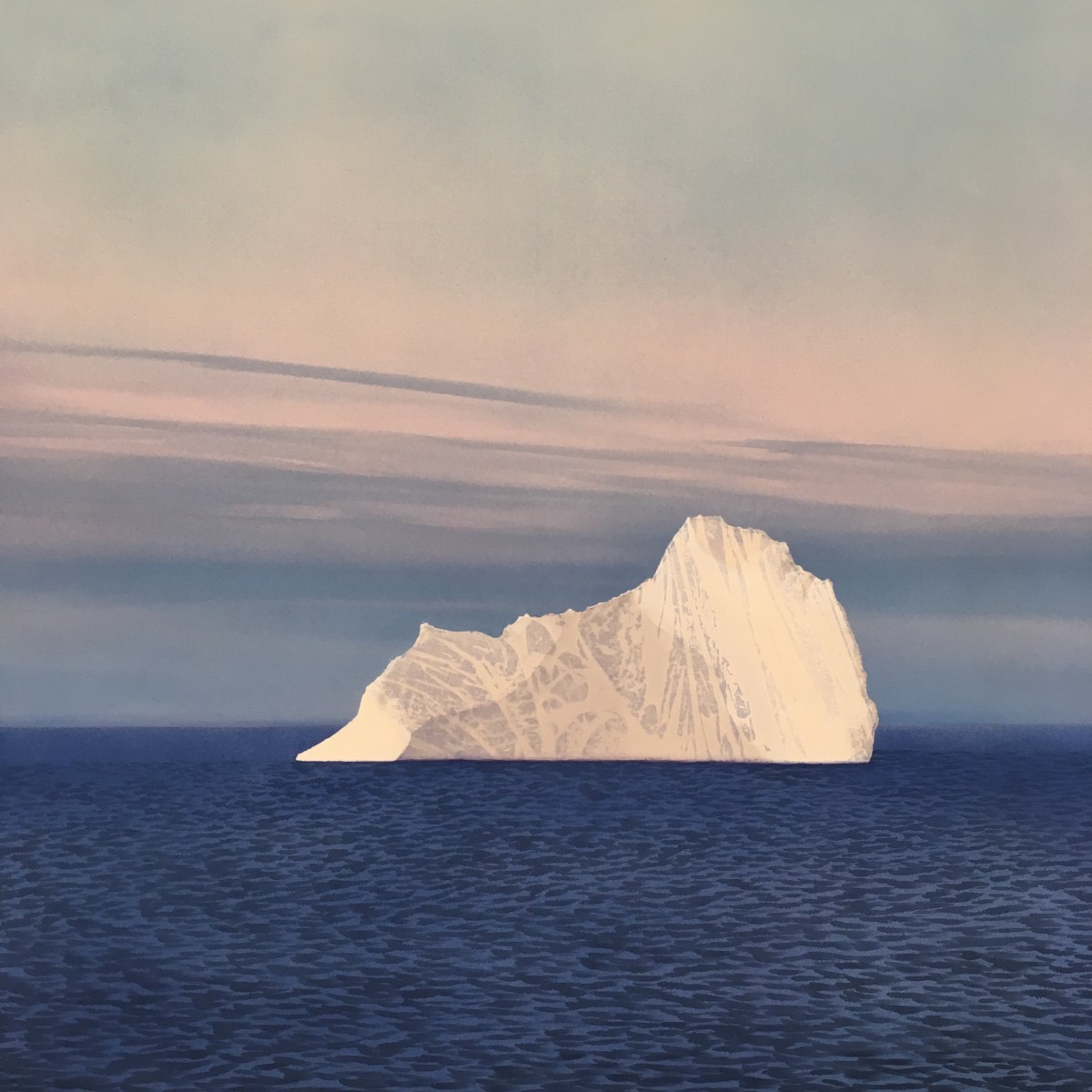
Above: An Austere Beauty, Iceberg off Cape Mercy, Baffin Island by Nicholas Jones

IMG_7073

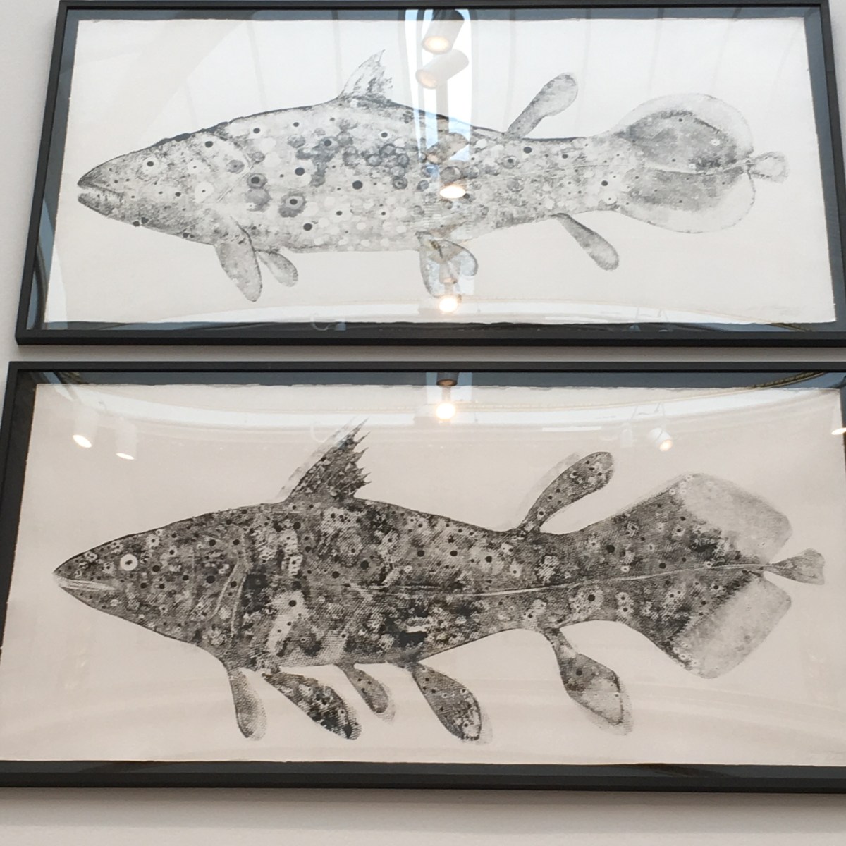
Above: Species: Coelacanth (Diptych) monotype by Stuart Mackenzie.

IMG_7077

|Above: The Painter Van Gogh by Hughie O’Donoghue RA

IMG_7076

Above: Dance of the Couds and Breezes V11 monotype by Bill Jacklin RA

IMG_7075

Channelling thoughts of Bruegel, I liked this  etching by Mychael Barratt entitled Richmond Park.

IMG_7101

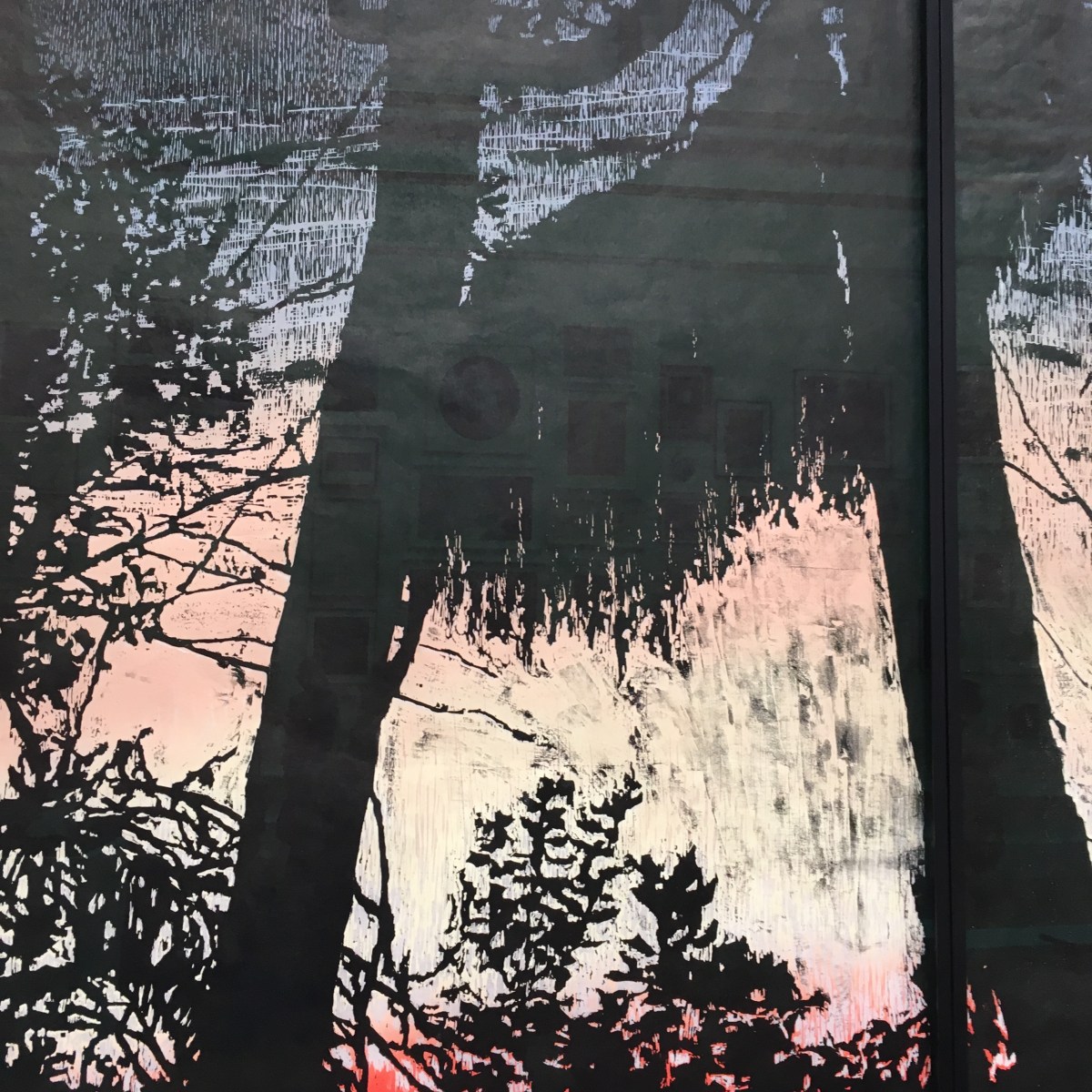
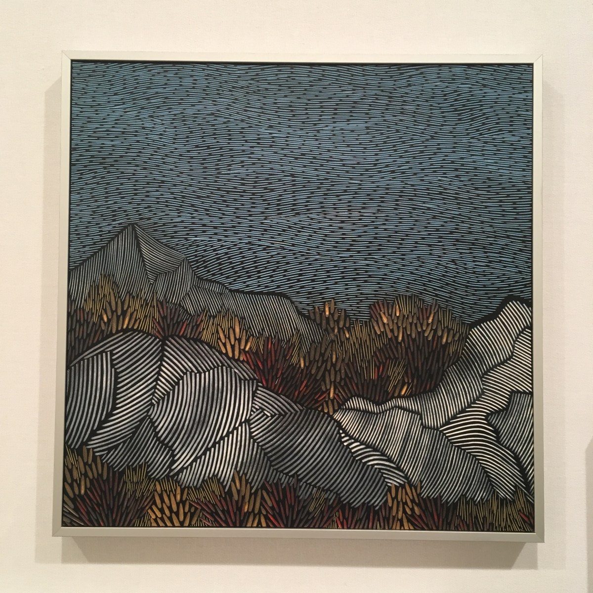
Above: detail from Calera Overlook, a four-part woodcut on Japanese paper by Emma Stibbon RA

IMG_7078

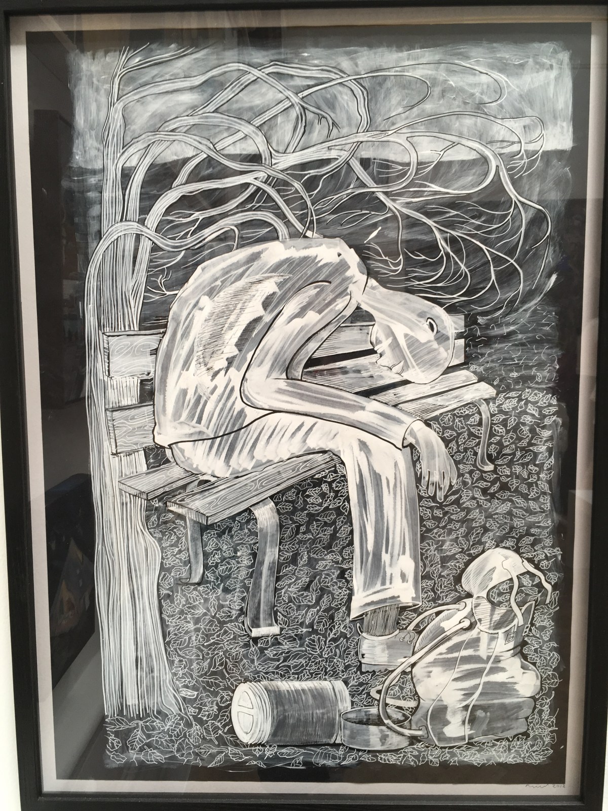
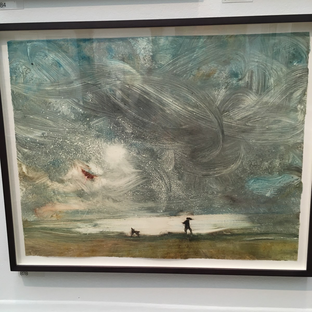
|Above: About to Get Up Again by Ray Ward (acrylic on card)

IMG_7080

Above: Beautiful Boy by Deniz Huysal, acrylic on paper.  A really compelling portrait.

IMG_7083

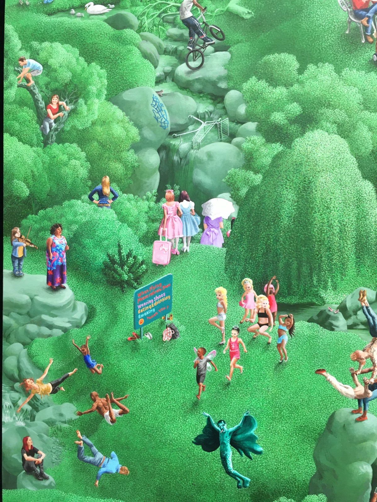
Above: detail from The Garden of Earthly Delights by Claire Douglass – a massive painting depicting park life, very fantastical park life.

So many great pictures.

The Summer Exhibition is open from Monday 10th June to 12th August.  http://www.royalacademy.org.uk


Clerkenwell Design Week notches up a decade of design in an area of London which is home for a concentration of some of the coolest and most talented makers, designers and marketers of contemporary design.

Every May for the past ten years Clerkenwell has sprung to life with a festival of design which brings a flutter of pink flags, enticing pink lines and arrows on pavements and paths and a wealth of design originality on many street corners.  Clerkenwell has long been an area of London which has attracted designers, architects, makers and craftsmen as well as showrooms with an abundance of showrooms and studios.

The design week is a celebration of this concentration of design brilliance and, historically, the sun has always shone upon the proceedings – this year was no exception.  In warm, summery weather, I joined the press tour around the historic streets and loved hearing about the history of the area and the way today’s designers (and the installations commissioned by Media Ten, organisers of the week) reflect the history.  There are fascinating and witty vinyls on walls – take a trip down ‘Pissing Alley’ – now more delicately named  Passing Alley and hear about its past as a place where convicted prisoners drank their last pint and relieved themselves there before being clapped in irons in one of the many prisons which used to exist within the area.


Around every corner there are fascinating things to see and spectacles to marvel at. It was fun to pause by the Aeron Hockey space in Brewhouse Yard, presented by Herman Miller, where teams  played a bonkers version of hockey whilst coursing around on wheeled office chairs.

IMG_6927Within St John’s Gate there is a timber structure designed by scalerule.org which reflects the geometry of the gate and plays with the idea of space and enclosure.

I loved the Bottle House – a clever new way to recycle empty plastic bottles. This simple structure made with just bamboo and twine, plus hundreds of bottles provides a kind of greenhouse or even a small shelter.

The handsome Moth Pavilion has been set up within Design Fields on Northampton Road has a great line up of speakers. I was lucky enough to hear Neisha Crosland being interviewed by Bethan Ryder about her life and career – fascinating stuff.

Clerkenwell Design Week run from today until 23rd May http://www.clerkenwelldesignweek.com #CDWfestival #CDW10 #CDW2019

The world of the ‘London Look’, swinging sixties and ‘cool’ seventies comes sharply to life through the fashion design and brand brilliance of Mary Quant. An impressive show at the V&A charts the evolution of a style which liberated women, democratised fashion and defined the look of two decades.

I was never quite old enough to enjoy the full impact of Mary Quant’s fashions and also, rather too plump for the leggy, mini-skirted fashions which I pored over in the pages of my Jackie magazine. As a child and young teenager, I was aware that there was an energetic world out there full of grown-ups with sports cars, coffee bars, girls with short-cropped hair, small dresses with big flower motifs who swung handbags with abandon as they sauntered down the King’s Road in Chelsea.

Mary Quant made the fantasy possible for all of us.  I did eventually get a Mary Quant dress – it was purple with a swingy-drop waist skirt with collar and cuffs in bright yellow. It know, it sounds ghastly but I absolutely loved it and wore it to all the after-school events I could and always felt confident and ‘cool’. These things are so important when you’re growing up. The dress disappeared a long time ago but I hung onto a small pot of eye makeup called Ink Pot.  I wanted to look wounded and tragic with bruised blue eyelids like models who looked deep and contemplative in sylvan wood settings, but it never suited me. I’m far too cheerful. The pot stayed with me – and most of the contents too – and I was delighted to dig it out of an old box of childish things and bring it with me when I went to the press preview of a retrospective on legendary fashion designer Mary Quant at the Victoria and Albert Museum.


I was holding up my pot of makeup by the museum exhibit when, by amazing serendipity, I found myself standing next to Dame Mary Quant herself!  Well, I just had to ask for a photo and showed her the little pot. She was amused and delighted and I felt fifteen years old again.

The show at the V&A is a joy from start to finish.  The evolution of the Mary Quant style is fascinating to review.  Mary was clearly a talented girl with a very good eye and a huge talent for art and design.  The was lucky to have a husband and confederates who helped mould her brand and take her unique look around the globe. Who knew that she would create clothes and a brand which would define a generation.  That haircut (thank you Vidal Sassoon), those nifty little dresses, dainty shoes, swingy bags and oh that five petalled flowers which adorned everything – I only have to look at it and feel happy.

IMG_6113

The curators at the V&A must have had fun when the put the shout out for Mary Quant clothing and products. Like me, there must have been thousands of women who have hung onto dresses long after their figures expanded too far for further wearing but couldn’t bear to part with these fabric treasures. What joy, here was an opportunity for the much loved garments to be taken out of storage and given their moment behind museum glass. I loved seeing the black and white and faded colour photos of women wearing their beloved Mary Quant fashions back in the day. It makes the fashion feel so real, so accessible, so owned.

IMG_6119

And I did enjoy the films of Mary in her studio working on designs, dressing models, testing fabrics. What a role model for all of us.  So, hasten ye down to the V&A to see this great show. It’s on until 16 February 2020 so no panic and tickets are £12.

Van Gogh and Britain – a new show at Tate Britain puts the spotlight on the way art and culture Van Gogh encountered during his three-year stay in London (from 1873 -76) influenced his life. The show also looks at the way Van Gogh’s work influenced the work and ideas of subsequent artists.

It’s a bit like seeing old friends at a party.  I’ve always admired Van Gogh’s ‘portrait’ of his boots – trusty lace-ups which he pulled on daily and trudged the streets and countryside. It’s a treat to see them on the walls of Tate Britain.  This blockbuster show  gathers together some of Van Gogh’s most familiar and best-loved paintings and puts them in the context of his own artistic development – and how important his time in London was in forming him as an artist – and how later artists have viewed his work, emulated, been inspired by and ‘translated’ it.

Van Gogh didn’t actually do much painting during his time in London. He lived in Stockwell from 1973-4 (there’s recent research that he fell in love with his landlady’s daughter but she was not interested). But spending time in the capital, walking everywhere, visiting art galleries, talking to people and reading quantities of Dickens, John Bunyan and the popular authors of the day was clearly a huge influence on his creative spirit. He identified with the common man, the poor, the dispossessed and, through his ambitions to work within the church, wanted to actively help people in both body and soul.

He earned little money whilst in London (he had a menial job at an art gallery) but he could afford magazines such as the Illustrated London News which was full of prints, engravings and news about art and culture. These he collected, squirrelled away, and used throughout his life as reference or inspiration.

It’s perhaps a little fanciful to believe that every painting he later made, once he’d moved back to the Netherlands and then France to be a full time painter,  could be traced back to some influence from those London days but the curators have had a good go at joining up the dots. And it’s a great excuse to bring together a lovely collection of paintings by other artists which are always a joy to see.

IMG_5891
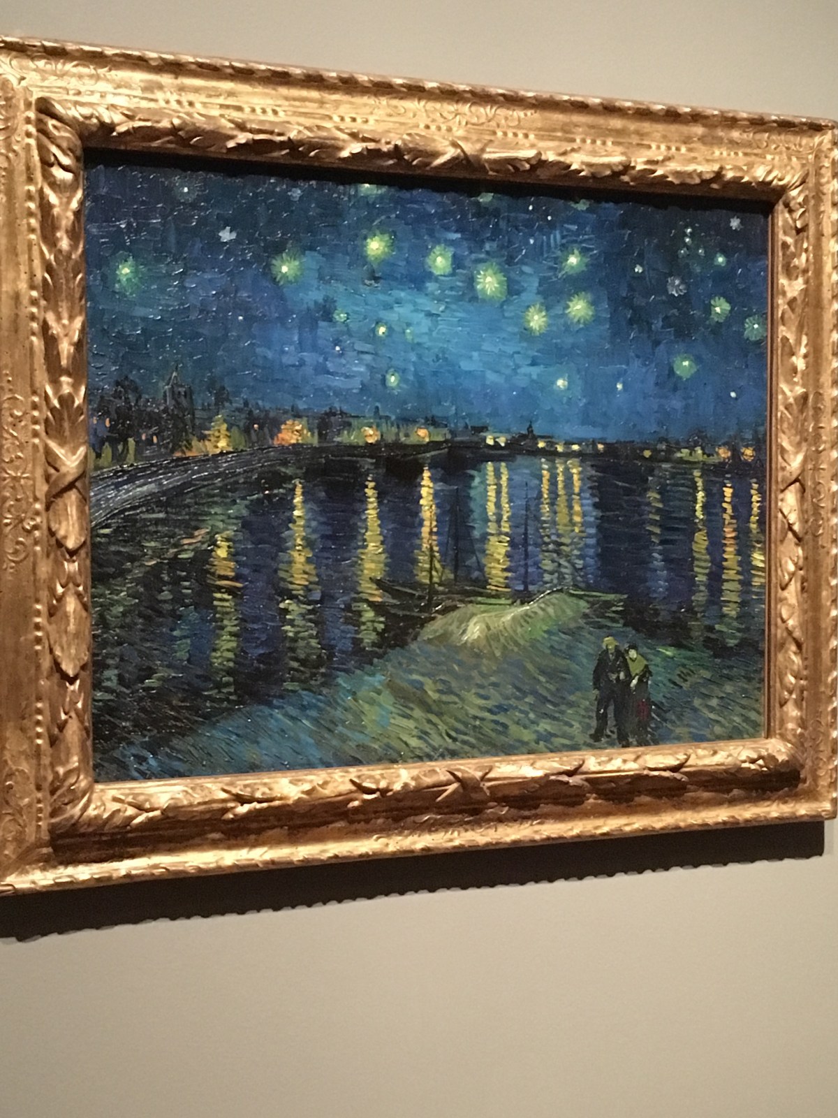
For example, we are able to view Starry Night – absolutely fabulous with those strong, zingy colours and the glow of stars and streetlight.  Yes, perhaps he had gazed at Whistler’s river paintings (Nocturne) but I’m not sure he was consciously channelling that image when he created that magnificent picture.

What I loved was the way Van Gogh ‘translated’ some of the prints saved from magazines or which he saved up to buy.  The famous engraving by Doré of convicts exercising in a prison yard is a very compelling image and Van Gogh worked it up into a full colour painted version which retains the misery of the subjects but also challenges the viewer through the direct gaze of one of the inmates who draws you in to the pitiful march.

All artists steal from other artists; it’s what we do. I really enjoyed seeing the way the famous Sunflowers have been reinterpreted or ‘translated’ by other painters and the room full of these examples lets in a metaphorical and literal light into the collection.

And then there are the self-portraits.  He was masterly at studying his own face. Apparently he did most of his painting in the days just after a mental breakdown and fuelled by a sense of recovery.  These paintings convey that vigorous desire to make a statement and seem lucid and focussed.

This huge show is on at Tate Britain until 11th August. It’s quite a treat.

Collect 2019, the Craft Council’s annual show of art, craft and design excellence is on show at the Saatchi Gallery – a feast of imagination, ingenuity and creativity.

I do enjoy the annual festival of contemporary craft which is Collect, organised by The Crafts Council.  Galleries from all over the world present a fascinating range of artists’ work and, since I was lucky enough to go to the VIP preview, you can talk to the artists and craftsmen and women about their work.

Collect fills the vast Saatchi Gallery from top to bottom in a well laid out exhibition which gives plentiful space to show off the pieces.  So many objects, imaginatively made from a wide range of materials can be viewed, pored over and even handled.  I am always drawn to things which are colourful, having interesting textures and appear in multiples where everything is slightly different.  There were some great examples that fitted that tick list.


Glass, ceramics, plastics, leather, wood, terracotta, resin….. there are no limits to the clever use of materials on display.  I enjoyed chatting to Janine Partington who has created artworks using leather which she works with lino cut tools.  When some paint accidentally dropped onto plain leather an idea popped into her brain and she with it. I like that sort of serendipity in creativity.

IMG_5564

In the VIP lounge I was very impressed by the stunning chandelier by Cox London.  Inspired by those polypore fungi which grow around the base of forest trees it incorporates over 5000 tiny glass leaves which were painstakingly added to the frame by a jeweller. A labour of love!

IMG_5537


Collect is on at the Saatchi Gallery until Sunday 3rd March

The Renaissance Nude at London’s Royal Academy sheds light on the fascinating role of the unclothed human figure in art history and how the evolution of the nude, between 1400 – 1530, sets up the bedrock of western art for centuries to come.

This is my kind of show.  I’ve been fascinated by the challenge of life-drawing for years. These days I make paper collages directly from life models but the process of looking, understanding, decoding and depicting is the same, whatever the medium used.


The Renaissance painters were obsessed with the unclothed human figure. The situation could be religious, naturalistic, spiritual, domestic or maybe even a bit gratuitous.  The key element was the training needed in order to teach yourself how to really LOOK.  And there’s nothing better to concentrate the brain than spending day after day making hundreds of drawings of the figure, ideally on the move or in active poses. That’s what a studio apprentice would have had to do.  After putting in those hours of scanning a body an artist could accurately reproduce the proportions and movements of the human body, drawing from memory if a real model were not available. This aspect of art history was eloquently explained at the press preview by Thomas Kren, Senior curator from the J. Paul Getty Museum, Los Angeles which has partnered with the Royal Academy to put on this show.

In the 1400s the technology of print making really took off which must have been a boon for artists able to work on woodcuts or create engravings which would provide a wider and cheaper distribution of their images.  It was a truly democratising aspect of art history meaning that ordinary people, not just the wealthy patrons who could commission work from artists studio, could have the chance to enjoy these images of the unclothed human.

There’s an equal balance of male and female nudes in this show.  Some make the figure the main focus and some present the nude within a landscape or depicting scenes from Christian history. There are also some fascinating ‘close ups’ for examples, you can see Leonardo da Vinci’s painstaking study of the shoulder of a dissected corpse.

IMG_5576

The Renaissance Nude is on show until 2 June 2019 in the Sackler Wing of the Royal Academy.

Elizabethan Treasures: Miniatures by Hilliard and Oliver. A rare opportunity to gaze, close up and personal, at faces from 400 years ago and glory in the delicate features and clever characterisation which those remarkable portrait artists achieved.

There’s something utterly enchanting and beguiling about seeing life in miniature.  You marvel at the sheer challenge of creating a piece of art which is just… so, so tiny.

This new show at the National Portrait gallery is a jewellery box of visual delights. You can borrow magnifying glasses to enlarge the tiny portraits, often oval or round and hidden away in beautiful boxes or pouches. It’s helpful that there’s a selection of materials on show which show how pigments were mixed in mussel shells, how the finest sable brushes were used to create the smallest details and how mini blobs of resin mixed with colour could resemble rubies and priceless gems.

Most of the miniatures on show are in remarkably good condition, perhaps bearing testament to the fact that these portraits were private; they were not displayed on walls or public places but kept in pockets, in carefully crafted frames or boxes, protected and gazed at by the owners at their discretion, maybe in secret. There’s something intensely personal about the faces we can gaze at.   Yes, we have the ‘famous faces’ – royalty, aristocrats, masters of derring-do of the day such as Sir Walter Raleigh and Sir Francis Drake.  And of course there are several of Queen Elizabeth I.

What they all have in common is a certain intensity.  Clearly drawn from life and then painstakingly painted, you feel the strong connection between artist and subject. The delicacy and detail demanded for the creation of a good likeness is matched by a fascination for clothing and jewellery and all the accoutrements of high fashion of the day.

I took a few photos of miniatures which particularly impressed me but really, they were ALL beautiful and I spent my time at the gallery in a kind of swoon of beauty as my eyes alighted upon each little marvel.


The exhibition majors on a ‘compare and contrast’ with the two miniature ‘giants’ of their day: Nicolas Hilliard and Isaac Oliver.  Both artists were contemporaries and reached the heady heights of royal patronage and were clearly much sought after by those able to afford their skills.  Hilliard was English, and trained as a goldsmith, before becoming a ‘limner’ – a miniature painter – while Oliver came from France and moved to England as a Huguenot refugee.  Hilliard seems to engage more closely with his subjects but Oliver makes them look gorgeous, using a particularly ‘soft-focus’ deftness with the brush.  These two pictures, above, are of sisters. They’ve been dressed similarly and you can see the family resemblance but each one’s character and personality is clear to see.

These two, above, by Hilliard are examples of gorgeous observation – on the top left we have Queen Elizabeth the First’s ‘favourite’ Dudley, Earl of Leicester, and then there’s the beautifully painted portrait of Henry, Prince of Wales.

I loved this portrait of an unknown man against a background of flames (representing burning, passionate love) by Hilliard and also this one of Venetia Stanley, who became Lady Digby, a renowned beauty of her day.

Portraits made from IKEA catalogues. A huge project for me and my www.paperface.co.uk venture. Live portraits made at speed and exhibited at Stephen Lawrence Gallery, within University of Greenwich, later shown within gallery space at the new IKEA store opening at Greenwich North on 7th February 2019!

The last few months have been super busy for me.  IKEA, is opening a new store at Greenwich North in February and, because this one is going to be very green and sustainable, they decided to find an imaginative way to use old IKEA catalogues  to express this and, yes, could they find an artist who can create portraits of Greenwich people made entirely from catalogue paper?

The clever people at Mother London, a whizzy advertising agency, were tasked with finding the artist who could do this. They asked The Mall Galleries who knew about me.  And, voila, the question was put: ‘Would I care to make some large format portraits of Greenwich celebrities, past and present, and also create ‘live portraits’ of locals in a Greenwich gallery?’  Of course I said yes to everything.  I love tearing up paper but I’ve never used catalogue paper like that – I generally use the pages of art, architecture or design magazines which are printed on high quality paper and are covered with gorgeous colours, textures and patterns.  However, I have learned to love my IKEA catalogues.  And I’m full of praise for the stylists who have found ingenious ways to incorporate all manner of products in the photography and I clever little motifs which pop up right through the publication – a spotty blouse a striped towel, jazzy mugs.  The pages of the catalogues are very cohesive and pleasing to browse. I now have my favourite, go-to pages for tearing up!

Before and after Christmas I was hard at work on some large, and very detailed portraits.  I made 10 in total and four were selected for the main display. The ones which made the walls of the Stephen Lawrence Gallery, which is part of the University of Greenwich, were Boy George (local lad) , Sir John Flamsteed (first Astronomer Royal), Queen Elizabeth I (born in Greenwich Palace) and Admiral Lord Nelson (based at the Admiralty in Greenwich).

Last weekend I was based in the gallery space with piles of catalogues, glue, scissors and pens and worked my way through a series of ‘live portraits’ of people who perched upon a very uncomfortable stool in front of my easel and allowed me to scrutinise their face, rip up bits of paper and create a very immediate, and extremely quick, paper portrait.  The results have been really fun and everyone seems delighted with them.

There will be another weekend of live portraits at the Stephen Lawrence Gallery which will fill the space with around 48 paper portraits. The ultimate solo show!  As soon as each portrait is finished and the varnish is dry, they are popped into IKEA frames and hung on wall.  It’s been exhausting but exhilarating and I so enjoy the privilege of gazing at people’s faces, listening to their stories and recording a moment of their life, in paper.

The lucky subjects will be able to come to the new store in Greenwich North and see the final collection on display at the opening and, in due course, will be able to take their portrait home.


An enlightened show on Anglo-Saxon Kingdoms at the British Library shows that the ‘Dark Ages’ were far from gloomy but actually a time of extraordinary cultural flowering; you can see rare examples of beautiful objects which date from the departure of the Romans to the invasion of William the Conqueror, early English literature, manuscripts, art and artefacts which have survived the centuries.

I was blown away by this show.  OK, I confess I have a bit of a ‘thing’ about Anglo-Saxon history and an obsession with art and artefacts from the period which spans the departure of the Romans and the arrival of the Normans. We’re looking at the years from  around 500 to 1066 so it’s big chunk of time. For years this period has been regarded by historians as the ‘dark ages’, simply because it’s a big ask to find objects which have survived from those years but the things that we can see show that life in the Anglo-Saxon lands were far from dark and definitely not boring.

At the press preview for this new show at the British Library I loved the enthusiasm of the curator, Dr Claire Breay and her team who have spent years preparing this show. They’ve assembled items from the Library’s own impressive collection of books, manuscripts and documents and mingled them with sensational loans from museums, galleries, cathedrals and collection from elsewhere in the British Isles and further afield.  What you come away with is a sense of the rich creativity, inventiveness and skills of the people of Anglo-Saxon Kingdoms.  Yes, there were wars and invasions and lots of local skirmishes.  It’s clear that this period must have been pretty tumultuous to live through – and being a woman would have been challenging.  However, you soon discover that it was time of intense evolution, innovation and excitement and clearly set down the foundations for the interesting and multi-faceted island race which we remain today.

I’ve long been an admirer of King Alfred, not just because his story was one of my favourite Ladybird books as a child.  His reign, (871- 99) was a vastly important time in terms of unifying the warring factions within Anglo-Saxon England, establishing the idea of education for children, establishing that English rather than Latin should be used for administration and developing international links, trade and shared knowledge.

Always on the hunt for portraits, I was impressed to see that King Aethelstan (924 – 39), grandson of Alfred, features in the earliest known contemporary image of a king within a manuscript.  Here he is shown presenting a book to the Community of St Cuthbert, established at Chester-le-Street, Co Durham.   Aethelstan was prodigious giver of books and promoter of education;  we have lot to thank him for.

IMG_3839

It’s a joy to peruse the glorious illuminated bibles and manuscripts and revel in the fabulous colours of the paint and the gleaming gold.

I liked an example of the first ever letter – you can tell is was a letter because it was folded up a special way.

IMG_3794

IMG_3795

I absolutely adored the Lichfield Angel. This sculpture (thought to date from the 660s) was excavated from beneath the nave of Lichfield Cathedral in 2003.  If you didn’t know it was so old you might possibly imagine it had been made by one of last century’s sculptors such as Eric Gill or Jacob Epstein – it is sensational.

IMG_3847

If you’ve never seen the Doomsday book, then here it is, in all it’s weighty glory, on loan from the National Archives in Kew – the most comprehensive glimpse of life in an organised, wealthy and very desirable country.  It’s also remarkable to learn that William the Conqueror commissioned this great record on Christmas Day 1085 and it was completed by 1st August 1086 – extraordinary.

IMG_3797

This is very much a ‘once in a generation’ opportunity to see so many treasures from this period in one place and beautifully displayed. The show is open until 19 February 2019 and well worth visiting.

http://www.bl.uk

The 2018 Taylor Wessing Photographic Portrait Prize at the National Portrait Gallery presents a fascinating collection of portraits from around the world with a mix of studio and street photography capturing spontaneous and carefully crafted pictures.

I’m gradually getting to understand photography.  As an artist I’m more familiar with the process of ‘eyeballing’ (as David Hockney described it) with a pencil, brush or bit of paper in my hand, rather than peering through a lens. However, when you visit a show like the Taylor Wessing Photographic Portrait Prize you come away with a feeling of huge admiration for the work of the photographers who have been fortunate enough to be selected for this prestigious prize.

I think the universal element to the success of these portraits is the ability to focus on that gaze, the way a subject will look directly at the photographer and allow something very exclusive and internal to be captured.  It’s probably a mixture of trust and good fortune. The winning pictures came from a series of photographs of ‘Drummies‘, young girls in Cape Town, South Africa, who clearly felt at ease with Alice Mann and allowed her to take informal photographs of them dressed in their wonderful majorette outfits in spaces which are familiar to them.

IMG_3767

I’m always drawn to curious portraits and a couple of them stood out.  I liked Eddie Mulholland‘s portrait of Robin Parsons as he transforms himself into Michael Jackson for a tribute act.  And I liked Toby Coulson’s portrait of Joan Jonas – you can sort of see the woman but she’s behind a curious mask and the effect is very beguiling.

IMG_3765

IMG_3763

I was also very struck by Alice Zoo’s portrait of Woman in a Blue Cap. The subject is close to my heart, it’s of one of those intrepid women who brave the freezing waters of the Women’s Pond at Hampstead and I have enormous respect for them. (I’m a fair weather swimmer so I won’t be back in the pond until the warm days of next year’s early summer.)

And I did like the very cool photograph by Max Barstow from his Londoners series – this was joint second prize winner – and captured two very chic women in Regent Street who agreed to pause from their purposeful shopping just long enough to be perfectly framed.

IMG_3770

The show is on at the National Portrait Gallery until 27th January 2019.

IMG_3753

Above: Charlotte, a member of the Jane Austen Pineapple Appreciation Society being photography by Guy Bell next to a portrait of her taken by Alejandra Carles-Tolra.

http://www.npg.org.uk