All Too Human – Bacon, Freud and a Century of Painting Life. New show at Tate Britain which traces 100 years of life painting and shows the evolution of artists’ fascination with the human figure and the way it is depicted.

I’ve been drawing from life for years.  Every Monday I spend two hours scrutinising an obliging model who braves the chill air of the art room to try and override the brain’s assumptions about shape and proportion and really try to capture, and make sense of, the figure in front of me.  Of course I make my version out of paper collage, rather than pencil or paint!

This level of scrutiny of the human form has fascinated artists for centuries.  It never gets any easier but it does evolve. This show puts the focus on the last 100 years of life painting and majors on the post-war artists – Bacon, Freud et al – to assemble an intriguing collection of paintings. These works represent the human form and portrait in many different styles – though it also includes a few surprising landscapes and cityscapes which vaguely reference the human element but do jar a bit.

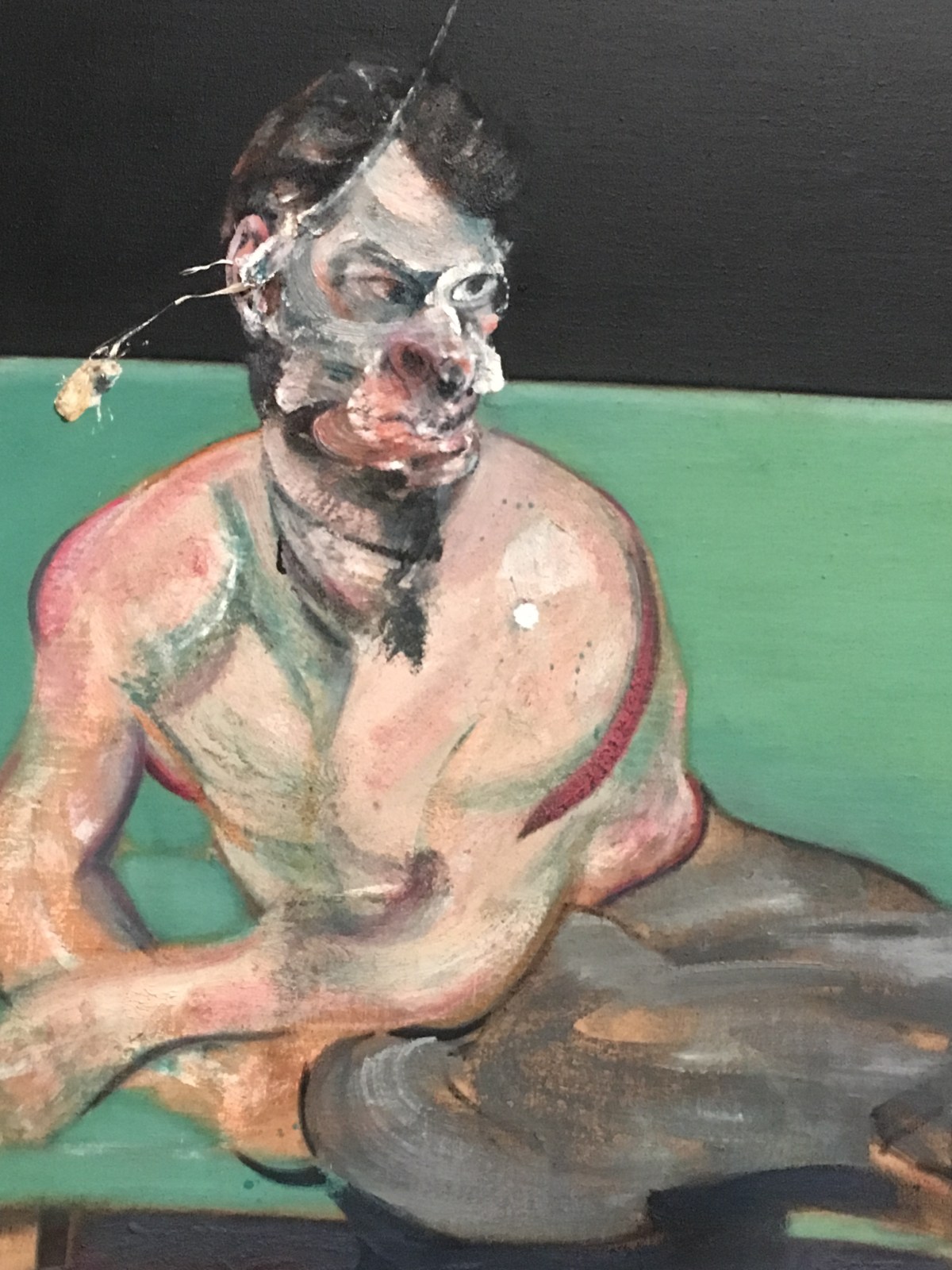
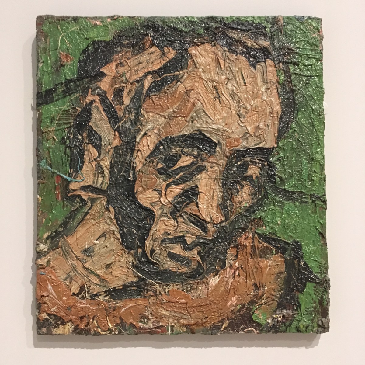
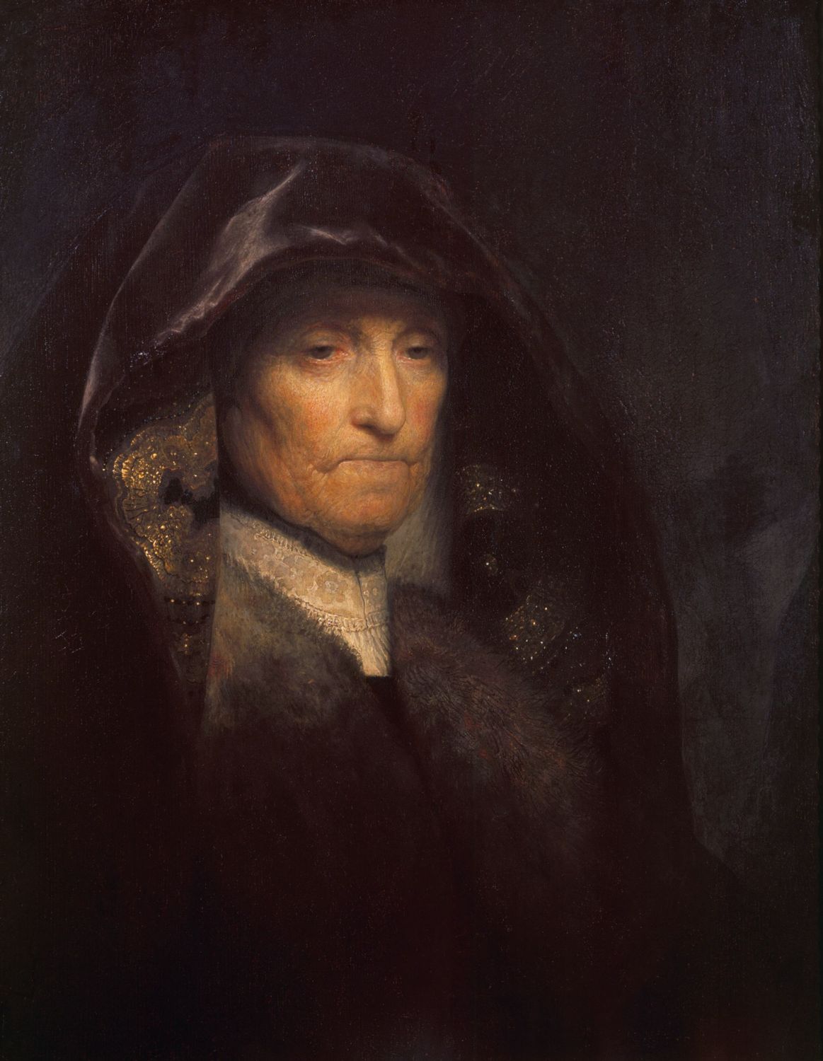
The Tate has an impressive collection of life paintings already, always a good starting point for a curator, and about a third of the pictures on show come from the gallery’s collection.  However, the show has acquired an interesting selection of pictures I have never seen before.  For example, there’s portrait of Lucien Freud by Francis Bacon (a detail is below).  I also liked the self-portrait by Leon Kossoff, below the detail from the Bacon.

IMG_0066


IMG_0056


It’s good to see Paula Rego given an entire gallery. I’ve always loved her edgy work which tackles some unappealing elements of the human condition – weakness, abuse, bullying, cruelty.  Here are my photos of her epic triptych, The Betrothal: Lessons: The Shipwreck all done on paper with pastel and inspired by Marriage a la Mode by Hogarth.

I’m not sure I was told anything especially new by this exhibition – the layout is fairly clunky in the sense that it features specific artists in their own gallery space. Perhaps if they’d been mixed up a bit more I might have made more of a double take when looking at the works.  A room full Freud paintings is just that – and we did see a lot of them at the major Freud retrospective a few years ago.

I also wish that the background walls had not been so grey. There’s something about that colour which tends to drain the energy from pictures rather than enhance them.  When you have paintings full of skin tones I feel it’s helpful to have a stronger background colour, perhaps an opposite in green or blue.  But that’s just my view.

Below: David Bomberg self-portrait, Stanley Spencer portrait of Patricia Preece, Ewan Uglow, Georgia and Michael Andrews, Melanie and Me Swimming.

However, it’s always a joy to see a collection of great figurative art and life-painting.  For years the idea of ‘eye-balling’ the human figure was abandoned by art classes and steamrollered by the hefty abstract and conceptual movement.  But real artists can’t help looking at things and the human form will always be a challenge. It’s very heartening to have a show at a major gallery like Tate Britain which celebrates this important artistic legacy.

As a finale, they presented  a gallery full of contemporary works by female artists: Below: Celia Paul‘s portrait of her mother, Lynette Yiadom-Boakye, Coterie of Questions and Jenny Saville‘s Reverse.


All Too Human at Tate Britain runs from 28 Feb – 27 Aug 2018. #AllTooHuman @Tate


Sensational works of art can be seen at Collect, the Craft Council’s annual showcase of the UK’s best artist/makers at the Saatchi Gallery – until Sunday 25th March (so hurry down to the King’s Road!)

Collect is the Crafts Council‘s major art fair for contemporary objects and it’s on at the Saatchi Gallery for another day (on from 22nd – 25th March 2018).  I always love this show and marvel at the creativity on show across all floors of the gallery.

Craft is often made to feel inferior to fine art but there’s no justification for this, as magnificent shows like this attest.  In fact, the originality on show quite eclipses the work you can see in many contemporary art galleries.  And the variety of materials makes you long to touch and feel, because they are used so beguilingly.  For example, this amazing sculpture which likes like a pile of thin paper pages is actually ceramics. There’s a big Do Not Touch sign next to this one, for obvious reasons! It’s by Su Xianzhong at the Ting & Ying stand.

IMG_9985
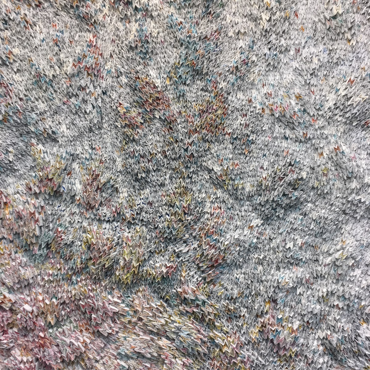
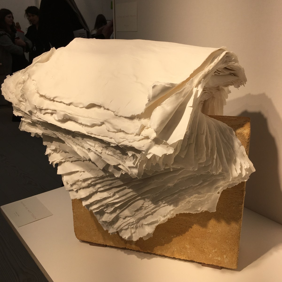
So many pieces caught my eye for their colour, texture and sheer originality.  It’s also great that the artists are there at the show too, eager to talk about their work and their creations and it’s fascinating to engage with them and discover the back story to their practice.

I find it so heartening that people develop passions for materials such as glass, ceramics, wood and sometimes a joyous mash up of things which leave you gazing in awe at the way pieces were put together.

Here are a few examples of very original ceramics.  You could argue that some are functional but, really, they are there just for the joy of admiration and a pleasure to own.

Of course I can’t help being drawn to works made using paper and was not disappointed.  I loved the Paper cut artworks by Charlotte Hodes at the Jagged Art stand.  And the amazing works by Ferri Garcès uses paper in such an intricate way with thousands of tiny printed pages being folded and fixed together within a frame. It’s on the Collection Ateliers D’art de France stand. Stunning.

IMG_9998IMG_9990
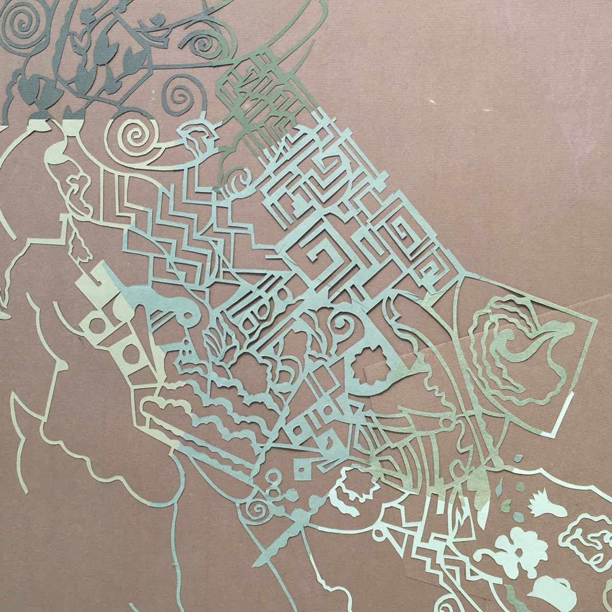
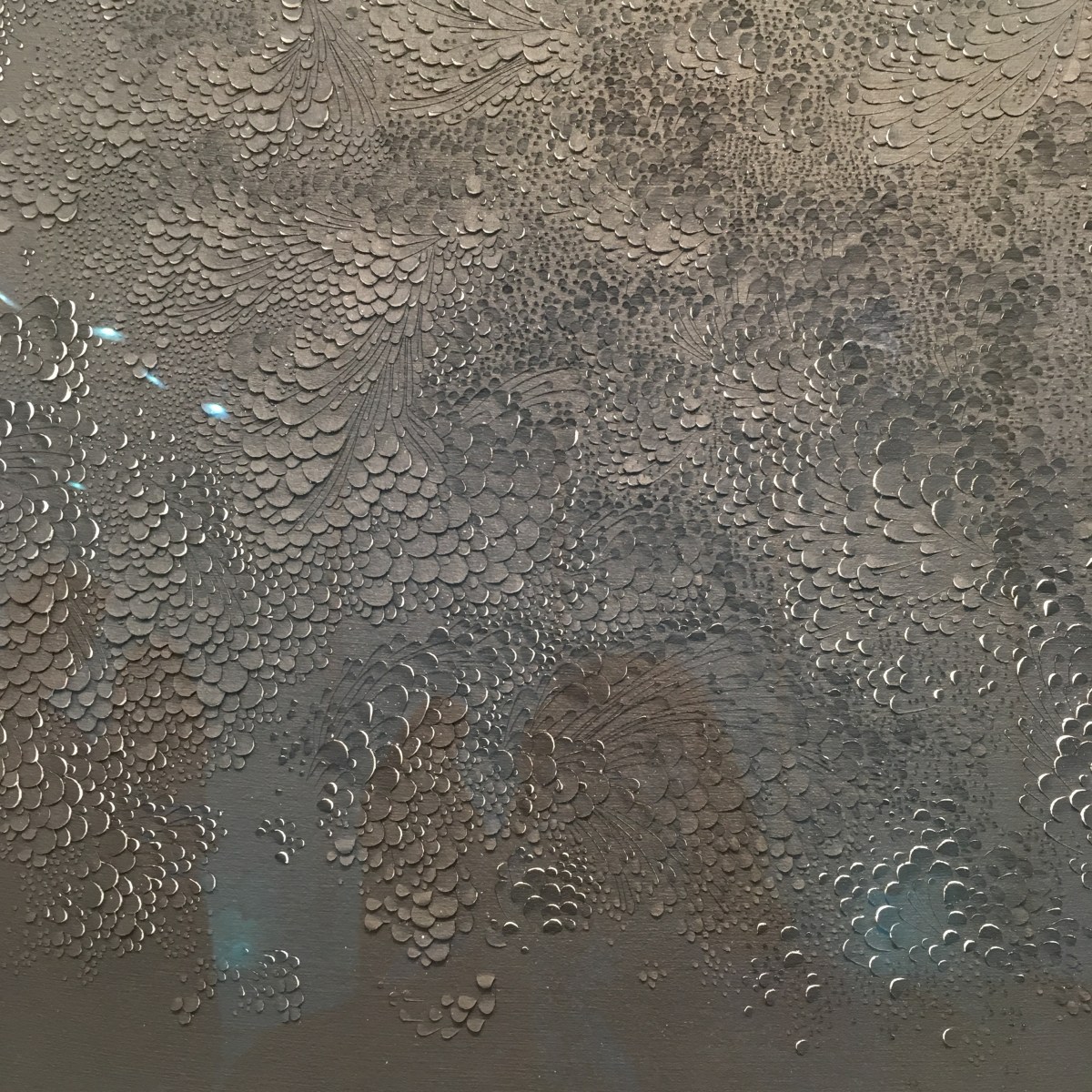
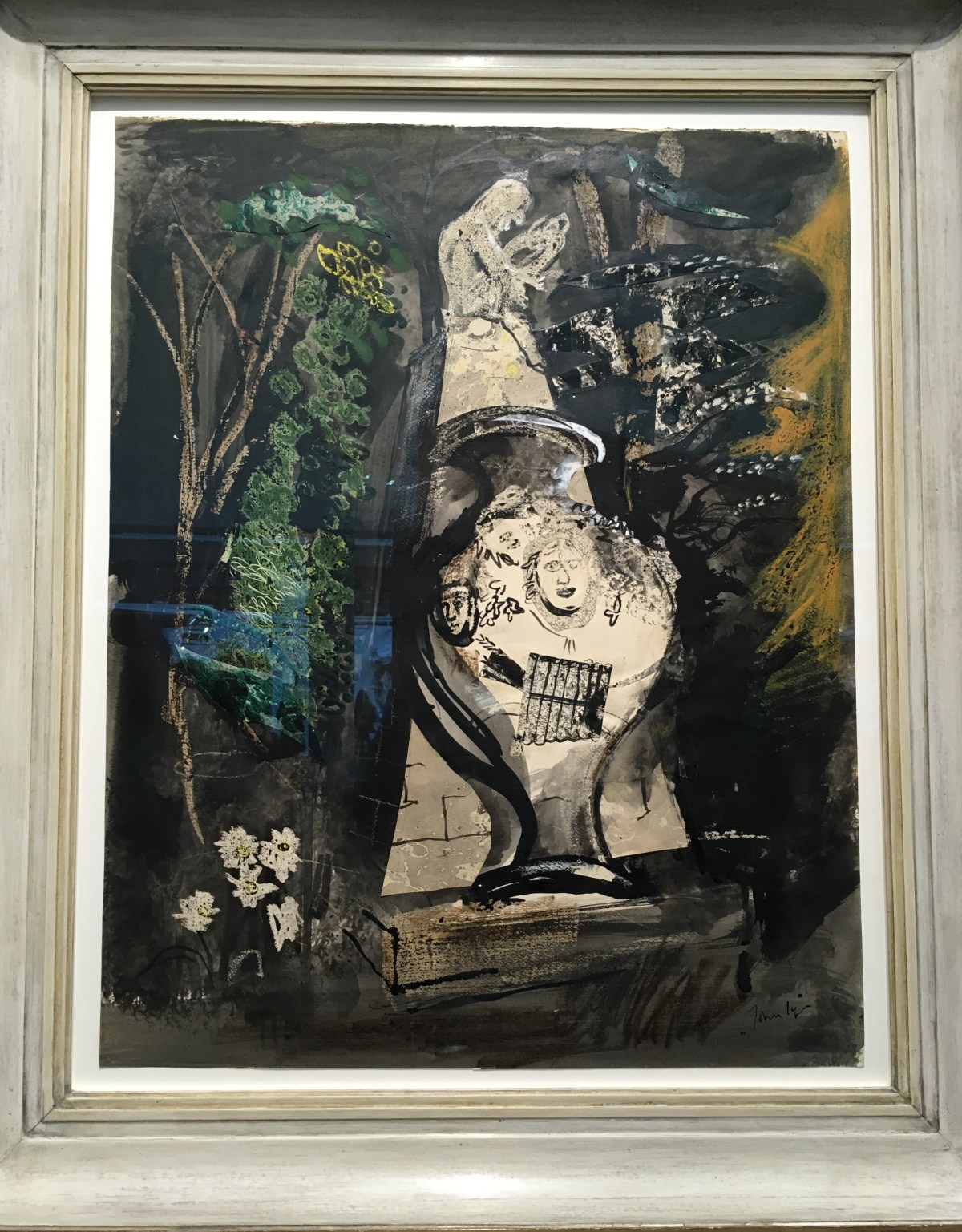
Other paper pieces which fascinated me were the works by Lauren Collin on the Galerie Dutko stand.   She takes the thickest cartridge paper and cuts intricate little shapes which have the style of a delicate Japanese print where the paper is lifted, oh so slightly, to reveal different colours and tone beneath. Inspired.

IMG_0004IMG_0002
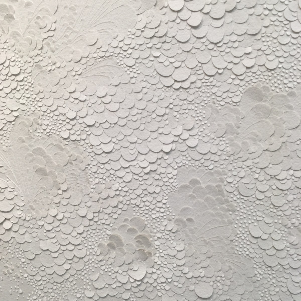
Collect is full of stunning pieces and well worth a visit.  There’s another day left – get down to the Saatchi Gallery if you can!

Collect, 22 – 25 March 2018    collect2018.org.uk  Thanks to the excellent Zettler PR for their support.

Experience Days has made a film of Papershades Workshops! Check it out here… https://www.experiencedays.co.uk/paper-lampshade-making-experience-london

One of the unexpected but very rewarding aspects of running workshops is the discovery that I’m not alone. No, there are organisations out there which also love putting people in touch with their creativity or adventurous side. One of them is Experience Days.  Two of their team, lovely Blossom and Rebecca, came to a recent Papershades workshop and, not only did they each create a beautiful Papershade, but they managed to film and photograph it at the same time.

The result can be seen on Experience Days‘ website. And you can check out Papershades too and see another film about workshops.

There’s a calendar of suggested dates on the website. I usually run them towards the end of the week in the morning, 10am – 1pm and on Sundays from 2 – 5pm.  But I’m very flexible and I love it when people suggest dates which suit them and a group of friends.

Here are just a few photos of recent Papershades workshops.  I have to say, a key feature of these events is the cake. About half way through the creative process I find everyone develops a fierce hunger along with a thirst for tea and coffee.  I make a point of being prepared!  Come along and try one!

The life on the ocean wave… oh how glamorous it once was. The glory days of trans-Atlantic liners and luxurious cruising (plus a reality check in the engine room) 
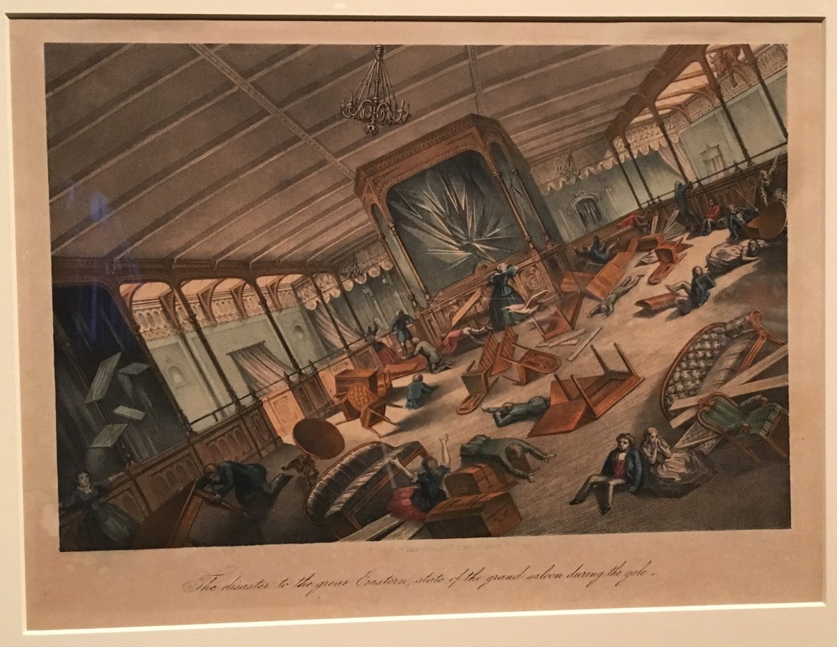
is on show at the Victoria and Albert Museum. Ocean Liners: Speed and Style brings together the design, art, engineering and architecture of ocean-going vessels and how much we love them.

Oh, how I wish I could have crossed the Atlantic in the heyday of the ocean liner – as long as I had been fabulously wealthy, had a first-class cabin, a pile of luggage which would fill the average family home, and could have spent four days luxuriating in beautifully decorated interiors, taking in the sea air from a comfortable deckchair and danced through the evening in my finest gowns in a glittering ballroom.

Of course, most people had rather a different experience of sea crossings – certainly in the early days of ocean travel. I rather liked the painting by Louis Rochefort from about 1881, of stormy mayhem on the Great Eastern when the rudder broke and passengers endured three days of rolling the waves. It must have been a relief to step on dry land after that voyage.

img_9354.jpg

This show, Ocean Liners: Speed and Style at the Victoria and Albert Museum concentrates more on the fabulous opportunities for designers which these floating palaces offered.  The inter-war years of the 1920s and 30s saw a huge expansion of travel from Europe to America and all over the world.  Clearly there was competition between the shipping companies to create the largest, the fastest, the most fabulous vessel. The poster’s of the day celebrate the sleek lines, the fantasy of calm, untroubled waters, the abundance of food, drink and entertainment. What a way to travel!

I loved seeing the art which is on abundant show in this exhibition. For example, Stanley Spencer was commissioned to record industries involved in World War Two. Spencer visited the Clyde shipyards and sketched the different activities – hammering, riveting, lifting, pushing – and created a stunning panorama of the workplace.


It was also a joy to see a mural by Edward Bawden, commissioned for the first-class lounge of The Oronsay, which depicts the joys of the English pub. Wonderfully witty.

There’s a frisson of fear to be felt when viewing two items from the ill-fated Titanic. There’s a deckchair, found floating in the sea after the ship had gone down, and also a carved wooden panel which had once adorned the first-class lounge, which must have bobbed to the surface after the ship broke up. Both pieces convey a chill atmosphere of the disaster and a sharp reminder of the risks involved in ocean travel. This is the first time either of them has been back to their country of origin.


Then there’s  fashion, the luggage, the gaiety and the fabulous marketing posters. It’s all  on glorious display to offer the fantasy voyage.


And I loved the furniture – there are so many examples of chairs, from the ones which are helpfully nailed to the floor, to the comfortable cabin armchairs and stylish seats in elegant lounges.


And finally, I can add my own, personal postscript to all this. When I was 10 years old, my family sailed from New York to Southampton in the Queen Elizabeth.  It was not a particularly rough journey but it was foggy for most of the four days at sea and the horizon seemed to tilt a lot. But, for a child, it was very heaven. Wall to wall food and drink, plenty of play areas, films to watch, shows to see, a whole ship to explore.  It was thrilling.  And I was delighted to see a vast model of the stalwart liner right at the entrance of the show. My brother, who has a forensic memory of the journey, informs me that our cabin was on F deck a the back of the ship, just above the water line. That might explain why there was nothing to see out of the porthole!


Ocean Liners: Speed and Style is on show at the Victoria and Albert Museum from 3rd February to 17th June 2018.

vam.ac.uk  Sponsored by Viking Cruises  


Who’s King? Charles I demonstrated his cultural credentials by amassing an astounding collection of art, which was scattered to the wind in the ultimate yard sale after his head was chopped off and Cromwell took over Britain. The Royal Academy of Arts’s new show, Charles I: King and Collector fills all the gallery space with sensational paintings reunited for first time since the 17th century.

Charles I was an art collector on an epic scale and, though this remarkable exhibition at the Royal Academy fills every corner of the gallery with glorious art, it by no means represents the full collection which once graced the walls of royal residences in the early 1600s.

Charles I was educated, spoilt and phenomenally vain. He loved a portrait and was lucky enough to meet, and become friends with Anthony van Dyck, a super-talented painter who made countless images of the mighty monarch.  In terms of image manufacturing van Dyck

was an essential and supremely confident confederate for Charles.  In rooms devoted entirely to images of a king who, ultimately, lost touch with reality, as well as his head, we are left in no doubt as to how he would have looked and how he wanted to be seen.  Drooping eyebrows, disdainful eyes, full and sensuous lips framed by a twirled moustache and neat pointy beard, the king’s image  must have been easy to describe and it’s no wonder that he was recognised and captured after losing the civil war to Oliver Cromwell and the Puritans.  Cornered in the Isle of Wight (after some thrilling escapes, clever outwitting of Parliamentarians and the fierce loyalty of aristocratic families and landowners who hid him) the end was brutal – a public execution on Whitehall before a baying crowd in 1649.

The Commonwealth Sale of the Royal Collection (to recoup money after the ruinous war) got underway at Somerset House soon after the king’s death   This show, Charles I: King and Collector reunites 140 of the most important works which have not graced the same walls since the seventeenth century.  The information cards next to each painting often included the price gained for a painting.  Some major works by leading Renaissance painters, such as Rubens or Titian might have made over £100 but some went for peanuts –  there’s a magnificent portrait by Rembrandt of his mother which went for a mere £4. The mind boggles!

255800-1330621692

The variety and quality of the paintings is breathtaking.  For me, the stars of the show were a series of portraits by Holbein the Younger, most of which are now in the Royal Collection, which show the extraordinary ability of the artist to really ‘eyeball’ his subjects and capture spirit, character and personality through the sparest amount of pencil marks or strokes of the paintbrush.

The show is on until 15th April and is bound to be very popular but I do recommend catching this one if you can, not only for the glorious works on show, but for the insight into an unrivalled collection of art in the history of English cultural investment.  Sponsored by BNY Mellon, in partnership with the Royal Collection Trust.

http://www.royalacademy.org.uk @royalacademy @royalacadmyarts

Rhythm & Reaction: The Age of Jazz in Britain – a foot-tapplingly wonderful show which traces the arrival of Jazz 100 years ago and the influence it’s had on culture, art and ordinary life.

For an immersion in the world of jazz, and a chance to learn more about its evolution, I recommend you hop or jive down to Two Temple Place to see a really lovely exhibition called Rhythm & Reaction, the Age of Jazz in Britain.

It’s 100 years since the first Dixieland Jazz band arrived in London and caused a sensation but, according to Catherine Tackley, Head and Professor of Music at Liverpool University, the curator of this show, the word and the concept had already arrived.  The argument of this show is that jazz is a concept, not just a description for music  influenced by African American culture.  Jazz infiltrated and infected all kinds of art from film to dance to design and in the way we could listen to music – encouraging everyone to buy records and play them at home!

IMG_9244
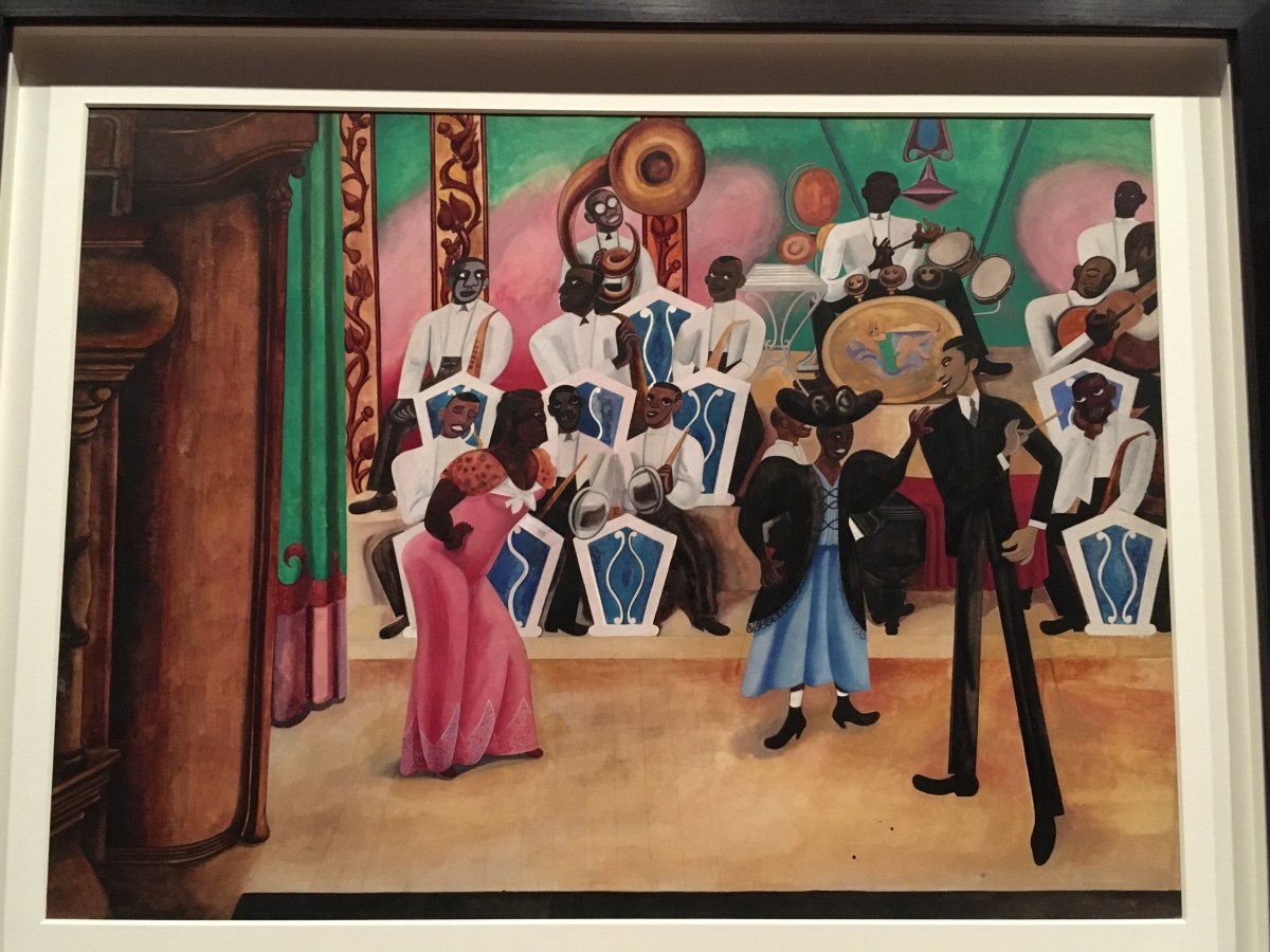
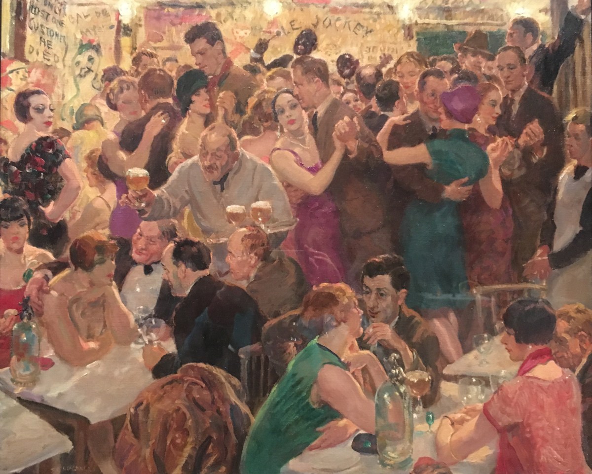
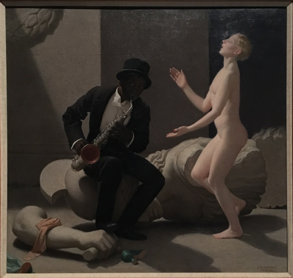
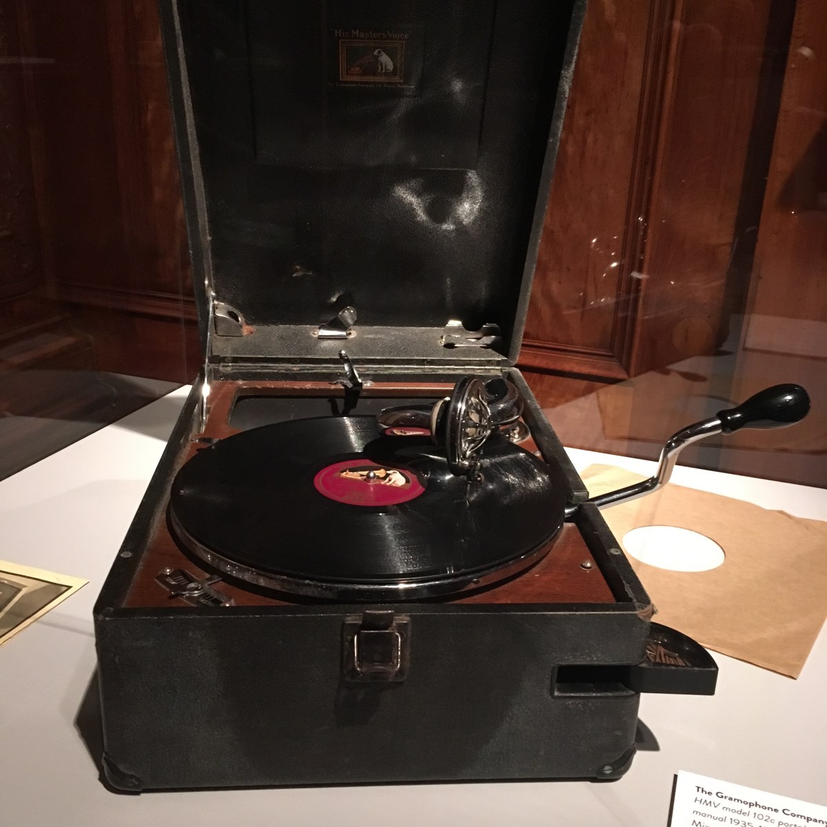
British jazz emerged and was embrace pretty quickly and it’s great to see evidence of its far reaching influence through the assembly of so many objects.  I particularly enjoyed some of the art which has been collected showing crowded dance halls, nightclubs, impromptu
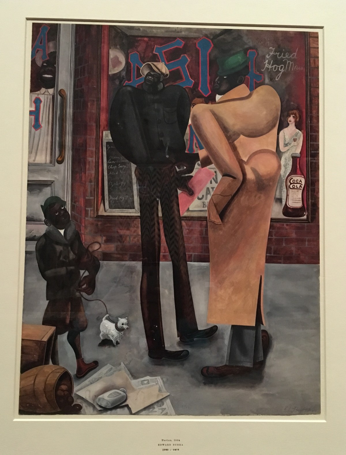
 dancing on streets and some wonderfully stylised paintings.  I’ve featured a trio of works here –  two by Edward Burra and one by Thomas Cantrell Dugdale.

IMG_9253
Edward Burra, Harlem, 1934 Watercolour
IMG_9255
Edward Burra, The Band, 1934, Watercolour
IMG_9259
Thomas Cantrell Dugdale, Night, 1926 – a small nightclub with barely room to move


IMG_9249

And this extraordinary work by John Bulloch Souter called The Breakdown 1962, brings a surrealist element to the depiction of jazz and highlights the inevitable racist element which existed in early jazz, performed mainly by black artists.

There’s a great collection of instruments too which make you long to hear them being played. And some surviving shoes which bear the scars of energetic dancing.


This show is great just to roam around, soaking up the atmosphere of jazz, from the black and white films of performers to the constant background playing of great music. It’s fun to see the jazz effect on ceramics, wallpaper and sculpture.


And it’s always a treat to have the chance to explore Two Temple Place which is an astonishing Neo Gothic Mansion built by William Waldorf Astor in 1895 which is full of sensational carving, stained glass and fabulous friezes which adorn the gracious rooms.

This show is on until 22nd April 2018.  http://www.twotempleplace.org


Top Drawer – a trade fair for gifts, crafts and stationery which is full of good things, including lots of wonderful paper!

Top Drawer is the ultimate place to go to seek out the newest, whizziest and most innovative gifts, crafts and stationery.  Walking up and down the aisles of this show at Olympia I was dazzled by the variety of new and beautifully designed objects on show and the quantity of makers and suppliers who just adore what they do.

Of course I was particularly keen to see what new paper is around and I was not disappointed.  It’s very heartening to see that artists and designers have taken the plunge and found a way to turn their creations and artwork into wrapping paper and stationery.   I did the rounds and chatted to a few stand holders – again, it was that gleam in the eye of total delight which impressed me.

So, all I can do is include a few shots of some of the papers which really grabbed me and I hope that the fair went really well for the makers.

Loved the work of Cambridge Imprint and the wonderful hand-blocked papers in beautiful colours.


I liked the cheerful designs by Emily Brooks

And hats off to Natasha Jade for finding a way to turn her art into really lively wrapping paper and cards.

Glorious work on show at the London Art Fair in Islington with a satisfying amount of paper collage art on display: 17 – 21 January 2018.

The London Art Fair is celebrating its 30th year and the show runs from 17 – 21 January at the Business Design Centre in Islington.  I’ve been going to this show for years.  It’s not to large and not too small….just right for a couple of happy hours scouring stands from some of the world’s top galleries and having the chance to see what’s new, what’s current and what’s fashionable. 

There’s a reassuringly high proportion of contemporary art on show but clearly a strong showing from ‘mid-century’ artists such as John Piper, Matthew Smith, Jacob Epstein, Eileen Agar et al. 

Being a paper artist myself I’m always helplessly drawn to works which have been made by fellow paper enthusiasts. So I’ve included photos of some of my favourite finds at this year’s fair.  On balance, I think the standard and quality of work was very high.  For example, if there’s a John Piper in the room I’ll make a bee-line for it.  I love his energetic collage work mingled with pen and ink and a variety of media.  You can see he’s used wax as ‘resist’, bits of paper stuck on top of the drawing giving it the collage credentials plus a mix of ink, wash and gouache. I rather think it must have been done at high speed too.  This was at the Christopher Kingzett stand.

IMG_9013 (2)I was really fascinated and impressed by the work of Marzia Colonna. She is a real collage artist working on a grand scale. This collage of West Bay (of Broadchurch fame!) is 44 x 71 inches – pretty massive – and wonderfully painterly, from a distance.  I took a close up of the work too to see that she’s used a variety of pre-prepped paper. Very inspiring.  This was at The Portland Gallery stand.

IMG_9024 (2)IMG_9026 (2)
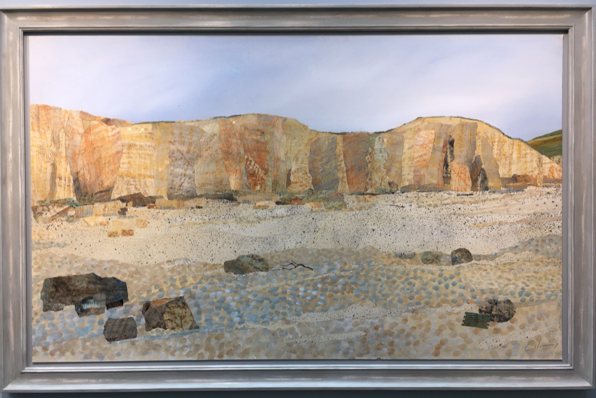
I was very intrigued by the work of David Wightman.  I know about these textured wallpapers which can be used in so many ways. (I use them too, but in a more random way). He’s used them with great precision cutting to get a very impressive effect which incorporates great colour and tone to cleverly create a sense of perspective.  These pieces were on show at the Long & Ryle.

IMG_9036 (1)IMG_9035 (1) And finally, there’s Peter Clark, a stalwart collage artist who makes wonderfully entertaining and variety-packed works.  This year we’re seeing fish, and what jolly things they are.  I took a photo of the Blue Smoked Fish and Smoked Salmon at the Portland Gallery. Who says art has to be serious!

So, I’ll be ripping up my paper with renewed confidence and pleasure safe in the knowledge that I am not alone in having a passion for paper!

The London Art Fair  http://www.londonartfair.co.uk  17 – 21 January 2018, Business Design Centre, Upper Street, Islington, London N1

From Life – drawing the human body has always been a challenge for artists. The Royal Academy presents a brief history of life-drawing, with examples of work by contemporary artists and also a ‘virtual’ body of work…

I’ve been grappling with life drawing for years – it is the most difficult thing. You’d think that we humans have a pretty good idea about the shape, form and proportion of the human body yet it’s a constant battle to overcome the brain’s perception of what is seen and find a way to translate what is seen in front of you to something drawn on paper, card, canvas or in sculpture.

It fascinates me that an interest in portraiture and life drawing started with the Renaissance artists who were inspired by sculpture from the classical world. Seriously, did nobody do any life drawing or portraiture in the intervening 1500 years?  Were these skills ‘lost’, can this be true.  I’m intrigued by the remarkable Fayum portraits (Mummy portraits), painted over 2000 years ago, which were clearly made from life as a real likeness of the subject and then buried with the mummy, placed over their face as a lasting memorial of that person’s appearance.  The Greeks and Romans really LOOKED at humans and made the most sensational art based on what they saw. Then, for some reason, artists stopped representing what was in front of them and started making art which represented what the people were, or how they lived, or how they would like to be represented.  Anyway,  thank goodness for life-drawing.  It’s the ultimate discipline for training the eye to really SEE what is there and make a bold attempt to capture it.  Life Drawing has been the bedrock of artistic training for centuries and so it should continue, I believe.

The new show at the Royal Academy takes us from the early life-drawing classes established with the RA Schools in 1768 up to the work of contemporary artists and into the new arena 3D virtual reality.  I enjoyed the paintings by Zoffany and (attributed) to Hogarth of eager students peering at plaster models.  Then there’s a mix of life drawings of Iggy Pop before examples of work by Antony Gormly, Chantal Joffe, Jonathan Yeo, Gillian Wearing, Jenny Saville and many more.

I was blown away by the virtual reality experience created by Yinka Shonibare RA in a separate space where, encased in a head set, you find yourself transported in front of and then walk THROUGH a neo-classical painting he has produced and beyond into a wonderful, paradise of classical idealism. I could quite happily have stayed in that virtual space for some time but it was probably a couple of minutes before I had to give it up and return to the grey light of Piccadilly on a December morning. Hey ho.

Above: Self-portrait with hand on hip by Chantal Joffe, Sculpture and painting, GThe Preserving Machine by Jonathan Yeo

Images from favourite childhood books seen up close and personal at the V&A. The wonderful world of Winnie-the-Pooh – illustrations and texts on show in an enchanting exhibition.

I know not everyone enjoyed the stories of Winnie-the-Pooh or the poetry of A.A. Milne, but I did.  I can recite great tracts of verse from When we were Very Young or Now we are Six. Don’t get me started on James, James, Morrison, Morrison… you will regret it because I know the WHOLE thing!  But I could also tell you the basic story line for most of Christopher Robin’s adventures and I must have spent many an hour of bedtime reading poring over the maps of the Five Hundred Acre Wood and fixing in my mind just where everything is.  I’ve always had a thing about maps and it could well stem from that early exposure to sketched out paths, copses, streams, bridges and the homes of key characters.

IMG_8348

I also really loved the drawings as a child without having any notion of how they were made, why they felt so relevant and how true to the characters they were.  The exhibition at the Victoria and Albert Museum on Winnie-the-Pooh: Exploring a Classic will be wonderful fun for any Pooh enthusiast like me or for a younger who might just be getting to grips with the world of young Christopher Robin and his friends.

Much of the exhibition is nicely laid out at child height and there are some great interactive elements such as a Pooh-Sticks bridge with a constant flow of (digital) twigs and bits and pieces flowing under it.  On press preview day there were several children obligingly ‘throwing’ sticks and clutching red balloons (a very useful object for Pooh when honey hunting) while adults peered with fascination at the more historical exhibits higher up on the wall.

I really enjoyed seeing E.H. Shephard‘s initial doodles and drawings. You can really see the way he used pencil sketches to feel his understanding of the character before creating the finished illustration in pen and ink.  It was also great to see how imaginative the publisher and book designers had been in using elements of the illustrations in a non-obvious way, taking details and placing them elsewhere on the page.

IMG_8347

Of course there were exhibition spaces filled with the stuffed toys like the ones owned by Christopher Robin who triggered thoughts of Tigger and Piglet along with the quantity of merchandise soft toys, games and films which followed.  But for me, I think the most exciting part of the show was to see the earliest and most experimental of illustration ideas and how the author and illustrator almost melded into one combined being, both sharing and expressing the idea in complementary ways.  A true meeting of minds.  An enchanting show.  9 December 2017 – 8 April 2018

IMG_8357