Queer British Art 1861 – 1967 at Tate Britain – a new show of ambivalent art has just opened in London

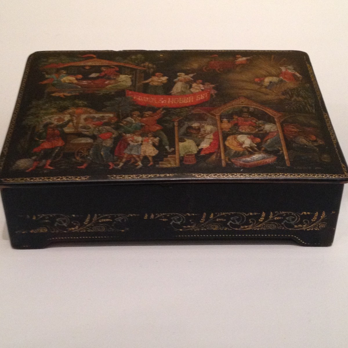
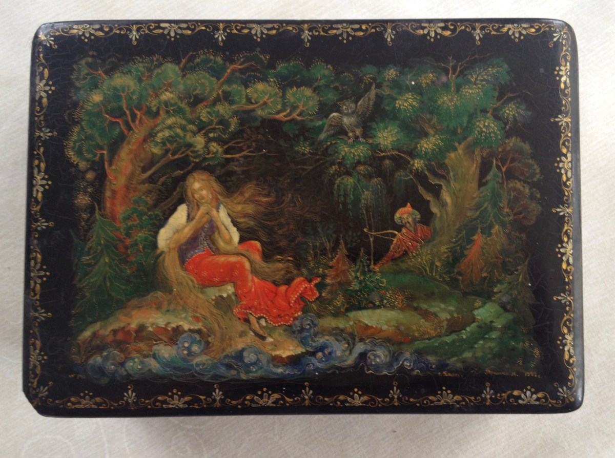
This new show, Queer British Art 1861 – 1967 at Tate Britain contains artworks which convey a whole range of emotions – wistfulness, joy in the human form, humour and suffering.   It’s a fascinating compilation of works on canvas, paper, photography and sculpture.  The unifying element is the sensuality between same sex affection or simply a voyeuristic celebration of the human form with a strong dose of lust thrown in.

So many fascinating characters feature in this show. Quite rightly we have Oscar Wilde, Quentin Crisp, Radclyffe Hall, Cecil Beaton… well known names.  And of course so many of our greatest artists have been, and are, gay.  It’s good to have a show which celebrates their contribution and their sacrifice.

It’s always hard to pick out favourites from such a large and diverse show, and there are some ‘old friends’ too such as Dame Laura Knight‘s wonderful self portrait with the full length female nude which we can usually see at the National Portrait Gallery.

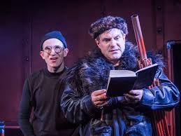
I was particularly struck by the playful and subversive collages made by Joe Orton, the playwright, and his boyfriend Kenneth Halliwell.  I rather like the story that the pair used to borrow and steal books from libraries around Islington and cut out some of the illustrations which they used to decorate the walls of their flat in collage form.  Then they started ‘adding’ to book covers, introducing collage elements from other sources and completely redefining the design.   They were eventually caught and jailed for six months for ‘malicious damage’.

The end of the story is not happy. The prison experience ruined Halliwell and contributed to his alcoholism and he murdered Joe Orton.

And I’ve already spotted a gratuitous link between a very fine bronze figure by Hamo Thornycroft, made between 1888-90 and that very famous photograph of Aidan Turner as the sun-bronzed Poldark in the TV series as he prepared to do a bit of scything!

The charming ladies of the Women’s Institute at their annual WI Fair at Alexandra Palace welcomed Papershades at today’s presentation

Unaccustomed as I am….. Yes, public speaking has not been my thing before so it felt pretty amazing to find myself on a stage in the Great Hall at Alexandra Palace, giving a talk about Papershades to an audience of 100 or so discerning ladies from the Women’s Institute.  This was the annual WI Fair and it’s a terrific event – there’s a wide range of talks and workshops and hundreds of stands selling clothes, toys, crafts, artworks, food and drink from enterprising entrepreneurs. It last four days; there’s Friday and Saturday to go.

And what an experience!  Of course it’s nerve wracking but I had a very strong feeling that the audience was on my side. They laughed at my little jokes, responded to my passionate story telling with encouraging nods of the head and pleasant smiles.  I was given the lunchtime slot which turned out to be rather special – time for a sit down and a sandwich and, well, let’s see what this paper lampshade business is all about.

I presented my range of six floral paper lampshades and then, with a metaphorical waft of the hand and imagined fade/dissolve I took my audience back in time to the moment when my passion for art took hold and the need to make collage found form.   It’s quite cathartic telling a life story in public and I probably sounded pretty impassioned when talking about my art school experience and the various stages of creative development which have culminated in the creation of Papershades.

So I thank the Women’s Institute for inviting me and feel very honoured that my first experience of speaking about my life and art was delivered to such a sympathetic and delightful audience.

Howard Hodgin: Absent Friends. Very moving exhibition at the National Portrait Gallery.

Walking around this remarkable exhibition of work by Howard Hodgkin:Absent Friends at the National Portrait Gallery you can feel the presence of the artist very strongly.  Less than two weeks ago we heard that he had died, just as the first of 50 portraits were being put in place at the gallery, a sad irony. However, Curator, Paul Moorhouse, said that Hodgkin had been delighted to hear that his portraits were being assembled for a major retrospective, “at last”.

Hodgkin has been a central figure in contemporary art for some 60 years.  Clearly he was prodigiously talented as a child and his family encouraged his artistic interest.  Not much from his early years survives but some fascinating sketches have been included in this exhibition.  Looking at them you would think that they must have been done from life but no; apparently they were done from memory some time after the event.  What concerned Hodgkin was the idea of memory and how memory selects what feels important about a person, a scene or an experience.  As Hodgkin’s work evolved he developed a very individual ‘language’, a way of conveying emotion, memory and sensation through the bold and colourful use of oil paint.

IMG_6216IMG_6218


It was fascinating to learn that so many of Hodgkin’s portraits were made at a distance; not for him the studio ‘eye-balling’ of his contemporary, David Hockney.  Hodgkin’s aim was to conjure the personality, the feeling and the environment of the person or people in the portrait.  Although the gestural brush strokes and strong, clear colour give the impression that his portraits might have been done in a whoosh of energy over a short span of time, the opposite is true. He took his time over each picture, apparently putting them away to revisit it at a later date, building up the layers of paint to create texture and deepen colour. His use of colour opposites too, for instance combinations of red and green, make your eyes dance when gazing at the pictures.

The portraits are mainly of his friends, colleagues, confederates or people he loved or encountered in his life.  The idea of creating a literal likeness did not interest him.  He wanted to go deeper and create pictorial spaces which ooze personal resonance and capture private or shared experiences.

IMG_6220IMG_6227

The last room in the show contains his most recent work and is dominated by a very moving self-portrait.  Paul Moorhouse asked Hodgkin if he would like to contribute a new work to this important show.  The result was a vast canvas which Hodgkin had started work on some years ago but revisited towards the end of 2016. He was too frail to stand up and his gallery assistants supported him so that he could paint with a brush on a long stick and then smear the paint with his hands. The result feels visceral and immediate. And indeed it turns out to have been a fitting final piece from a remarkable artist.

(I apologise for my rather out of focus picture of this piece)

IMG_6225

Hop along to the Jermyn Street Theatre to see the UK premiere of The Frogs, a ‘freely adapted’ (says Nathan Lane) version of the musical by Burt Shevelove, some songs and lyrics by Stephen Sondheim

Review of The Frogs , a comedy by Aristophanes, freely adapted for today by Burt Shevelove, even more freely adapted by Nathan Lane  with music and lyrics by Stephen Sondheim

What a strange little piece of theatre this is. The programme notes for the UK premiere of The Frogs contains an amusing preface from Nathan Lane. He has been the driving force for the revival of a work which made an uneasy debut in 1974 (in the swimming pool of Yale University) and languished in a bottom drawer until he was moved to dust it down soon after 9/11 and review its ‘message’.

And what is the message? Well it’s a bit scrambled, I have to say. A bit of a ‘frogs dinner’. We are sort of in 405BC, Dionysos, entertainingly played by Michael Matus, in good voice, and his faithful slave Xanthias, a rather sweetly wet George Rae, decide that something must be done to counter the untrustworthy leaders on earth. “Do something more than just deplore.” He decides that we need a good writer to ‘tell the world the truth’. In a supposedly ‘post truth’ time this is nicely resonant.

imgres-2

The frogs of the title are referred to as the people in charge, the ones who hate change, do not want new ideas and will support only what is good for them. Yes, I’ll go with that….but this doesn’t really develop.

Anyway, our dynamic duo sets off on a trip to the Underworld and that’s where things get more interesting. To begin with we have a fantastic performance by Jonathan Wadey as Charon, the stoned skipper of the boat who navigates our travellers down the River Styx.   I think Mel Brooks would rather like him – he milked that part for every scrap of comedy and brought a strongly sinister air to this weird journey.

imgres-3

In Hades – hell, yes! – things really hotted up. We stumbled into a kind Berlin of the 1930s nightclub scene with much strutting, high kicking, eye-rolling entertainment. I was impressed by Emma Ralston who played Pluto in dominatrix style. Now she had a proper song to do which contained those ingredients you expect from a Sondheim musical – really good tune, cracking lyrics and the opportunity to bring some serious razzle dazzle to the proceedings. That scene really lifted the show.

The denouement – if that’s the right word – was Dionysos challenging George Bernard Shaw and Shakespeare to a literary duel in order to decide who to take back to earth. Who could out do the other in terms of spoken truths, epigrams and ‘isms? As it turned out, Shakespeare had the edge on Shaw (we saw some Shavian chagrin as a result) and agreed to get into the boat, sail back up to earth and give our world the poetry it needs at this emotionally stricken time.

As a play, I’d say it needs a bit of work but the evening is full of theatrical fun  – a bit panto, a bit cabaret and full of nice one-liners, some witty repartee and a couple of seriously good songs.

The absolute heroes of last night’s show were the band. Hats off to Tim Sutton for leading his tight little crew – Adam Bishop (woodwind), Oliver Carey (trumpet) and Sarah Bowler (cello) on the deck of the ship on the River Styx and creating a very strong sound.   Sondheim is not an easy composer to interpret. His music is complex with uncompromising rhythms and a demand for lyrics to fit absolutely. The cast really depended on this machine on their right to keep on the straight and narrow and they were brilliant.

Michelanglo & Sebastiano – the ultimate artistic double act of the renaissance – on show at the National Gallery, London

We’ve all heard of Michelangelo – the long-lived artist who agonised over the ceiling of Rome’s Sistine Chapel. But few of us knew that he formed a surprising 25 year partnership with Sebastiano del Piombo, ten years his junior and collaborated on some of his best work.

A fantastic show which has just opened at the National Gallery sheds light on this creative partnership showing, in delicious detail, how differently each painter approached his art and how successfully their divergent skills fused to create some sensational art.

I was lucky enough to go to the press preview and hear curator Matthias Wivel talk with huge passion about this show.   Michelangelo was primarily a sculptor and an extraordinary draftsman. He loved design and composition and his work was meticulously planned.  Sebastiano, on the other hand, was less concerned with planning and preferred to paint in an organic way, feeling his way into a picture and taking a more random approach.  You could argue that he anticipated the later freedoms which defined the work of impressionist painters.

Sebastiano understood oil paint – a medium which Michelangelo could not abide. He preferred the established method of painting directly onto wet plaster or using pigments mixed with egg temperer on wood panels. Alas, it seems this ideological difference in how to use materials was the cause of a serious falling out and the partnership ended.

It’s fascinating to look at Michelangelo’s unfinished paintings; he would complete entire figures and leave others undone.   Sebastiano would tend to use paint across the piece and build up colour and texture.  I was very struck by two portraits he made of Pope Clement VII.  The first was of a powerful and successful pontiff. The second, painted a few years later, shows him bearded, shorn, defeated and disappointed.  His political dealings with the French emperor had not gone well and Rome was sacked on his watch.

DSC_1279DSC_1281

But what a legacy of their shared work remains.  It was a joy to view these paintings, to see so many sketches and sculptures tool, which celebrate two masters of their day.


The Ends of Collage – at Luxembourg & Dayan in Savile Row. An exhibition featuring the work of Max Ernst, Richard Hamilton, Joan Miro, Francis Picabia, Kurt Schwitters and other exponents of collage art….

I think that collage puzzles many people.  Random, surreal, fragmented, simplistic… Perhaps, as children, we’ve all cut out interesting images from magazines, books or comics and arranged them on a surface in a way that pleases the eye.  In simple terms, this is exactly what many of the giants of 20th century art did and created some compelling and memorable works.

This show at Luxembourg & Dayan, a small gallery in Savile Row, central London, has gathered together a fascinating collection – indeed, a collage – of unusual artworks.  I guess the joy of the collage is the element of surprise, that moment when you fuse one image or idea with another and create something entirely new.  If you look at the Joan Miro (above), it’s called Metamorphose and was made in 1936.  It’s a glorious mix of pencil, dribbled Indian ink, a few brushes of watercolour, bits of decorative sticker and a photo from a magazine of sunbathers.  So how on earth does a piece like that get made?  Miro must have had a studio filled with bits and pieces, obviously a ready supply of art materials and, most of all, a curious mind.  There’s no reason WHY these random objects and images should fit together but it is the cleverness of the artist’s mind which creates a balance which is playful and somehow balanced.  Not everyone could do this.

Think about that famous collage by Matisse – The Snail.  It’s a fabulously random piece using pieces of painted paper arranged by the artist to great effect.  People have separated those pieces and tried to rearrange them upon the canvas differently and nobody has came close to the the satisfying design Matisse made. He saw something no one else could.  imgres

So, collage works can sometimes look beguilingly simplistic but, rest assured, the artist will have tried a great many ideas before alighting on the one which is finally fixed in place.  There’s also a much more scary and bold element to this form of art and that’s the stage when you draw or paint directly onto the piece, even though it might look quite finished.  It feels dangerous with a high risk that the piece could be trashed. When it works, the artist can feel satisfied that they have managed a strange almost psychic PUSH into another visual dimension.

I’m on a mission to see and celebrate all the collages shows I can, particularly where paper is used.  My own use of collage is more literal – I use fragments of paper like brush strokes rather than as strong compositional pieces – but maybe it’s time to give myself a bit of a PUSH! We’ll see.


Fantastic chef Rosemary Shrager will be an ace judge on the BBC’s new cookery show: The Big Family Cooking Showdown

This post is a gratuitous and loud HURRAH to say well done Rosemary for being part of the new BBC show: The Big Family Cooking Showdown.  This, as every knows, is the BBC’s replacement for the Great British BakeOff which will move to Channel 4.  We were all heartbroken to hear of the programme’s loss but this new show will fill the void – and no doubt fill our tums with delicious food and an enthusiasm for home cooking.

I must confess now that I have known Rosemary for a very long time – we are first cousins. I’ve learned so much cooking knowledge from her over the years  While she was running her cookery school in the Outer Hebrides we had a brilliant time going there as students  learning how to do amazing things to fish and seafood which came straight from the fishing boat in crates and were dumped onto the kitchen surfaces to be prepped for feasts held at a vast dining table.  My family cooking became almost sophisticated… for about a week and then we subsided back to a world of pasta and sauce.

I have a very vivid memory of Rosemary sitting in my kitchen and  looking at me in horror when I innocently mentioned that I’d never made choux pastry. “What, never ever?” she cried. “No, I’ve no idea how to do it?”  The next thing I knew the eggs had been beaten into flour in the pan on the hob and an amazing pastry paste I’d never seen before was being dropped onto baking sheets. We ate some terrific profiteroles that day!

So, huge congratulations Rosemary for getting this gig. Can’t wait to see you in action!

I made this paper portrait of her quite a while back. I surrounded her with cooking paraphernalia and food.  She’s lost a lot of weight since I made this piece of art and looks sleekly wonderful, all thanks to prunes, apparently!

Bumblebees and fifties fashion – the joys of creating Papershades!

This afternoon’s Papershades workshop was huge fun with two very talented and creative ‘students’.  There’s just no knowing what you will end up making when you come to this workshop.  Jane was thrilled with her very pretty collaged lampshade featuring girls in pretty fifties dresses.  “I never imagined I would do something like this,” she said.  Although she’d come with existing artwork and an idea of what she might do, being introduced to a wide range of possibility was seductive and sent her in an entirely new direction. And the making of this delightful retro creation was the result.

thumb_dsc_1167_1024thumb_dsc_1170_1024

thumb_dsc_1172_1024thumb_dsc_1174_1024

Fia loves bumblebees. She’d come with a photograph of one and used it as a guide for the design. It was so exciting to see Fia using paper from a bathroom tile catalogue to create her artwork and combining it with a mix of tissue paper and other printed paper.  The bumblebee looks enchanting and the flower it is about to alight upon – or maybe has just visited – looks wonderfully weighty yet graceful.

Really impressed by these wonderful shades which will now adorn their homes.

http://www.papershades.co.uk

thumb_dsc_1166_1024thumb_dsc_1173_1024

thumb_dsc_1178_1024thumb_dsc_1180_1024

thumb_dsc_1182_1024

America After the Fall: painting in the 1930s, at the Royal Academy of Arts

If I were to describe a picture and told you it featured two grumpy faces, the pin-sharp tines of a pitchfork, the steeply pitched roof of a clapboard church with a pointy window you’d probably guess that it was American Gothic by Grant Wood (The Art Institute of Chicago); it’s possibly the most iconic image to represent America in the 1930s and I was lucky enough to see this amazing painting for real at the Royal Academy of Arts‘ new show, America After the Fall.

The drawn faces of the farmer and his wife (or possibly his daughter) conjure the tough days of dust-bowl America in the 1930s, a time of economic disaster and meltdown, especially for the small farmers who were forced to leave their homesteads in the mid-west.

This show provides a snapshot of the turbulent ‘thirties which endured two recessions and, through art, charts a disillusionment with the ‘American dream’ and the end of an ‘age of innocence’. There are some really great pictures – many of which have not been seen in the UK before.  I’m familiar with works by artists such as Hopper, Guston and Pollock but it’s a joy to be introduced to other painters of that time; for example, I loved the  vivacity and colour of a domestic scene entitled Thanksgiving by Doris Lee full of delicious detail of the frenzy of kitchen activity in preparation of the feast.

img_5977.jpg

I was very struck by Daughters of the Revolution by Grant Wood – three pretty grim looking ladies upholding the traditions of the Pilgrim fathers.  Interesting and rather distasteful that these immigrant descendants feel entitled to claim a kind of supremacy over all subsequent immigrants to America.

img_5975Capturing the vitality of growing cities and rapid urbanisation I loved the painting by Stuart Davis entitled New York -Paris which was wonderfully stylised and also In Fourteenth Street by Reginald Marsh which oozes the energy and frenzy of New York.

img_5972imgres
It’s a thoughtfully and well presented show which captures a fascinating and transitional moment in American history.

The revolutionary Papier Mâché of Russia at the Royal Academy of Art

Whilst touring Revolution, the fabulous exhibition of post-revolutionary Russian art, at the Royal Academy of Art, my eye was caught by an exhibit in a glass case.  It was an example of  papier-mâché and lacquer art – a technique known as Palekh, after the village where it originated.  Palekh papier-mâché trays and boxes are beautifully and delicately painted with rural scenes and images based on Russian fairy tales and folk stories.

img_5887-1

As a paper geek I was obviously drawn to this little box and the intriguing image on the box which apparently shows life on a collective farm.

Then I realised that I’d seen something very similar before. I’d grown up with one of these boxes in the family home. It moved around with us and always contained lost buttons, drawing pins and bits of broken toys.  It had been bought from Palekh by my father when he was in Moscow in the 1950s.  As I child I used to gaze at the lovely lady with her glorious golden locks and the potentially threatening hunter with the bow and arrow spying on her. The image was painstakingly painted in beautiful colours.

For a long time I didn’t really believe that the box I so admired was actually made of paper – the lacquer finish makes it shiny and strong and provides a smooth surface for the painter.   Well, after the RA show I took a much closer look at the family Palekh box and feel very proud and pleased that we own such an amazing example of this enchanting art form.

img_5965