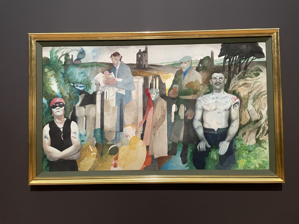
and the painted pieces which followed.")
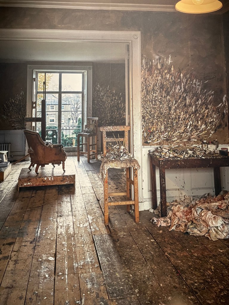
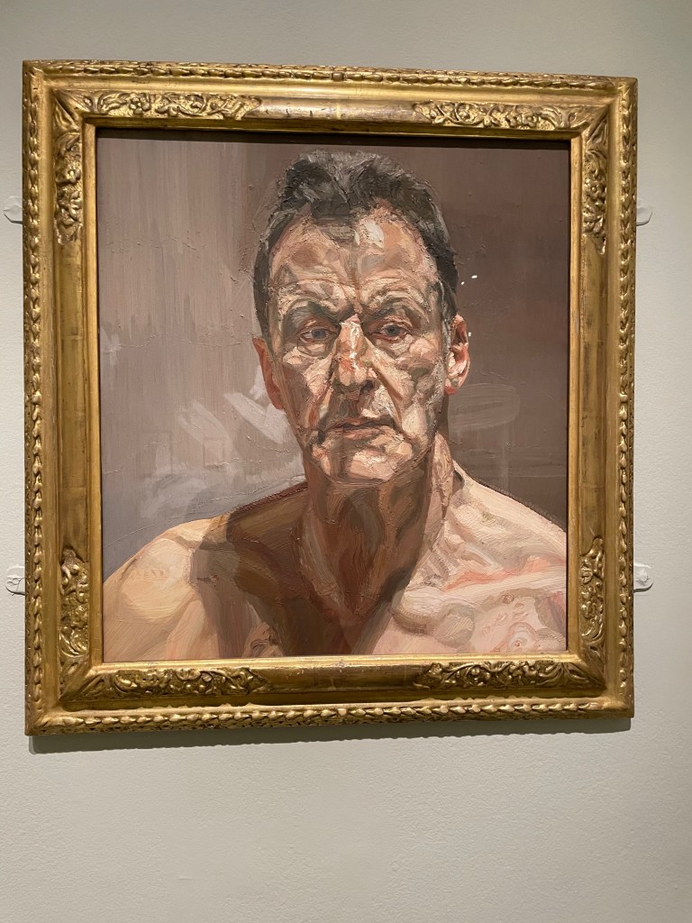
Right at the start of this show we are treated to a huge photograph of Freud’s studio in West London. It has the look and feel of one of his paintings and it’s quite moving to see the way he daubed the walls, furniture and floor with paint. Above is the picture and one of his later self-portraits.
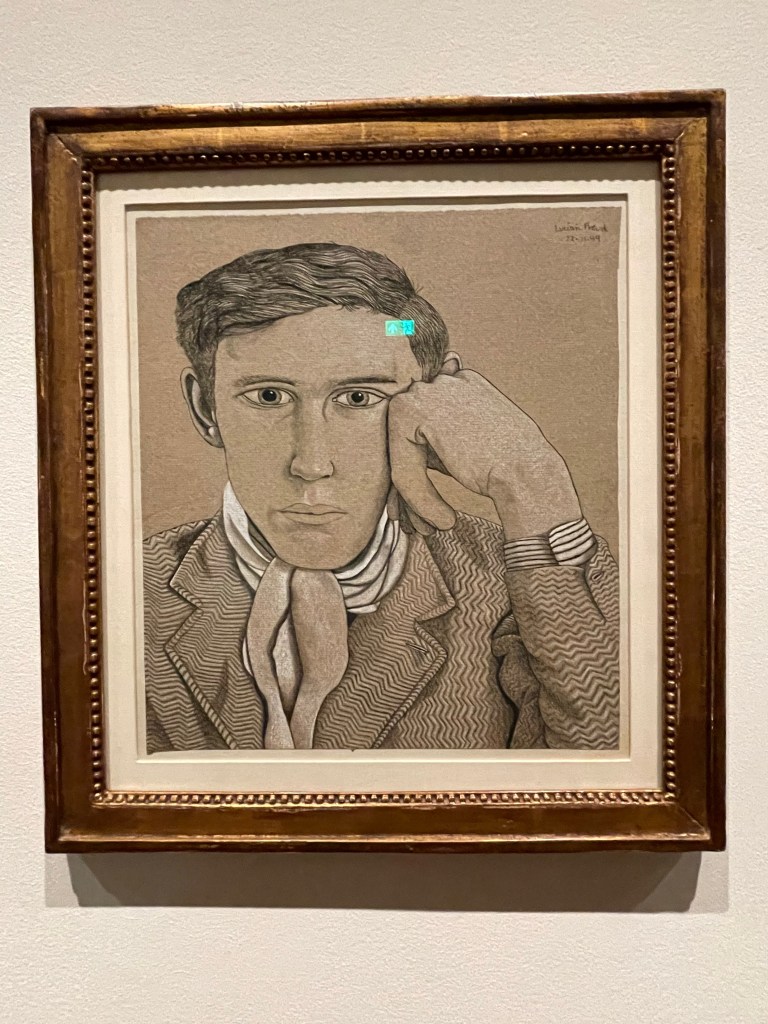
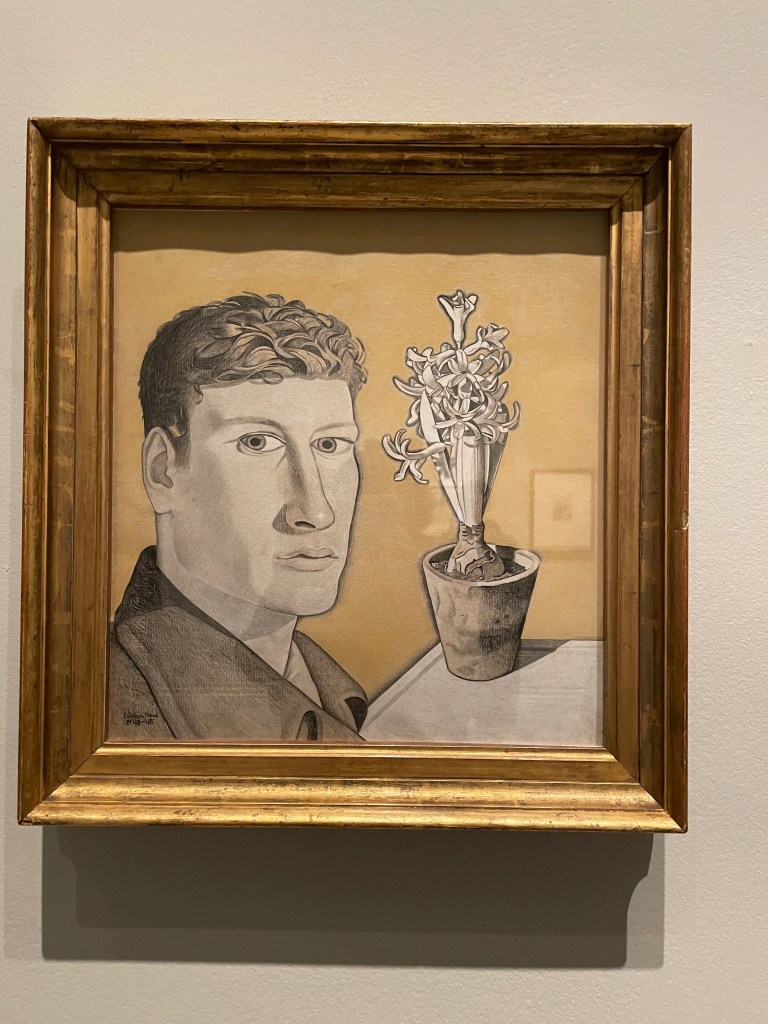
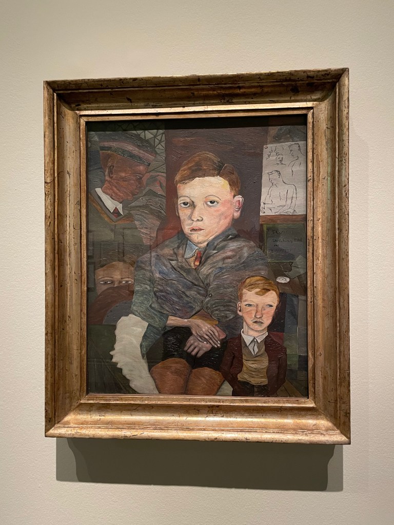
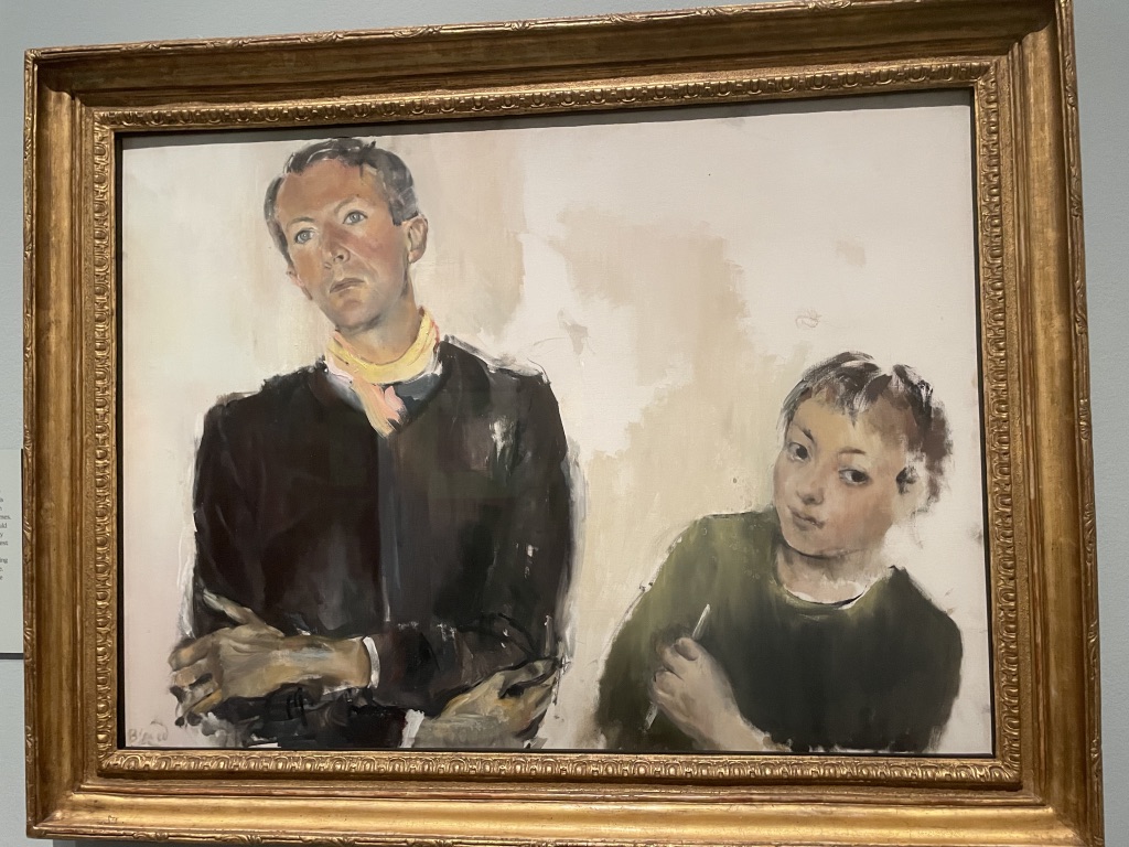
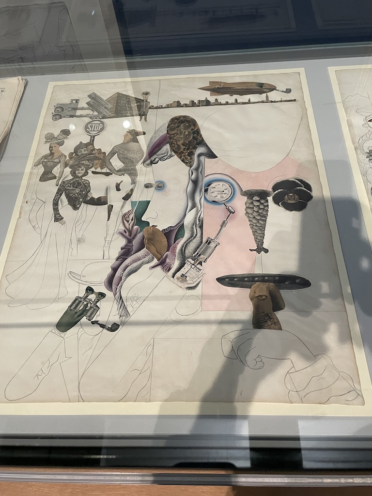
Anyone familiar with Freud’s work will know how he evolved from an artist fascinated by detail and fine lines into a painter who used large, bristle brushes and created his work from bold, expressive brush strokes. I was very intrigued by the early drawings on show. The middle one, above, is a self-portrait with hyacinth drawn with conte crayon on paper. On the left is Portrait of a Young Man and on the right is The Village Boys, which is oil on canvas from 1941 and probably painted when Freud was studying at the East Anglia School.
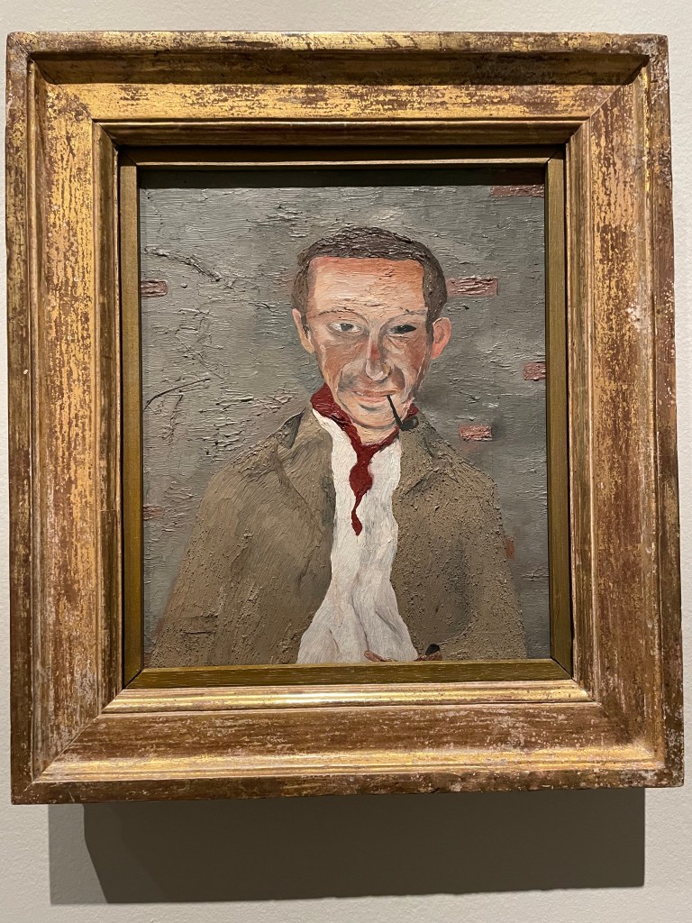
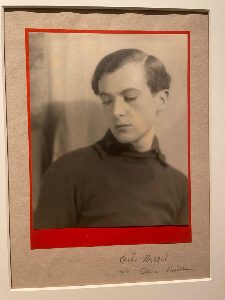
I really liked this portrait of Cedric Morris, Freud’s tutor at the East Anglian School of Painting and Drawing. Made in the summer of 1940 when Freud was only 18. It captures Morris’s character beautifully.

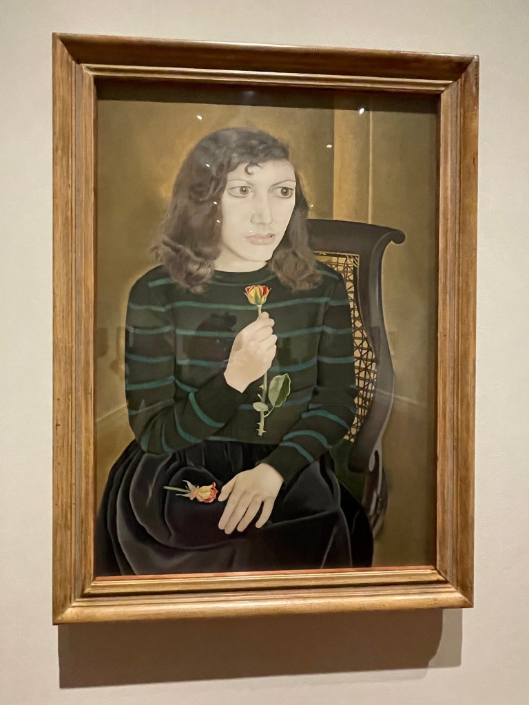
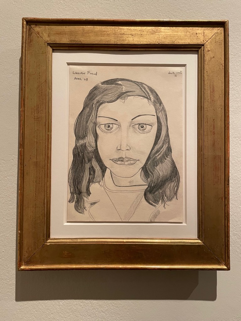
There were a lot of women in Freud’s life. Some were lovers, wives, models or simply friends. Above is a selection of the ones he loved. Above left is Suzy Boyt and centre Caroline Blackwood. One the right and above are two portraits of Kitty Garman. Quite a mixture of drawing and painting – detail and broad brush strokes.
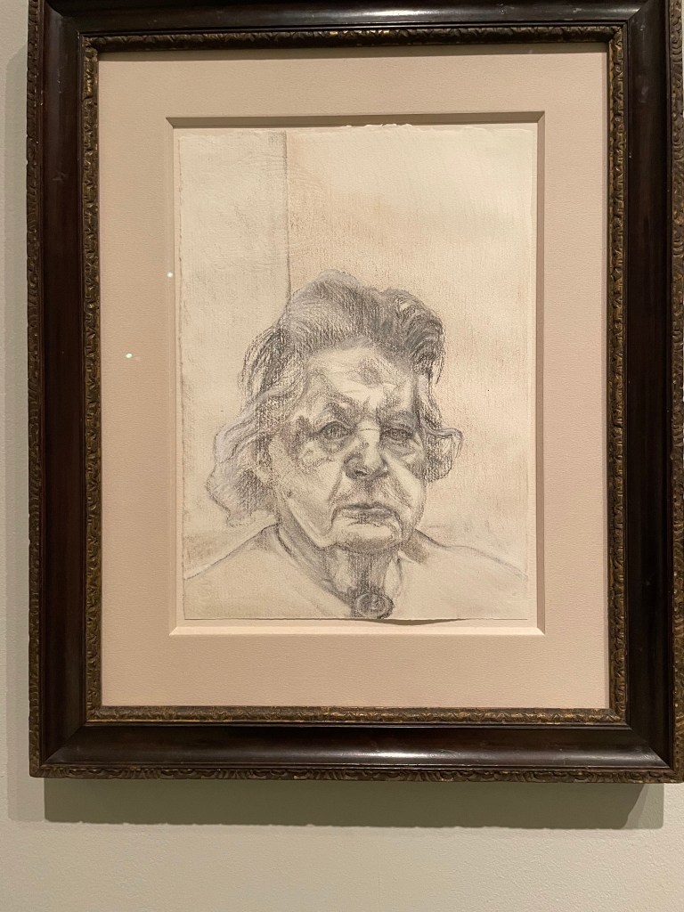
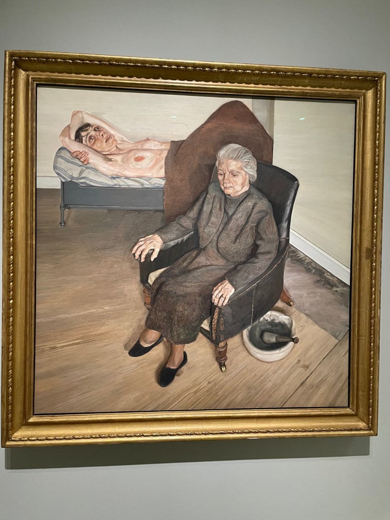
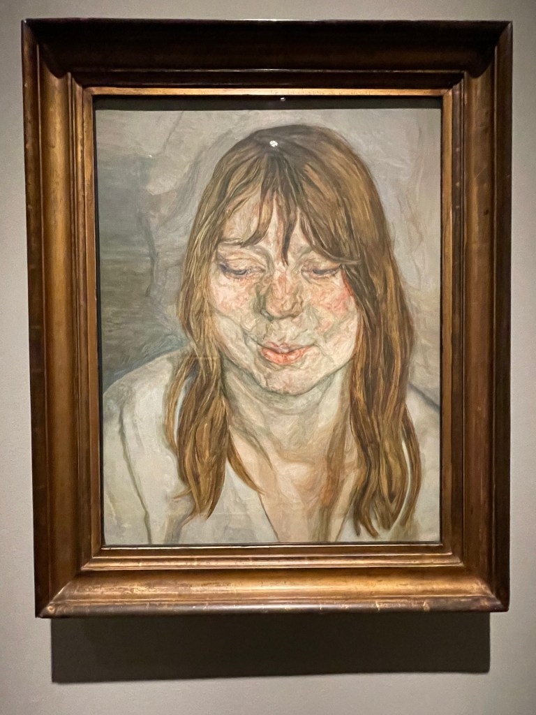
Freud’s mother, Lucie Freud, was also an important model. On the left is a very direct charcoal drawing of her from life and on the right a painting combined with a nude of Jacquetta Eliot.
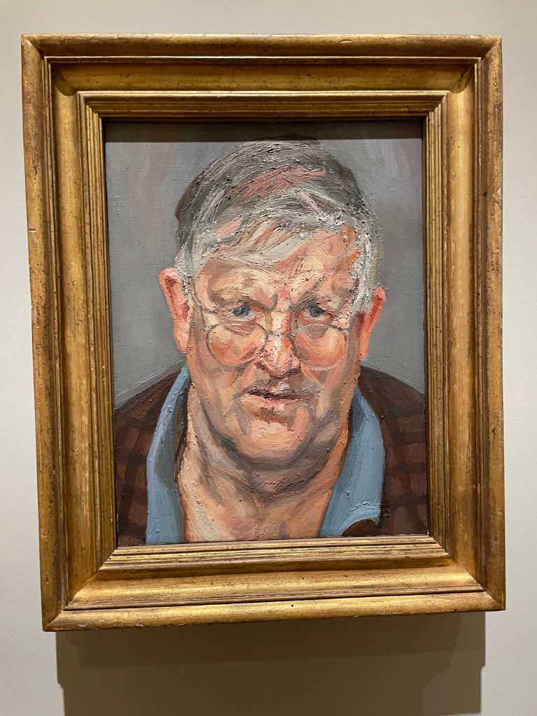
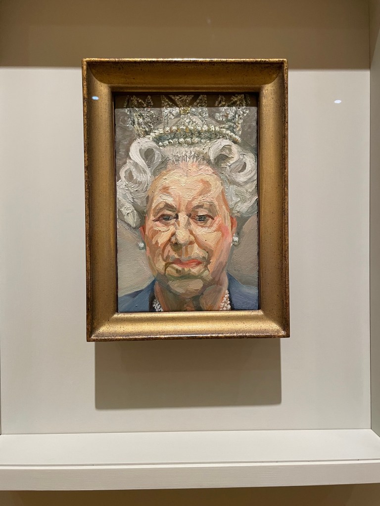
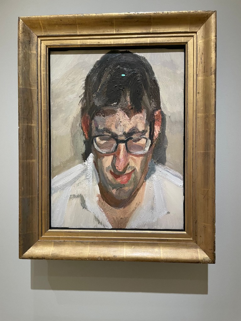
Two faces you may recognise? On the left is David Hockney, centre, the late Queen Elizabeth II and on the right is Frank Paul.
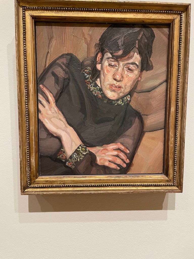
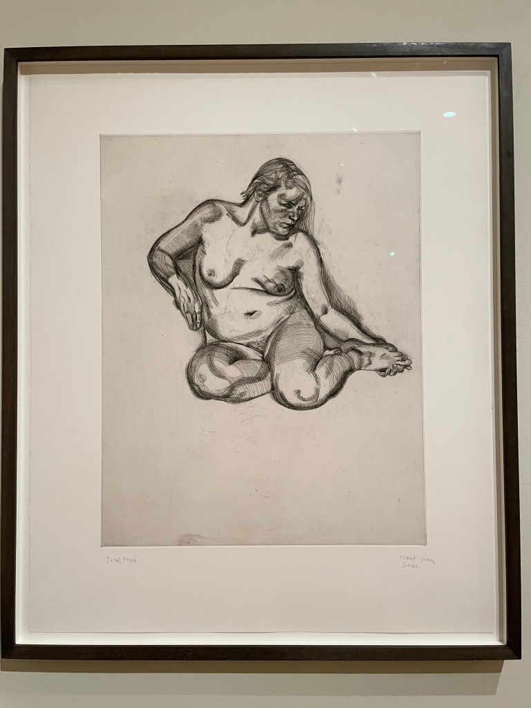
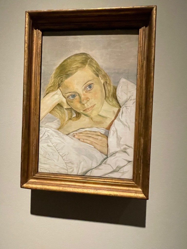
His portraits always seem to capture the sitter’s thoughts. There’s a really contemplative feel to these to portraits. On the left is his daughter Bella Freud, in the centre is a nude etching and on the right is Suzy Boyt – the painting is entitled Girl Smiling.
The show is on at the National Portrait Gallery until 4th May 2026.
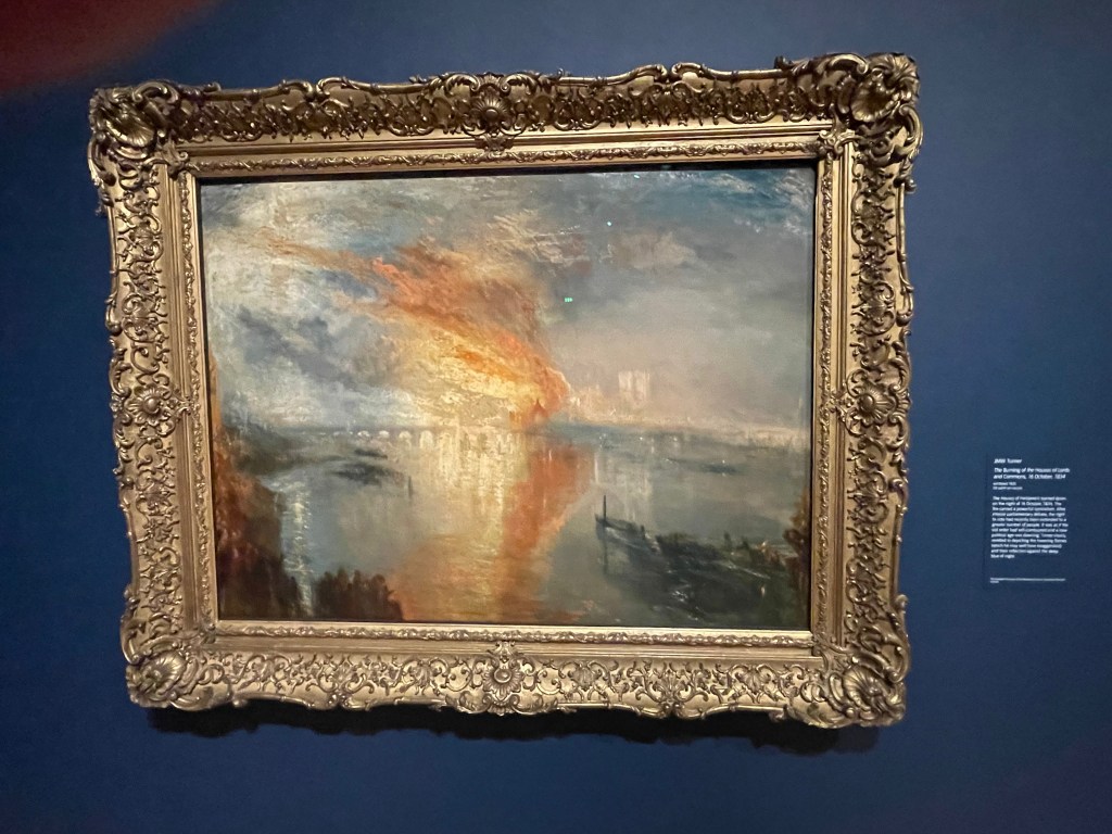
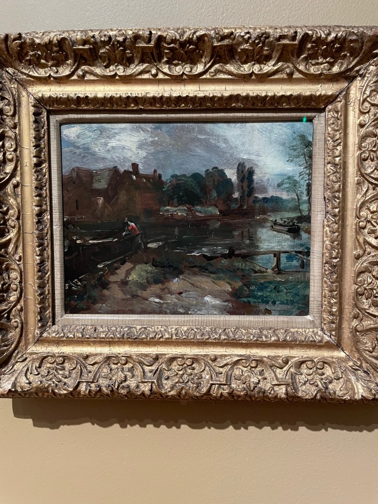
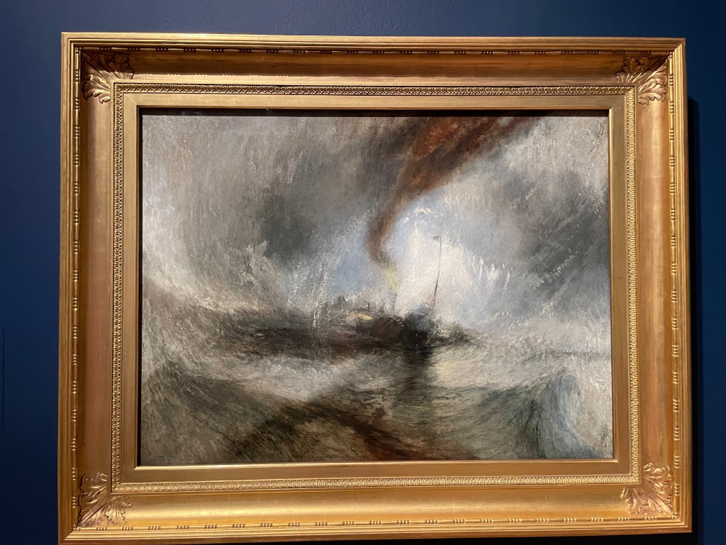
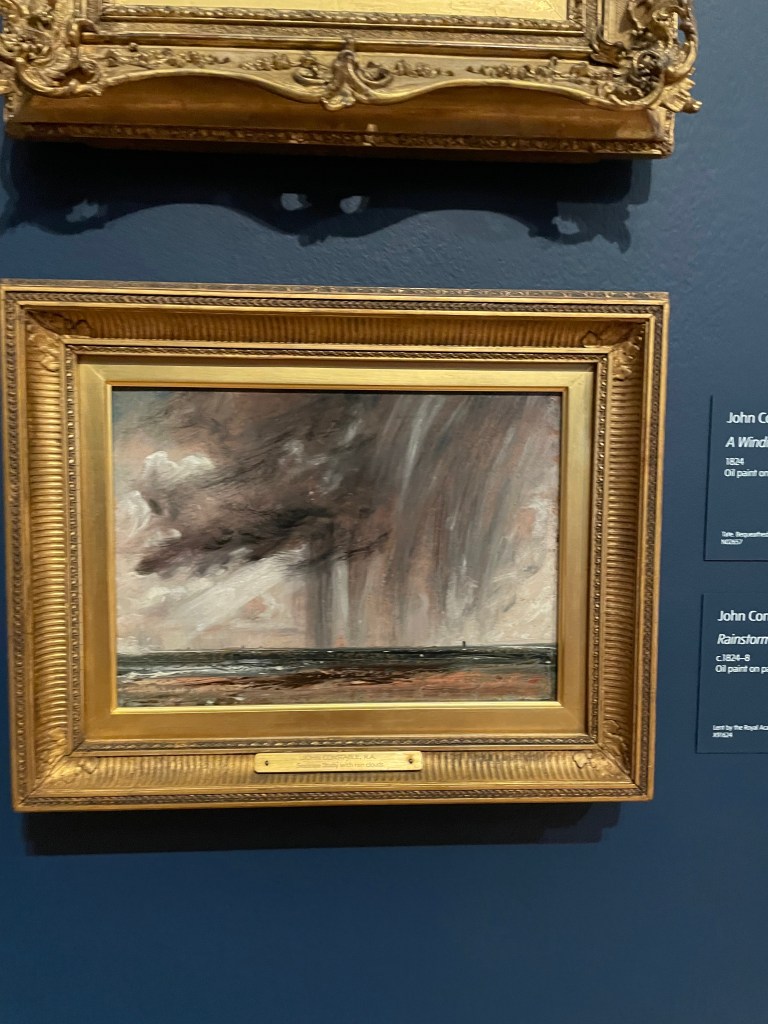
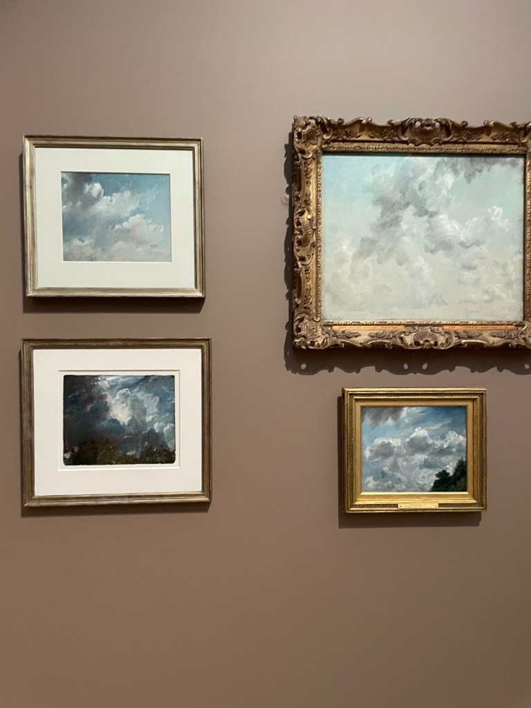
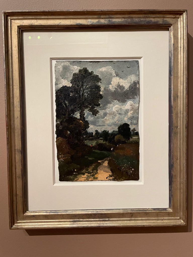
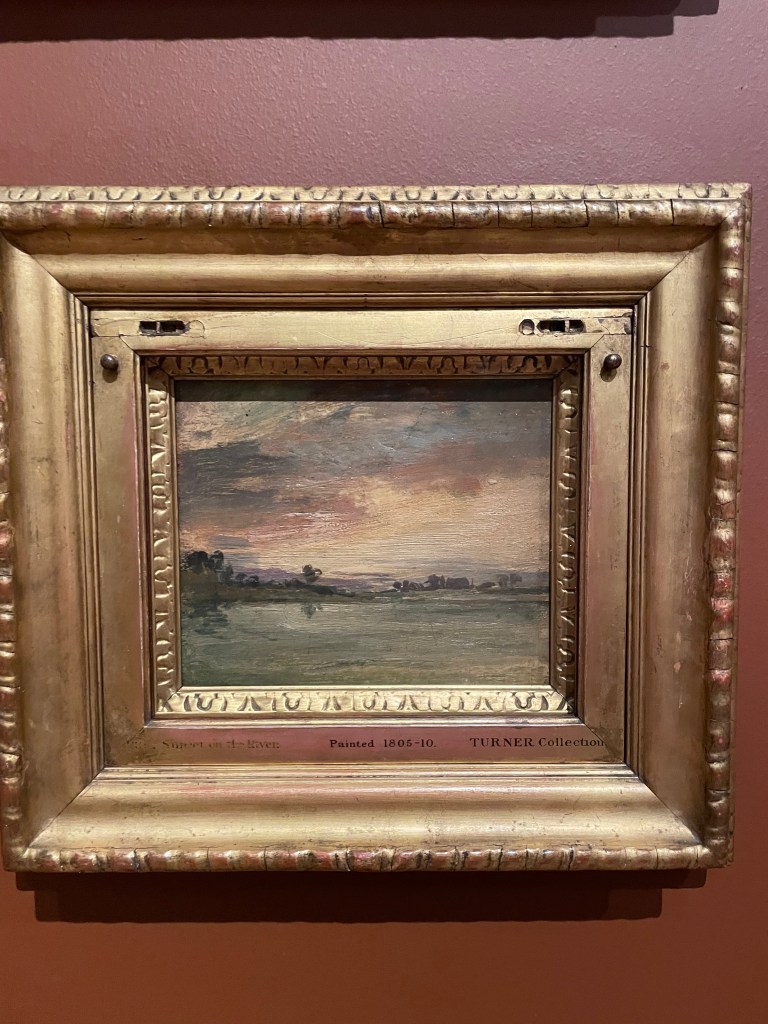
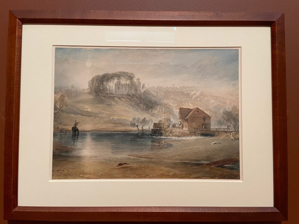
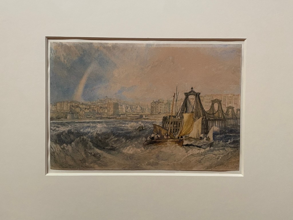
 and John Constable (1776-1837) both pushed their art into entirely new aesthetics and left a lasting legacy in the development of British art, paving the way for the Impressionist’s movement and everything that followed.")