Splash! A century of swimming and style. This exhibition at the Design Museum is a celebration of fashion, technology and politics of water, swimming and messing around in ponds, rivers, pools and the sea.

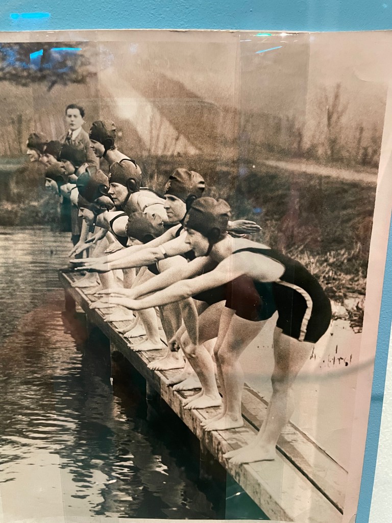
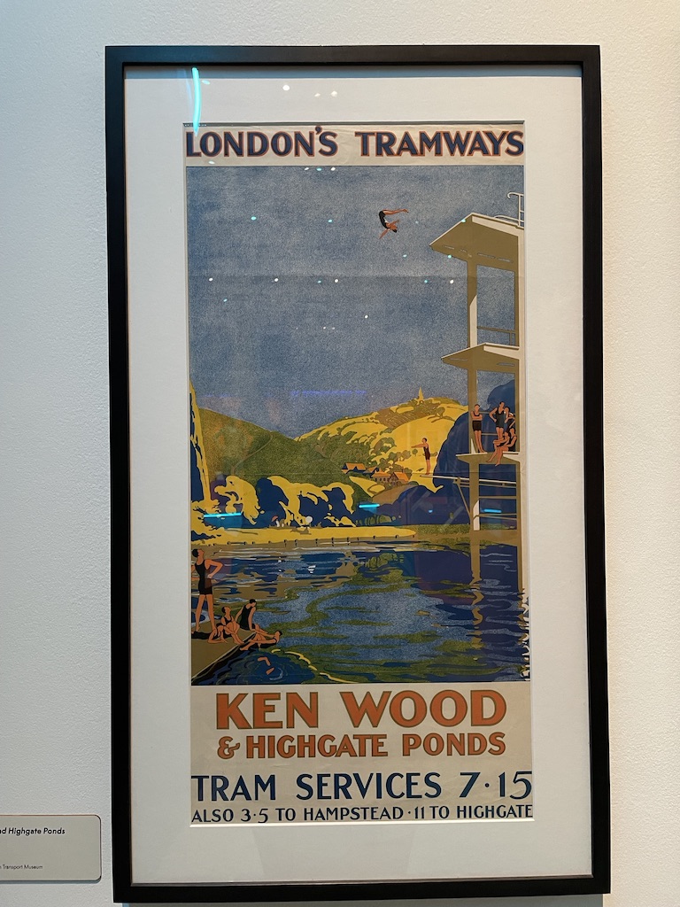
As a keen ‘pond dipper’ I was intrigued by this show and very pleased to see a reference to the Women’s Pond at Kenwood, a place I find very addictive during the summer months, but only once the water has inched its way towards at least 15 degrees and even better when it reaches a balmy 20 degrees. The poster showing Ken Wood suggests the pond nestles beneath high mountains. Hampstead Heath is not that high but I did like romance of the image.

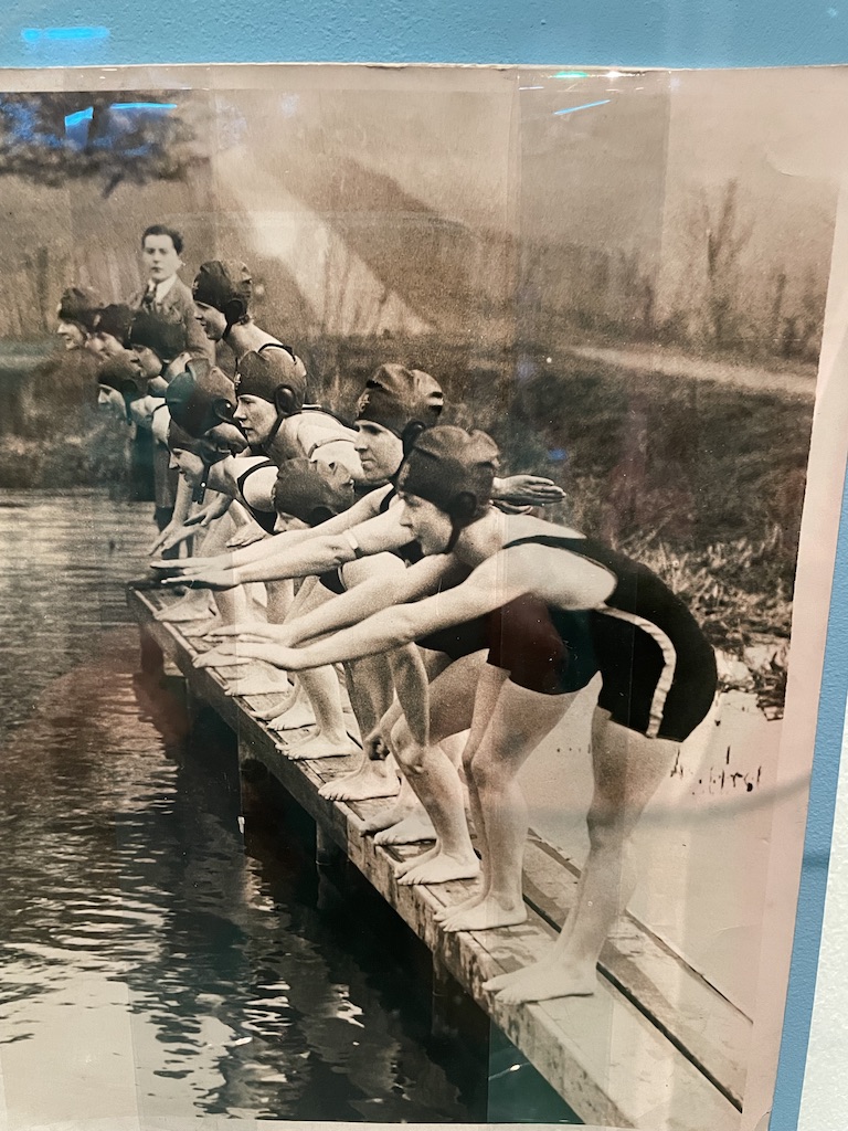
There are a great many swimming costumes on show. I remember my mother describing the indignity of wearing a woollen swimsuit when she was a child in the 1930s. The thing just spread out in the water before slapping back against her body, dragging down to her knees when she emerged from the water covered in embarassment.

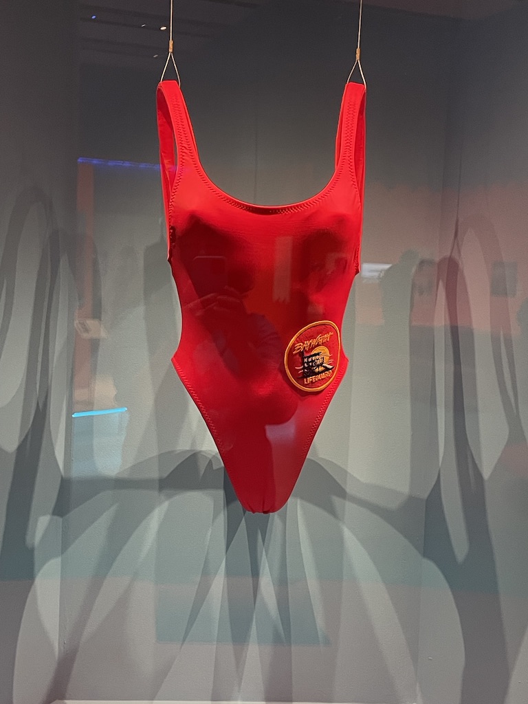
But what I’d really hoped to see was the type of swimming costume I wore as a child – blue nylon, ruched by criss-crossed elastic. I have such a strong memory of my swimsuit and the way the little triangles of fabric would fill with water, swell and then gradually empty on emerging from water. Alas, this curious garment was not represented. Instead the star of the show was the red swimsuit worn by Pamela Anderson in Baywatch.

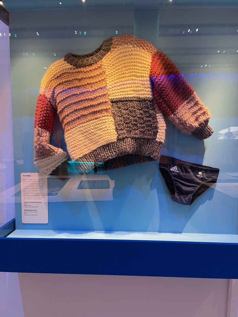
Fun to see the Gold Medal winning diver, Tom Daely’s scanty trunks and also the chunky sweater he knitted to occupy himself waiting for his moment at the Olympics.

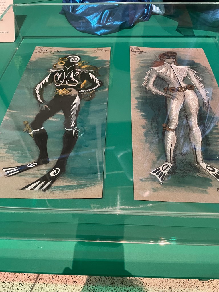
Good to see the costume designs for Captain Nemo and the Underwater City. They wouldn’t look out of place in a ballet.

My takeaway from the exhibition was that something had been missed. Because it was so much about the design of objects used in or near water we didn’t get a feel for the spiritual nature of water and the very human, primal desire to be close to the sea, rivers, ponds or expanses of water. We both fear and revere water. There’s a desire to be near it but not for it to come too close, univited and offend us by flooding our homes or disturbing our travel with dangerous high tides or inundated roads. Perhaps that’s something for a different show.

Splash! is on at the Design Museum until 17th August.

Who knew that the artist best known for that agonising work, The Scream, started out as a painter of colourful portraits? Well, now we know – thanks to a wonderful exhibition at the National Portrait Gallery of Edvard Munch’s early portraits, mainly of family and close friends. It’s a chance to re-evaluate this artist’s work and enjoy the sunshine and affectionate relationships in his life.

Colour! Yes, serious colour and, to my mind, a speediness of thought and hand in the creation of many of these portraits. I enjoyed the dribbles, splodges and daubs of hasty painting, as if he were in a great hurry to capture the subject in front of him and then get on with something else. Above: Torvald Stang, a friend, and self portrait of Munch.

Munch was clearly very fond of his friends and family and painted them with obvious pleasure. And he liked depicting them in pairs. This is very much a theme. People with a connection occupy the same space and, again, were painted at much the same pace with an equal distribution of attention to detail. Above: Lucien Dedichen and Jappe Nilssen – friends from Munch’s student days. And on the right are sisters Olga and Rosa Meissner, professional models.

There’s an overwhelming tenderness to many of the paintings and, in some cases, they might not seem finished. But, to Munch, he had provided quite enough detail in the face and the rest of the figure can be filled in by the viewer’s eye. Above: Inger, Munch’s younger sister, looking charming in sunshine and Inger Barth, a friend. This work was confiscated in 1937 when it was among the works declared to be ‘degenerate’ by the National Socialist government.

What’s absolutlely apparent is the free-flowing style we recognise from his later, angst-riven work. I like the direct gaze of his subjects. It looks as though they must have been deep in conversation when the portrait was being made and the affection between sitter and artist is very apparent. Above: the Norwegian colourist painter Ludvig Karsten in a ‘dandyish’ pose, August Strindberg, the playwright, and Sultan Abdul Karem whom Munch employed.

Just a few of the lithographs and black and white portraits (and the very dark one on the right) give a hint of the darkness within. But one comes away from this show in a very uplifted state, pleased to see such great portraiture by one of the 20th century’s finest artists. Above: lithograph portrait of Eva Mudocci, 1902, and self-portrait with skeleton arm, 1895 and on the right Tête à Tête, 1885, showing the painter Karl Jensen-Hjell drinking in the cafe in conversation with woman who might be Inger Munch. Very atmospheric.

Above: a self-portrait and a very tender portrait of Munch’s father, Christian, a military doctor. The show is on at the National Portrait Gallery until 15th June 2025. Well worth it.

Prince George & Master Frederick has been published! Yes, my historical fiction novel was launched in style with an event at St Giles’ Church, Cripplegate. A huge crowd braved a chill January evening and gathered to buy signed copies and listen to speeches about the book

I’ve always loved book launches but this one was the best ever! It’s an amazing feeling to publish your debut novel. But quite daunting to stand up in front of a large audience and explain how researching a family story turned out to be so fascinating that I simply had to write the story of Frederick Blomberg, the secret son of King George III. Having been introduced to the gathered crowds by my publisher, Janet Weitz of Alliance Publishing Press, I stood up and gave a speech.

In this picture I’m standing in front of a print of a portrait of Master Frederick Blomberg, painted by court artist Richard Brompton in about 1770. The painting was commissioned by Queen Charlotte and it’s a companion piece to two other portraits of her royal sons: Prince George, Prince of Wales and Prince Frederick, Duke of York which now hang in the 1844 Room at Buckingham Palace. I was delighted to put this painting of Prince George in Garter robes next to his ‘adopted’ brother, Frederick Blomberg on the front cover of my book.

And what fun it was to welcome so many lovely friends to the book launch, sign books and chat. And for all those who could not be there, you can order a signed copy through my author website: http://www.rosalind-freeborn.com Otherwise, you can buy a copy through Amazon, (on Kindle, print or Audible) and through bookshops.

In my talk I showed a display of portraits commissioned by Queen Charlotte in 1769 of her family, drawn as a set by the artist Hugh Douglas Hamilton. The portrait of Frederick was probably given to Frederick Blomberg by Prince George and ended up at his home in Yorkshire, Kirby Misperton. After Blomberg died in 1847 the little portrait remained on the wall, through two subsequent owners, until my great-grandfather bought the estate and my grandmother grew up there. She used to look at the picture of Frederick on the wall of her home and told me that the boy was the son of King George III (wrong side of the blanket, as she put it). That piqued my interest but I did nothing about it for decades. Then, about five years ago, I thought I’d investigate this claim and find out more about Blomberg. Well, what I discovered was so fascinating that I was compelled to write this novel.

I’ve been so delighted with the quantity of publicity this book has attracted. Above is a feature which appeared in the Yorkshire Post. I’ve done radio and television interviews too. Yes, I feel very published!

Brasil! Brasil! A glimpse of the artistic heritage of this lively country is on show at the Royal Academy and it’s fascinating to see how a mix of European and indigenous artists have combined to create a distinctive Brasilian aesthetic.

This image, entitled Three Orishas, was painted by Djanira da Motta e Silva in 1966. It’s an example of the ‘newer’ art in a show which exhibits the art of Brasil from the 1920-70s. The bright colours, stylised look and clear mingling of cultural languages captures, for me the true spirit of this young South American country.

I’m always drawn to portraits and there are some very interesting examples. The muted colours betray the period of the painting and the inheritance of German expressionism. Left: Self-portrait with Orange Dress 1921 by Tarsila do Amaral, Portrait of a Young Man 1943 by Roberto Burle Marx and Lucy with Flower by Lasar Segall painted in 1939-42.

You can see the influence of expressionism and abstraction here with Djanira da Motta e Silva’s self-portrait from 1945, Flavio de Carvalho’s Portrait of Ivone Levi from 1951.

Interesting examples of social commentary with these two paintings. The rather sinister Migrants by Candido Portinari from 1944 represents the migration of northeastern rural communities who were forced to move to other part of the country in search of work. And Tarsila do Amaral’s ‘Second Class’ from 1933 illustrates the awful poverty resulting from the economic crash of 1929.

I liked the stylised tennis player in Vincente deo Rego Monteiro’s limited palette painting from 1928. And I really liked the Marrapaia Dance, Pariti painted by Djanira da Motta e Silva in 1961. Such a striking resemblance to the UK’s Morris dancers with strings of bells tied to the performers’ knees!

And here’s a pick and mix of abstracts and figurative work which show the evolution of Brasilian art.

The show is on at the Royal Academy until 21st April 2025

Love for the elderly, sensitive family situations and tender images of relationships dominate this year’s selection of Taylor Wessing photo portraits on show at the National Portrait, and I approve the choice of prize winners for 2024.

Above is Celia and Shay, a very tender photograph taken by Megan Taylor which I found enchanting.

There was a great emphasis on images of much-loved elderly relatives in this year’s collection. These two caught my eye. On the left is Ageing Gracefully by Madeleine Waller of her mother at home in Australia. On the right is Inderjit Kaur by Jasmeen Patheja of her grandmother.

Here’s another trio of images of parents or images which capture older models. On the left is Mom, I’ll follow you still by Jesse Navarre Vos and shows his grandmother standing in the lift of the care home where she moved after they stopped living together. Vos wanted to capture the sense of separation and knowledge that he could no longer be with her into her new surroundings. In the centre is My Father’s Reflection by Diana Markosian and on the right is a portrait of Chicko, a clothes seller in London taken by Toks Majek using a 60 year old lens.

This photograph looked very spontaneous. Entitled Kitchen Embrace it shows the photographer’s daughter tenderly touching her grandmother’s cheek. The dog peeps up at the young girl and the two aubergines the woman is holding take centre stage.

And this, above, is the image which won first prize. It’s a very beguiling photograph taken by Steph Wilson of Sonam with her newborn baby. Sonam is a wigmaker and she is wearing a replica of her father’s moustache.

It’s a very interesting show this year and is situated on the upper floor of the gallery so you have the fun of walking through faces of the past to see these, the gallery’s most contemporary images. The Taylor Wessing Photo Portrait exhibition is on until 16th February 2025.

What an enchanting show! It’s a joy to visit the National Gallery and ‘Discover Constable and the Hay Wain’. This picture has graced millions of biscuit tins and chocolate boxes but there’s so much more to the image. Fascinating to see the painting in the context of a contemporary painter of the 1820s channelling the aesthetic of traditional landscape painting and establishing a British school of landscape. Fabulous

The Hay Wain is such a familiar image and conjures thoughts of ‘Merrie England’, the countryside fantasy of rural beauty, a simple life and the contented relationship between people who till the earth and the beauty of the fields where they work. At the press preview, listening to curator Christine Riding, it was fascinating to hear the context of the Hay Wain explained and then illustrated by a charming selection of complementary paintings, drawings, sketches and cartoons.

Took a couple of close-ups of the Hay Wain. It’s one of John Constable’s ‘six-footers’, a very large painting which was started in 1819 with the intention of grabbing the attention of collectors and fellow artists. Size does matter when you’re competing with other people to gain a reputation in the art work; this was an epic work, produced in his studio, but very much based on sketches and paintings made ‘en plein air’ in the Suffolk countryside Constable knew so well.

This is a large-scale (6ft) dry run which Constable painted. I love the liveliness and free painting. He does not become bogged down in detail yet all the elements of the composition are there.

On the left is a work by Constable entitled The Wheat Field. It makes rural life look very clean, romantic and relaxed. On the right is Golding Constable’s Kitchen Garden (his father) which was very personal to Constable and he kept it for himself and it was never sold in his lifetime.

This painting is by Thomas Gainsborough (1748) Like Constable, he was born and brought up in Suffolk and was familiar with the same landscape. This work depicts Cornard Wood, common land at the time. The painting belonged to Constable’s uncle, David Pike Watts and would have been familiar to the young artist as he was developing his interest in landscape painting and admiring Gainsborough’s technique.

Always wonderful to see an artist’s sketch book and this shows how Constable studied field-workers and rural activity. On the right is a tiny oil sketch showing the composition of the Hay Wain. We learned that the house on the left, known as Willy Lott’s Cottage was, in fact, owned by Mr William Lott and it was a house, and a substantial dwelling. Perhaps Constable is guilty of loading his seminal work with a dose of sentimentality in order to appeal to the ideal of the rural idyll?

This is very charming set of tiny models depicting the best singers in the East Bergholt church choir. It has been attributed to the young John Constable as creator but we can’t be sure. They are very enchanting, tiny carved and painted wooden figures.

The show is just wonderful. It’s part of the National Gallery’s 200th year celebration and well worth a visit.

Francis Bacon: Human Presence. A very impressive new show at the National Portrait Gallery brings together over 50 of his paintings and includes fascinating photographs of him at work in his studio and fragments of the images and source material which inspired him. It is a visceral experience. Bacon aimed to captures the essence of his subject, not bothering with a direct likeness, but depicting what he feels about them.

Francis Bacon is one of those artists whose work divides opinion. Self-taught, ambitious, original and curious, he has created images of people which are arresting, memorable and honest. He was not interested in the conventions of likeness – for so long the measuring stick of portraiture – his aim was to capture and convey the ‘essence’ of a person and express their ‘presence’ within the painting rather than features which resembled them.

Having said that, there is a likeness to the subjects he depicts. Clearly, he scrutinised faces carefully. He started his career by painting from life but swiftly moved on to using photographs – taken specially for the work or gathered from magazines and scraps of paper. It’s great to see so many of these ‘scraps’ of images which inspired his work. Often they were scattered about on the floor of his studio, bespattered with paint and generally destroyed. But their very presence within this show only adds to the intensity of the portraits on show.

I enjoyed the triptych studies of head. Above are images of his friends Isabel Rawsthorne and Peter Lacy. Peter Lacy was Bacon’s lover in the early part of his career. There were several important gay relationships in his life but the last was with George Dyer. There is a very moving triptych of the last paintings of George Dyer shortly before he died. (below) The paintings are a tribute to an important man in his life and the atmosphere of depression and sickness which emanates from the canvases is overwhelming.

This impressive exhibition explores the influences and friendships which contributed to the evolution of his distinctive and challenging style. It was a joy to see a small self-portrait by Rembrandt which Bacon especially admired for its darkness and thickly applied paint.

Francis Bacon: Human Presence is on at the National Gallery until 19th January 2025

Michael Craig-Martin at the Royal Academy. There’s an ‘Alice in Wonderland’ feel to this exhibition where everyday objects, graphically outlined and painted with eye-popping colours are celebrated on canvas, as wall-sculpture, digital art and drawings. Astounding.

I wasn’t sure I was going to like this exhibition of work by Michael Craig-Martin but I’m happy to report that it was very enjoyable. I tend to be drawn to a painterly painting, with plentiful brushstrokes and evidence of the artist’s hand at work and I wasn’t sure that his very graphic, almost cartoon-like style might not appeal to me. But it just goes to show that you need to wander around an exhibition with an open mind and be prepared to reassess any preconceived ideas.

Loved the hot, bright colours the curators have chosen to set off these works. The celebration of ‘ordinary’ objects is great fun. Once you look beyond the intense colours and the strong outlines, the composition is thoughtful and the subjects are intriguing.

Above: an example of Craig-Martin’s interpretation of old masters, reducing themto strong graphic shapes with bold colours. On the right is a self-portrait.

I really enjoyed the Digital creation entitled Cosmos – an immersive film with everyday objects flying across the walls, balls bouncing, musical instruments barrelling across the space in time to an interesting plinky plonky music track. It did make me feel like Alice tumbling down the fictional rabbit hole, passing shelves of familiar objects, seeing life cascading past her as she drifted further down to Wonderland.

The exhibition features some of Michael Craig-Martin’s early work too. Experiments with form, balance and conceptual ideas. I really liked the wonky shelf with the milk bottles.

And I was also impressed by the wall sculptures which are an interesting mix of his drawings combined with blocks of colour. Also, I was fascinated to learn that it was the discovery of a special black crepe tape, used in electronics, which he used to create the very uniform outline shapes.

Interesting seeing an artist’s world where there is no shading, no deliberate 3D expression yet somehow the objects just explode from their surfaces. A very interesting exhibition. It’s on at the Royal Academy in London until 10th December 2024.

So good to be back at the National Portrait Gallery for the press launch of the Herbert Smith Freehills Portrait Award. Fifty portraits were selected from over 40,000 entries from all over the world. The results are fascinating, full of variety and made with many different media – but all involving traditional material such as oil, acrylic, tempera. And it’s always fun to meet the artists and some of the subjects too.

Above is a very compelling and painterly portrait of Adam Pearson, British TV presenter and disability rights campaigner, by Tim Benson. I chatted to Adam about the process and he told me that the portrait had been completed in under four hours in one sitting. It’s that immediacy of image and energy which really attracted me to it.

I was very taken by this portrait entitled Chewing the Cud by Emily Ponsonby. Using the ‘encaustic’ technique using honeyed wax, scraped and mixed with oil and oil pastel, I think it’s a very successful painting both technically and in terms of composition. The viewer is given a surprising ‘fly on the wall’ viewpoint and absolutely absorbed into the conversation in a Dorset kitchen.

Above, a couple of winners. First prize went to Antony Williams‘ portrait: Jacqueline with Still Life. It’s been meticulously painted in tempera, which is a difficult medium (you mix egg yolk with pigment and it’s full of depth and interest. On the right is the Second Prize, Isabella Watling‘s portrait of Zizi which combines very traditional use of paint and pose but gives the subject and the whole atmosphere of the painting, a very contemporary feel.

These two portraits, above, captivated me for their narrative quality. They are not just good paintings but they capture a moment and an emotion. On the left is Estuary English by Ray Richardson and the subject is Adé, a young actor. The two met by chance and became good friends. The title refers both to the body of water in the background of the painting and also the English accent associated with areas of London, along the River Thames, where both men live.

On the right is 1111, by Shinji Ihara. The artist records his partner on the day their beloved cat died. It took over a year and 90 sittings to complete.

By contrast, I was very struck by the photo-realism of this painting on aluminium of Agnese by Massimiliano Poronti. I chatted to the artist who told me that it took a very long time to complete this one.

And above is just a selection of other portraits which caught my eye. I do like a brush stroke and these paintings delivered!

The Herbert Smith Freehills Portrait Award 2024 exhibition is free to visit at the National Portrait Gallery from 11th July until 27th October 2024. Good stuff.

Mythic Time / Tens of Thousands of Rememberings by Lina Iris Victor. And what a fascinating exhibition at the Sir John Soane’s Museum this is. A celebration of African culture, mingled with inspiration from the astonishing collection of ancient artefacts assembled by Sir John Soane and housed in his idiosyncratic home in Lincoln’s Inn Field, London.

Visiting the Sir John Soane’s Museum is always a pleasure. It’s a treasure-trove of cultural history which is open to the public, free, from Wednesdays to Sundays, and well worth a trip. Every now and then the museum collaborates with a contemporary artist. This year Lina Iris Victor, a Liberian/British multidisciplinary artist who lives and works between Italy and the UK, has taken on the challenge of creating works which reflect and complement the collection. Her African heritage really comes through in these pieces. She combines all manner of materials, most fascinatingly, she uses empty silkworm cases, fragments of woven fabric and weaves them in amonsgt acrylic forms gilded with gold.

Many of the works are on paper – sturdy paper, because these pieces are heavy – and there’s an impressive gutsy-ness to the pieces.

I was really taken by the large scale colourful work which combined gold with red on paper. Red Ornamental (series of four works) mixed media on paper.

I liked the array of portraits too which combine the gold element with strongly pigmented paint and drawing on paper.

It’s very interesting to see such original art in such a spectacular setting. The amalgam of contemporary and ancient really blends well. Down in the crypt are two ‘Ritual Thrones’ and an extraordinary sculpture entitled Nbiru which goes rather well with the Greek and Roman statues collected by Soane.

The exhibition opens on 10th July and will be there until 19th January 2025. Free