I object: Ian Hislop’s search for dissent. Elements of subversion in everyday objects collected for this intriguing exhibition at the British Museum. Plus a clever contribution from Banksy.

I like a bit of subversion.  This new exhibition at the British Museum makes it very clear that, for centuries,  humans have made small interventions, protests or signs on objects which record their disgruntlement or simply a desire to make their mark.

The pieces on show have been selected by Ian Hislop, editor of Private Eye, with co-curator Tom Hockenhull.  Clearly, in a museum like the British Museum there is a great deal to choose from and it’s good to see interesting objects taken out of their usual display cases (or storage) and included in this show.  I was already familiar with the wonderful penny stamped with Votes For Women which as such a blissfully clever way of distributing a message on such a commonplace piece of currency which would be impossible to trace yet would circulate widely spreading the message.

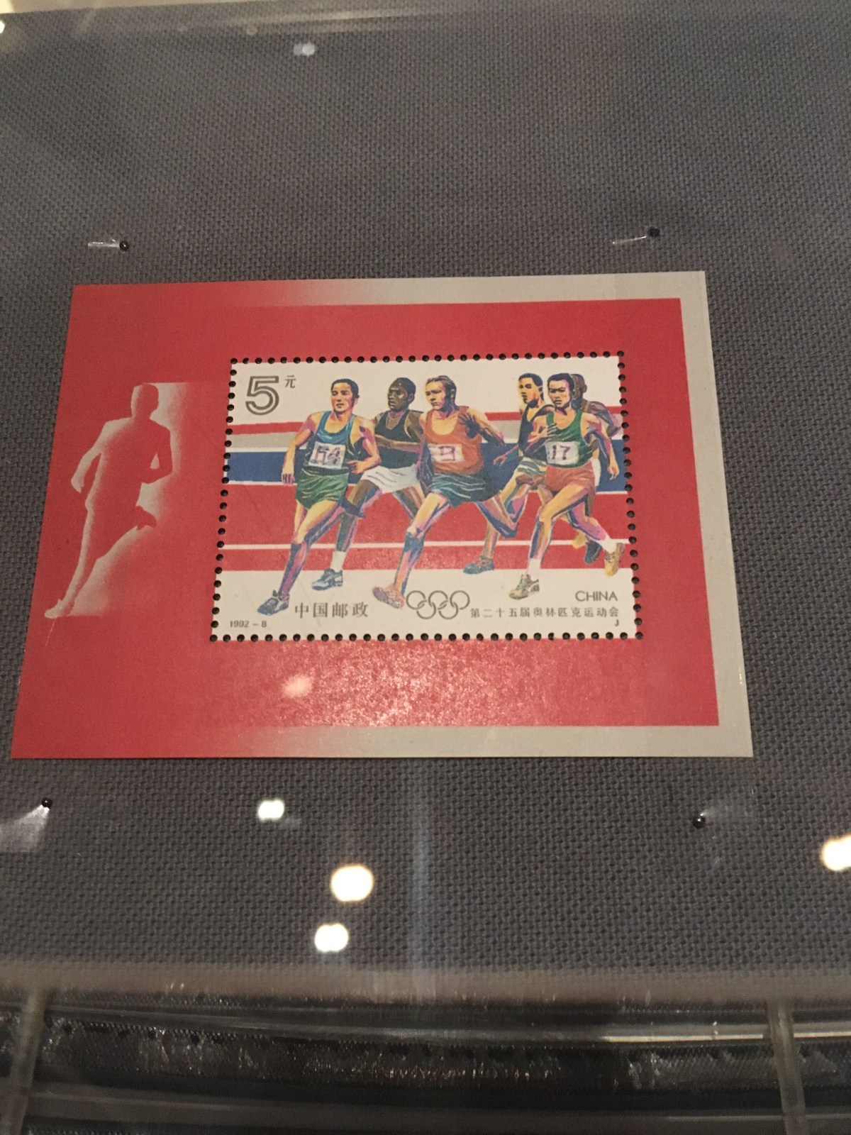
Movingly a Chinese stamp was designed to mark the Tienanmen Square massacre in 1989. The numbers on the runners’ bibs carry the date the tanks rolled in and killed protesters.

IMG_3063

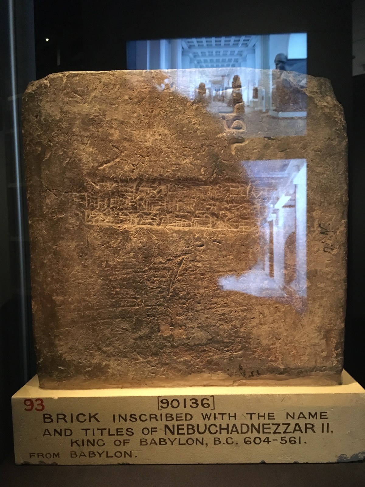
I liked the Babylonian brick made for Nebuchadnezza’s tomb which had been scrawled with the maker’s name – a pretty treasonable thing – but he must have felt moved to make a grumpy mark on a hot day.

IMG_3091

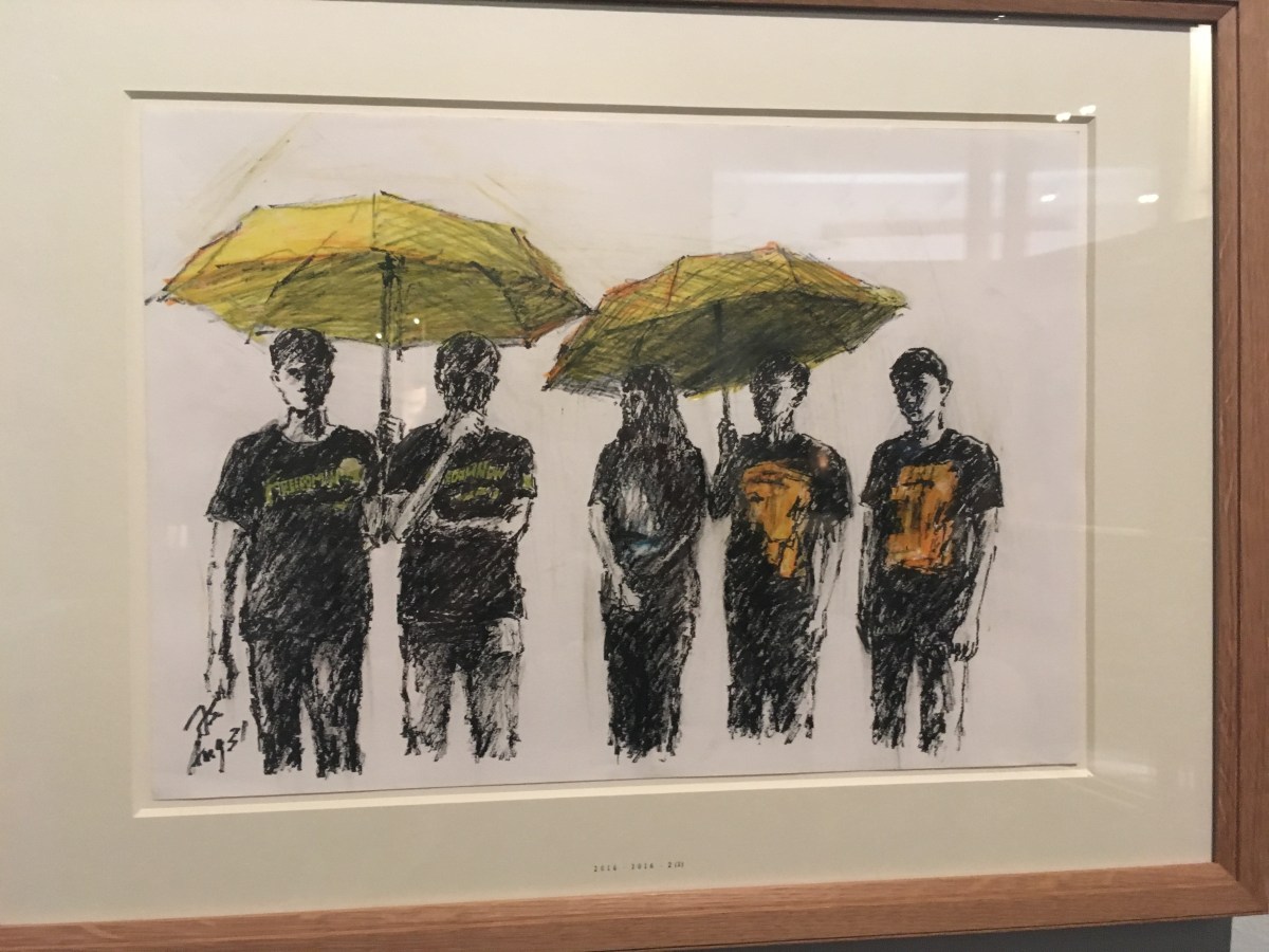
The yellow umbrellas used by protesters in Hong Kong  in 2014 to shield themselves from pepper spray and tear gas during clashes with police spawned the ‘Umbrella Movement’.  A mundane and necessary object has been cleverly adopted as a political symbol but, when challenged, the owner of a yellow umbrella could just shrug and say, ‘It’s raining, that’s why I’ve got my umbrella’.

IMG_3065

In a more playful approach to dissent the curators chose to include a witty contribution from the artist Banksy – his cartoon of ‘Peckham Rock’.

IMG_3077


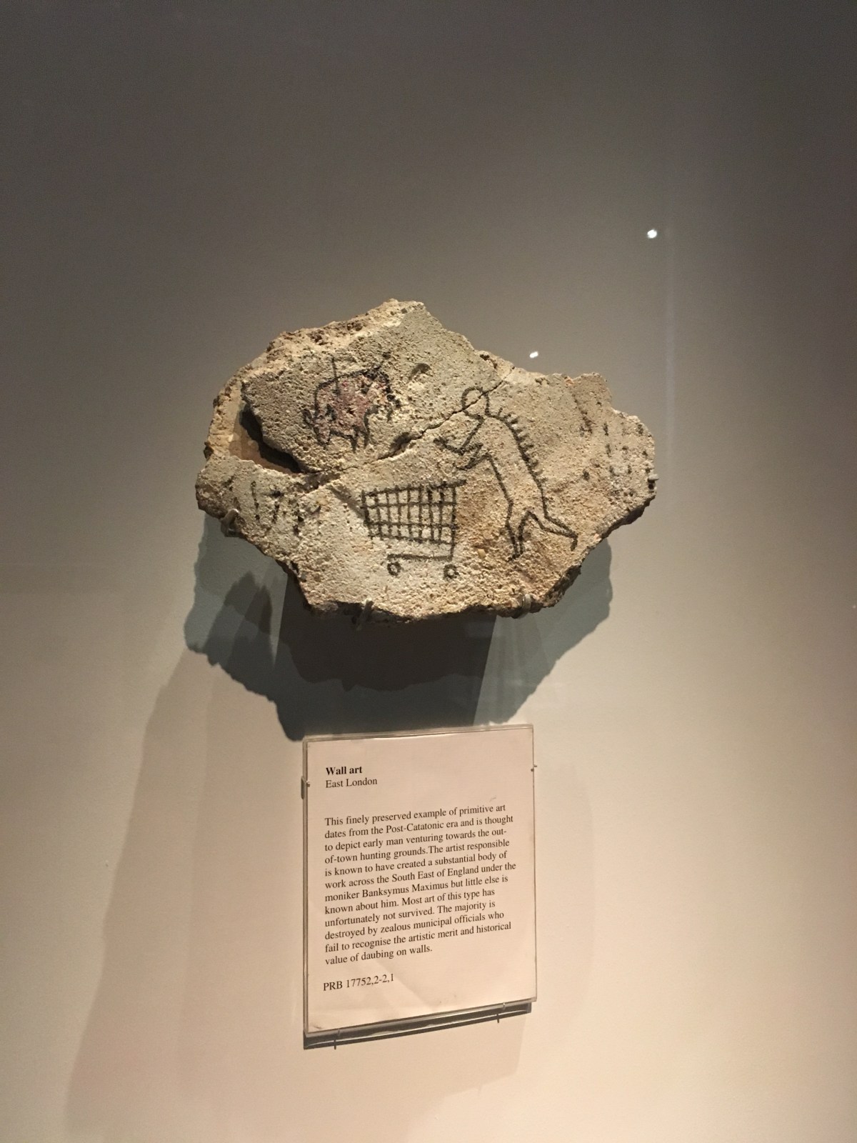
Complete with a totally credible caption behind perspex, this drawing was described as a ‘finely preserved example of primitive art dating from the Post-Catatonic era and is thought to depict early man venturing towards the out of town hunting grounds.’  The artist is referenced as ‘Banksymus Maximus’. It’s a very clever pop at the rather po’faced hanging of pieces in a museum, and reputedly, it was quite sometime before the museum folk noticed it was hanging there! Now that’s an example of really clever dissent.


A moving portrait of a mother wins the BP Portrait Award 2018 with a stylish, technically impressive painting.

This is the 29th BP Portrait Award and, if anyone thought that painted portraits don’t have a place in a time of photography and the ubiquitous ‘selfie’, this is proof that the desire to make pictures of people using ‘old-school’ media is very much alive and kicking.

I guess the clue is in the name – BP is all about oil and the majority of the paintings on show have been made using oil paints.  This sometimes frustrates me because I’m a great advocate of mixed media (and of course paper collage). But I was blown away by the talent on show at this year’s exhibition.

I would think that photos have been used as reference tools for many of the pictures. It’s just impossible to keep a subject still for any length of time and many of the paintings seemed to capture fleeting moments, glances, and glimpses of personality and emotion.  I think that’s hard to do with a sitter who’s getting a bit itchy and uncomfortable.

IMG_1860

The winning portrait, An Angel at My Table by Miriam Escofet is remarkably proficient.  It’s quite photo-realistic but then there is a beguiling ornament which seems to be moving – the angel, perhaps? And the wistful look of the woman sitting amongst the cool, blue china cups and saucers is captivating.

I always look for evidence of brush stroke and the sheer joy of slapping oil paint on canvas. I was encouraged to see that Second Prize went to Felicia Forte for her painting entitled Time Traveller, Matthew Napping.  It’s more a portrait of a moment than the actual person and I loved the big, bold colours and exuberance of the process which is clear to see.

IMG_1851

The BP Portrait exhibition is free to visit – it’s in a different gallery this year which makes it feel rather smaller than usual ( I don’t know if that’s true) but it’s always worth a visit.


http://www.npg.org.uk   www.bp.com/arts

It’s on until 23rd September 2018


There’s so much to see at Royal Academy of Arts in London – not just the Summer Exhibition, but a whole Spectacle to enjoy along with the newly opened permanent collection. This gallery is certainly having a moment in celebration of its 250th anniversary.

“People get the words dull and subtle muddled up” said Grayson Perry at the press preview for this year’s Summer Exhibition at the Royal Academy which he has curated.  Well, standing in Room 3 painted a zingy bright lemon yellow, there was no chance of that.  Perry’s enthusiasm for the weird, wonderful, colourful, seductive, playful, non-conformist and just a bit rude is clear to see in his selection of works.  But they are such fun.  Yes, I know the Summer Exhibition’s primary objective is to sell work and raise money to fund the schools but that has often made the choices very safe – maybe a bit dull? In the past we’ve seen a lot of cute cats, birds, boats and moody landscapes.  Not a bit of it this year; there’s a giant bear emerging from a rug, an eggshell portrait of Iggy Pop (Eggy Pop  geddit!), sculptures made of smashed up crockery and lots and lots of colour.

So, this is my kind of show. You get the usual mash up of RA works with the Summer Exhibition, cheek by jowl with ‘amateur’ artists but the juxtaposition is fun and starts a kind of visual conversation. Grayson Perry is great advocate of the ‘outsider artist’, the artist who is compelled to create and makes work which has no classical or trained back story but has emerged from a compulsion to express an idea or a passion in their own language; that’s always fun, and often very moving.


But over in another part of the now HUGE gallery, the John Madejski Fine Rooms, Weston Rooms, Galleries I and II  is another treasure trove of visual delights – The Great Spectacle: 250 Years of the Summer Exhibition.  The premise of the exhibition – originally called The Annual Exhibition – was to exhibit art made NOW. Of course, 250 years later we see art made THEN but it’s absolutely fascinating.  What is clear is that the shock of the new is a constant, it’s something which we’re all looking for and even if it can’t be defined in exact terms there are certain paintings which become huge hits. For example, some of the terrific genre paintings by David Wilkie, such as The Village Politician, contained fascinating visual narratives and people would cluster and stare at the picture for ages.

IMG_1687


Back at the start of it all, Joshua Reynolds, founder of this great institution, understood fully the need for the blockbuster image which had that ‘wow’ factor. He introduced it with his fabulous portraits which used light in a wonderfully dappled way. The portrait of Mrs Lloyd is semi classical but shows the young woman in a diaphanous gown in a sun speckled glade and her face positively glowing against the dark leafy background. Apparently all the ladies who saw that image wanted to look like that, or be painted like that.

_1713
Mrs Lloyd Inscribing a Tree – Joshua Reynolds


Then there’s all that  argy bargy with the artists trying to out do each other in terms of bravura and attention grabbing.  As you can hear from Grayson when he was negotiating his hang of this year’s show, nothing changes, egos can be huge and expectations can be high and artists can be easily incensed by the space (or lack of it) they have been given.  Reynolds always competed with Gainsborough, Turner with Constable. We love all that!

So, what with the new permanent exhibition, the Great Spectacle, the Summer Exhibition and the show of work by RA students, there is a great deal to see at this magnificent gallery.

The Summer Exhibition and The Great Spectacle run from 12th June – 19th August. The Schools Final Year Show runs from 8th June – 1st July.


Aftermath:Art in the wake of World War One – a new show at Tate Britain marks 100 years since the end of the First World War with images which capture the conflict, the memorials, the anger, injury, resolution and legacy of this appalling conflict.

For the last four years we’ve been immersed in memories of the First World War as centenary of its conclusion approaches and it’s been fascinating and moving to review the art which recorded the slaughter and devastation on a scale the world had never seen before.  Those images of shell-blasted battle fields, ruined trenches, mud, puddles, corpses and dreadful injuries fix in the mind.

This exhibition at Tate Britian assembles some of those images of conflict to set the context – well known paintings by artists such as Paul Nash, CRW Nevinson and William Orpen – and the absolute misery and relentless horror of what they witnessed is captured in both literal terms and in bleak abstracts. And indeed it includes many images made from the German and French viewpoint, which we haven’t seen so much of but are no less powerful in their evocation of the suffering which was endured by everyone involved.

What this exhibition is does is look at the aftermath of the conflict and how artists started the process of recovery, repair and resolution.  The First World War became memorialised very early on.  The ubiquitous war memorials in every town, village and hamlet bear testament to the appalling loss of young lives but this exhibition gathers together an impressive collection of sculptures, bronzes drawings, prints and paintings which capture the impact of not only the fallen but those who have been left behind.

The enduring costs of conflict were only too apparent in the injuries endured and the pain of maimed bodies .  I’ve seen these portraits of soldiers by Henry Tonks before and they are very impressive, conveying a quiet dignity; there’s nothing sensational about the making of these portraits – just honest medical recording of the damage done and how the injuries were treated.

IMG_1637

Anger at what young men were forced to endure seems to roar from the prints and drawings of German expressionist artists such as Max Ernst, Otto Dix and George Grosz.  These drawing, prints and sketches suggest that all pleasure and innocence had been chased away and replaced by a kind of self-destructiom fuelled by domestic cruelty and unfair treatment of those who endured the conflict .

I enjoyed the selection of collages by artists such as Kurt Schwitters, Rudolf Schlichter and Hannah Hoch which seemed to express the chaos of the post-war years as people resumed their ‘normal’ lives and tried to put the horrors behind them.

It’s almost a relief to get to the gallery entitled Return to Order and see images of sun soaked landscapes, portraits and families enjoying themselves.  But there are still images which capture loss – widows, families where husbands and families are missing – and a feeling that the world is now an emptier place.

The final room in the exhibition looks to the future – images of machines taking over, of society being rebuilt with the help of new technology and innovation.  But nothing can override those initial images of wartime devastation and, no matter, how people strive to repair, recover and redeem the situation, the reality of conflict does nothing good for us.


Art in the Wake of World War One, Tate Britain, 5th June – 23rd September 2018.

In celebration of 250 years, the Royal Academy of Arts has bridged the great divide and linked the magnificent Burlington House with the mansion on Burlington Gardens creating stunning new spaces and the chance to show some sensational art.

It’s been a long time coming but well worth the wait. The Royal Academy has finally joined up its Piccadilly fronting mansion, Burlington House, with the splendid building on Burlington Gardens, which it bought back in 2001.

At the press preview this week I was fascinated to hear from the architect behind this new link, David Chipperfield.  It was far from straightforward, as he outlined. There are many ‘tribes’ within the RA and each one had a strong view on how the gallery should evolve.  He found a way to connect the buildings by taking the route down to the basement level, revealing intriguing vaults, going through the RA School which has occupied the back of the building for the past 250 years, and connected the space with the beautifully restored building on Burlington Gardens, which was formerly The Museum of Mankind.

IMG_1423

The result is the opening up of new spaces, the creation of a breathtaking new lecture hall and a home for the RA’s permanent collection.  We always knew the gallery possessed artistic treasures but we rarely got to see them since the original space was always used for ‘blockbuster’ shows and the Summer Exhibition (which funds students at the RA School).

Now, you can wander through spaces with some stunning examples of art from Roman sculptures, through to High Renaissance work up to works created by early members of the Royal Academy.  I was astounded by the vast copy of Leonardo da Vinci’s Last Supper – apparently soon after the original which is in Milan. This version is in rather better condition and, as Christopher Le Brun, President of the Royal Academy pointed out, you can see the feet and sandals of the apostles below the table (they’ve disappeared from the version on the wall of the Santa Maria delle Grazie).

I stared long and hard at Michaelangelo’s Taddei Tondo, The Virgin and Child with the Infant St John (c 1504) You could argue that it’s unfinished but what you can see in this piece is the artist’s hand at work – the way he shaped the figures using smaller and smaller claw chisels and getting to the stage where the stone is smoothed. I loved the little dint in the fabric made by the finger of the figure of baby Jesus.

There are also examples of James Thornhill‘s huge biblical paintings.  They’re fabulous in a slightly gaudy, colourful way and I was intrigued to see that the same model popped up playing different figures in the pictures.

IMG_1430

The new spaces offer an extraordinary showcase of art and architecture (for which the RA was established to promote).  This gallery is having a serious ‘moment’.  And, to bring things right up to date, the contemporary artist, Tacita Dean is having the THIRD of her moments with an impressive display of landscape inspired pieces. I was really impressed by the chalk on blackboard artworks of snowy, craggy mountains – a painstaking piece of work to produce.  And I was amused by her rather touching collection of three or four leaf clovers which she’s collection.

Down in the Vaults the space is devoted to the early learning of drawing and has collected a variety of pictures of students studying the human figure and many of the plaster casts which were used as models for aspiring artists getting to grips with the art of looking – really looking.

The whole project has cost a cool £56million to create – and £12.7 million came from Heritage Lottery Funds.  I reckon it’s all money very well spent.

https://www.royalacademy.org.uk/  #RA250 #TheNewRA #TacitaDean  @royalacademy

Shape of Light: 100 years of Photography and Abstract Art at TATE Modern. A fascinating look at the relationship between painted art and photography and the evolution of abstract art.

I think it must be part of the human condition that when new technologies, media or ideas come along, people can’t help seeing what can be done with it and finding ways to push it into new directions.  For example, when the internal combustion engine was invented and it was possible to drive around in a ‘horseless carriage’ what happened….? clever engineers looked for ways of making those carriages go really fast and started racing them.  Formula 1 is seriously exciting. We really don’t have to travel at such speed but it’s very thrilling seeing it made possible.


I’m sure it must have been the same with photography in the early years of the last century.  We’re used to seeing early photographs which mainly feature people, places and objects. It’s all pretty figurative. Then artists and disrupters got hold of their box brownies, or whatever cameras were being developed, and started seeing the world through that lens and capturing abstract images.  So which came first- abstract art or abstract photography?  This show at TATE Modern cleverly pulls together examples of paintings which have metaphorically ‘let go’ of convention by plunging into abstraction and shows how the shock of what was new in painted art and sculpture was matched by a similar shock emanating from the hands of inspired photographers.  We start off with a room filled with a mix of interesting abstract oil paintings by artists such as Kandinsky, , Mondrian and  George Braques.  They’ve been neatly paired with Vortographs, a great selection by Alvin Langdon Coburn (1882 – 1966) which feature interesting compositions in photographic form which echo the artists’ work.

And so the exhibition evolves. It’s fascinating to see the evolution of photographers such as Brassai and Man Ray who looked at surface and texture of objects and saw, within the random and abstracted shapes, what we most definitely call art.  You only have to look at Instagram feeds these days to see that we’re still fascinated by cracked floor tiles, peeling paint, tree bark and random arrangements of pebbles.  We all have an eye for these things but it must have been very exciting in the 1920s to be capturing such images with an artist’s sensitivity.  Then there’s the process of photography itself. It was intriguing to see how photosensitive paper and various ways of developing pictures can be harnessed, corrupted and adapted to create images which, quite simply, have never been seen before and yet are, most definitely art.

The show brings us right up to date with examples of work by young, contemporary artist/photographers. Barbara Kasten (born 1936) spoke about her photogenic painting and her large piced from 1978 which is a photograph, print and oil on mural paper stretched on canvas. (The featured image on this post)

It was interesting to hear Antony Cairns (born 1980) talk about the way he creates images printed in ink on Kindle screens which have been removed from the  handset and preserves photographic images which otherwise might just fade away.  And Maya Rochat (born 1985) has used a mix of photography, mixed media and constantly moving images to create a site-specific display of work called A Rock is a River.

Simon Baker, the lead curator for this show explained that the relationship between art and photography is important and that photographs should most definitely exist within the history of art. TATE is well known for integrating photographs into shows of painted work or other media, expressing a broad sweep of art.

A very interesting show for anyone interested in photography, or the way this medium is part of art history.  At TATE Modern from 2nd May – 14th October 2018.  #ShapeOfLight

Monet & Architecture at the National Gallery; a fascinating exhibition of paintings which shows how Monet was drawn to the built environment – from the picturesque to the modern.

I’ve always imagined I was pretty familiar with the work of Claude Monet. There can’t be many people who haven’t seen an image of his waterlilies on a biscuit tin or those famous chilly winter scenes on a Christmas card.  When approaching this exhibition at the National Gallery I rather expected to see a lot of ‘old friends’ hung together for maximum impact, one of those shows which focus on glorious repetition of images. Not a bit of it.  This show is full of surprises. The surprises are not just in the subjects which Monet chose to paint – he was remarkably proficient by his early 20s and his style was clear to read – but in the imaginative curation of the show and juxtaposition of pictures you wouldn’t normally have thought would go together. And we are also treated to the chance to see paintings from galleries and private collections from around the world – a rare treat.

The room full of early years paintings was a revelation.  Monet clearly had a very acute eye for colour and form.  Apparently he wasn’t that keen on the formal training of art school and struck out on his own artistic journey in his mid 20s.  I really enjoyed seeing the paintings of places which resonated with him and landscapes which incorporated a compelling mix of wild nature and examples of architecture.  One forgets that the notion of the ‘picturesque’ was an English style which the French painters duly adopted; the seeking out of ancient places and buildings and the creating of composition which incorporated romantically ruined or old structures set in natural but stylised settings – a bit Claude Lorraine.

IMG_0878

Above: Cleopatra’s Needles and Charing Cross Bridge about 1899

Some of the paintings appear to be unfinished.  Given that many of the works started life ‘en plein air’ one can only guess at the reasons why they never quite got the final treatment – did it start to rain, was there a cup of coffee to be drunk or did someone distract him with conversation?  We understand that many of the paintings begun outside were then taken indoors to his studio to be ‘worked up’.  This makes me love the wild and incomplete ones even more.  You get a real sense of place with these swift pictures which sketch in the basics and use large, gestural brush strokes to indicate skies, water and outline structures.  Having said that, these more finished pictures are gorgeous.  I understand Monet’s desire to paint not just the shape of buildings but the nature and atmosphere of the light which surrounds them.  Hence the repetition and the constant return to buildings or scenes such as Rouen Cathedral or views of London’s Thames, the bridges and newly completed Houses of Parliament.

IMG_0877

As the curator, Monet scholar, Richard Thompson, points out, Monet was attracted to the newness of buildings, the way architecture creeps across the landscape and how dynamically buildings can contrast with the curves and organic shapes of nature. I loved the city paintings too, often painted several at a go from a strategically placed window so that he could have around eight canvases on the go at any time and move seamlessly from one to the other and the day progressed and the light and atmosphere changed.

Above: The Thames below Westminster and Quai de Louvre

This show is an absolute joy and I’m rather tempted to go back again, very soon.

National Gallery, Sainsbury Wing, London .  9th April – 29th July 2018. Sponsored by Credit Suisse.

Immersed in Merce at the mercy of the projector! Visitors can find themselves in the picture at the Landscape, Portrait, Still Life shows at the National Portrait Gallery, the National Gallery and, coming soon, the Royal Academy. Tacita Dean is having a mega-moment across three galleries with a retrospective of work as well as new, previously unseen, film portraits.

Whether you are the subject of an exhibition or a curator it’s hard work.  For Tacita Dean, her workload has been exceptional – she’s not only the subject but also curator of THREE exhibition across major London galleries.

IMG_0461

LANDSCAPE, PORTRAIT, STILL LIFE  is a major undertaking. I went to the press preview for PORTRAIT AND STILL LIFE – which are at the National Portrait Gallery and National Gallery.  The third element, LANDSCAPE, will open at the Royal Academy in May and will be the first exhibition to be held in the new Jungels-Winkler Galleries after years of redevelopment.

The thing about the exhibitions I saw is that they do need a bit of explanation.  I was lucky enough to hear Tacita Dean talk about her work and outline the technical challenges and the difficulties in getting her subjects to cooperate and capture the elements she was after.  I think, without that direct input from the artist it might be quite hard for viewers to comprehend what they are seeing and how to understand it.


I admire Tacita Dean’s faithful use of film, real film, the tactile stuff which you can hear running through a camera, see developed and then experience again through the whirr of the projector as the finished image on celluloid is thrown onto a vast screen.  But I do find it hard when you creep into a totally black space to watch some very long shots of …. well, leaves rustling, for example.  I know you have to invest in this kind of art, it’s not designed to be easy or a quick fix, but it does demand time and concentration of the viewer and sometimes it’s inclined to feel a bit, well, boring.

Anyway, I was very beguiled by the large gallery space which was filled with screens showing projected portraits of the American choreographer Merce Cunningham.  The filmed portrait is of a performance called STILLNESS and it’s that famous piece by John Cage: 4minutes 33seconds where no music is played but the ambient sound of the environment becomes the ‘music’.  But stand in front of the projector, your own shape enters the space in a rather surprising way.

IMG_0460

I was very taken by the tiny portraits of three actors who have played Hamlet: David Warner, Ben Whishaw and Stephen Dillane. Called His Picture in Little, 2017, the title is  a quote from the play. These tiny portraits, arranged as a split screen triptych amongst collections of miniatures from the gallery’s collection of 16th and 17th miniature portraits, is very intriguing and impressive.  Each actor was filmed on their own but, when seen in the three screens, you vaguely make out a kind of ‘synergy’ between the three.

IMG_0464

Over at the National Gallery there’s an exhibition curated by Tacita Dean which throws up questions about the nature of the Still Life and the Landscape. Are they part of the same way of looking?  Dean’s own work is subtly introduced within the collection. I almost missed her contribution of ‘Bird on a Wire’ chirruping away on a projected screen above images of birds – alive, stuffed, dead.


And I completely agree with her assertion that the  painting by Thomas Jones of A Wall In Naples  (about 1782) is magnificent.  You can read it as a landscape, a still life and also as an abstract piece of art.

IMG_0472

I look forward to the third element of this show when it opens at the Royal Academy on 19th May. Otherwise, I suggest that the exhibition should be seen, discussed and that each visitor makes up their own mind.


Tacita Dean: LANDSCAPE, PORTRAIT, STILL LIFE    http://www.npg.org.uk/tacitadean   www.nationalgallery.org  http://www.royalacademy.org.uk

15th March – 28 May 2018 at National Portrait Gallery and National Gallery    Royal Academy 19 May – 13 August 2018

Tacita Dean: PORTRAIT costs £14

Tacita Dean: STILL LIFE is free

Victorian Giants: The Birth of Art Photography – a dazzling exhibition at the National Portrait Gallery which shows how the artists of the mid 19th century took the new-fangled camera to their hearts and used the lens to capture a fascinating range of portraiture and adventurous images.

The development of the camera in the mid 1800s must have created a thrilling time for artists as they explored and played with the potential of this new, accurate way to record images .  Before the evolution of the printed photographic image any painter aiming to create a likeness, an effective portrait, would have had to rely on their training and skill in ‘eyeballing’ the subject to capture the features and personality for a larger work.

The arrival of the camera changed all that. What a marvellous thing it must have been for a studio artist to be able to refer to pictures taken rather than make the subject sit still for hours on end filling sketch books with endless drawings.  But, more than using the camera and photos as a tool, a group of artists discovered that the camera was a brilliant way to create portraits, to stage-manage and compose image, control lighting and manipulate the various stages of production to produce artistic results.

Below: Agnes and Amy Hughes asleep on a couch 12 October 1863 taken by Lewis Carroll

img_0129.jpg

The leader of a small group of artists who embraced the artistic potential of the camera was Oscar Rejlander (1813 – 75).  I confess I was unaware of him before going to the charming exhibition which has just opened at the National Portrait Gallery.  Rejlander was a Swedish emigre with ‘a mysterious past’, we are told. Judging from the self-portraits on show and a wonderful selection of expressive ‘selfies’ on show, he must have been quite a mercurial character.  He attracted artists from various disciplines like moths to a flame and it sounds as though he was generous with his understanding of this new art form and encouraged artist/photographers to develop their expertise.

He was a pioneer is the idea of the photo montage and created a ‘collage’ of images for his famous compilations scene called Two Ways of Life made from some 32 separate negatives. Apparently Queen Victoria and Prince Albert loved this picture and bought three prints.

img_0148.jpg


IMG_0137

Above: Rejlander posing for a photographs which capture emotion.


The show features the work of Julia Margaret Cameron (1815 -79), Lewis Carroll (1832-98) and Lady Clementina Hawarden (1822 – 65).  We’re all pretty familiar with Julia Margaret Cameron‘s work – those wonderful soft focus portraits. Below is her portrait of Freddy Gould taken in 1866 when he was five.

IMG_0121

Below are portraits by Rejlander of children reproducing those famous putti by Raphael’s putti at the Sistine Chapel.

Lewis Carroll is best known as the author of Alice in Wonderland and Alice Through the Looking Glass and his (possibly questionable) relationship with the children of the Liddell family whom he photographed hundreds of times.  It’s fascinating to see the images of young Alice, who modelled for him in various dressed up set pieces, and  intriguing to see a later photo of the 18 year old Alice, all innocence gone from her features and the emerging of a thoughtful young woman.

Below: Photograph of the Liddell children: Alice, Ina, Harry and Edith at their home in Oxford and, to the right,  Alice, aged 18 taken by Lewis Carroll.

Lady Clementina came from a well-to-do Scottish family and was closely associated with the pre-Raphaelite Brotherhood (who, apparently, used photography as source material for their detailed paintings)

All four photographers really did set the bar for the artistic use of photography, the careful lighting, composition and the medium’s potential for capturing emotion.  I loved this show.

It’s on at the National Portrait Gallery until 20th May and will then to go the Millennium Gallery, Sheffield from June 30 – September 21 2018


Matthew Day Jackson creates fascinating collage reinterpretations of flower paintings from the 16th and 17th century made with artificial, manufactured and contemporary materials on show at Hauser & Wirth.

I like collages and I’ve always admired those fabulous still life flower paintings by Jan Breughel (Elder and Younger) and major Dutch artists. It’s great to see that American artist Matthew Day Jackson has looked closely at those detailed works and created lively  reinterpretations of those classic compositions using a variety of contemporary materials.

IMG_0114

Using formica, acrylic paint, epoxy resin, scorched wood and metal, Jackson has cleverly created contrast and harmony between the delicate fronds of flowers and the texture of leaves, foliage, vases and gritty backgrounds. The colours are lively and the silk screen printing captures the detail of petals and delicate flora.

The show is on at Hauser & Wirth in Savile Row, London. Also on show were  Jackson’s ‘reclining nudes’. These sculptures are in bronze but look as though they’ve been formed from charred logs, twigs and thistles and a variety of forest floor bits and pieces.  I was intrigued but definitely more drawn to the art on the wall.

Hauser & Wirth, Matthew Day Jackson, Still Life and the Reclining Nude

1 March – 28 April 2018