A blockbuster show at Tate Britain celebrates two of the the UK’s most acclaimed artists. Born a year apart, JMW Turner (1775-1851) and John Constable (1776-1837) both pushed their art into entirely new aesthetics and left a lasting legacy in the development of British art, paving the way for the Impressionist’s movement and everything that followed.

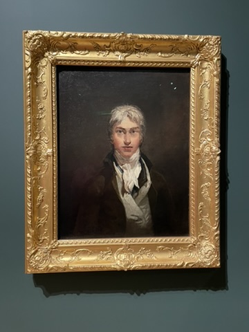
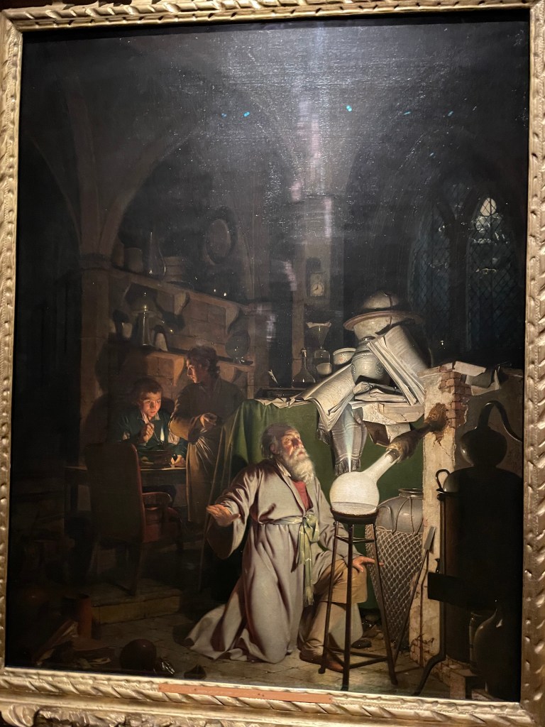
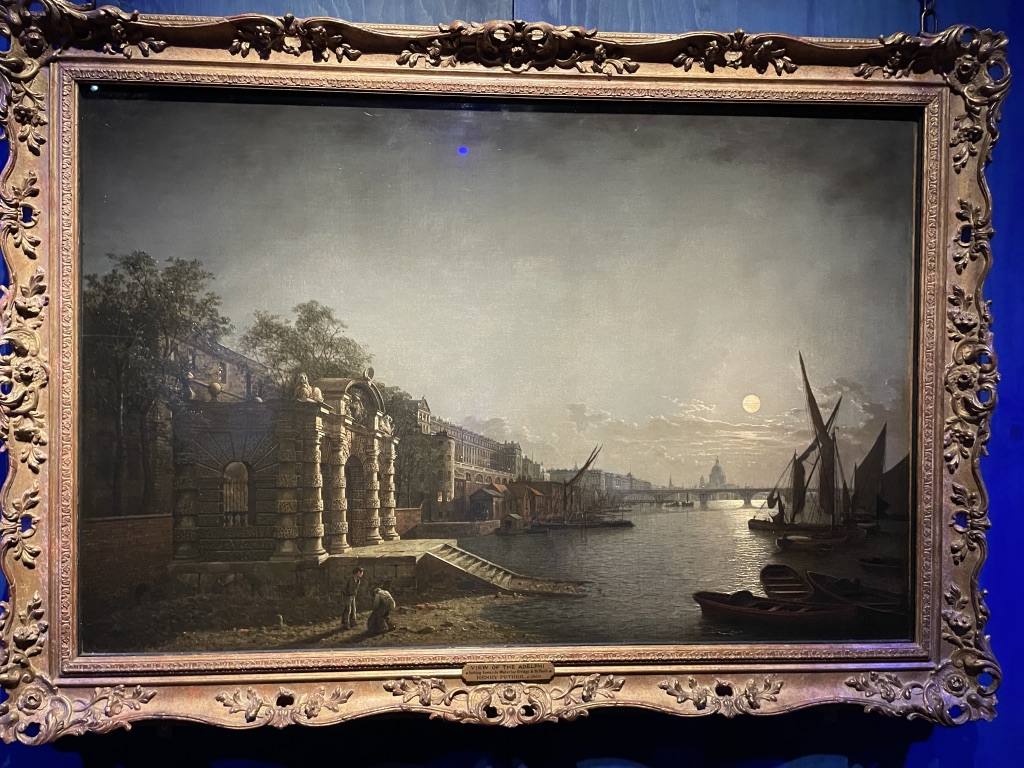
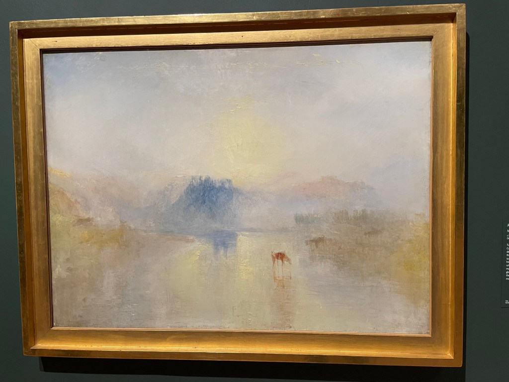
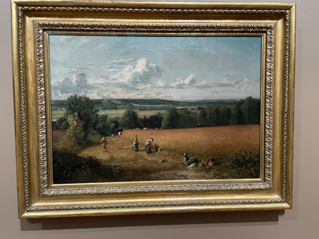
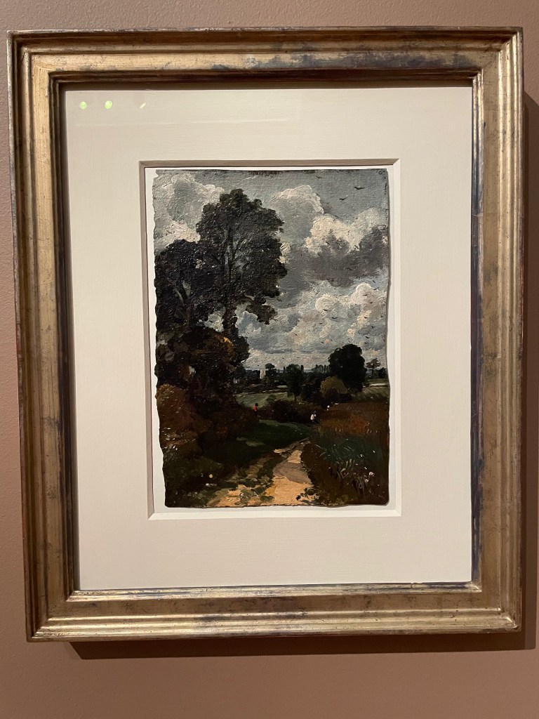
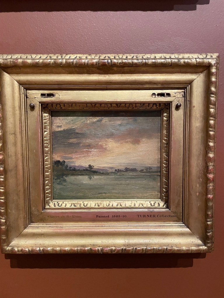
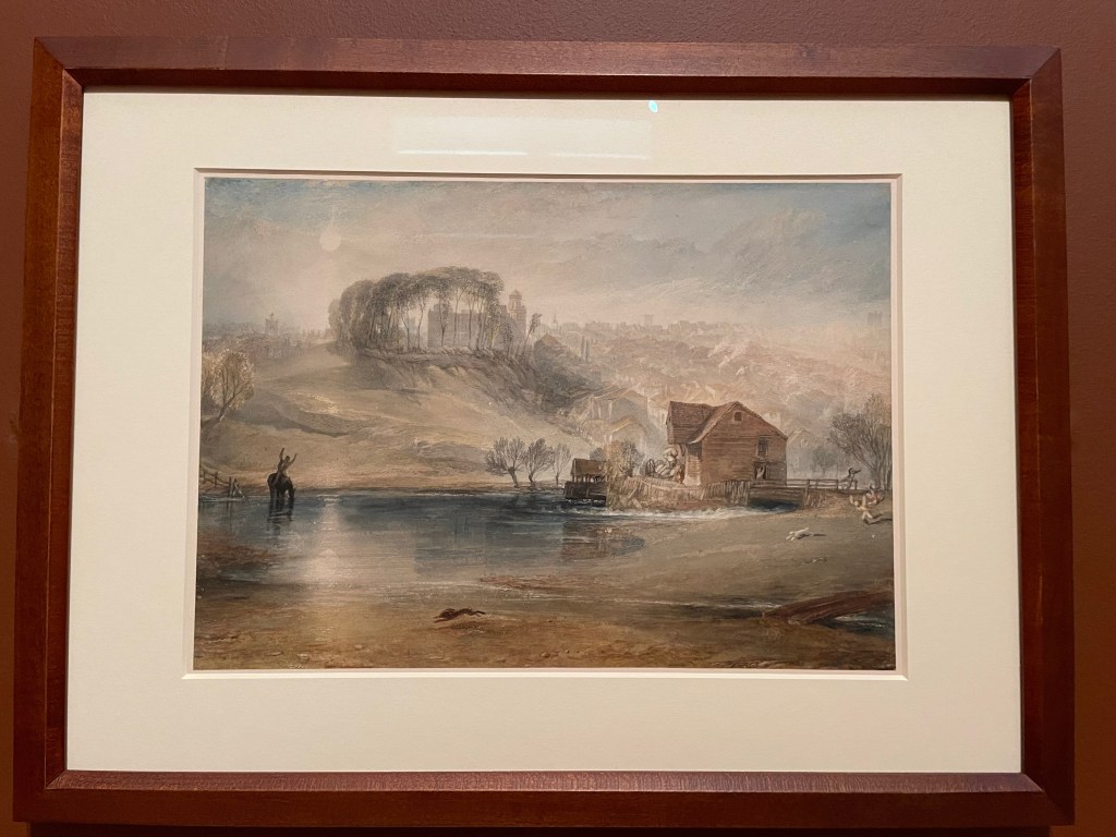
The works of Turner and Constable must be amongst some of the most recognised images in art history. Say the words Flatford Mill or A misty sunset in Venice and most of us will conjure the familiar bucolic image of a Suffolk Mill with a horse and cart or the beauty of Venice seen through a haze of cloud and watery sunshine. These works are amazing. But the history of these two artists is more entwined and their approach more similar than I had realised. This show, entitled Rivals and Originals, charts their artistic development as contemporaries and adversaries.

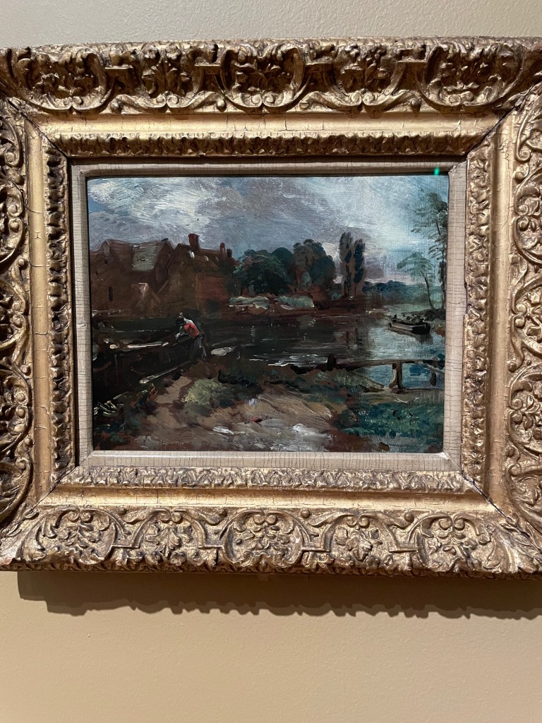
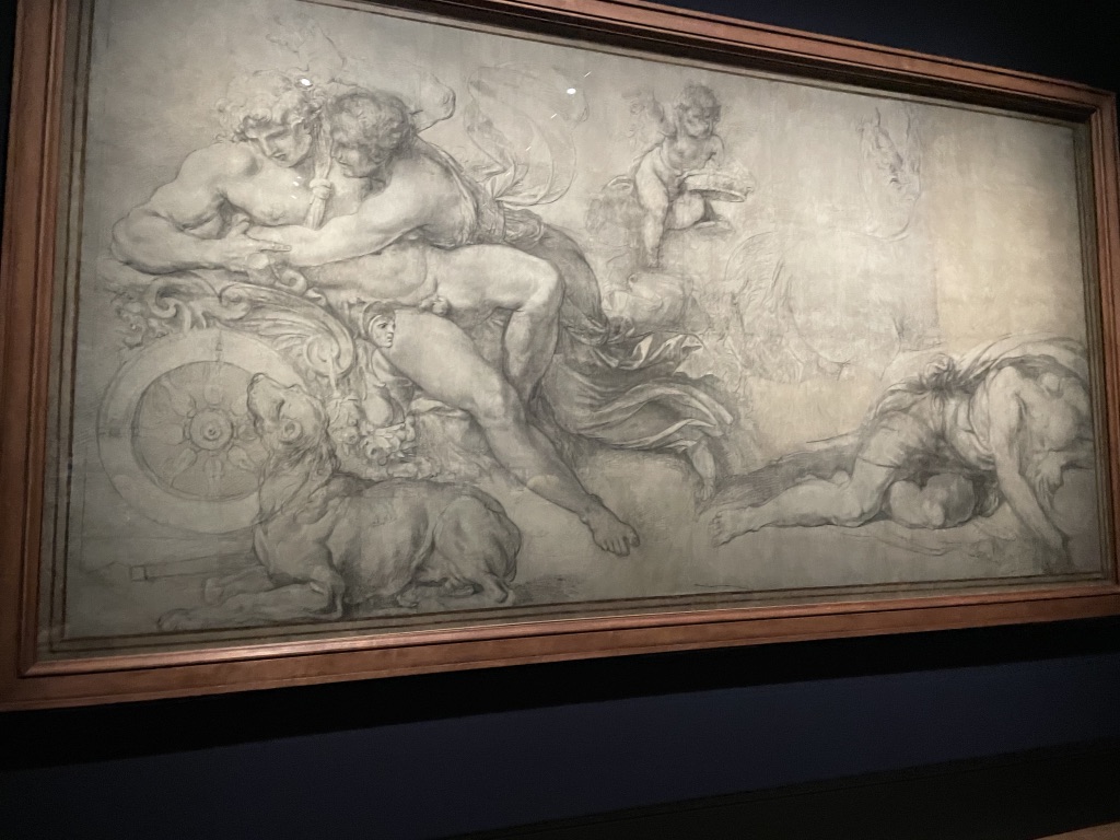
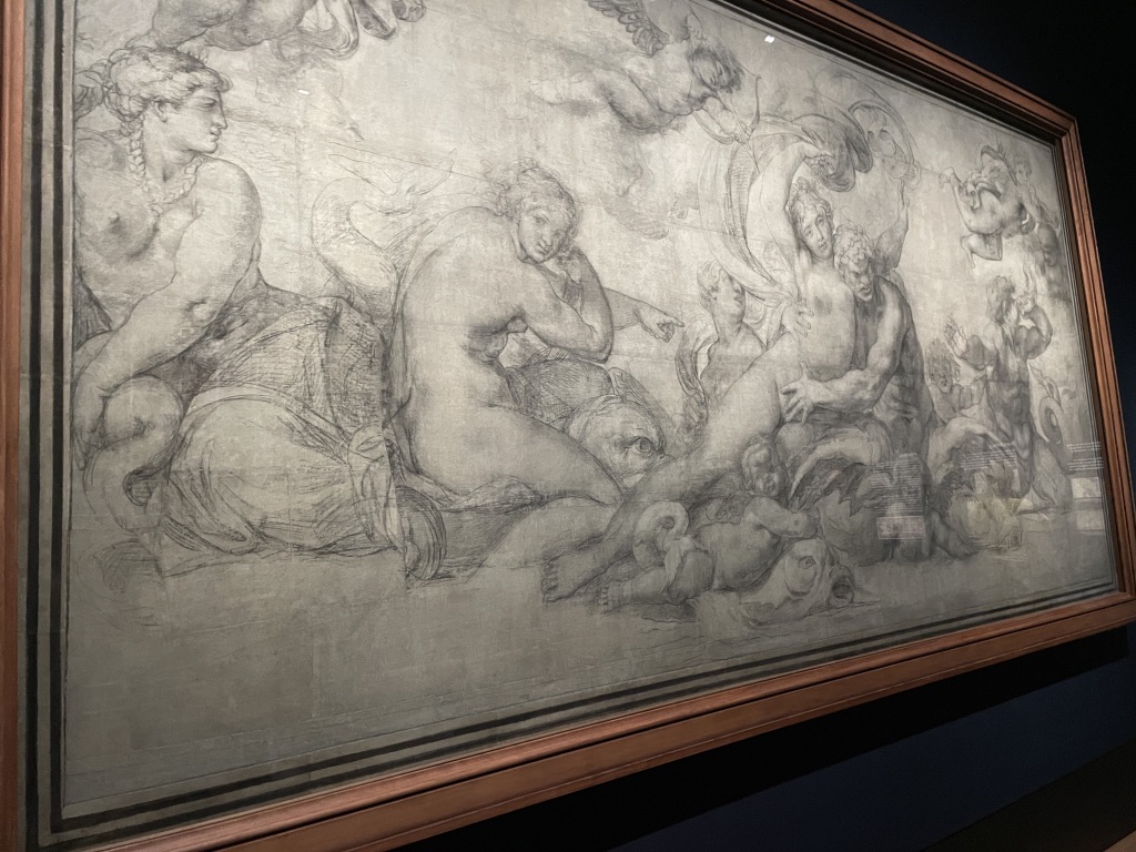
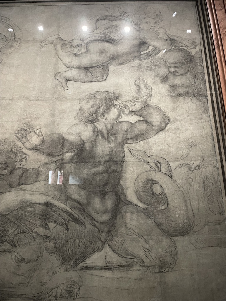
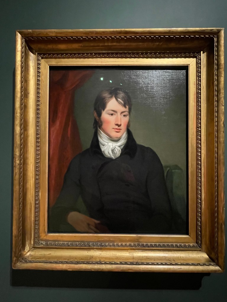
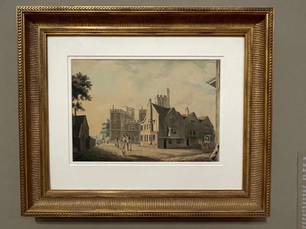
Both Turner and Constable were dedicated to art from an early age. Turner, you could argue, had the more difficult journey – the son of a barber based in Covent Garden, London, he demonstrated his skills at an early age and his father did his best to support his son’s desire to paint but he was not of the class expected to choose art as a career. Constable was born into middle class comfort in Suffolk and had to convince his family that he did not want to follow a conventional profession but devote his life to art. The pair developed their styles through study of Old Masters and a desire to push a narrative element into their art while recording contemporary life.

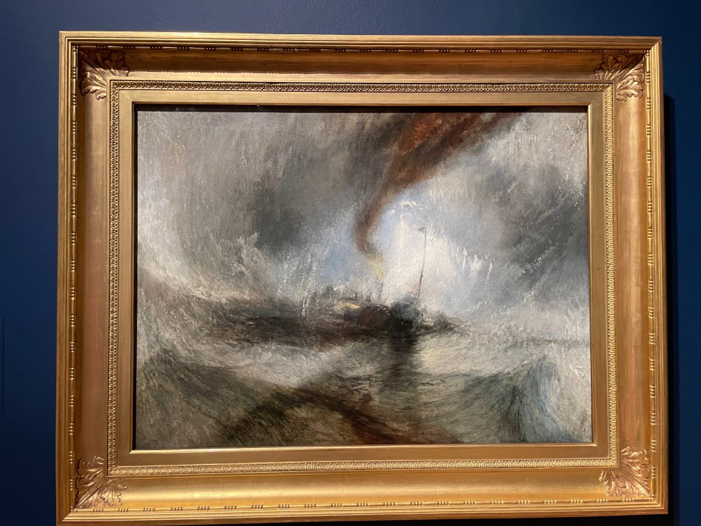
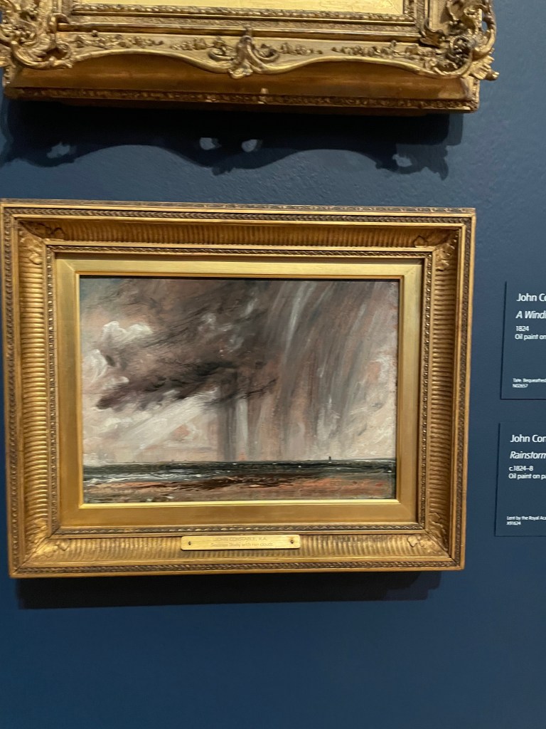
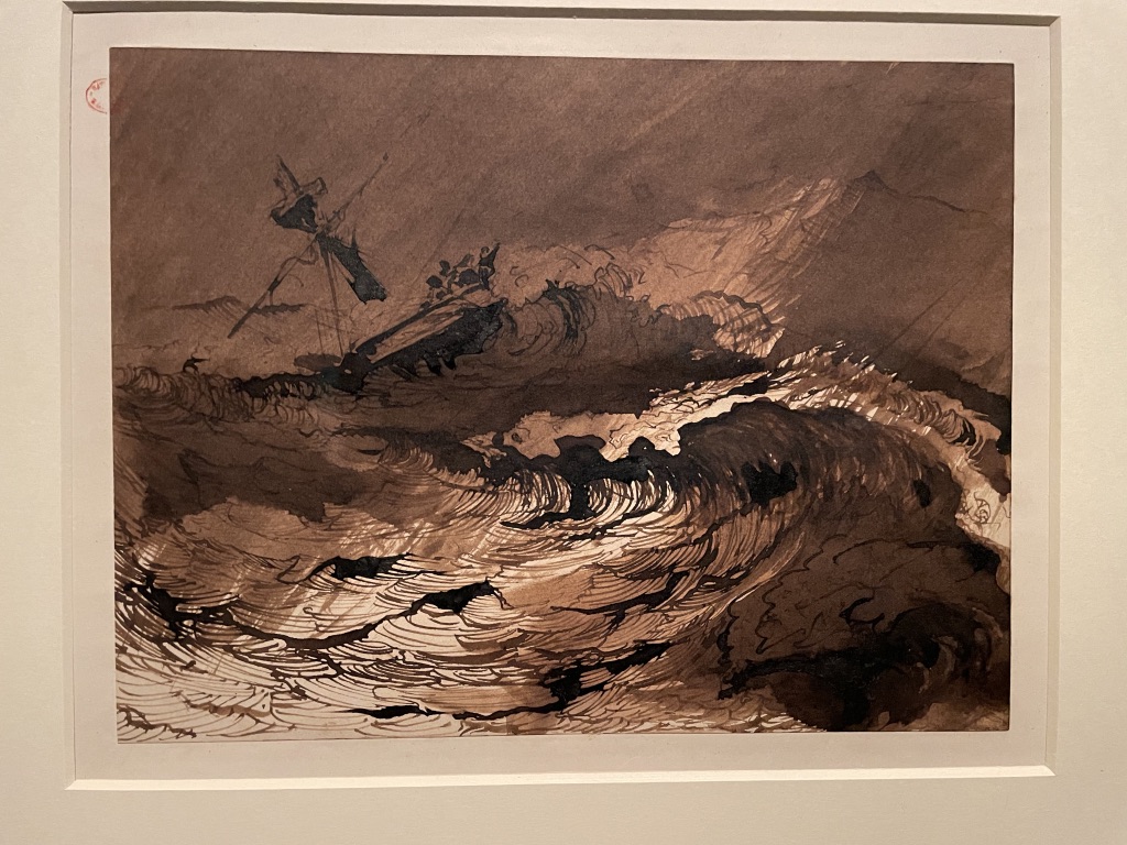
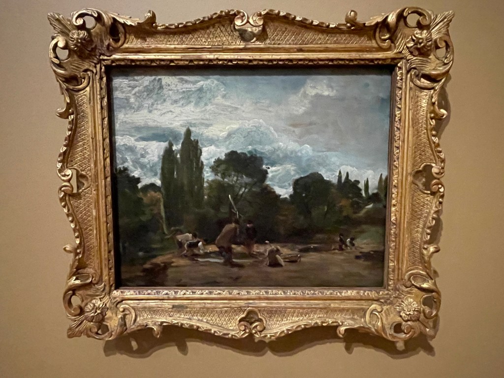
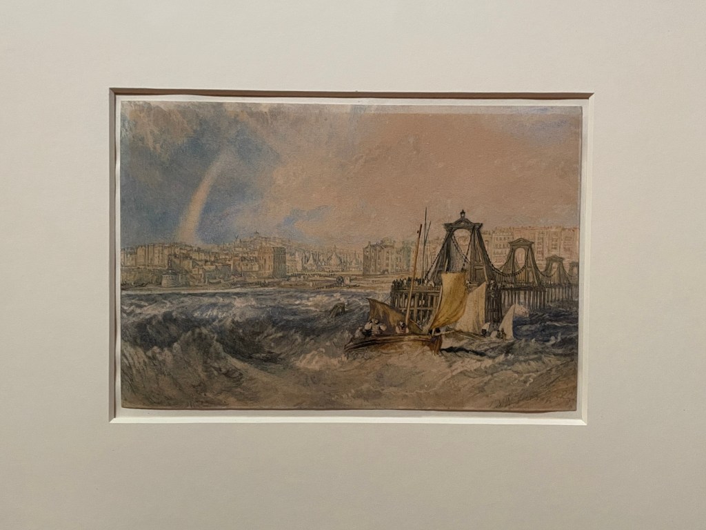
Sometimes it’s hard to differentiate between them – just look at these two, above. On the left is Turner’s Snow Storm – Steam-boat off a Harbour’s Mouth and on the right is Constable’s swift oil sketch called Rainstorm over the Sea. Both of them were fascinated by the power of nature and the constantly changing sky and weather conditions. They spent all their time sketching landscapes and painting the scene directly onto whatever surface they brought with them.

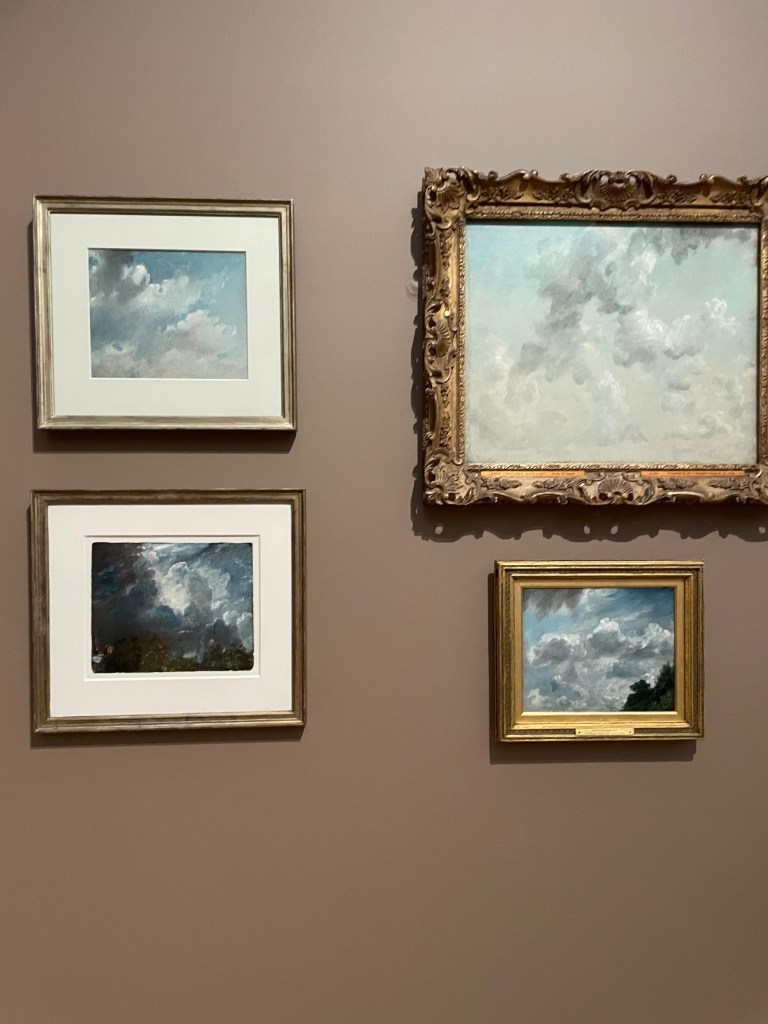
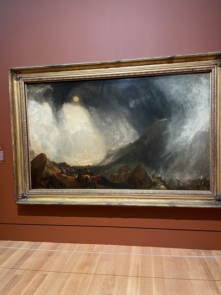
Both must have spent hours observing clouds in their infinite variety and using immediate sketches to dramatic effect. On the left is a selection of cloud studies by Constable and on the right is Turner’s massive painting Snow Storm: Hannibal and his Army Crossing the Alps.

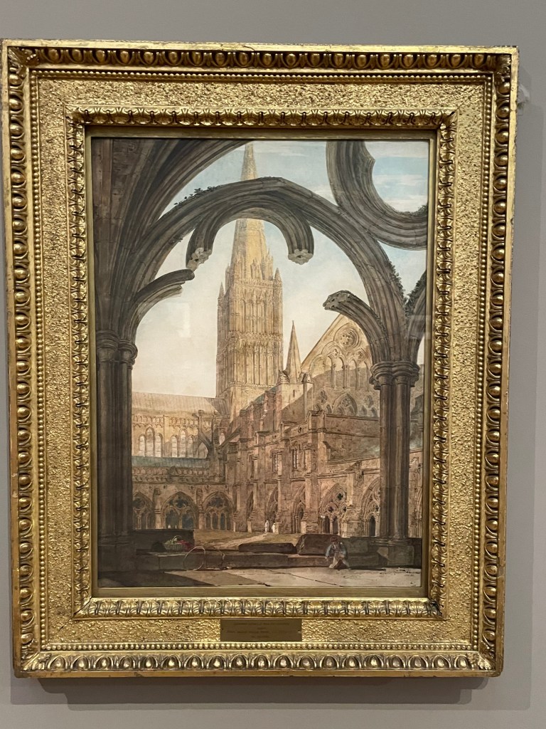
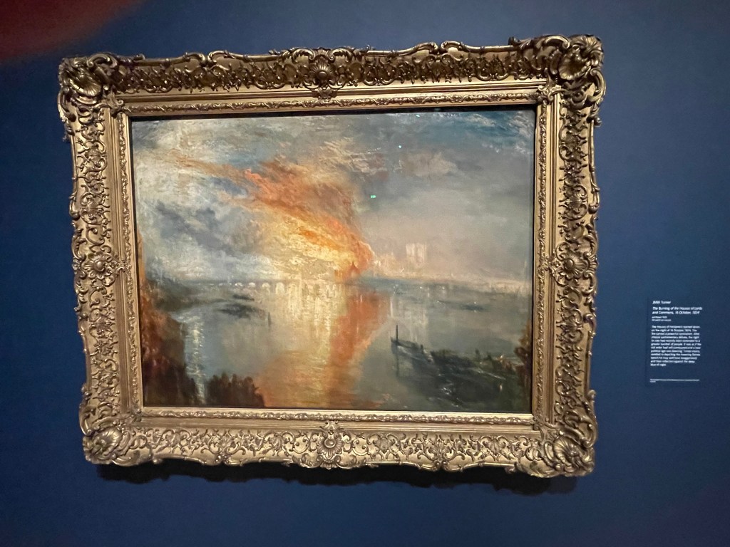
My takeaway from the show, apart from having thoroughly enjoyed it, was the chance to see the evolution of these two artists from detailed work, which might be as literal and accurate as possible, towards a much freer, expressive way of working. Both appear to have created their work at speed, using wonderful gestural swishes of paint or urgent daubs of white and black to denote drama and impact. They are both glorious. This is a wonderful show and well worth seeing.

It’s on at Tate Britain until 12 April 2026.

Wright of Derby: From the Shadows. What a terrific show at the National Gallery, London. I’ve long been an admirer of Joseph Wright’s ‘candlelight’ paintings which capture moments of interior drama, both literally and psychologically. Wonderful to see the artist’s work from 1765 – 1773 at the height of his powers.

Above is a detail from probably the most famous painting by Joseph Wright, known as Wright of Derby – the town where he was born and worked. The Air Pump shows an audience watching a scientific demonstration. The air is being pumped out of a glass flask and the bird inside is about to suffocate. The girls are clearly distressed, the adults fascinated and the scientist resembles a wizard, in a loose gown, playing God over the life of the hapless bird. There is so much going on in this compelling picture which gives you so many perspectives. But the most striking element is Wright’s ability to capture the lighting of the scene. A single candle, hidden behind a large goblet containing a skull, illuminates the faces and highlights the reactions.

This wonderful exhibition not only brings the best of Joseph Wright’s paintings from the 1760s-70s but also assembles some of the instruments and props which feature in the pictures. For example, below, we see a painting entitled The Orrery which was an extraordinary teaching instrument for demonstrating the movement of the planets and the earth’s place in the heavens. The two boys are transfixed by the tiny orbs which are shown to move around each other.

Tenebrism is the word given to the style of painting associated by Italian artist Caravaggio and describes the use of an extreme form of ‘chiaroscuro’ (meaning light and dark). The drama derived from seeing, and not seeing, objects is brilliantly conveyed in these picture. As a viewer you are drawn to the illuminated faces and the expressions responding to the action but then you wonder what is happening in the shadows? Each picture contains so many questions and invites you to puzzle over the subject as you scan the painting absorbing the story.

Above is The Alchymist in Search of the Philosopher’s Stone, Discovers Phosphorus, and Prays for the Successful Conclusion of his Operation, as was the Custom of the Ancient Chymical Astrologers. Wow! Quite a title, but what a picture, there’s so much going on. Amazement on the face of the alchemist and bewildered fascination by his helper making notes at the desk by candlelight. And capturing the bright light of phosphorus must have been a huge challenge.

I love this painting of the girl reading the letter. You can’t see the candle but it’s behind the paper, making it transparent, but for the shadowy fold. And is the man leaning over her shoulder about to grab the paper away? What was she reading? Oh, so many questions. This painting is up there with works by Vermeer but with a more rosey hue and earthy atmosphere.

Above are a couple of great examples of ‘tenebrism’ showing not only Wright’s skill at capturing light but depicting the enduring artistic quest to capture form by using light and shadow in the context of the art class.

And above is a detail from a painting of two boys fighting. You can see that things are turning violent as one boy’s ear is grabbed and pinched with his assailant in the foreground represented in shadow. And I loved the picture on the right of A Blacksmith’s Shop. Nighttime work, with the moon beyond the clouds and all eyes focused on the action on the anvil. Wonderful.

Above is a self-portrait by Joseph Wright of Derby done with pastels early on his career. Clearly he was perfecting his ‘tenebrist’ skills but, quite playfully, representing himself in the style of an ‘Old Master’. What a master of his craft he was. This is a great show. It’s on at the National Gallery until 10th May 2026.

The Story of South Asian Art at the Royal Academy shines a light on the artist Mrinalini Mucherjee, her family and fellow artists. Their work spans the the second half of the twentieth century and shows how Western art was stylistically absorbed into traditional Indian art.

I had no idea what to expect when I attended the press preview for this show. My knowledge of Indian history is scant. For this exhibition we were introduced to the work generated by Benode Behari Mukherjee, his wife, Leela, daughter Mirnalini and students who lived and work an an idyllic-sounding art school established in Santiniketan in 1919. This was a time when Indian artists might look to the West for influence but were determined that their work would be definitively Indian, and reflect their deep-rooted culture.

I was impressed by the variety of work and, at times the visceral nature of the imagery. Above is a water colour sketch on paper by Leela Mukherjee demonstrating the influence of Matisse through bold, vigorous brush strokes.

I really liked this trio of work. On the left is a paper collage made with cut outs by Benode Mukherjee. He became blind in his 50s but continued working and teaching. His daughter, Leela, worked closely with him, describing what she could see around them and helping him interpret his art by preparing and cutting up paper for him to collage. He would then, intuitively, ‘feet’ his way into these later works. In the centre is a carved wood mosaic by K G Buramanyan (a student) which relates to a monumental mural commissioned in 1962. The mural stretches some 25 metre and used 13,000 terracotta tiles – examples are shown on the right.

These two paintings caught my eye. On the left is a watercolour by Mrinalini Mukherjee which is like an abstract landscape using great colours. And on the right is a very Matisse and Picasso-inspired ‘Reclining Woman’ by K G Subramanyan.

The sculptures are interesting. On the left is Night Bloom II by Mrinalini Mukherjee, a partly-glazed ceramic made with folds of clay which convey the idea of a woman seated in the lotus position. They clay bears impressions of textiles. And on the right is her intriguing sculpture named Jauba, from 2000 made with hemp and steel.

I found this lithograph, Landscape 1968, by Gulammohammed Sheikh quite threatening with intimations of unsettling goings on. And on the right is an etching entitled Riot from 1871 where the violence is evident.

A very intriguing show. It’s on at the Royal Academy until 24 February 2026.

Cecil Beaton’s Fashionable World – well, there is so much more to this show at the National Portrait Gallery than fashion. Glorious to see so many photographs, drawings, illustrations, sketches and creative ideas which demostrate the breadth of this remarkable man’s abilities.

Above are three portraits of Cecil Beaton. On the left is a very posed photograph showing his youthful beauty, in the centre is an impressive oil painting by Christian Bérard, which shows a kind of wistful self-confidence and on the right is a self-portrait in pen, ink, wash and pencil made in a New York hotel room in 1928 – a young man with a focus on his career, complete with camera on the right, behind the wine glass, framed by fashion photos and sketches.

Cecil Beaton was born at just the right time. Coming of age in the early 1920s he was fortunate enough to fall in with a crowd of creative, free-living and very wealthy young people who lived in fine houses and threw wild parties. They look extremely pleased with themselves in the photo above but they are having fun; and, after the horrors of the First World War, which they were too young to take part in but were no doubt affected by, you can see how that whoosh of expressive freedom must have captured these Bright Young Things and propelled them into a creatively brave new world.

The show begins with Cecil Beaton’s gorgeous photographs of lovely society ladies and celebrities. Who wouldn’t want to have been photographed in a sumptuous gown, surrounded by flowers, frills and frou-frou? What a wonderful record of beautiful youth.

Cecil Beaton was far more than a photographer. He was an artist, designer and fashion designer. I rather liked the swift watercolour sketch he made for Vogue (on the left) of Wallis Simpson. He didn’t like her at first but was impressed by her transformation into ‘all that is elegant’. And on the right is his frontispiece to Cecil Beaton’s New York in 1938. He adored New York and he was a stalwart photographer and front cover designer for Vogue magazine.

Of course the highlight of Cecil Beaton’s career was his work on the staged musical My Fair Lady. He created all the costumes and set designs for the theatre and, when the musical was filmed in Hollywood in the early 1960s, he won two Oscars for his work. The magnificent evening dress worn by Audrey Hepburn is on display.

And here he is in a photograph on the set of the film with Audrey Hepburn.

Well, this is a charming exhibition which transports you back to a world of late Edwardian opulence, manners and mores of ‘flapper days’ and the celebration of flattering fashion when women (more than men) could truly dress up for important events. Cecil Beaton’s naturally theatrical style fuelled ‘dressing up’ in its purest sense. What a fun time, and what a fun show.

It’s on at the National Portrait Gallery until 11th January 2026

The fabulous new storage space for V&A East has opened in Stratford and it’s a ‘must see’ for any London visitor. Taking over the building created as a media centre during the 2012 Olympics, this space has been reimagined in the most original way as an exhibition/storage space for the Victoria and Albert Museum’s extensive collection. It’s like a giant cabinet of curiosities with so much to see.

What a thrill to be part of the press preview at the opening of the new V&A East storage space in east London. It’s a most dynamic space – the most extraordinary storage unit ever imagined. There’s easy access to all the objects; they are not only on display, but if there’s something you are keen to see close up, you can make an appointment, come to the space and see it close up in the company of a curator.

The objects are arranged on pallets, carefully lashed to their space and exude a wonderful confidence in their new environment. As well as objects from all eras, countries, cultures and faiths there are entire room sets. It was fascinating to see the complete kitchen from a Frankfurt apartment of the 1920s and the amazing Kaufmann Office designed by Frank Lloyd Wright. There’s a stunning Moorish ceiling and a giant theatre backcloth by Picasso.

In architectural terms this new space is a joy. There is the luxury of a vast atrium in the centre of the storage unit which can be used for events, talks, concerts. The collection is displayed on five floors and seem to disappear down corridors into infinity. And the large space where the Picasso cloth was displayed provides much-needed opportunity for huge carpets and theatrical backcloths to be conserved, examined and displayed. You can also look into the conservation studios and see the work being done to restore all kinds of items, preparing them for display.

The V&A East is a short walk from Hackney Wick station and it’s exciting to see all the new buildings and attractive design which is pouring into this area. The whole Olympic Park repurposing is a shining example of legacy architecture, forward thinking and imaginative usage of the space. I’m impressed.

What a delight to see, close up, a remarkable survivor from the Renaissance – the two Carracci ‘cartoons’ created in the late 1590s in readiness for transfer to the ceiling of the Palazzo Farnese in Rome. You can see the joins, the cuts, the holes for the ‘pouncing’ and simply absorb the atmosphere of artists at work over four centuries ago. Stunning!

It was a thrill to enter the darkened space of Room 1 at the National Gallery and behold two massive, landscape-sized charcoal drawings by the artistic double act of the early 1600s, Annibale and Agostino Carracci. These huge cartoons were the preparatory works for two of the large paintings which adorned the spectacular gallery ceiling of the Palazzo Farnese in Rome. The work was commissioned by Alessandro Farnese who became Pope Paul III. The building is now the French Embassy so it’s not easy to see the amazing works.

The two cartoons on show are the centre top and bottom images in the gilded fame. It’s spectacular to see these works close up. You can see the cuts, tears, reps and pin marks in the fragile paper. These cartoons were working documents, used to lay out the design, develop the artwork and then placed against the damp plaster of the ceiling surface to have the image pricked (pounced) and and traced onto the surface. Then the artists would labour at ceiling height on a scaffold to complete the frescoes.

It’s impressive to see these works close up and follow the lines and scratches made by artists over four centuries ago. It’s rare for these working documents to survive but, apparently, they were carefully pieced together again after the transfer process and kept safely. Maybe the idea was to reuse elements of them on future commissions.

There’s such vitality to the drawing and the clever composition There’s humour too. On the right, you can see a putti blowing a shell in the face of another putti who is covering his ears!

Above is a view of the gallery made by Francesco Panini, who appears in the bottom left of the gallery sketching the view.

Secrets of the Thames. What a treat to visit the London Museum Docklands, to see their new exhibition which celebrates the determined curiosity of generations of mudlarkers. Swishing around the river’s foreshore at low tide is clearly an addictive activity and the results are wonderful.

The exhibition opens with this spectacular painting by Henry Pether (around 1850) featuring mudlarkers searching the foreshore near York Water Gate, the Strand, by moonlight. Anyone living near the river will be aware of the constant rise and fall of the tide which is ordained by the moon. And there’s a fabulous sculpture of The Moon which you can circle, and peer at the extraordinary pitted surface.

You need a licence to be a mudlarker, along with sturdy shoes, waterproof clothes and a beady eye to spot potential treasure with in the mud of the river. It’s astonishing that every low tide will reveal items dropped, lost or hidden in the Thames. These pieces vary from the really ancient, pre-historic tools and items, jewels and coins, up to contemporary objects thought lost for ever.

Above is a selection of figurines showing different gods and godesses from Roman times. They might have been offerings – the Romans revered water – or accidentally dropped into the river. And on the right is The Waterloo Helmet from 150 BCE. It’s the only Iron Age helmet found in southern England and the only one with horns ever found in Europe.

I do love seeing the everyday items which have been fished out. This wooden tankard must have been a thrilling find. It holds three pints – great for a very thirsty person, most likely a sailor. And it’s great to see these Delftware pots and dishes, even in fragments, giving you an idea of the household crockery in use from the mid 1500s to the 1800s.

There’s something very touching about seeing children’s shoes. They have survived the centuries because the mud of the Thames is ‘anaerobic’ meaning it preserves the material from oxygen and it does not decay.

Mudlarking has been going on for centuries. For many early mudlarkers it was the coal and wood which they wanted, rather than the ‘treasure’.

The layout of the exhibition is fascinating. A very eye-catching recreation of the Thames foreshore has been recreated throughout, giving viewers an idea of how complicated it can be to sift through the detritus of the river and use just your eyes and experience to spot and uncover something exciting.

It’s a very stimulating and moving show. And impressive that so many of the items were discovered by dedicated mudlarkers and donated to the Museum of London so that they can be viewed and admired but visitors.

The exhibition at the London Museum Docklands is on until 1st March 2026. Well worth adding to your ‘must-see’ list!

Splash! A century of swimming and style. This exhibition at the Design Museum is a celebration of fashion, technology and politics of water, swimming and messing around in ponds, rivers, pools and the sea.

As a keen ‘pond dipper’ I was intrigued by this show and very pleased to see a reference to the Women’s Pond at Kenwood, a place I find very addictive during the summer months, but only once the water has inched its way towards at least 15 degrees and even better when it reaches a balmy 20 degrees. The poster showing Ken Wood suggests the pond nestles beneath high mountains. Hampstead Heath is not that high but I did like romance of the image.

There are a great many swimming costumes on show. I remember my mother describing the indignity of wearing a woollen swimsuit when she was a child in the 1930s. The thing just spread out in the water before slapping back against her body, dragging down to her knees when she emerged from the water covered in embarassment.

But what I’d really hoped to see was the type of swimming costume I wore as a child – blue nylon, ruched by criss-crossed elastic. I have such a strong memory of my swimsuit and the way the little triangles of fabric would fill with water, swell and then gradually empty on emerging from water. Alas, this curious garment was not represented. Instead the star of the show was the red swimsuit worn by Pamela Anderson in Baywatch.

Fun to see the Gold Medal winning diver, Tom Daely’s scanty trunks and also the chunky sweater he knitted to occupy himself waiting for his moment at the Olympics.

Good to see the costume designs for Captain Nemo and the Underwater City. They wouldn’t look out of place in a ballet.

My takeaway from the exhibition was that something had been missed. Because it was so much about the design of objects used in or near water we didn’t get a feel for the spiritual nature of water and the very human, primal desire to be close to the sea, rivers, ponds or expanses of water. We both fear and revere water. There’s a desire to be near it but not for it to come too close, univited and offend us by flooding our homes or disturbing our travel with dangerous high tides or inundated roads. Perhaps that’s something for a different show.

Splash! is on at the Design Museum until 17th August.

The drawings and ink sketches of French 19th century novelist, Victor Hugo, really are ‘Astonishing Things’ and it was fascinating to see a selection of the thousands he produced on show at the Royal Academy. They’re pretty dark, slightly creepy and give insight to a creative mind and a complex man.

There’s a feeling of vigorous movement to Hugo’s art. These landscapes were inspired by the coastline of his Channel Island homes – in Jersey and Guernsey. They are full of energy, foreboding and danger. I’d say they were created very swiftly using brushes loaded with ink, combined with the swishes of a feather. Very dramatic. I wonder if he had seen some of JMW Turner’s work – such as the very atmospheric impression of a storm?

Victor Hugo is probably best known for his novel, Les Miserables. However, another bestseller in his lifetime was the Toilers of the Sea, (and also The Hunchback of Notre Dame). Toilers is a very compelling novel which involves a ship being attacked by a giant octopus. Judging from these drawings he clearly studied the forms of these sea creatures and, when the book was published in 1882, it included his own drawings.

Above are photographs of his home in St Peter Port, Guernsey. Hautville House is a large town house and Hugo added ‘Le Lookout’ at the top of the building where he would stand at a high desk to write while looking out over the bobbing boats in the harbour. I visited Hautville House years ago and was struck by the very oppressive atmosphere of the place. I’m not sure I would like to have been a guest at the place. Apparently Victor Hugo rigged up gas burners in the spare rooms which he would make flare up at night and terrify the occupants. He also arranged mirrors strategically up the stairs so that he could see into all the room from his Lookout and know who was approaching.

He took control of the decoration of his house (I think his wife must have been very long-suffering to put up with his heavy and rather ‘gothic’ taste.) He even created some of the furniture such as this mirror with a painted surround. Apparently he would walk up to ‘Exile’s Rock’ in Jersey and sit alone upon it thinking and writing before retiring to his study in the Lookout and write his books, poetry, plays and political treatise.

I was impressed to learn about his strongly-held political views. He was fiercely anti-slavery and appalled when John Brown, an American abolitionist was executed in Virgina after being accused of inciting a slave rebellion. Victor Hugo made this image in protest.

He spent a great deal of time travelling around Europe (avoiding France) with his sketchbook, noting scenes and recording landscapes and buildings. He didn’t seem to be so interested in drawing people.

It’s a very interesting show which provides a welcome view of this revered 19th century novelist whose books are still popular. And it’s treat to see his drawings which rarely leave France. The show is on at the Royal Academy until 29th June 2025.

The V&A has just launched a fabulour exhbition celebrating the ‘Golden Age’ of the Mughal court 1560-1660. What a rich and creative time that was, embracing art forms which celebrated a huge and cultural geographic area covering a vast swathe of central Asia. A vast array of objects on show, from woven and printed fabrics, drawings and paintings on paper, books, weapons, clothing and vessels.

Before visiting this exhibition I had no idea that the Mughal dynasty was founded by a Central Asian ruler, Babur, in 1526 and lasted a hundred years. And in that time there was a spectacular flowering of artistry and creative excellence. The Mughal empire spanned India, Iran (Persia), Afghanistan, Gudjerat and Bangladesh. It’s so interesting to see how the art forms from these different countries and cultures merged. We regard them so separately these days but they all combined to create a beautiful Mughal aesthetic.

I did enjoy the narrative quality of the very intricate drawings and paintings. You get a terrific sense of life from these images – crowded with drama and people expressing politics, emotion and events.

Such delicacy to the painting of this goshawk, made about 1650-1700. Falconry was a familiar sport right across Asia. These birds were a luxury item, often given by merchants to the emperor as gifts.

There were many examples of traditional carpet weaving, fabrics and hangings such as this poppy floorspread (celebrating the opium trade), made for a palace.

Very attractive and interesting exhibition which is open at the V&A until 5th May 2025