Brasil! Brasil! A glimpse of the artistic heritage of this lively country is on show at the Royal Academy and it’s fascinating to see how a mix of European and indigenous artists have combined to create a distinctive Brasilian aesthetic.

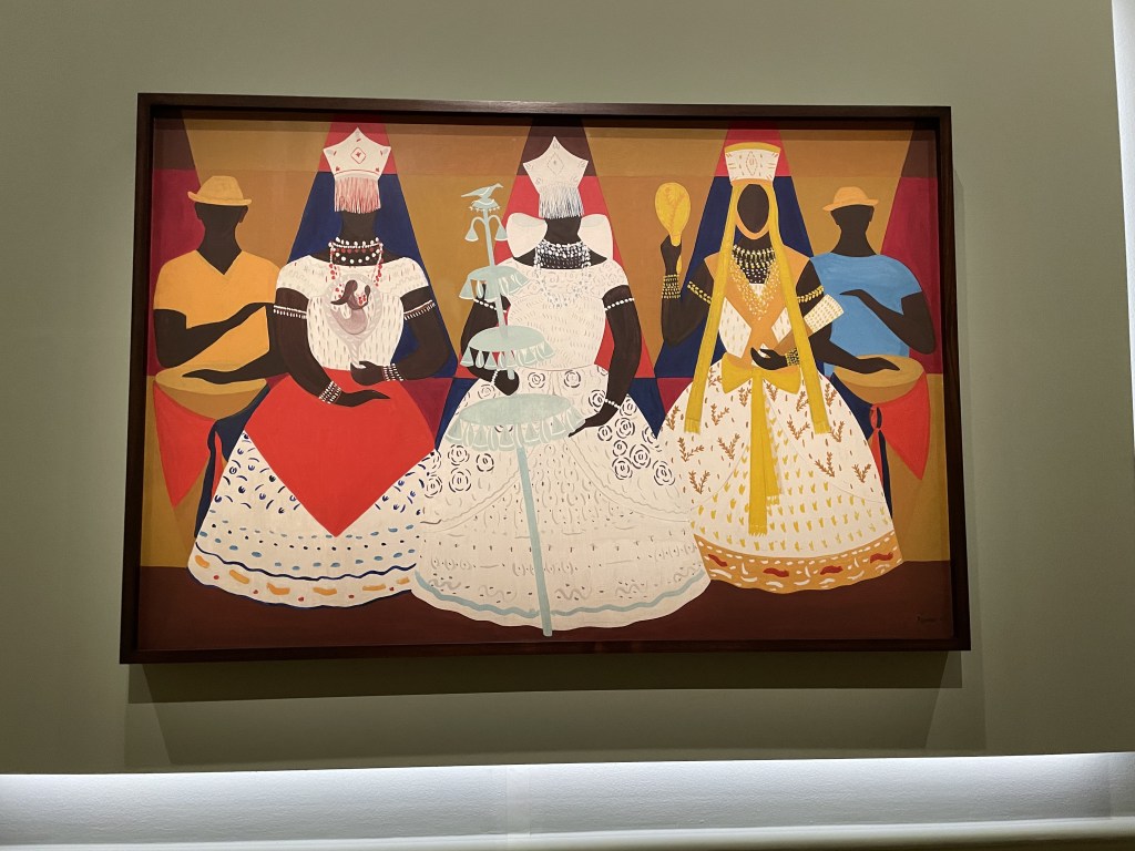
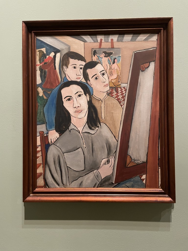
This image, entitled Three Orishas, was painted by Djanira da Motta e Silva in 1966. It’s an example of the ‘newer’ art in a show which exhibits the art of Brasil from the 1920-70s. The bright colours, stylised look and clear mingling of cultural languages captures, for me the true spirit of this young South American country.

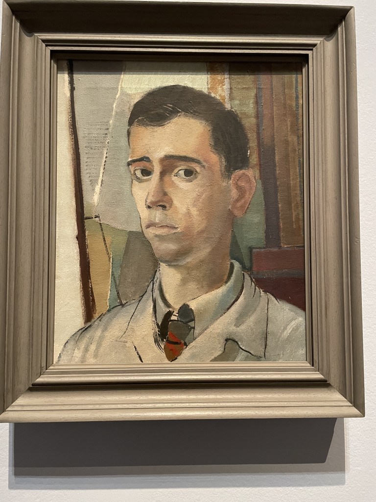
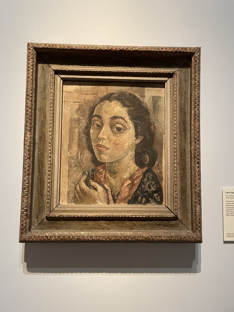
I’m always drawn to portraits and there are some very interesting examples. The muted colours betray the period of the painting and the inheritance of German expressionism. Left: Self-portrait with Orange Dress 1921 by Tarsila do Amaral, Portrait of a Young Man 1943 by Roberto Burle Marx and Lucy with Flower by Lasar Segall painted in 1939-42.

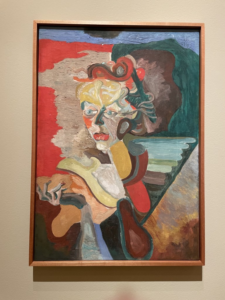
You can see the influence of expressionism and abstraction here with Djanira da Motta e Silva’s self-portrait from 1945, Flavio de Carvalho’s Portrait of Ivone Levi from 1951.

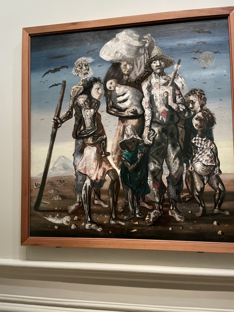
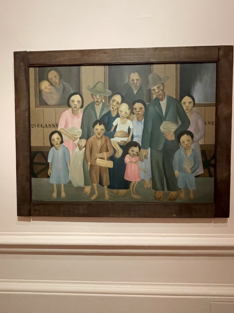
Interesting examples of social commentary with these two paintings. The rather sinister Migrants by Candido Portinari from 1944 represents the migration of northeastern rural communities who were forced to move to other part of the country in search of work. And Tarsila do Amaral’s ‘Second Class’ from 1933 illustrates the awful poverty resulting from the economic crash of 1929.

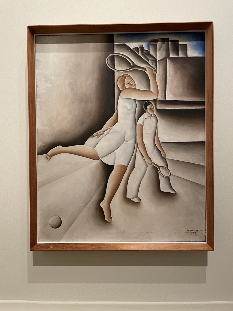
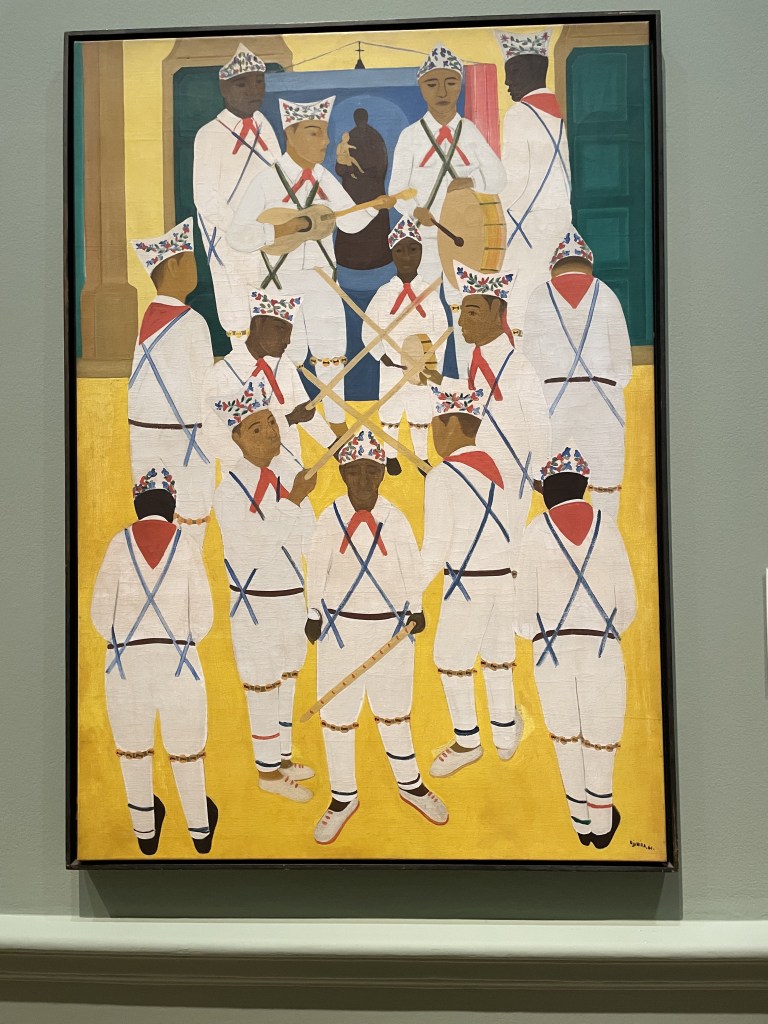
I liked the stylised tennis player in Vincente deo Rego Monteiro’s limited palette painting from 1928. And I really liked the Marrapaia Dance, Pariti painted by Djanira da Motta e Silva in 1961. Such a striking resemblance to the UK’s Morris dancers with strings of bells tied to the performers’ knees!

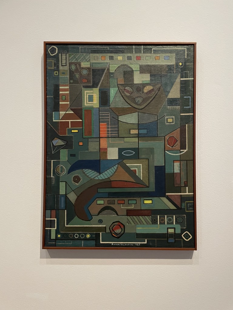
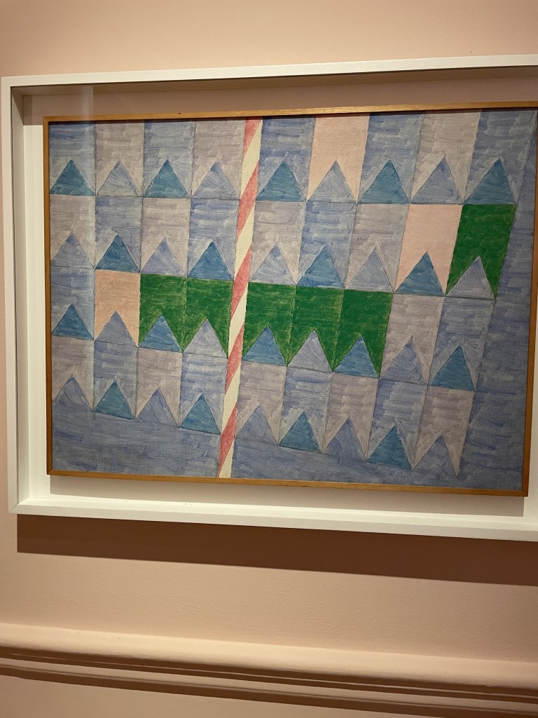
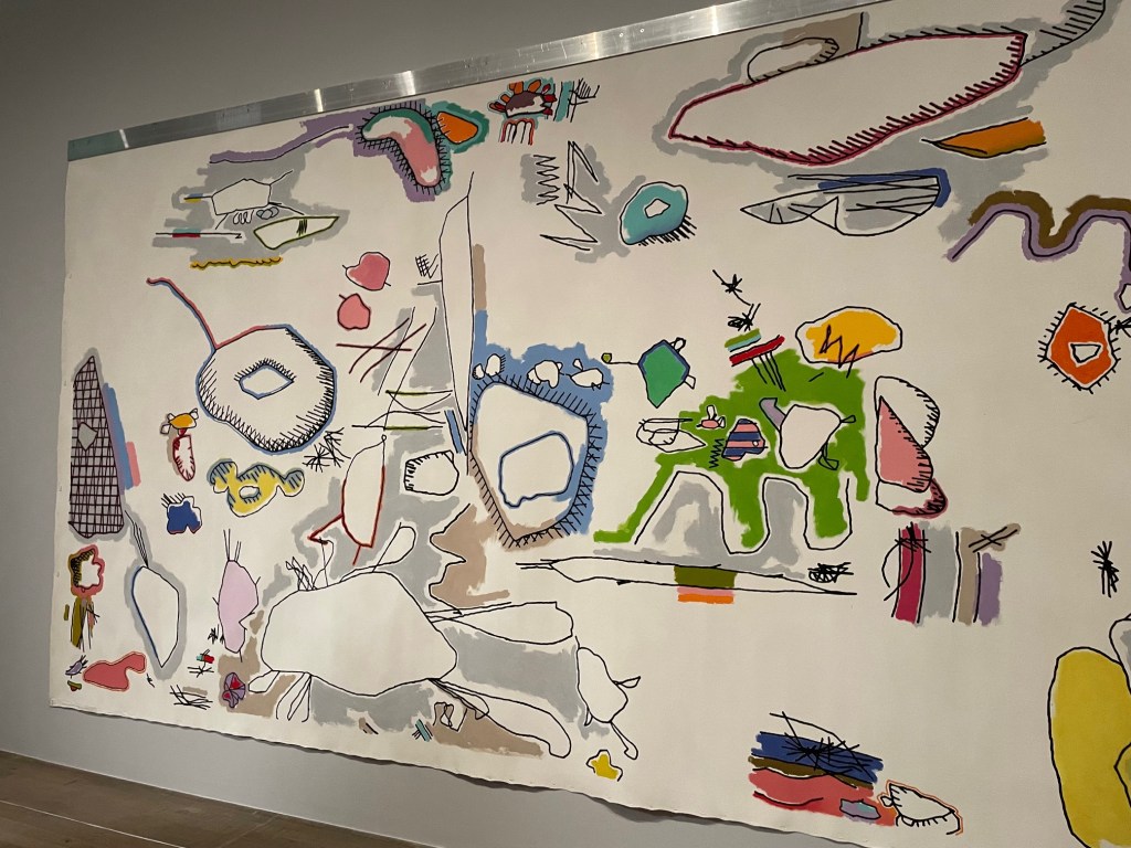
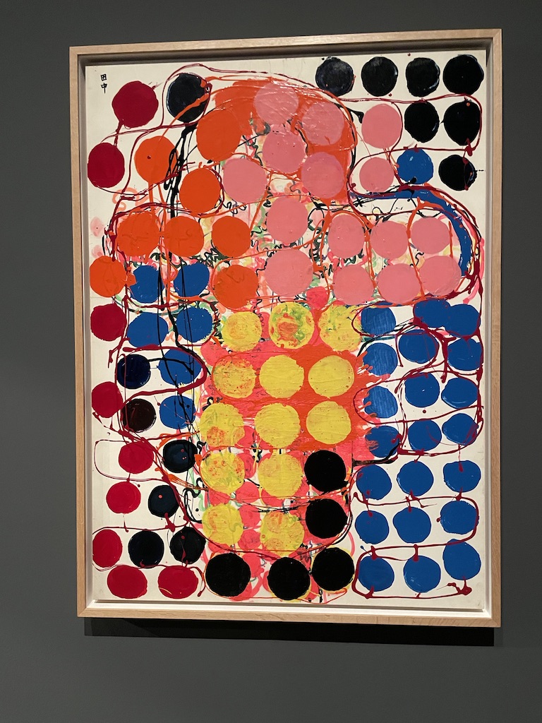
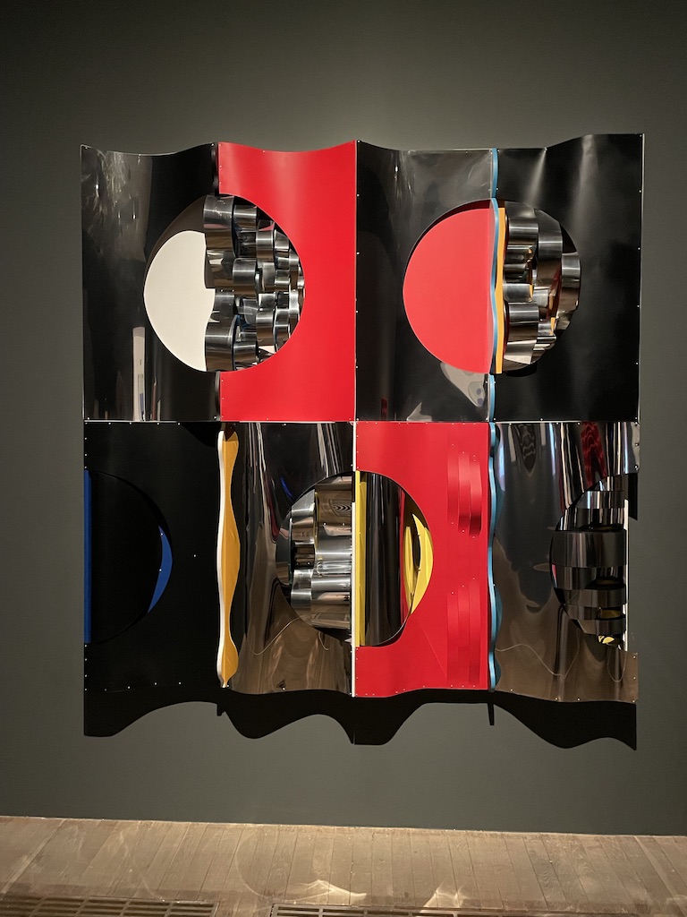
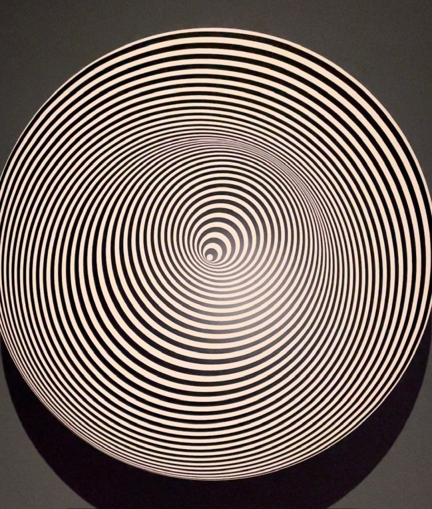
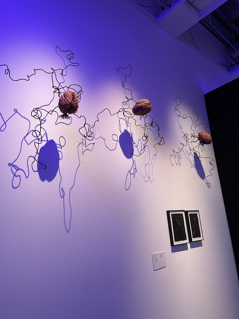
And here’s a pick and mix of abstracts and figurative work which show the evolution of Brasilian art.

The show is on at the Royal Academy until 21st April 2025

What a treat to see the spectacular ‘Vision of Saint Jerome’ by Parmigianino at the National Gallery. The painting was acquired 200 years ago when the gallery first opened and it’s great to see it displayed in its own space surrounded by fascinating sketches and outline plans.

Wow! You enter room 46 of the National Gallery and see this enormous, elongated painting in front of you. It was painted by the precociously talented young Renaissance painter, Parmigianino in around 1527. He was only 23 years old when he complete this astonishing commission for noblewoman Maria Bufalini as an altarpiece.

This one-man, one-room show is accompanied by drawings which illuminate the artist’s thinking and planning for this painting. With such a tall and thin space to fill, the composition had to be carefully worked out. The brief stipulated that the image must feature the Madonna and child, St Jerome and St John the Baptist. St Jerome is pictured reclining in a sylvan space and experiencing this fabulous vision. It’s such a robust and lively image, so well arranged with a real ‘line of beauty’ sinuously snaking through the figures giving the impression of circles and swirls within the picture space.

The accompanying drawings are fascinating too and so excellently done. You can see how the young artist sketched from life at speed to work out the poses of his figures. He was as brilliant with red chalk as he was with pen and ink and watercolour.

The exhibition is free and well worth a visit to the gallery. It’s on until 9th March 2025.

Electric Dreams: Art and Technology before the Internet. What a beguiling exhibition this is at Tate Modern. I find it a comfort that, whenever scientists and inventors come up with useful technology and innovations the artists follow in their wake and use them in a playful and creative way. Fascinating to see what artists achieved between the 1950s – 90s using motors, screens, broadcast, photography and computers to herald the dawning of digital.

The above image is ‘old school’ in comparison to the screens, flashing and kinetic works which follow but I really liked it. It is made of paper/card, so that helps. It’s by Vera Spencer and entitled Artist versus Machine from 1954. The punched cards are patterns followed by automated looms, early binary storage and the forerunner of computer coding.

Still clinging to the notion that art is physical, I was drawn to these works which celebrate the use of strange materials, the artist’s capacity for playing with a viewer’s perception and looking at a ‘flat’ artwork and seeing it appear to move. On the left is The Bride by Liliane Ljin using blown glass, ostrich feathers and croched stainless steel. In the middle is White Field by Guner Uecker, painted nails on canvas and on the right is a work from 1964 by Almir Mavignier.

And just a few more examples of the more ‘accessible’ art on surfaces which are mounted on the wall. But you can see how the artists are channelling abstract ideas and using unusual materials to create art. In the centre is a bright work by Atsuko Tanaka from 1957.

And these are some of the kinetic pieces which I can only show as stills. They twirl, flash, twiddle and mesmerise. Really fun room.

So, in conclusion, I really don’t understand the thinking behind much of this art but I can appreciate the playful, creative minds which created it. And now, in our digital age, we have these pioneers of playfulness to thank for the astonishing, surreal and fantastic images we tend to take for granted in our entertainment and media.

The show is at Tate Modern until 1st June 2025.

The 80s: Photographing Britain This is a new photography exhibition at Tate Britain which captures aspects of that decade and seems to suggest that everyone back then was in a state of angst, dissatisfaction and dispute. I remember it rather fondly but now it’s all history for a younger generation to view. An interesting show with 350 images to tell the story of Britain during those years.

We had the miners’ strike, race riots, poll tax riots, sky-high interest rates, poverty and loud fashion. Looking at the images from the eighties there are times when you wonder if the photograph might have been taken decades earlier, especially when the subject is poverty or inequality.

I guess, the eighties were the last decade when photography was done the ‘old-school’ way, before the digital revolution really took hold and we all started recording life on our phones. Still, I’m impressed to see how many photographers found a way to enter the most personal of moments in people’s lives and record important or incidental events – and all in black and white too. There were some excellent portraits too.

The galleries and walls with photographs in colour have a completely different atmosphere. There’s a richness, thanks to the colour, but sometimes there’s a feeling that the image is contrived even though you know that it’s the moment when the photographer saw a small event and captured it.

I was mainly drawn to the photographs of people but there were some striking images of landscapes too. I liked the sad collection of still-life images of beauty spots which have been ruined by pollution or fly tipping. And there was something about that photograph of the road with red paint taken in Ulster which captivated me.

The show is on at Tate Britain until 5th May 2025. Take yourself back to the eighties and enjoy!

Love for the elderly, sensitive family situations and tender images of relationships dominate this year’s selection of Taylor Wessing photo portraits on show at the National Portrait, and I approve the choice of prize winners for 2024.

Above is Celia and Shay, a very tender photograph taken by Megan Taylor which I found enchanting.

There was a great emphasis on images of much-loved elderly relatives in this year’s collection. These two caught my eye. On the left is Ageing Gracefully by Madeleine Waller of her mother at home in Australia. On the right is Inderjit Kaur by Jasmeen Patheja of her grandmother.

Here’s another trio of images of parents or images which capture older models. On the left is Mom, I’ll follow you still by Jesse Navarre Vos and shows his grandmother standing in the lift of the care home where she moved after they stopped living together. Vos wanted to capture the sense of separation and knowledge that he could no longer be with her into her new surroundings. In the centre is My Father’s Reflection by Diana Markosian and on the right is a portrait of Chicko, a clothes seller in London taken by Toks Majek using a 60 year old lens.

This photograph looked very spontaneous. Entitled Kitchen Embrace it shows the photographer’s daughter tenderly touching her grandmother’s cheek. The dog peeps up at the young girl and the two aubergines the woman is holding take centre stage.

And this, above, is the image which won first prize. It’s a very beguiling photograph taken by Steph Wilson of Sonam with her newborn baby. Sonam is a wigmaker and she is wearing a replica of her father’s moustache.

It’s a very interesting show this year and is situated on the upper floor of the gallery so you have the fun of walking through faces of the past to see these, the gallery’s most contemporary images. The Taylor Wessing Photo Portrait exhibition is on until 16th February 2025.

Prince George & Master Frederick is my debut novel. It’s a work of historical fiction but is based on the true story of Frederick Blomberg, the little orphan boy who was adopted by King George III and Queen Charlotte in 1765 and brought up like a prince within the royal household. Was he really the King’s secret son?

Prince George & Master Frederick (by Rosalind Freeborn) will be published by Alliance Publishing Press on 30th January 2025. It will be available on Amazon and through bookshops. You can also buy it directly from me on my author website. The cost is £15 per copy (plus £5.00 postage in the UK) and I’ll send you a signed copy.

Prince George & Master Frederick by Rosalind Freeborn, book jacket, portraits of Prince George - future regent and King George IV - and Frederick Blomberg, adopted son of King George III.  The paintings are by Richard Brompton and commissioned by Queen Charlotte.

In 1765, Frederick Blomberg a four-year-old orphan, is bundled into a carriage with a woman he does not know and taken to the royal palace at Richmond to be a playmate for the three-year-old Prince George. But why have King George III and Queen Charlotte adopted this child and what is his secret connection to the king?

I was prompted to write this book after investigating a family story suggesting that there was a connection (on my mother’s side) with King George III. Researching this story opened up the most fascinating life-story of Frederick Blomberg. He’s a character who is occasionally referenced in history books and royal biographies but his story has never been told before. Yet, when you look at the portrait by court artist, Richard Brompton, which was commissioned by Queen Charlotte, it’s clear that he was an important child in the household.

Prince George & Master Frederick is a work of fiction but it is based on real events, charting the lives of real people with just a few characters added for dramatic impact.

Prince George & Master Frederick by Rosalind Freeborn, historical novel about the secret son of King George III. Published by Alliance Publishing Press on 30th January 2025.

The two portraits which appear on the book jacket are by Richard Brompton. They feature the same plinth as prop and both boys are wearing the same pom-pom shoes. The portrait of Prince George, wearing garter robes, features Windsor Castle in the background (the painting now hangs in the 1844 Room at Buckingham Palace). Frederick Blomberg, in a fabulous rust-coloured suit, with greyhound, features Buckingham House in the background. Buckingham House was later remodelled and became Buckingham Palace.

It’s very exciting to have some advance copies of the book. I look forward to the moment it is published on 30th January 2025.

Photo of Rosalind Freeborn, author of Prince George & Master Frederick with a copy of her historical novel due to be published on 30th January 2025.

The V&A has just launched a fabulour exhbition celebrating the ‘Golden Age’ of the Mughal court 1560-1660. What a rich and creative time that was, embracing art forms which celebrated a huge and cultural geographic area covering a vast swathe of central Asia. A vast array of objects on show, from woven and printed fabrics, drawings and paintings on paper, books, weapons, clothing and vessels.

Before visiting this exhibition I had no idea that the Mughal dynasty was founded by a Central Asian ruler, Babur, in 1526 and lasted a hundred years. And in that time there was a spectacular flowering of artistry and creative excellence. The Mughal empire spanned India, Iran (Persia), Afghanistan, Gudjerat and Bangladesh. It’s so interesting to see how the art forms from these different countries and cultures merged. We regard them so separately these days but they all combined to create a beautiful Mughal aesthetic.

I did enjoy the narrative quality of the very intricate drawings and paintings. You get a terrific sense of life from these images – crowded with drama and people expressing politics, emotion and events.

Such delicacy to the painting of this goshawk, made about 1650-1700. Falconry was a familiar sport right across Asia. These birds were a luxury item, often given by merchants to the emperor as gifts.

There were many examples of traditional carpet weaving, fabrics and hangings such as this poppy floorspread (celebrating the opium trade), made for a palace.

Very attractive and interesting exhibition which is open at the V&A until 5th May 2025

The World of Tim Burton – what a treat. This new show at the Design Museum takes us into the creative mind of a truly original artist, designer and film-maker. Who knew that a boy who loved monsters would grow up to terrify generations of children and adults with his astonishing work.

Above is Tim Burton’s studio. Wherever he goes in the world he brings the cork boards where he can pin up doodles, sketches, paintings,fragments of information and survey them for inspiration.

it all begins with drawing. At the start of this fascinating exhibition at the Design Museum we learn that young Tim Burton grew up in Burbank, a suburb of Los Angeles where life was very quiet, ordered and conventional. But Tim loved monsters and disrupters – characters or creatures who enter ‘normal’ environments and cause chaos and change. I really liked this example of life drawing, above. He has drawn the model but just look, down below is a fantasy creature – clearly far more interesting to the artist than the pose in front of him.

Having established that he was going to use his artistic talent to make his living, Burton spent some formative years working for Disney, creating animations. Too slow. No, he wanted a far speedier medium. Yes, the creations might all begin as pencil sketches or paintings but soon they became 3D entities when models were made. The world of stop-frame animation suited him far better. With his team of designers, he would create the body of a character and then make a dozen different heads with a variety of expressions which would, ultimately, create the moving image.

This extensive exhibition has some great examples of costumes and props. I was really interested to see the Edward Scissorhands costume – made with a real mash up of fabrics, leather, buckles and buttons.

Not only figures but whole ‘worlds’ are brought to life through these models.

I think this exhibition will entrance all Tim Burton fans and inspire any budding animators, artists or film makers to consider ways of bringing their imagination to life. Definitely a show to catch. It’s on until 21st April 2025.

What an enchanting show! It’s a joy to visit the National Gallery and ‘Discover Constable and the Hay Wain’. This picture has graced millions of biscuit tins and chocolate boxes but there’s so much more to the image. Fascinating to see the painting in the context of a contemporary painter of the 1820s channelling the aesthetic of traditional landscape painting and establishing a British school of landscape. Fabulous

The Hay Wain is such a familiar image and conjures thoughts of ‘Merrie England’, the countryside fantasy of rural beauty, a simple life and the contented relationship between people who till the earth and the beauty of the fields where they work. At the press preview, listening to curator Christine Riding, it was fascinating to hear the context of the Hay Wain explained and then illustrated by a charming selection of complementary paintings, drawings, sketches and cartoons.

Took a couple of close-ups of the Hay Wain. It’s one of John Constable’s ‘six-footers’, a very large painting which was started in 1819 with the intention of grabbing the attention of collectors and fellow artists. Size does matter when you’re competing with other people to gain a reputation in the art work; this was an epic work, produced in his studio, but very much based on sketches and paintings made ‘en plein air’ in the Suffolk countryside Constable knew so well.

This is a large-scale (6ft) dry run which Constable painted. I love the liveliness and free painting. He does not become bogged down in detail yet all the elements of the composition are there.

On the left is a work by Constable entitled The Wheat Field. It makes rural life look very clean, romantic and relaxed. On the right is Golding Constable’s Kitchen Garden (his father) which was very personal to Constable and he kept it for himself and it was never sold in his lifetime.

This painting is by Thomas Gainsborough (1748) Like Constable, he was born and brought up in Suffolk and was familiar with the same landscape. This work depicts Cornard Wood, common land at the time. The painting belonged to Constable’s uncle, David Pike Watts and would have been familiar to the young artist as he was developing his interest in landscape painting and admiring Gainsborough’s technique.

Always wonderful to see an artist’s sketch book and this shows how Constable studied field-workers and rural activity. On the right is a tiny oil sketch showing the composition of the Hay Wain. We learned that the house on the left, known as Willy Lott’s Cottage was, in fact, owned by Mr William Lott and it was a house, and a substantial dwelling. Perhaps Constable is guilty of loading his seminal work with a dose of sentimentality in order to appeal to the ideal of the rural idyll?

This is very charming set of tiny models depicting the best singers in the East Bergholt church choir. It has been attributed to the young John Constable as creator but we can’t be sure. They are very enchanting, tiny carved and painted wooden figures.

The show is just wonderful. It’s part of the National Gallery’s 200th year celebration and well worth a visit.

Francis Bacon: Human Presence. A very impressive new show at the National Portrait Gallery brings together over 50 of his paintings and includes fascinating photographs of him at work in his studio and fragments of the images and source material which inspired him. It is a visceral experience. Bacon aimed to captures the essence of his subject, not bothering with a direct likeness, but depicting what he feels about them.

Francis Bacon is one of those artists whose work divides opinion. Self-taught, ambitious, original and curious, he has created images of people which are arresting, memorable and honest. He was not interested in the conventions of likeness – for so long the measuring stick of portraiture – his aim was to capture and convey the ‘essence’ of a person and express their ‘presence’ within the painting rather than features which resembled them.

Having said that, there is a likeness to the subjects he depicts. Clearly, he scrutinised faces carefully. He started his career by painting from life but swiftly moved on to using photographs – taken specially for the work or gathered from magazines and scraps of paper. It’s great to see so many of these ‘scraps’ of images which inspired his work. Often they were scattered about on the floor of his studio, bespattered with paint and generally destroyed. But their very presence within this show only adds to the intensity of the portraits on show.

I enjoyed the triptych studies of head. Above are images of his friends Isabel Rawsthorne and Peter Lacy. Peter Lacy was Bacon’s lover in the early part of his career. There were several important gay relationships in his life but the last was with George Dyer. There is a very moving triptych of the last paintings of George Dyer shortly before he died. (below) The paintings are a tribute to an important man in his life and the atmosphere of depression and sickness which emanates from the canvases is overwhelming.

This impressive exhibition explores the influences and friendships which contributed to the evolution of his distinctive and challenging style. It was a joy to see a small self-portrait by Rembrandt which Bacon especially admired for its darkness and thickly applied paint.

Francis Bacon: Human Presence is on at the National Gallery until 19th January 2025