Before visiting this exhibition I had no idea that the Mughal dynasty was founded by a Central Asian ruler, Babur, in 1526 and lasted a hundred years. And in that time there was a spectacular flowering of artistry and creative excellence. The Mughal empire spanned India, Iran (Persia), Afghanistan, Gudjerat and Bangladesh. It’s so interesting to see how the art forms from these different countries and cultures merged. We regard them so separately these days but they all combined to create a beautiful Mughal aesthetic.
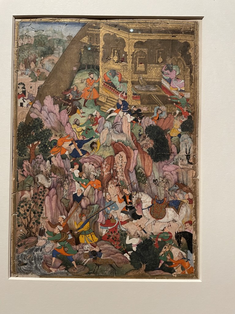
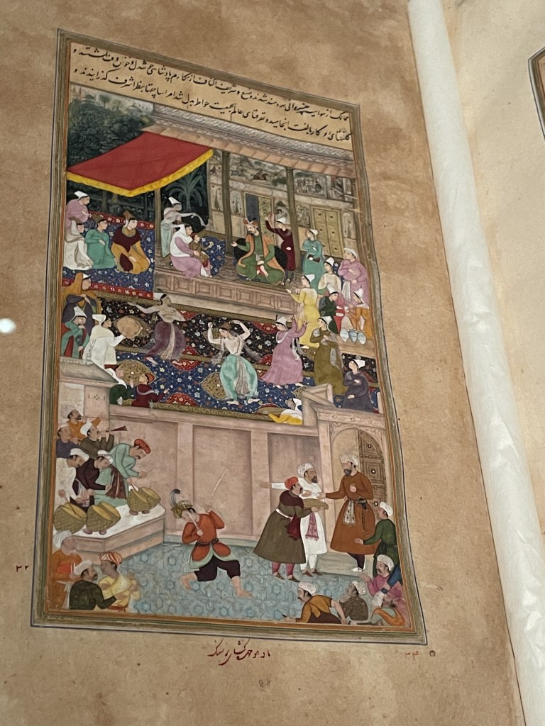
I did enjoy the narrative quality of the very intricate drawings and paintings. You get a terrific sense of life from these images – crowded with drama and people expressing politics, emotion and events.
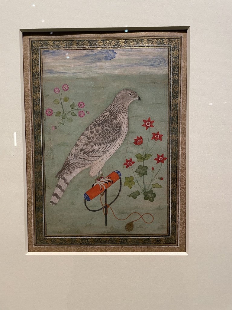
Such delicacy to the painting of this goshawk, made about 1650-1700. Falconry was a familiar sport right across Asia. These birds were a luxury item, often given by merchants to the emperor as gifts.
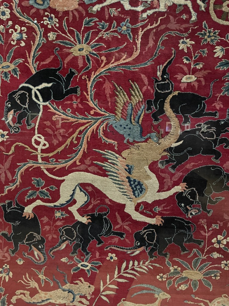
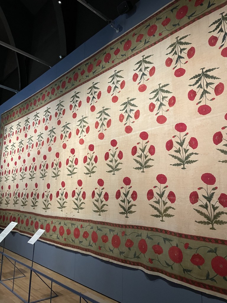
There were many examples of traditional carpet weaving, fabrics and hangings such as this poppy floorspread (celebrating the opium trade), made for a palace.
Very attractive and interesting exhibition which is open at the V&A until 5th May 2025
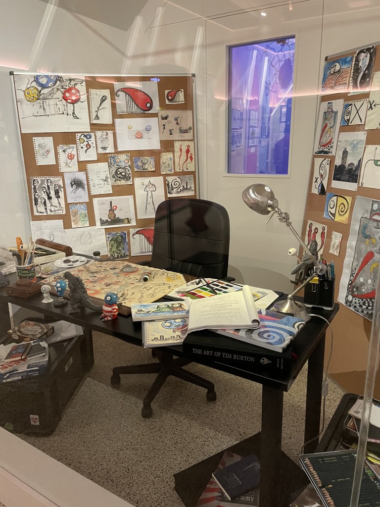
Above is Tim Burton’s studio. Wherever he goes in the world he brings the cork boards where he can pin up doodles, sketches, paintings,fragments of information and survey them for inspiration.
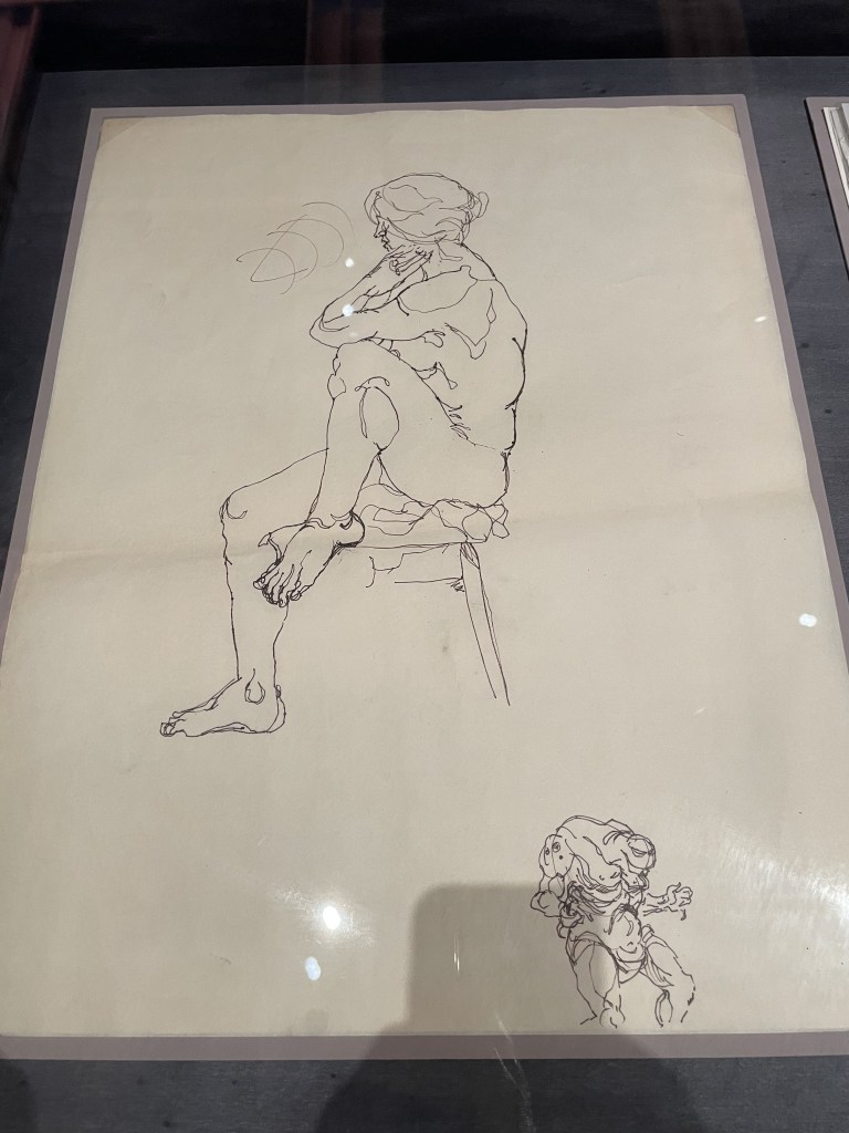
it all begins with drawing. At the start of this fascinating exhibition at the Design Museum we learn that young Tim Burton grew up in Burbank, a suburb of Los Angeles where life was very quiet, ordered and conventional. But Tim loved monsters and disrupters – characters or creatures who enter ‘normal’ environments and cause chaos and change. I really liked this example of life drawing, above. He has drawn the model but just look, down below is a fantasy creature – clearly far more interesting to the artist than the pose in front of him.
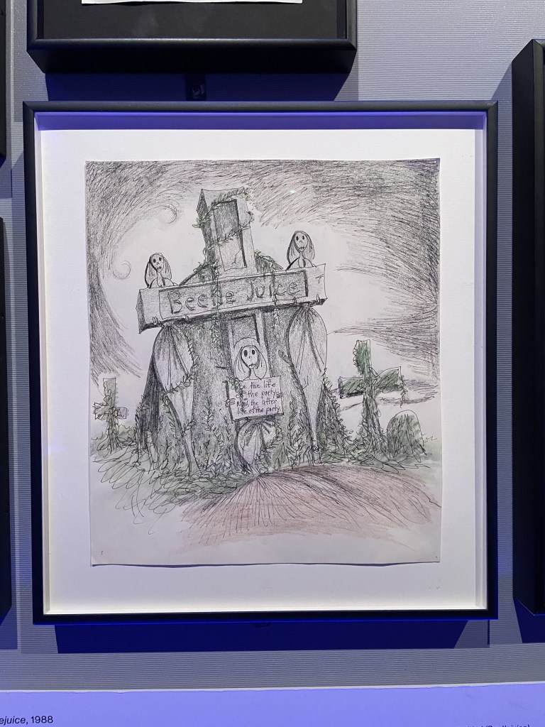
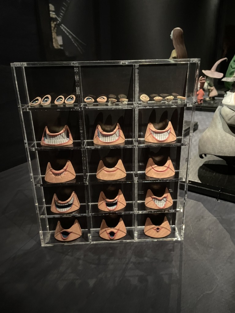
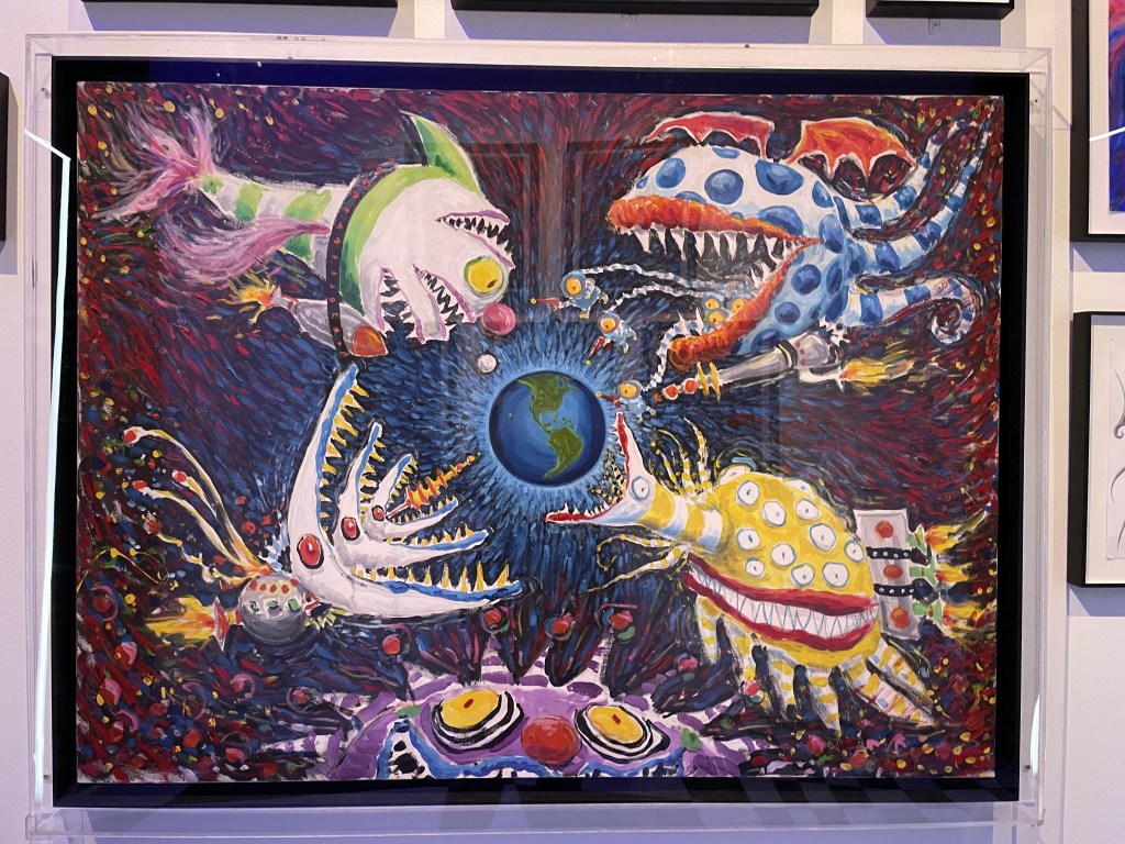
Having established that he was going to use his artistic talent to make his living, Burton spent some formative years working for Disney, creating animations. Too slow. No, he wanted a far speedier medium. Yes, the creations might all begin as pencil sketches or paintings but soon they became 3D entities when models were made. The world of stop-frame animation suited him far better. With his team of designers, he would create the body of a character and then make a dozen different heads with a variety of expressions which would, ultimately, create the moving image.
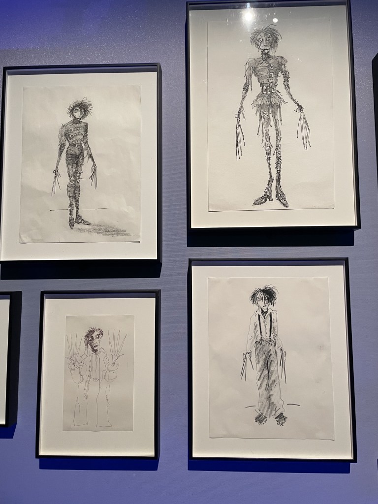
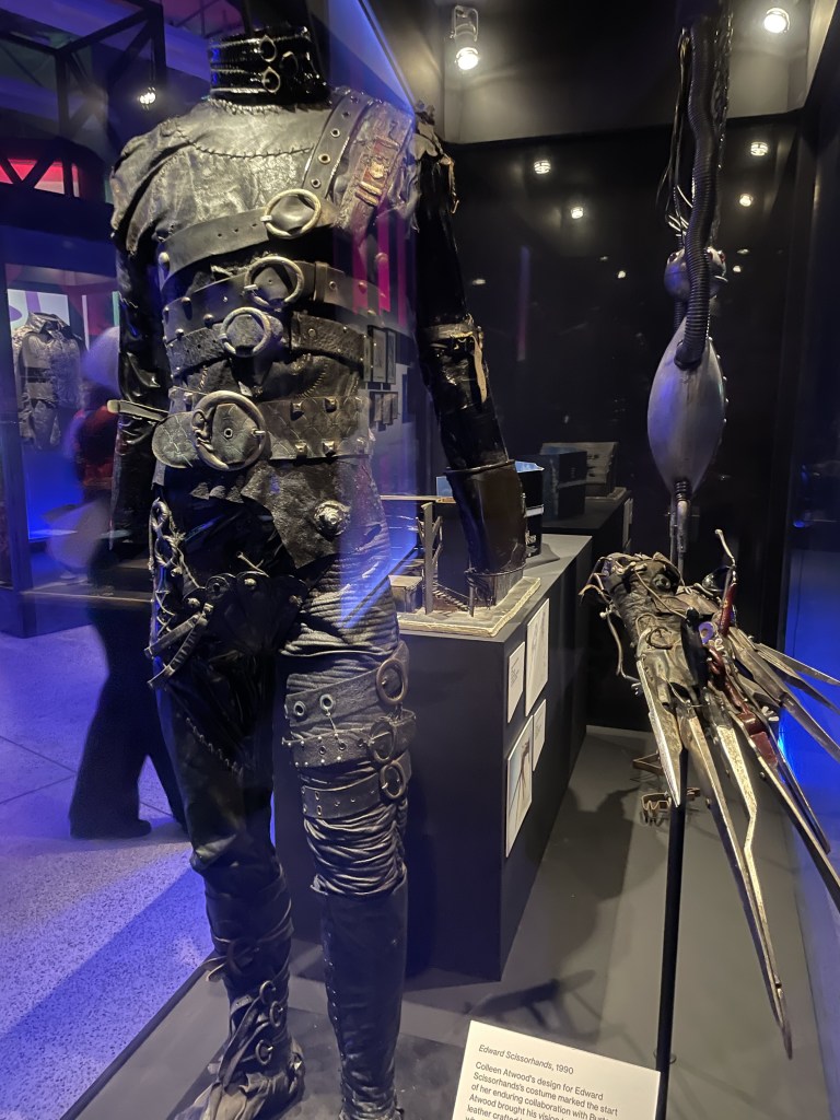
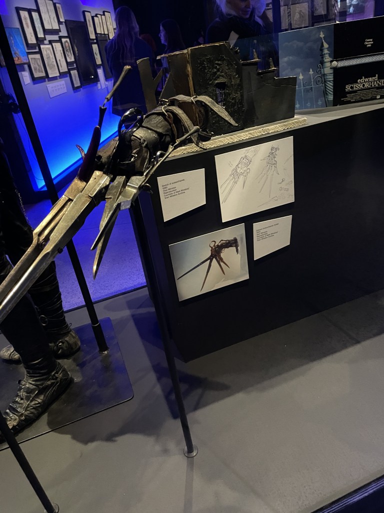
This extensive exhibition has some great examples of costumes and props. I was really interested to see the Edward Scissorhands costume – made with a real mash up of fabrics, leather, buckles and buttons.
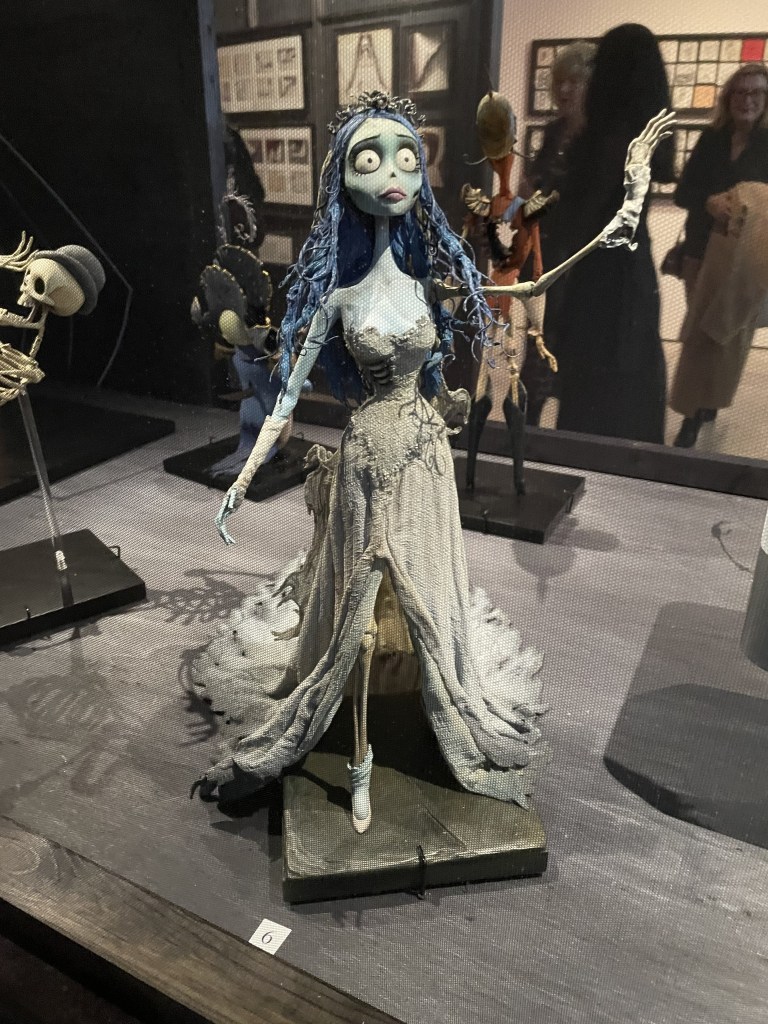
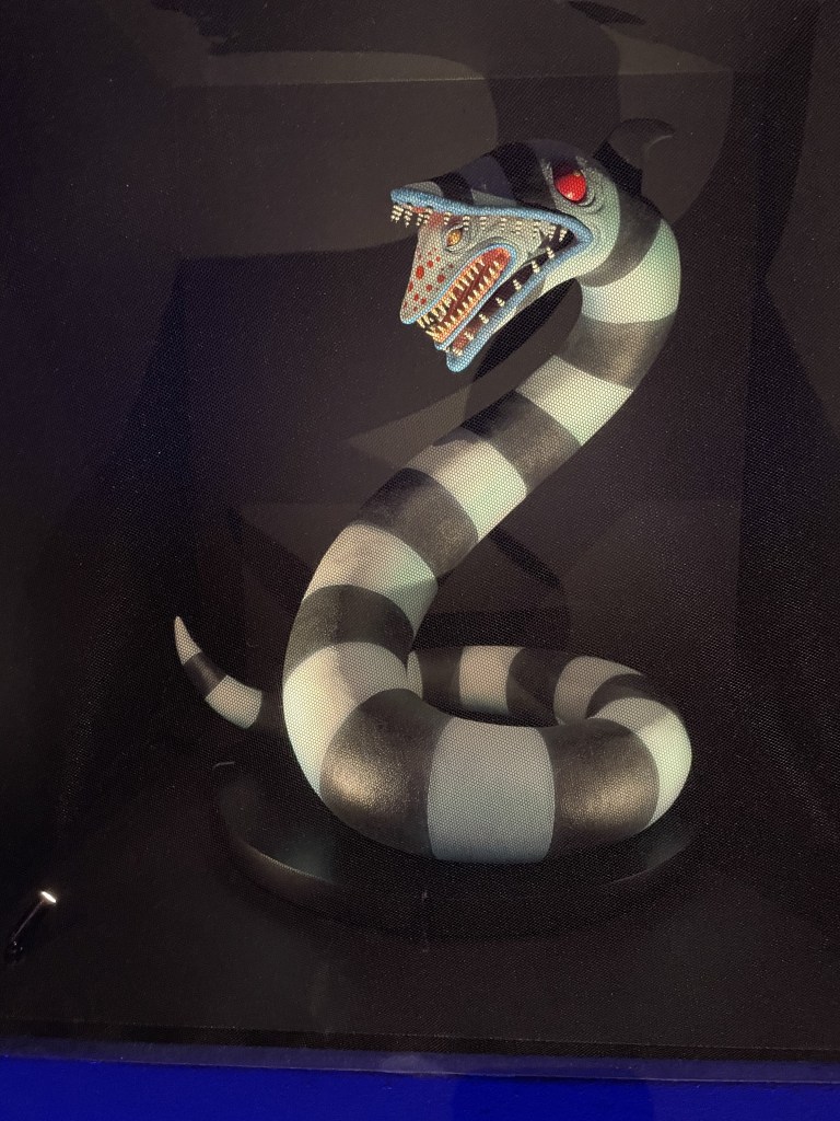
Not only figures but whole ‘worlds’ are brought to life through these models.
I think this exhibition will entrance all Tim Burton fans and inspire any budding animators, artists or film makers to consider ways of bringing their imagination to life. Definitely a show to catch. It’s on until 21st April 2025.
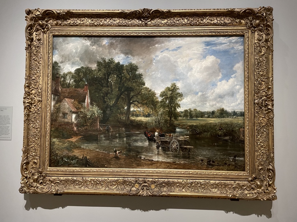
The Hay Wain is such a familiar image and conjures thoughts of ‘Merrie England’, the countryside fantasy of rural beauty, a simple life and the contented relationship between people who till the earth and the beauty of the fields where they work. At the press preview, listening to curator Christine Riding, it was fascinating to hear the context of the Hay Wain explained and then illustrated by a charming selection of complementary paintings, drawings, sketches and cartoons.
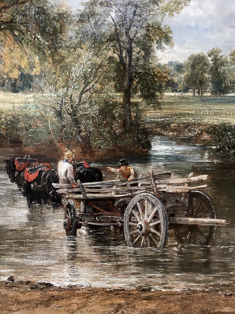
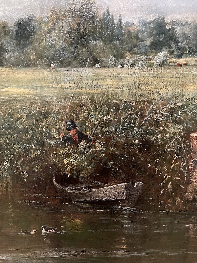
Took a couple of close-ups of the Hay Wain. It’s one of John Constable’s ‘six-footers’, a very large painting which was started in 1819 with the intention of grabbing the attention of collectors and fellow artists. Size does matter when you’re competing with other people to gain a reputation in the art work; this was an epic work, produced in his studio, but very much based on sketches and paintings made ‘en plein air’ in the Suffolk countryside Constable knew so well.
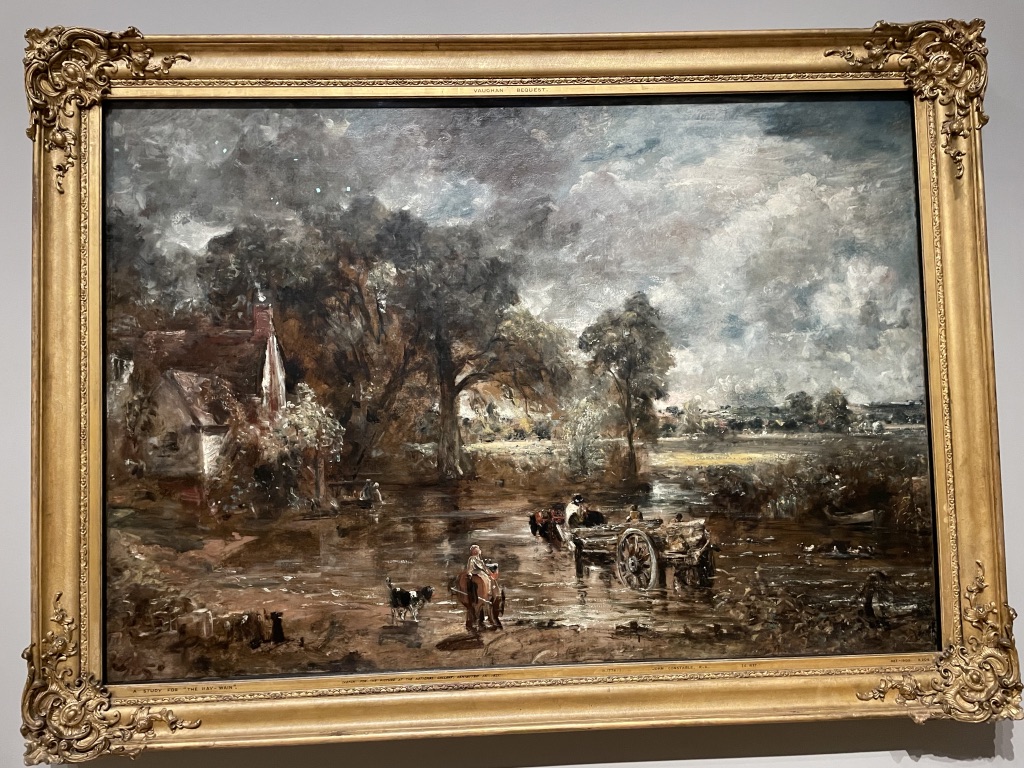
This is a large-scale (6ft) dry run which Constable painted. I love the liveliness and free painting. He does not become bogged down in detail yet all the elements of the composition are there.
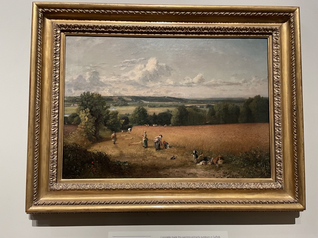
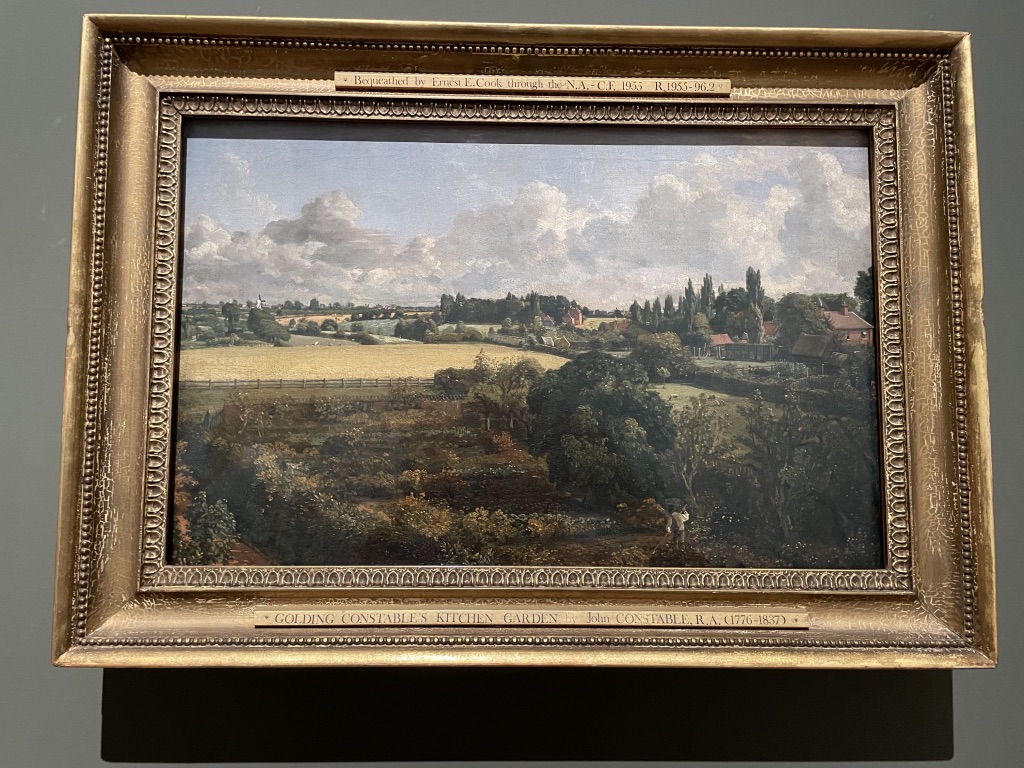
On the left is a work by Constable entitled The Wheat Field. It makes rural life look very clean, romantic and relaxed. On the right is Golding Constable’s Kitchen Garden (his father) which was very personal to Constable and he kept it for himself and it was never sold in his lifetime.
This painting is by Thomas Gainsborough (1748) Like Constable, he was born and brought up in Suffolk and was familiar with the same landscape. This work depicts Cornard Wood, common land at the time. The painting belonged to Constable’s uncle, David Pike Watts and would have been familiar to the young artist as he was developing his interest in landscape painting and admiring Gainsborough’s technique.
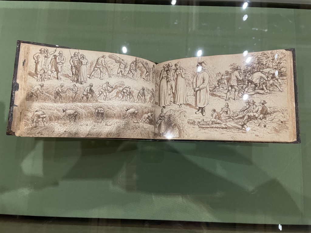
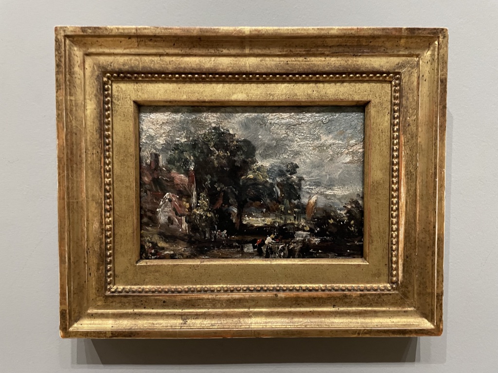
Always wonderful to see an artist’s sketch book and this shows how Constable studied field-workers and rural activity. On the right is a tiny oil sketch showing the composition of the Hay Wain. We learned that the house on the left, known as Willy Lott’s Cottage was, in fact, owned by Mr William Lott and it was a house, and a substantial dwelling. Perhaps Constable is guilty of loading his seminal work with a dose of sentimentality in order to appeal to the ideal of the rural idyll?
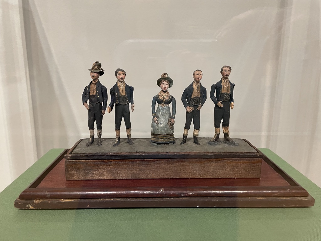
This is very charming set of tiny models depicting the best singers in the East Bergholt church choir. It has been attributed to the young John Constable as creator but we can’t be sure. They are very enchanting, tiny carved and painted wooden figures.
The show is just wonderful. It’s part of the National Gallery’s 200th year celebration and well worth a visit.
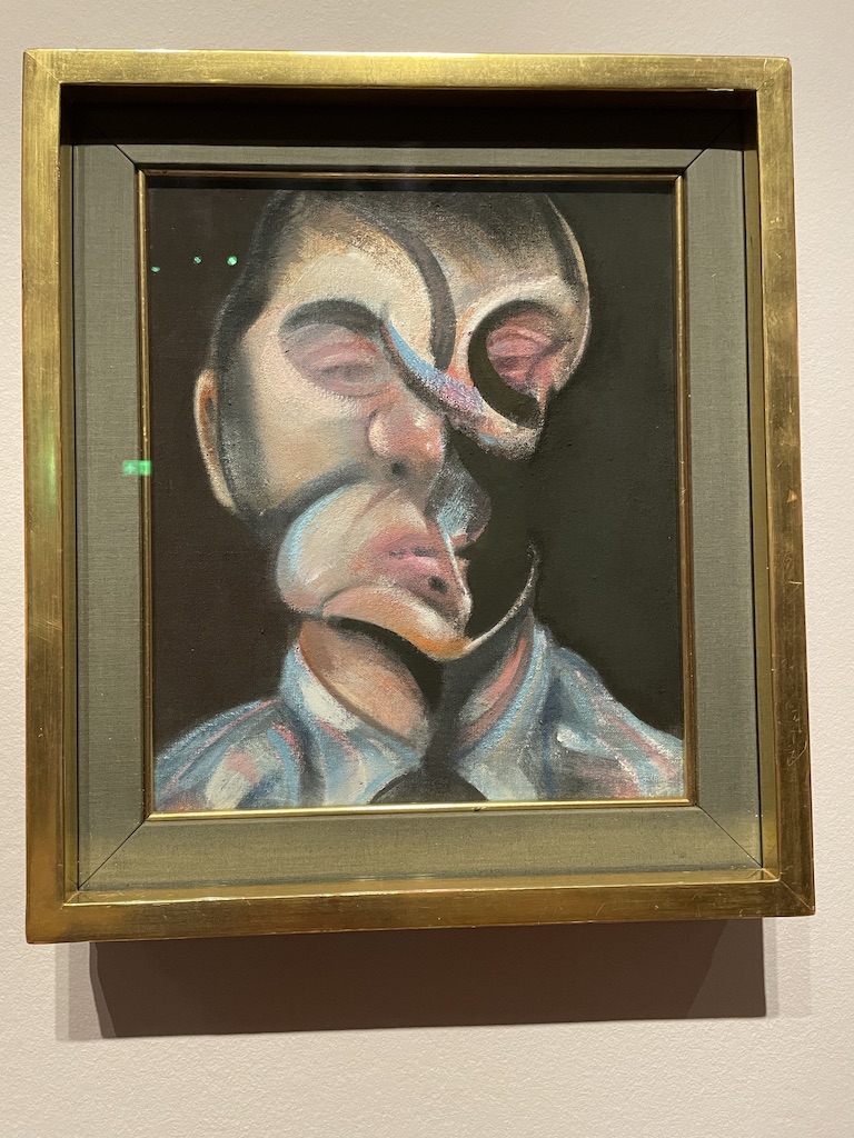
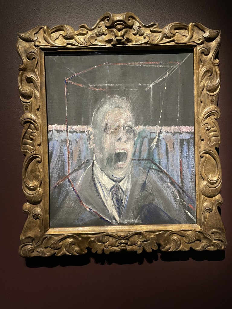
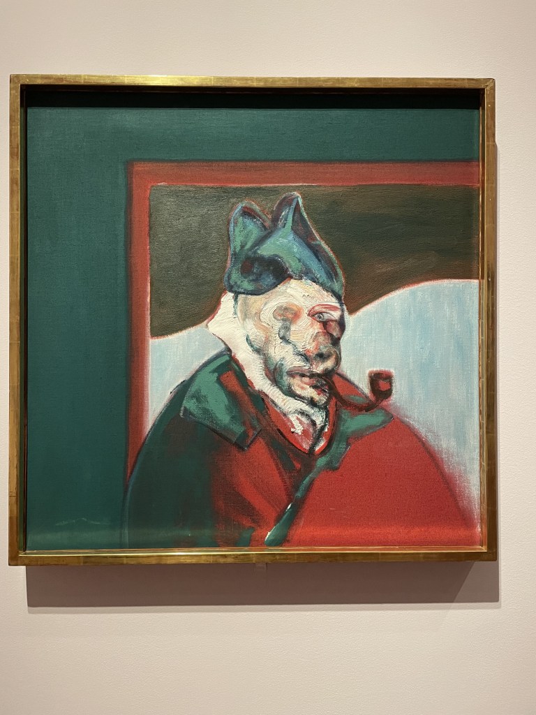
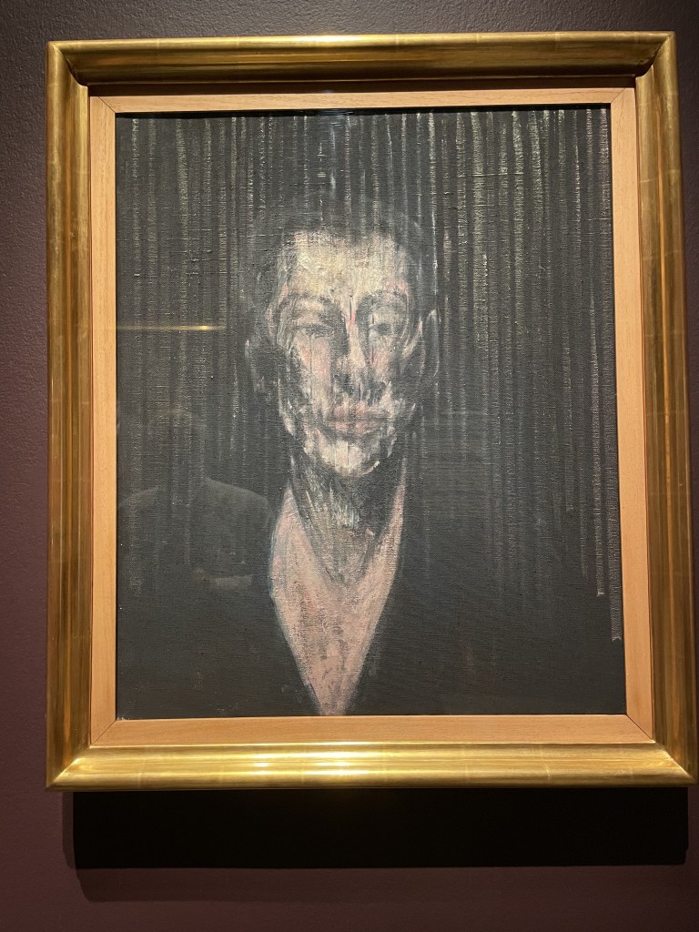
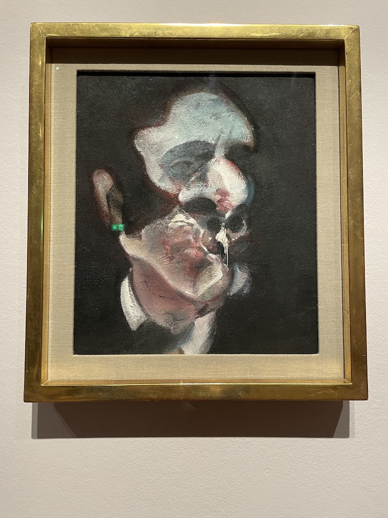
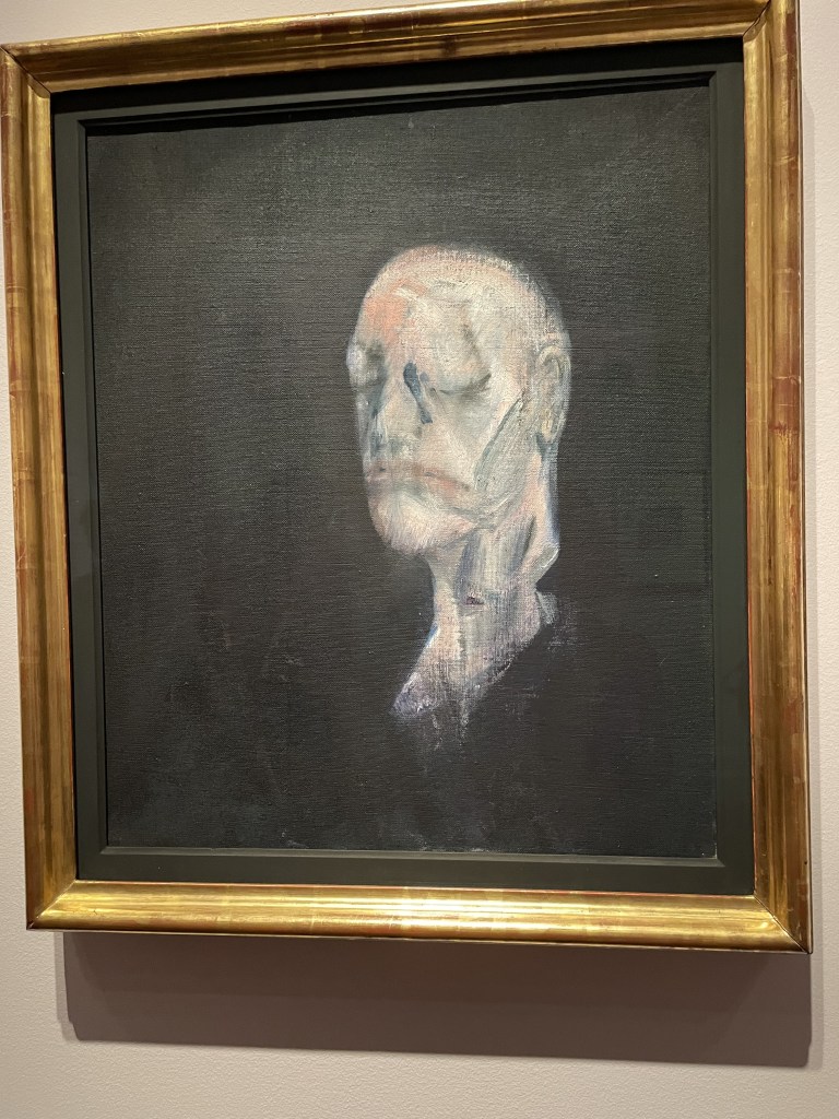
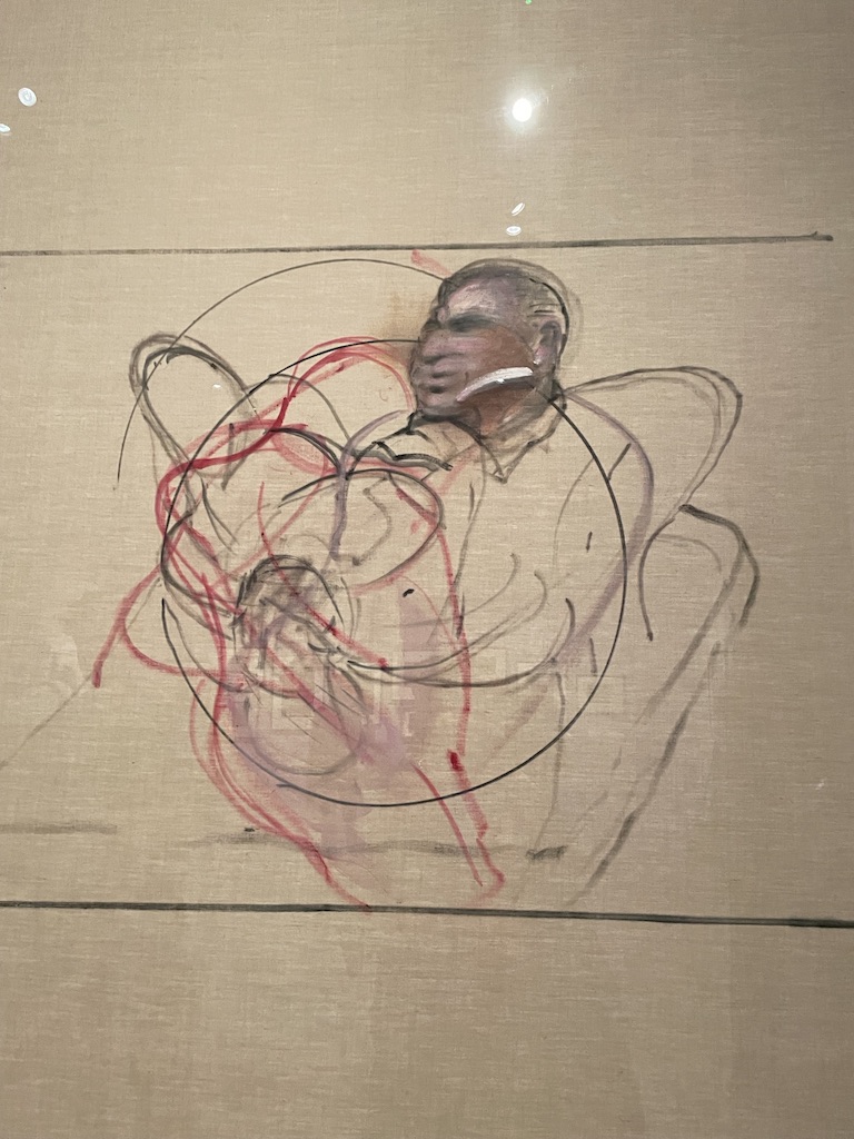
Francis Bacon is one of those artists whose work divides opinion. Self-taught, ambitious, original and curious, he has created images of people which are arresting, memorable and honest. He was not interested in the conventions of likeness – for so long the measuring stick of portraiture – his aim was to capture and convey the ‘essence’ of a person and express their ‘presence’ within the painting rather than features which resembled them.
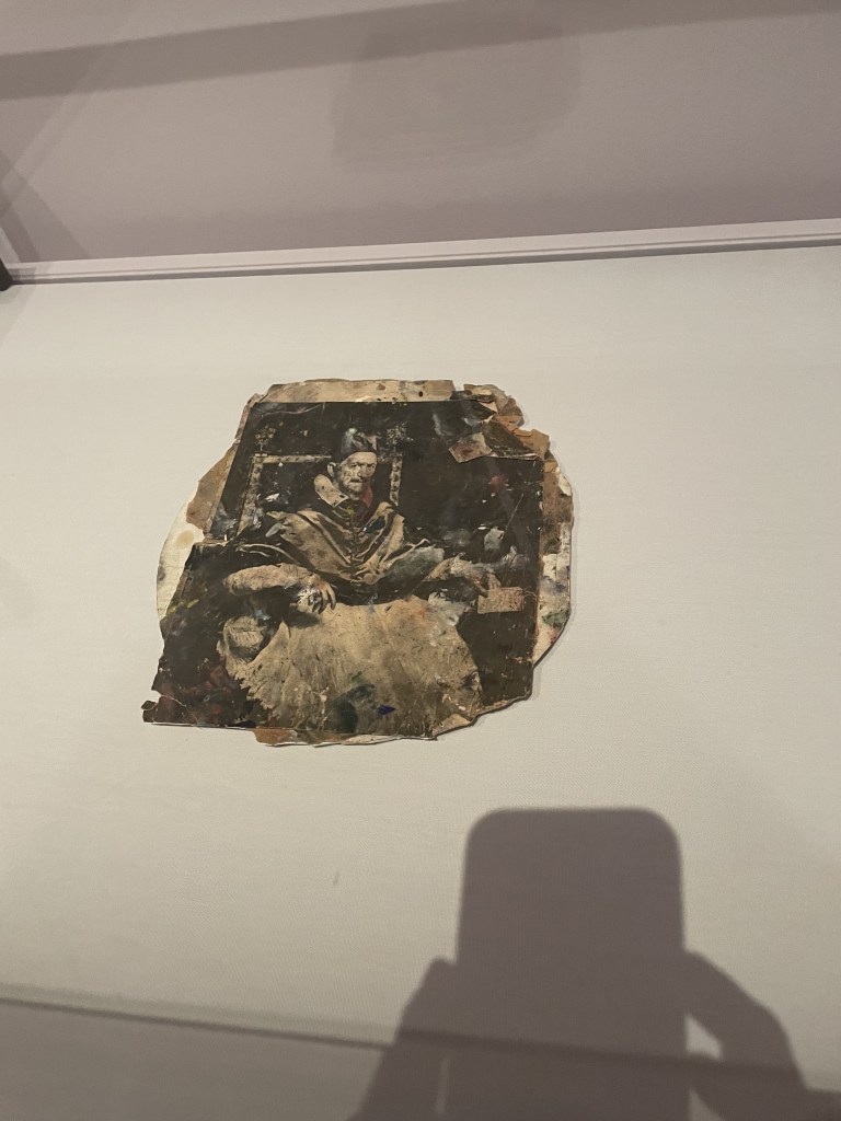
Having said that, there is a likeness to the subjects he depicts. Clearly, he scrutinised faces carefully. He started his career by painting from life but swiftly moved on to using photographs – taken specially for the work or gathered from magazines and scraps of paper. It’s great to see so many of these ‘scraps’ of images which inspired his work. Often they were scattered about on the floor of his studio, bespattered with paint and generally destroyed. But their very presence within this show only adds to the intensity of the portraits on show.
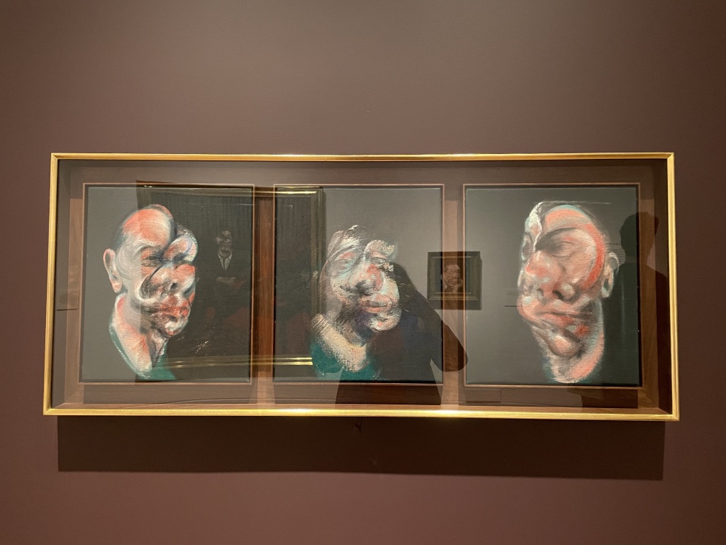
I enjoyed the triptych studies of head. Above are images of his friends Isabel Rawsthorne and Peter Lacy. Peter Lacy was Bacon’s lover in the early part of his career. There were several important gay relationships in his life but the last was with George Dyer. There is a very moving triptych of the last paintings of George Dyer shortly before he died. (below) The paintings are a tribute to an important man in his life and the atmosphere of depression and sickness which emanates from the canvases is overwhelming.
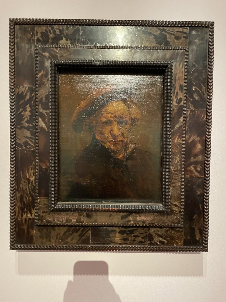
This impressive exhibition explores the influences and friendships which contributed to the evolution of his distinctive and challenging style. It was a joy to see a small self-portrait by Rembrandt which Bacon especially admired for its darkness and thickly applied paint.
Francis Bacon: Human Presence is on at the National Gallery until 19th January 2025
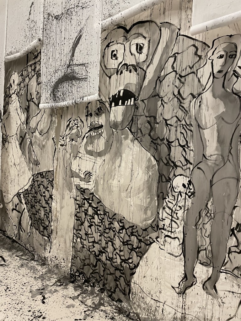
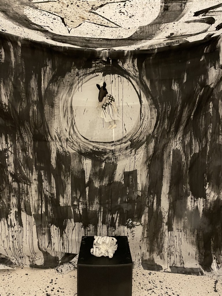
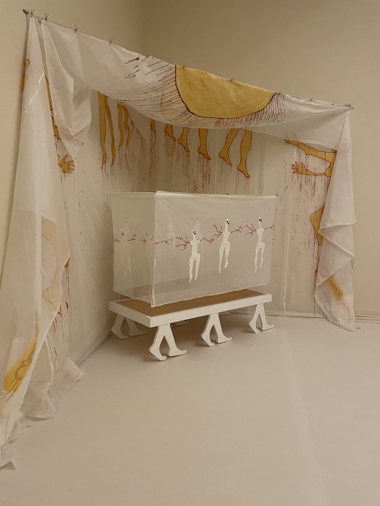
Each of the four artists have created exhibition spaces which have an immersive quality but the Delaine Le Bas room are a riot of black and white exuberance with individual chambers filled with textiles, paint, costume and sculpture. The themes are death, loss and renewal.
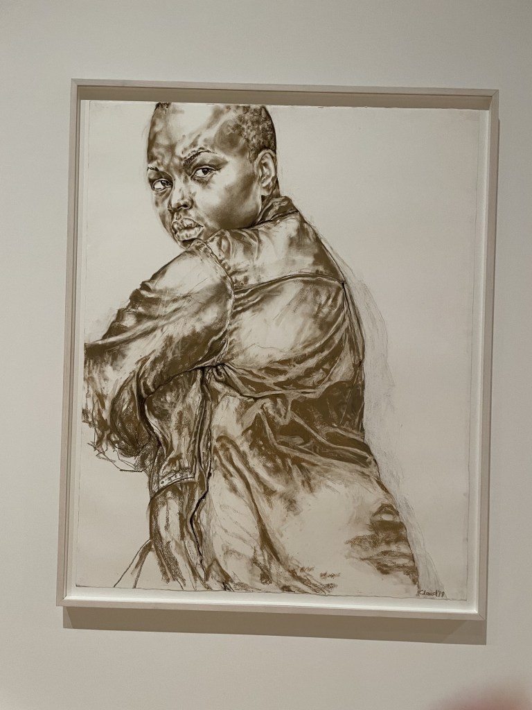
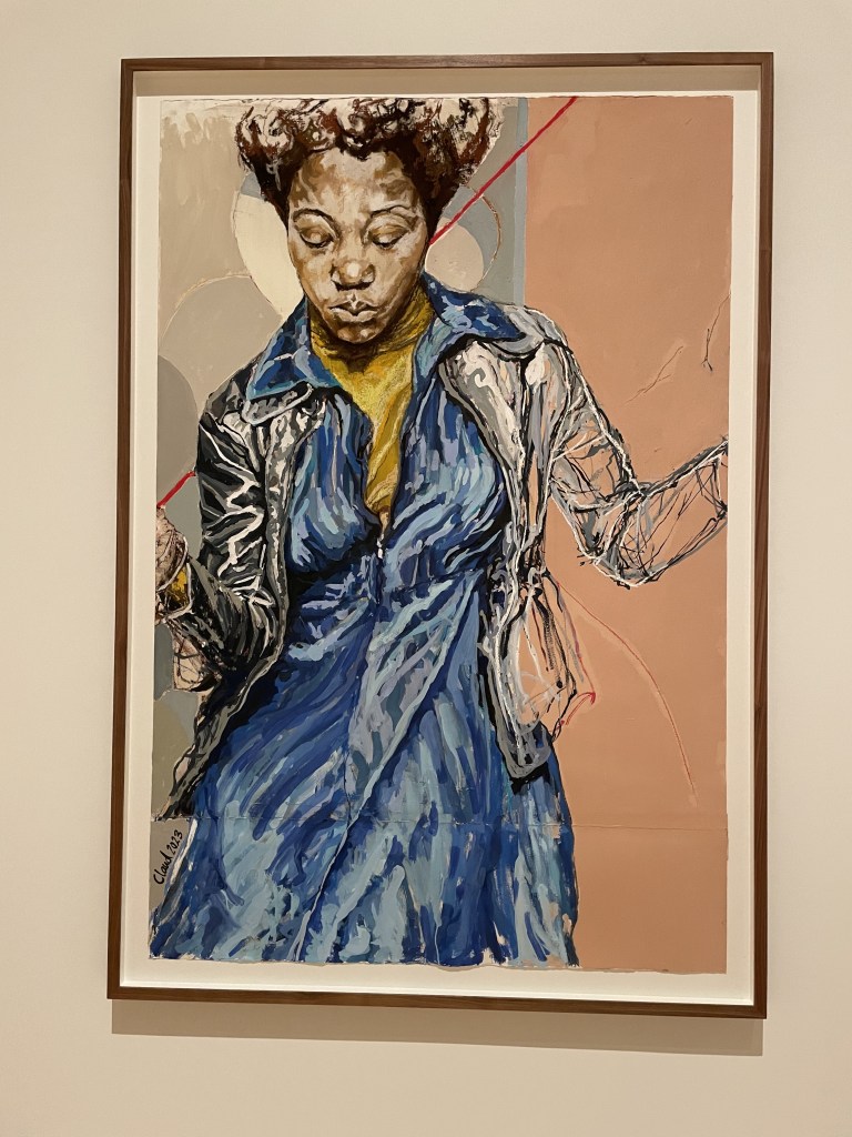
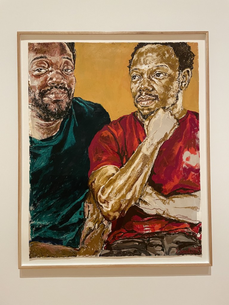
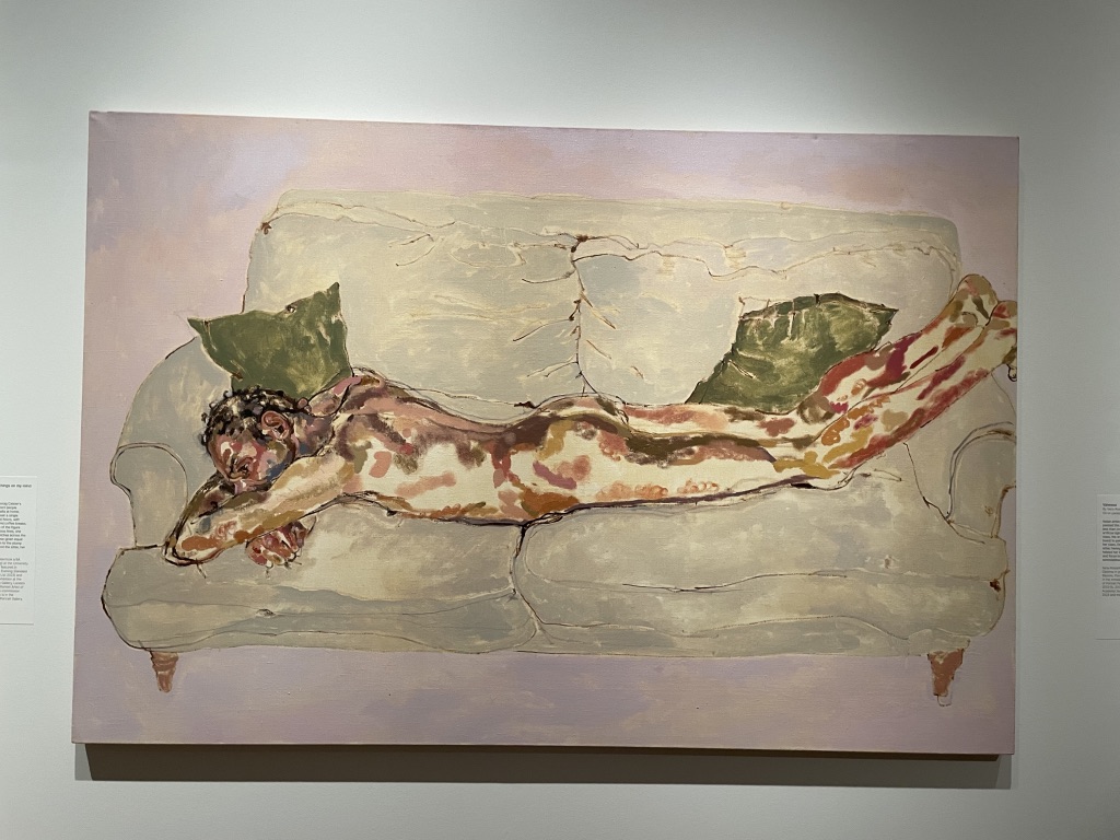
Above are four works by Claudette Johnson. After the immersion of the other rooms it was quite a relief to see portraits on canvas on walls. The subjects are Black men and women with a very striking narrative quality to each of them. Big, bold and expressive, I really liked these works.
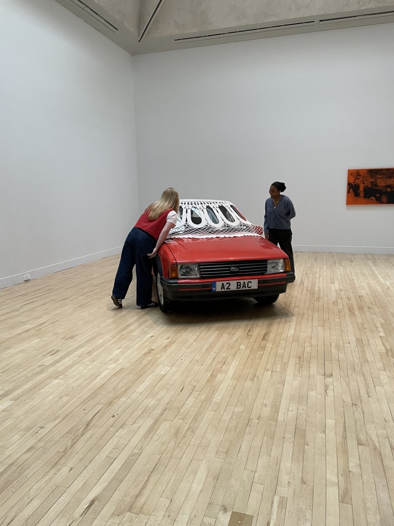
Jasleen Kaur’s rooms are about tradition, memory, family and history. There’s also a very witty quality to the work. A vintage Ford Escort is covered with a large doily crocheted from cotton.
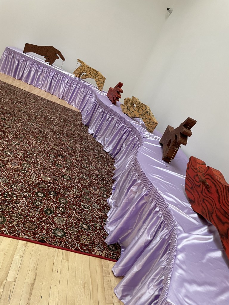
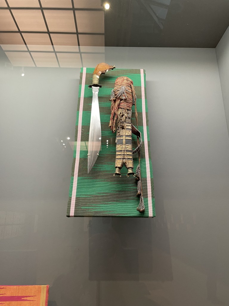
Pio Abad explores cultural loss and colonial history. Inspired by museum objects from the Ashmolean Museum in Oxford he channels his Filipino heritage. The image I’ve posted is bladed weaponry from Mindanao. Beautiful but terrifying at the same time.
There are some interesting films about each of the artists in the corridor outside the exhibition space and it’s useful to hear their inspiration and see their studio spaces. The show is on until 16th February 2025 but the winner will be announced at Tate Britain on 3rd December 2024, the prize’s 40th anniversary.
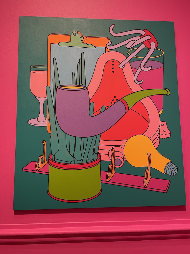
I wasn’t sure I was going to like this exhibition of work by Michael Craig-Martin but I’m happy to report that it was very enjoyable. I tend to be drawn to a painterly painting, with plentiful brushstrokes and evidence of the artist’s hand at work and I wasn’t sure that his very graphic, almost cartoon-like style might not appeal to me. But it just goes to show that you need to wander around an exhibition with an open mind and be prepared to reassess any preconceived ideas.
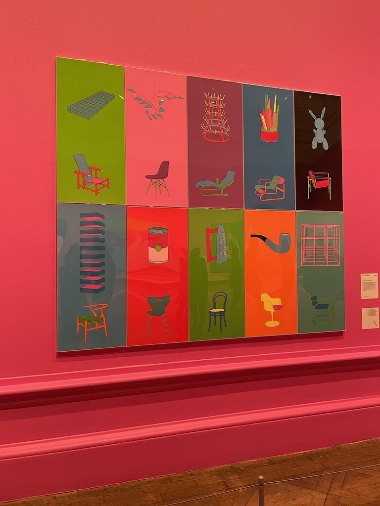
Loved the hot, bright colours the curators have chosen to set off these works. The celebration of ‘ordinary’ objects is great fun. Once you look beyond the intense colours and the strong outlines, the composition is thoughtful and the subjects are intriguing.
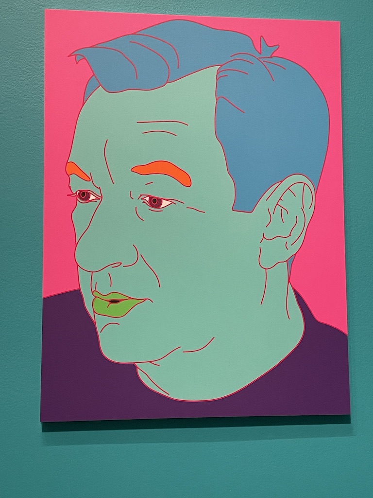
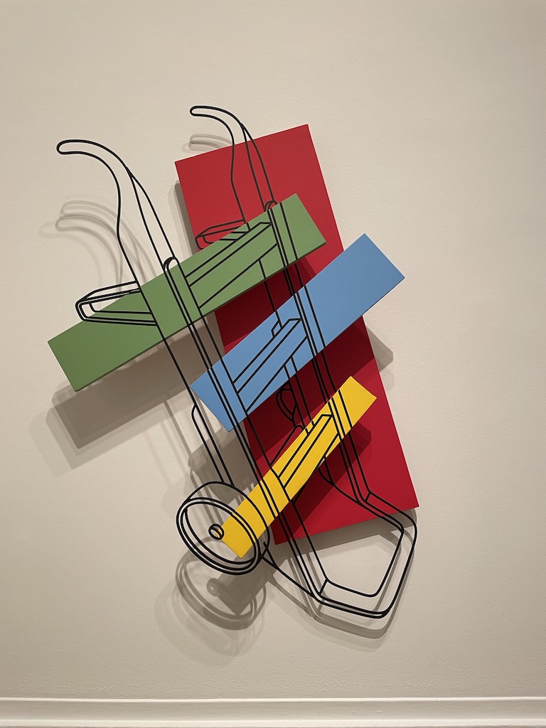
Above: an example of Craig-Martin’s interpretation of old masters, reducing themto strong graphic shapes with bold colours. On the right is a self-portrait.
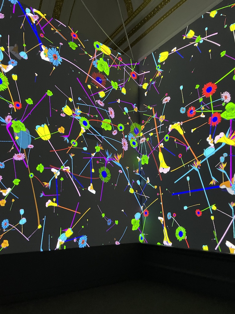
I really enjoyed the Digital creation entitled Cosmos – an immersive film with everyday objects flying across the walls, balls bouncing, musical instruments barrelling across the space in time to an interesting plinky plonky music track. It did make me feel like Alice tumbling down the fictional rabbit hole, passing shelves of familiar objects, seeing life cascading past her as she drifted further down to Wonderland.
The exhibition features some of Michael Craig-Martin’s early work too. Experiments with form, balance and conceptual ideas. I really liked the wonky shelf with the milk bottles.
And I was also impressed by the wall sculptures which are an interesting mix of his drawings combined with blocks of colour. Also, I was fascinated to learn that it was the discovery of a special black crepe tape, used in electronics, which he used to create the very uniform outline shapes.
Interesting seeing an artist’s world where there is no shading, no deliberate 3D expression yet somehow the objects just explode from their surfaces. A very interesting exhibition. It’s on at the Royal Academy in London until 10th December 2024.
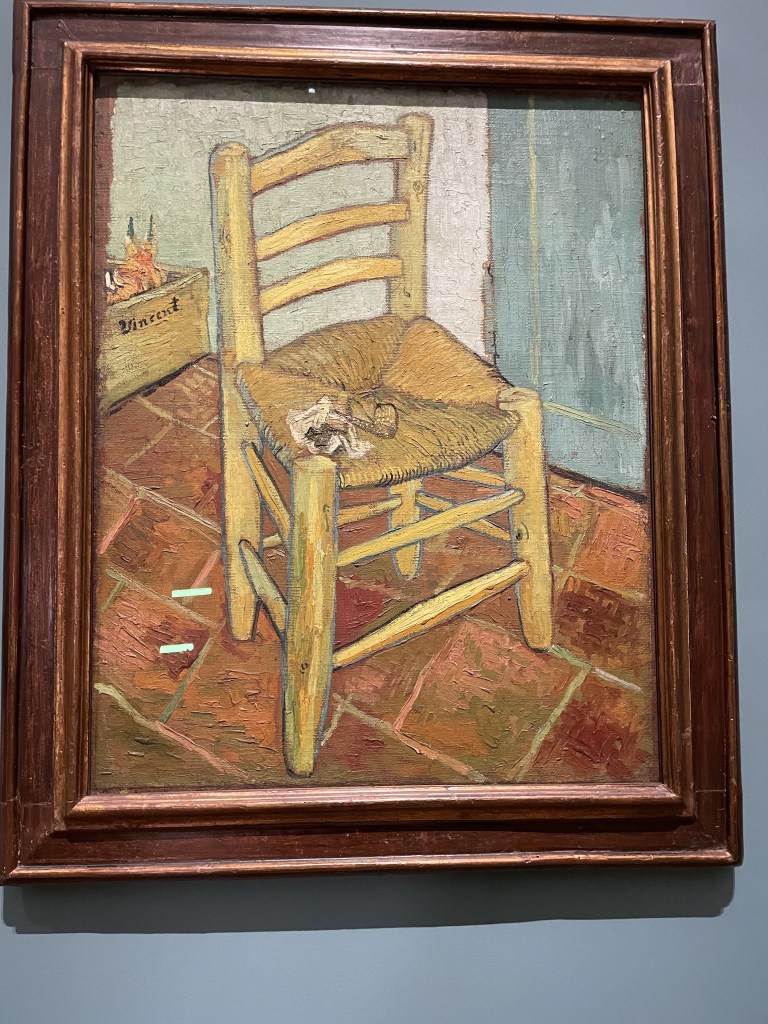
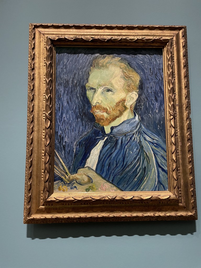
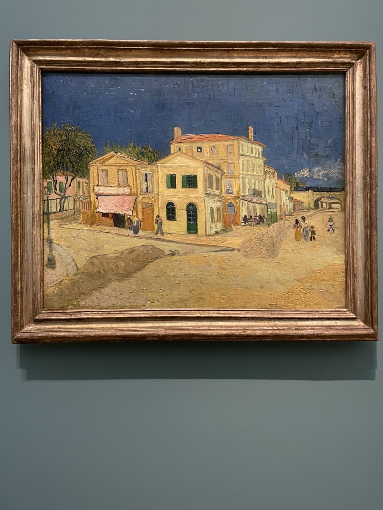
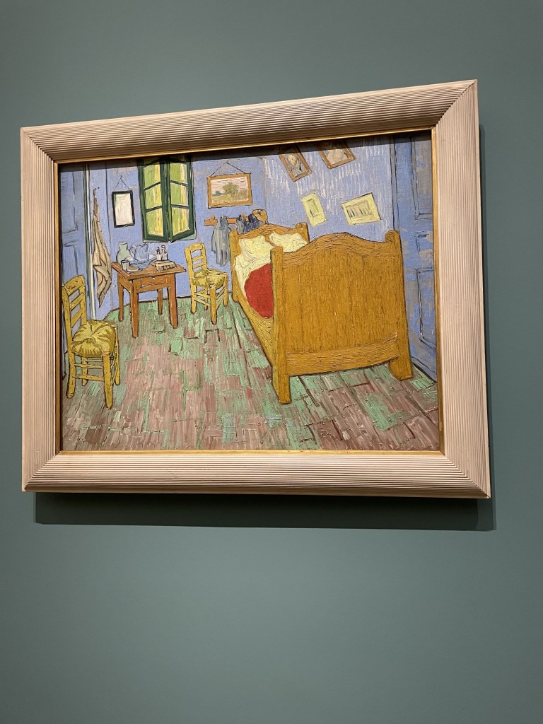
Above, are some of the best-known images from this period. There’s the chair with the pipe, a self-portrait and an impression of the Yellow House, the building in the centre of Arles which he rented. Vincent set up home here, creating a studio space, while welcoming fellow artists to share in his enthusiasm for the surroundings and the exciting development of his art.
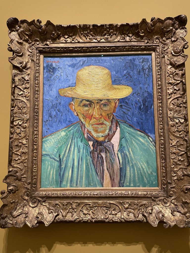
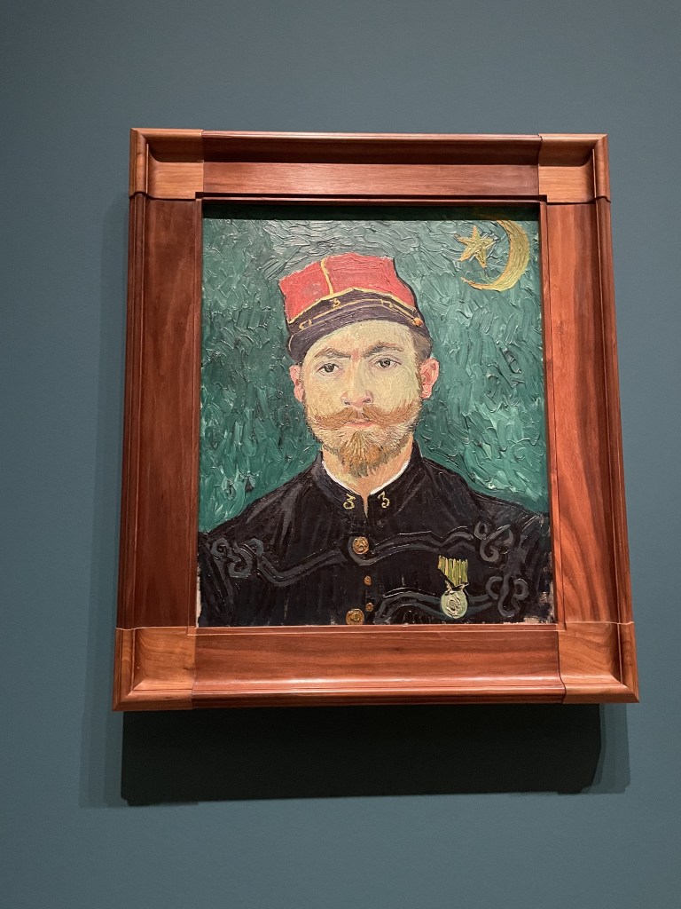
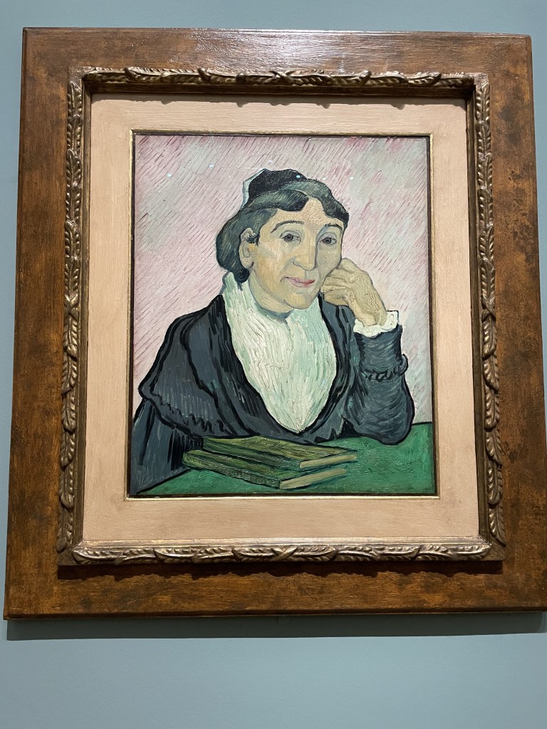
These portraits were new to me too. Left to right we have Portrait of a Peasant (Patience Escalier), an old gardener, painted in wonderfully bold colours. Middle is a portrait of Lieutenant Milliet named The Lover, because of this handsome fellow’s success in attracting women – He is wearing the uniform of the Zoauves. On the right is The Arlesienne, based on a portrait of Marie Ginoux who ran the local cafe in Arles. She’s been reading Charles Dickens’s Christmas Stories and Harriet Beecher Stowe’s novel, Uncle Tom’s Cabin. Apparently the women in Arles were renowned for their beauty. Vincent declared that he had seen a ‘Venus’ in the town!
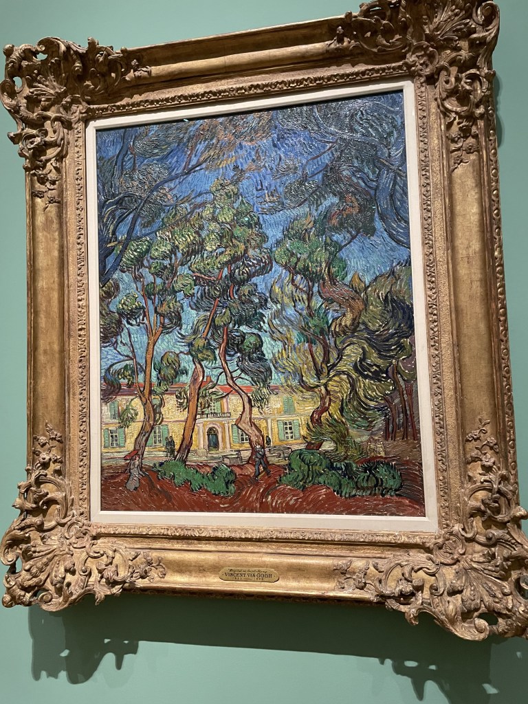
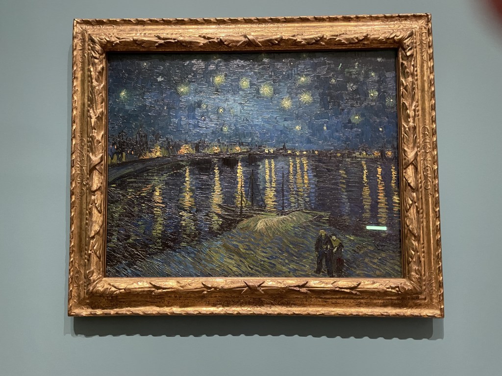
Wonderful to see the variety of landscapes. On the left is a view of the Garden of the Asylum at Saint-Remy, in 1889, where Vincent Van Gogh admitted himself when dealing with a mental health crisis. He was given a room at the hospital to use as a studio and sent the work he generated to his brother Theo. Middle is a view of the Hospital at Saint Remy and on the right is a familiar image: Starry Night over the Rhone which is just breathtaking.
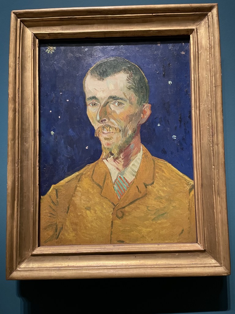
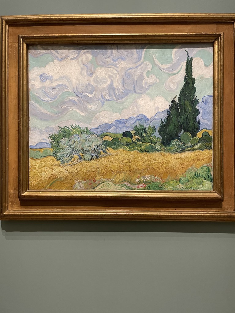
Portrait of the Poet, above. This is Eugene Boch, painted in 1888, complete with starry sky in the background. And on the right is a Wheatfield with Cypresses, one of the exhibition’s ‘old friends’ we can see at in the National Gallery collection.
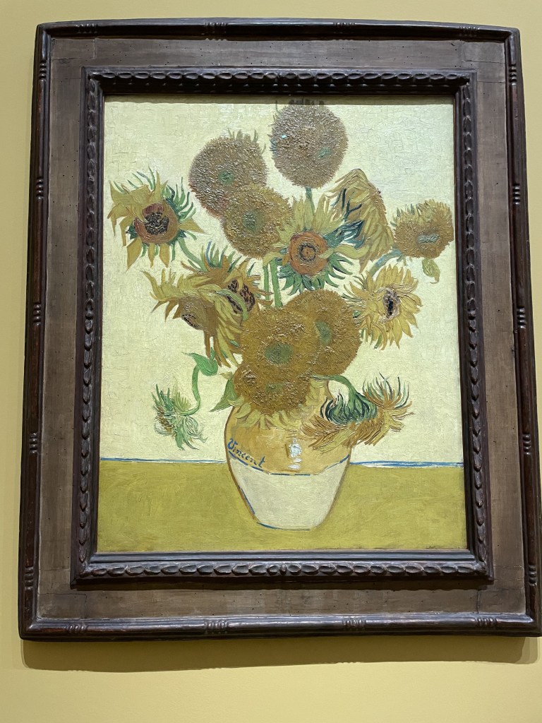
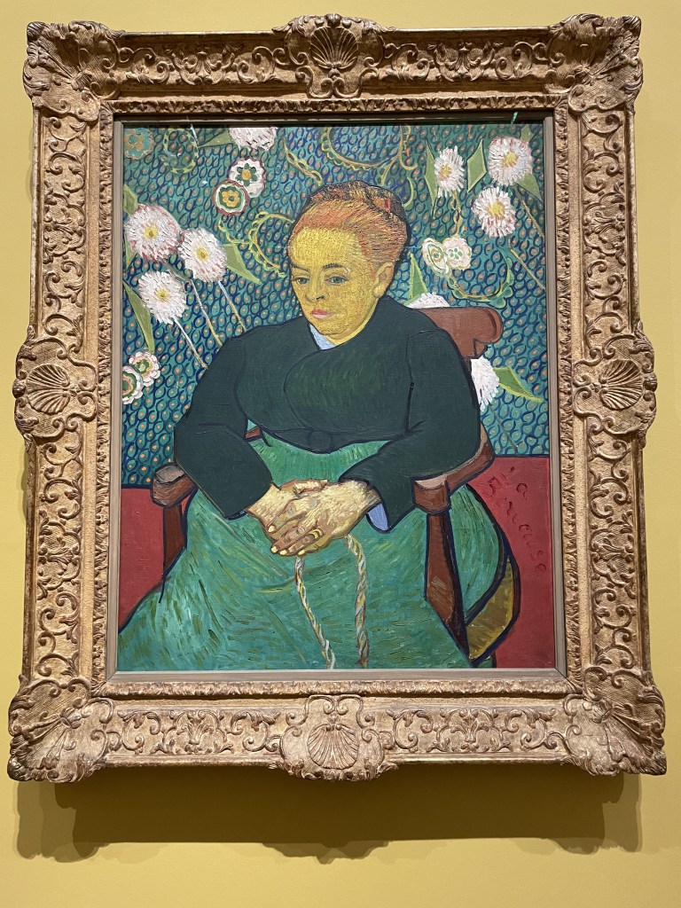
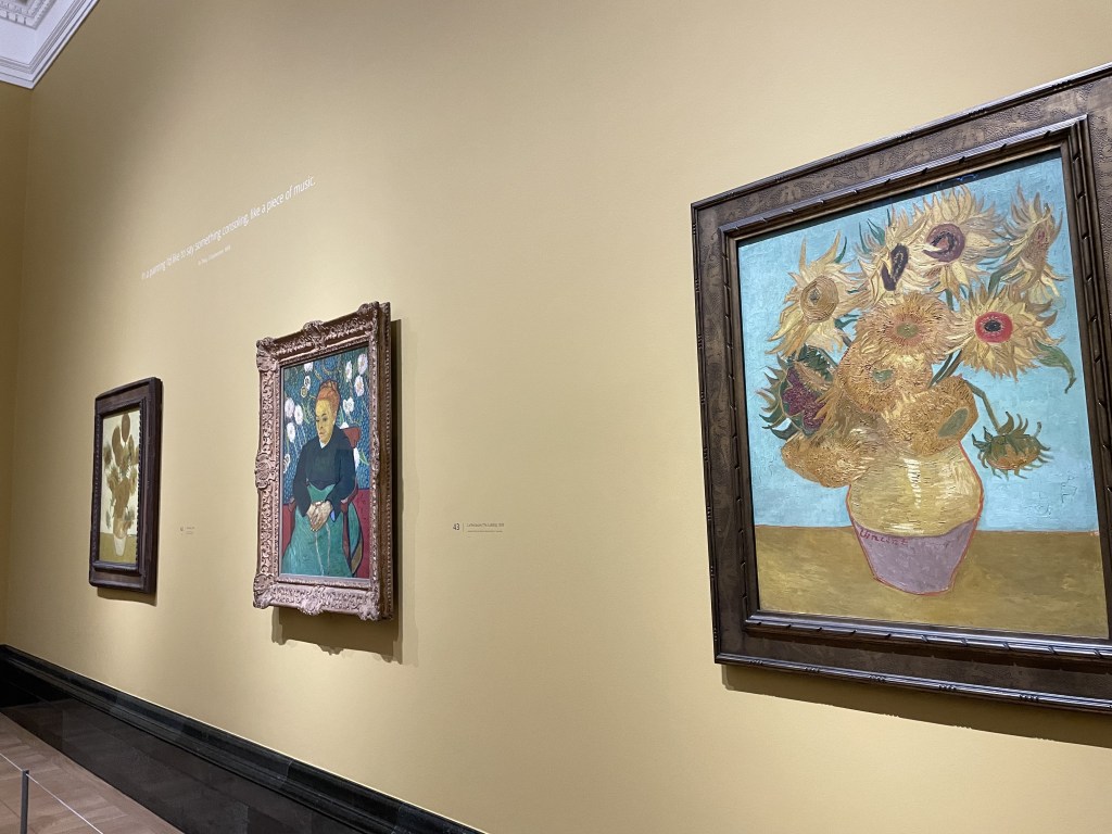
Alas, my photo on the right does not show all three images but, apparently, Vincent Van Gogh wanted the portrait of Augustine Roulin, (picture is entitled La Berceuse – the Lullaby) to be seen flanked by two of his sunflowers paintings. So, there they are.
This is a show well worth seeing. Amazing that it covers just the last two years of his life but what a rich and productive time it was for the artist, despite difficult relationships with fellow artists and mental health battles . Most of all, it’s a joy to view rarely-seen images which have been lent by collections from all over the world, giving us a very comprehensive glimpse into the artist’s careful use of colour, brave application of paint, personal interests and fascinating subjects.
Van Gogh, Poets & Lovers opens on 14th September and runs until 19th January 2025
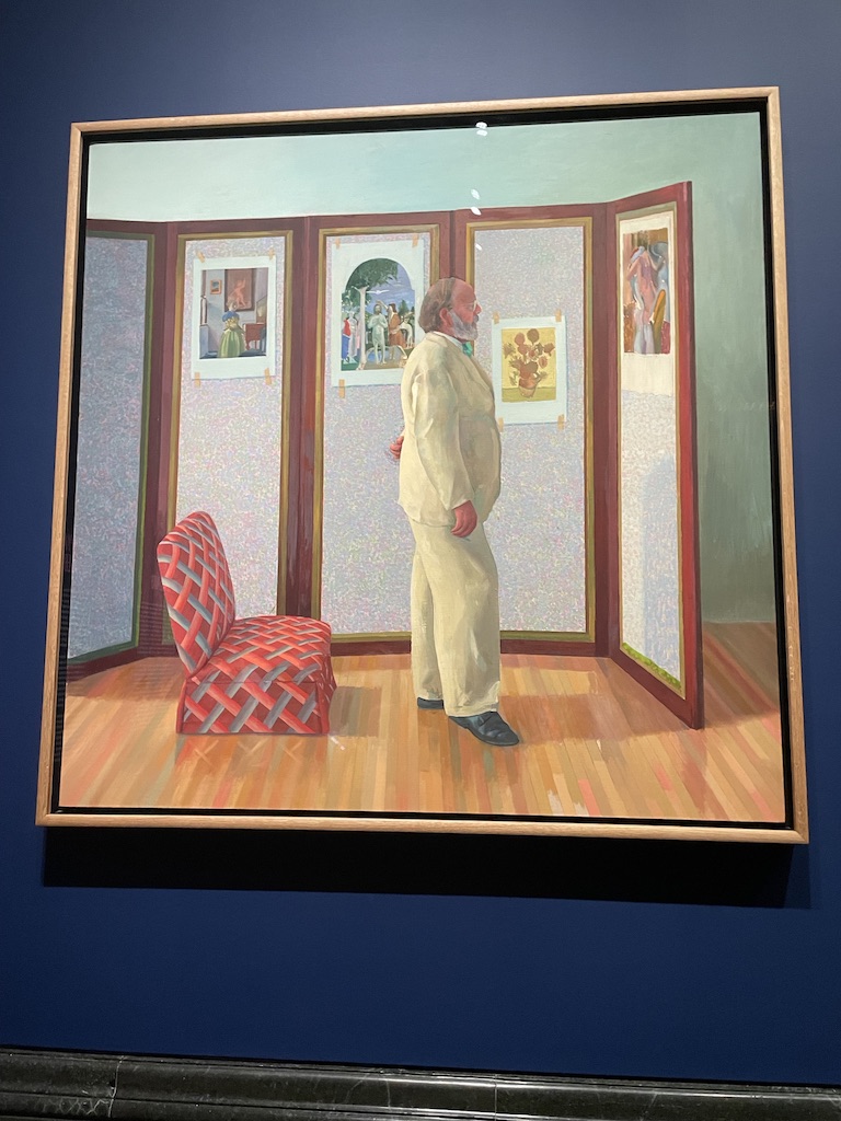
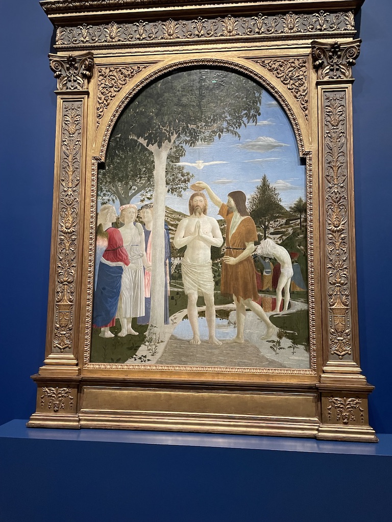
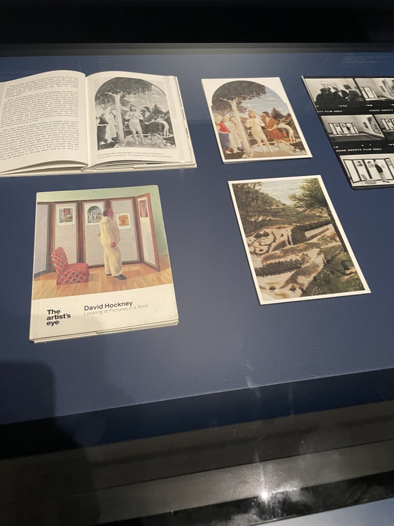
I’m so enjoying the series of small, but perfectly formed, exhibitions which are being shown at the National Gallery in Room 46. These jewel-like shows are only on for a few weeks but are FREE to view and utterly enchanting. So, from 8th August until 27th October 2024, it is the turn of The Baptism of Christ by Piero della Francesca (1415 – 1492) to feature, flanked by two paintings by our greatest living artist David Hockney.
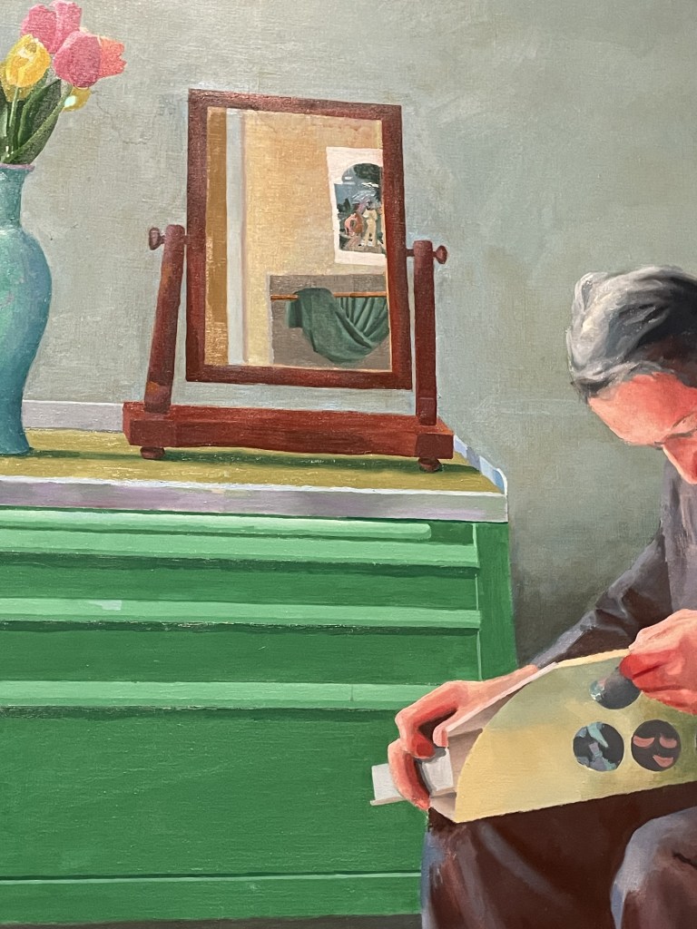
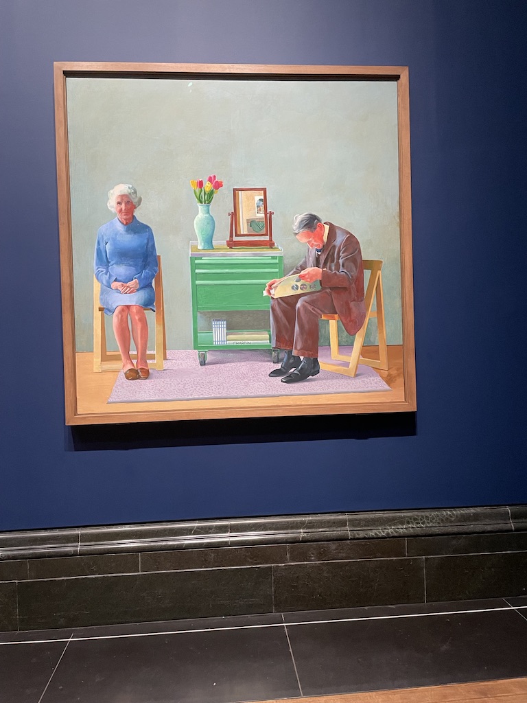
What you can see on either side of the fabulous Piero painting, made using egg tempera, are two portraits made by Hockney in 1977. On the left is a portrait of Henry Geldzahler, Belgian-born American curator of 20th-century art (and a close friend of Hockney’s) taking a long close look at four paintings including the Piero painting. On the right is Hockney’s lovingly crafted portrait of his parents, Laura and Kenneth Hockney (usually in Tate Britain) and in the mirror on the chest between the two figures you can see a depiction of the Piero, based on a postcard.
Hockney has long been a huge admirer of the National Gallery. Apparently, he first came to the gallery aged 18 and, as he put it, has never tired of ‘this gem’ the Piero painting which drew him in. In the two paintings he had clearly referenced the Piero, using the same horizontal and vertical lines in the composition as well as the style of the poses. In the Piero, the figure of Christ is centre stage with St John the Baptist in profile as he pours holy water over the young man. There’s also a wonderful glimpse of a man peeling off his shirt in readiness for baptism, giving it a realistic and personal feel. In the portrait of his parents, Hockney has depicted his mother lookind directly at him while his father is in profile, immersed in the study of a book. And in the painting of Geldzahler, the central figure is depicted in white, centre stage with strong verticals.
Hockney reminds us that even though an artist has died, their art lives on. And there can be relationship between artists across the ages, simply by ‘eyeballing’ art and absorbing the special atmosphere of a painting, allowing its power to be absorbed and interpreted in contemporary work.
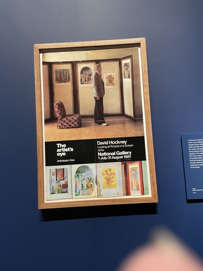
Before the advent of phones with cameras, the Gallery was not in favour of visitors taking photographs of works. The view was that a painting should be admired and recalled in memory. Hockney disagreed. He argued that artists and viewers would benefit from taking home some impression or reminder of the work, whether it’s a photo, a postcard or poster. Apparently he keeps a postcard of The Baptism of Christ by his bed and enjoys looking at it every night.
The National Gallery is celebrating its 200th birthday this year. What a marvellous example this is of the way exhibitions can bring artists together across the centuries in a most satisfying and creative way.
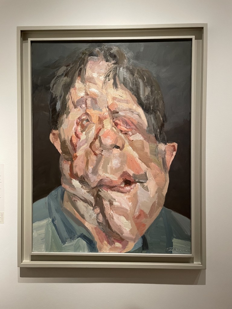
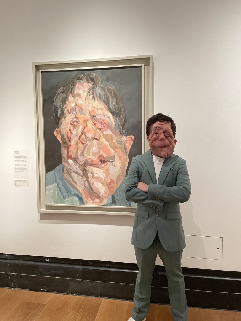
Above is a very compelling and painterly portrait of Adam Pearson, British TV presenter and disability rights campaigner, by Tim Benson. I chatted to Adam about the process and he told me that the portrait had been completed in under four hours in one sitting. It’s that immediacy of image and energy which really attracted me to it.
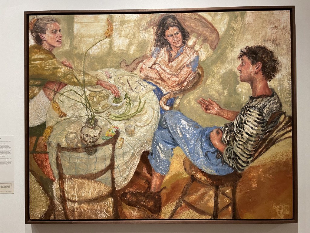
I was very taken by this portrait entitled Chewing the Cud by Emily Ponsonby. Using the ‘encaustic’ technique using honeyed wax, scraped and mixed with oil and oil pastel, I think it’s a very successful painting both technically and in terms of composition. The viewer is given a surprising ‘fly on the wall’ viewpoint and absolutely absorbed into the conversation in a Dorset kitchen.
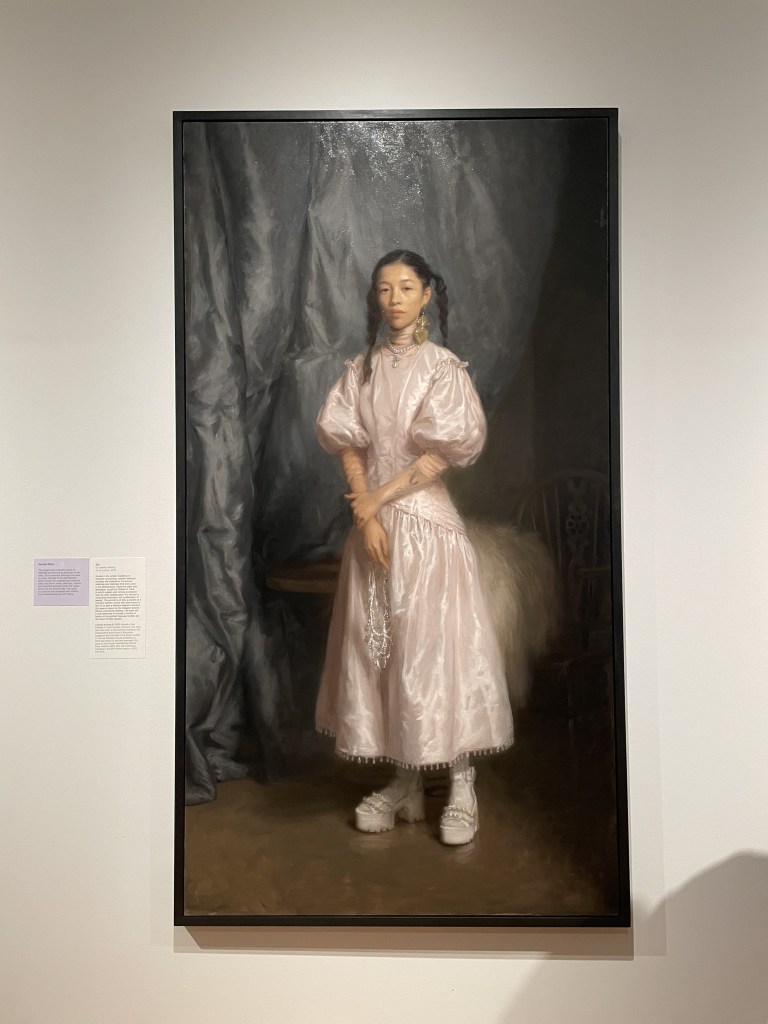
Above, a couple of winners. First prize went to Antony Williams‘ portrait: Jacqueline with Still Life. It’s been meticulously painted in tempera, which is a difficult medium (you mix egg yolk with pigment and it’s full of depth and interest. On the right is the Second Prize, Isabella Watling‘s portrait of Zizi which combines very traditional use of paint and pose but gives the subject and the whole atmosphere of the painting, a very contemporary feel.
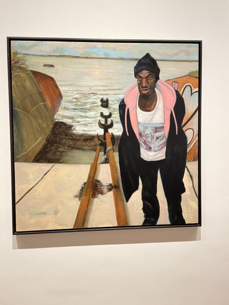
These two portraits, above, captivated me for their narrative quality. They are not just good paintings but they capture a moment and an emotion. On the left is Estuary English by Ray Richardson and the subject is Adé, a young actor. The two met by chance and became good friends. The title refers both to the body of water in the background of the painting and also the English accent associated with areas of London, along the River Thames, where both men live.
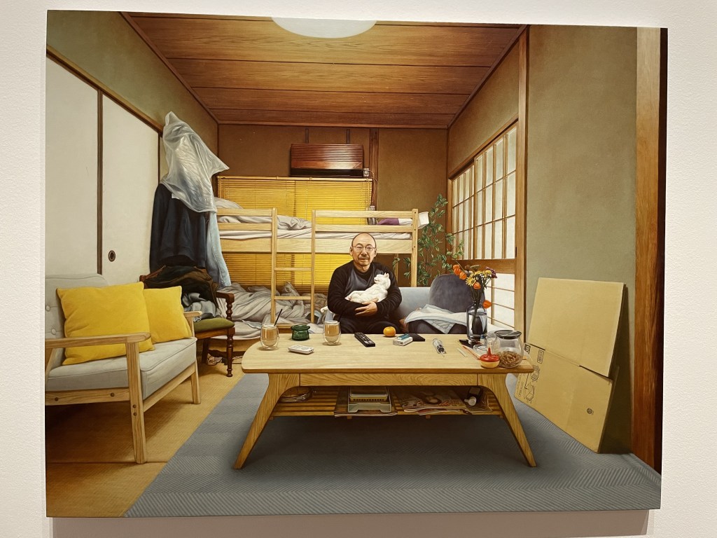
On the right is 1111, by Shinji Ihara. The artist records his partner on the day their beloved cat died. It took over a year and 90 sittings to complete.
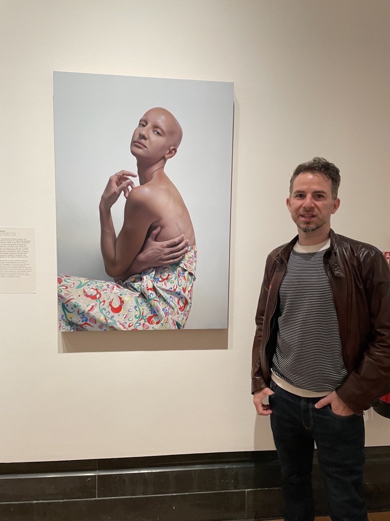
By contrast, I was very struck by the photo-realism of this painting on aluminium of Agnese by Massimiliano Poronti. I chatted to the artist who told me that it took a very long time to complete this one.
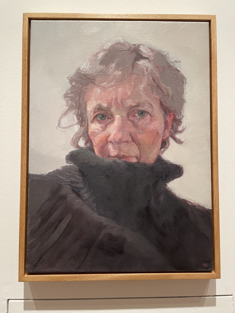
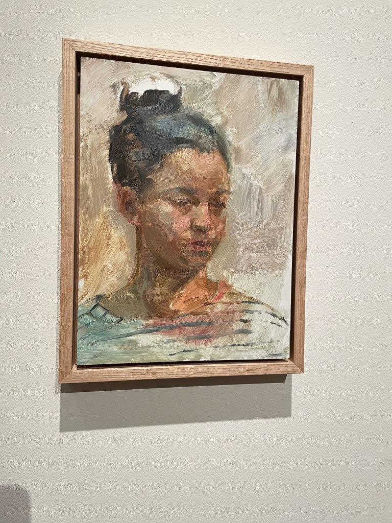
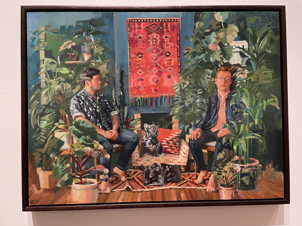
And above is just a selection of other portraits which caught my eye. I do like a brush stroke and these paintings delivered!
The Herbert Smith Freehills Portrait Award 2024 exhibition is free to visit at the National Portrait Gallery from 11th July until 27th October 2024. Good stuff.
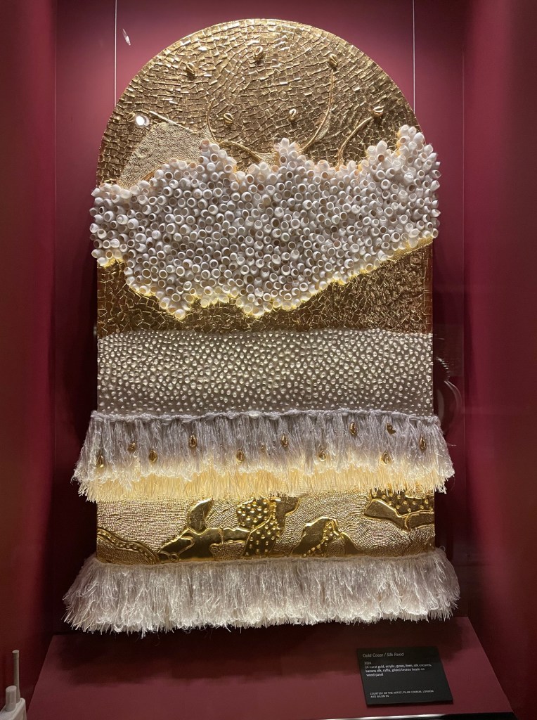
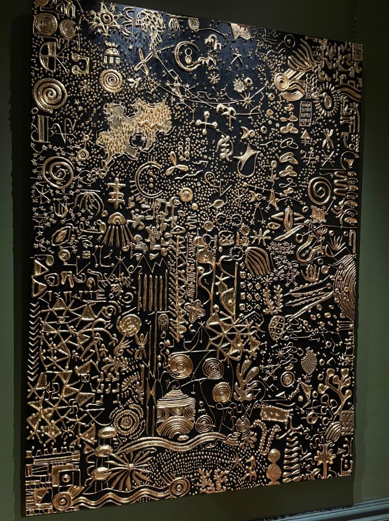
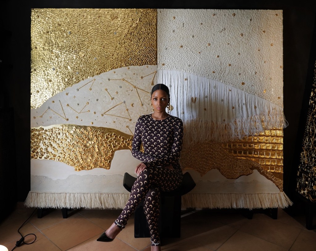
Visiting the Sir John Soane’s Museum is always a pleasure. It’s a treasure-trove of cultural history which is open to the public, free, from Wednesdays to Sundays, and well worth a trip. Every now and then the museum collaborates with a contemporary artist. This year Lina Iris Victor, a Liberian/British multidisciplinary artist who lives and works between Italy and the UK, has taken on the challenge of creating works which reflect and complement the collection. Her African heritage really comes through in these pieces. She combines all manner of materials, most fascinatingly, she uses empty silkworm cases, fragments of woven fabric and weaves them in amonsgt acrylic forms gilded with gold.
Many of the works are on paper – sturdy paper, because these pieces are heavy – and there’s an impressive gutsy-ness to the pieces.
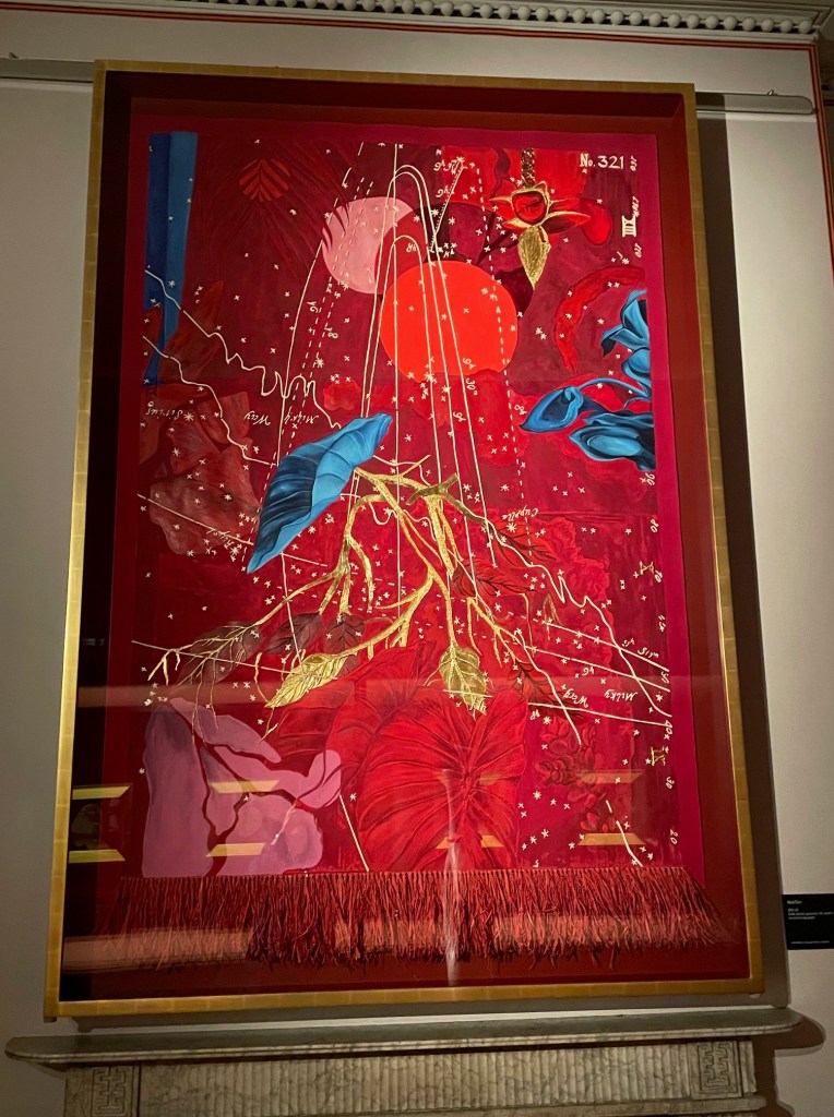
I was really taken by the large scale colourful work which combined gold with red on paper. Red Ornamental (series of four works) mixed media on paper.
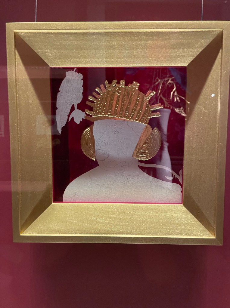
I liked the array of portraits too which combine the gold element with strongly pigmented paint and drawing on paper.
It’s very interesting to see such original art in such a spectacular setting. The amalgam of contemporary and ancient really blends well. Down in the crypt are two ‘Ritual Thrones’ and an extraordinary sculpture entitled Nbiru which goes rather well with the Greek and Roman statues collected by Soane.
The exhibition opens on 10th July and will be there until 19th January 2025. Free




































 Paper Places