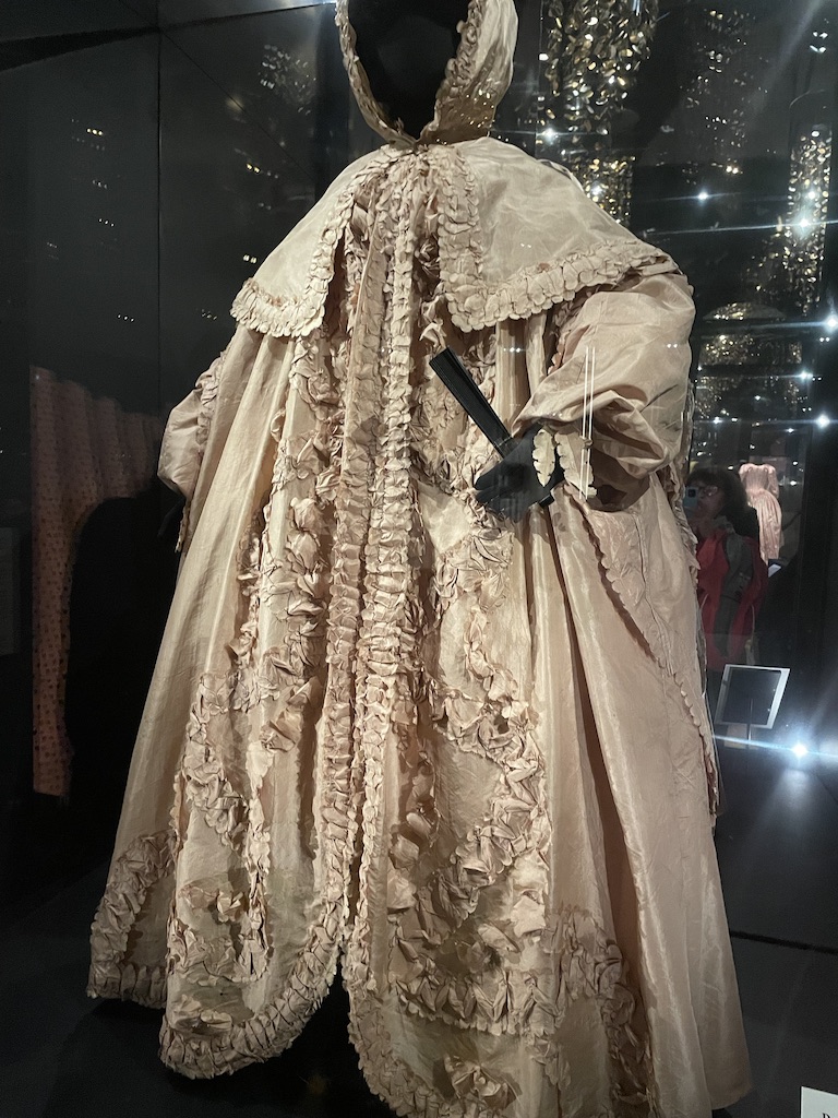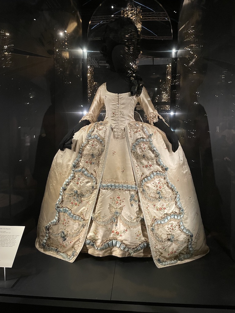
Maria Antoinette Style at the Victoria and Albert Museum is a triumph. The curators have assembled many surviving objects which were worn or used by France’s last Queen and sensitively chart the life of the child bride who evolved into a fashion icon but ended her days as a derided aristocrat executed by the guillotine at the height of the French Revolution.

Immortalised in many art forms and still celebrated in fashion and style, Queen Marie Antoinette’s influence is legendary. Mention her names and the words, ‘let them eat cake’ spring to mind, but it’s likely that she simply had no idea of the poverty of the French people in the 1780s which precipitated the country into revolution while she lived a life of palatial splendour with royal funds to indulge her interest in fashion.

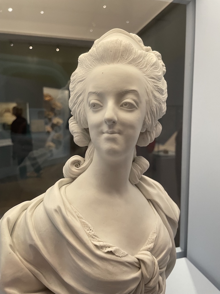
She was an attractive woman who clearly understood the power of image. Judging from the number of portraits and sculptures on show at this brilliant exhibition, she was always eager to pose for artists. And artists clearly responded to her interest in fashion, eagerly capturing the details of her outfits.
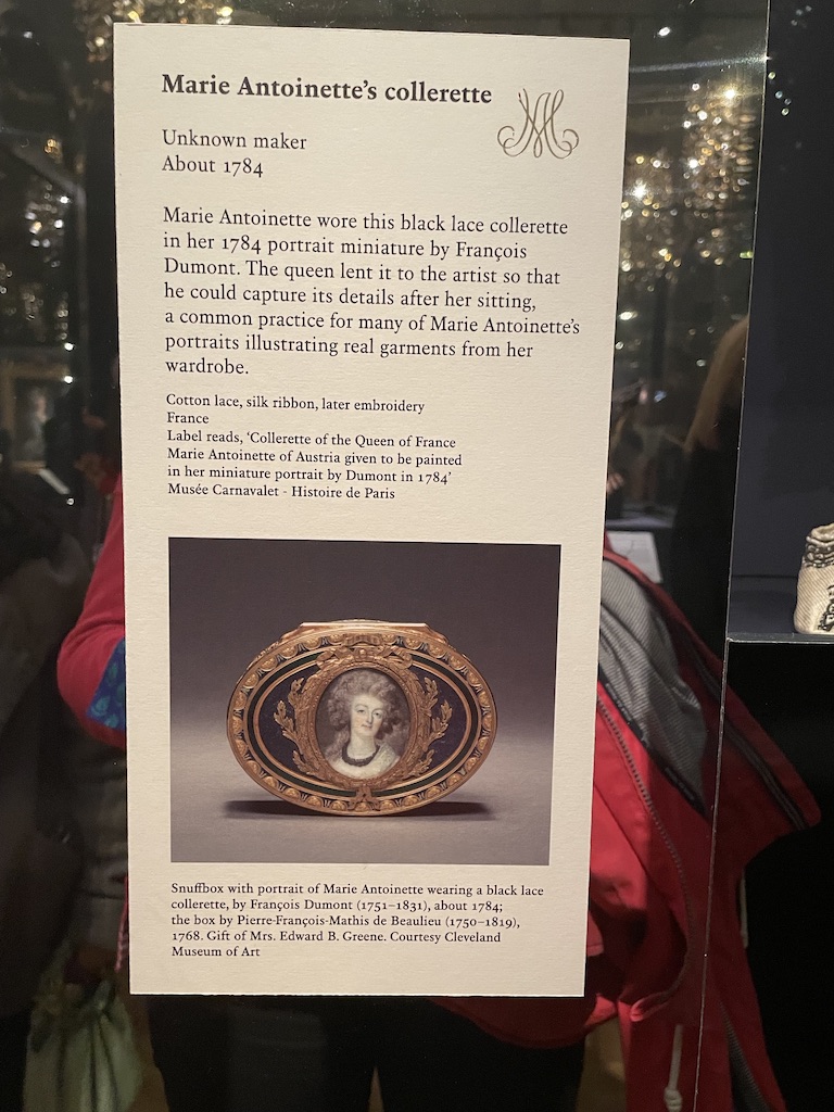
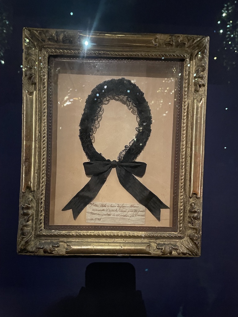
it’s fascinating to see the black lace ‘collerette’ which featured in a portrait miniature by Francois Dumont – and was lent to the artist so that he could capture the details.
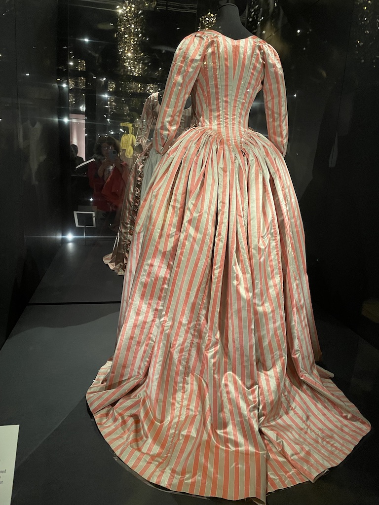
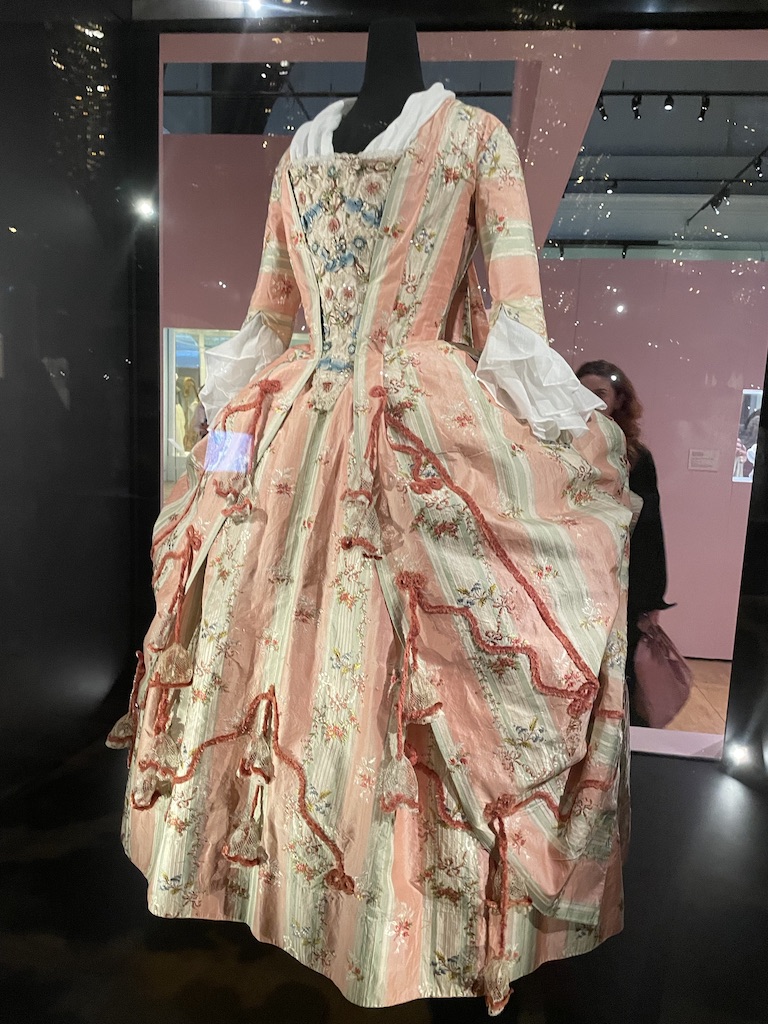
Oh, the costumes! There’s an amazing collection of gowns – not necessarily worn by Marie Antoinette but come from the 1780s and 90s and are very similar to many of the dresses and clothing featured in the portraits. It’s astounding to see the detail in the couture and opulence of these dresses.

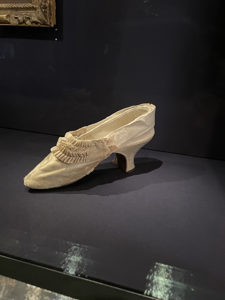
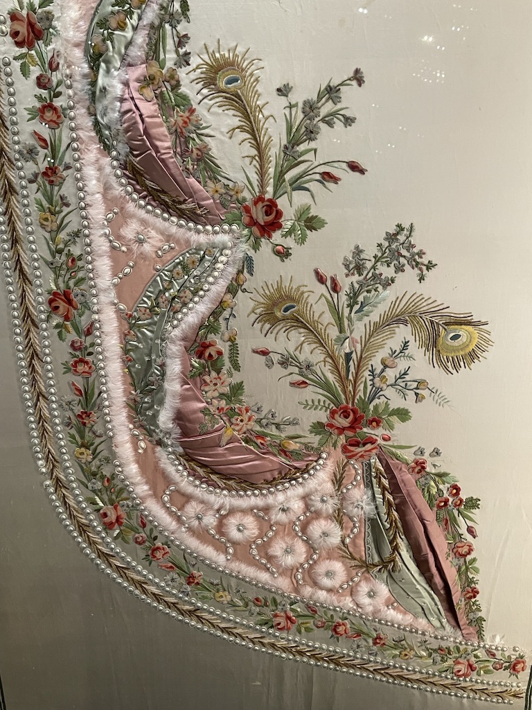
The jewels and the shoe (above) were known to have been worn by Marie Antoinette and the embroidery was, apparently, a sample of an over-dress which a couturier would have presented to her for a potential gown. It’s very fitting that this show has been sponsored by Manolo Blahnik.

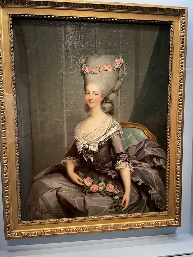
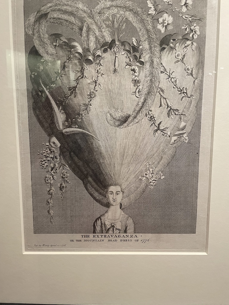
Anyone who watched Bridgerton – the total fantasy version of Regency Britain – will recognise the extreme wigs and hair dos. Clearly things reach heights (literally) of fantasy in the court of Marie Antoinette as hair was teased ever upwards and adorned with fantastical decoration.
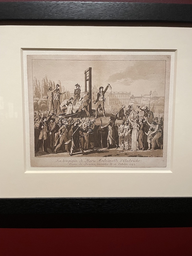
Queen Marie Antoinette’s reign ended badly with the brutal blow of the guillotine in 1793. There’s this very graphic drawing of the crowd cheering as the decapitated queen’s head is held aloft by the executioner. And the death mask, we are told, was taken soon after her death by Madame Tussaud. It’s all such a brutal end and she was certainly not guilty of any crime other than representing an overblown, indulged and superfluous monarchy.
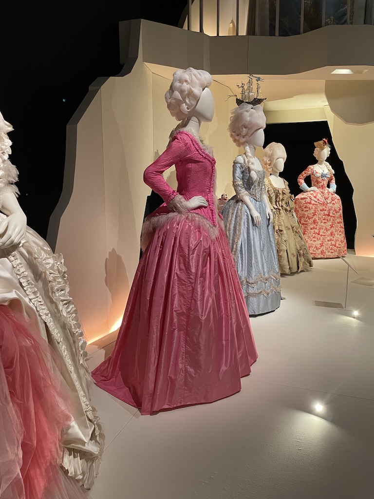
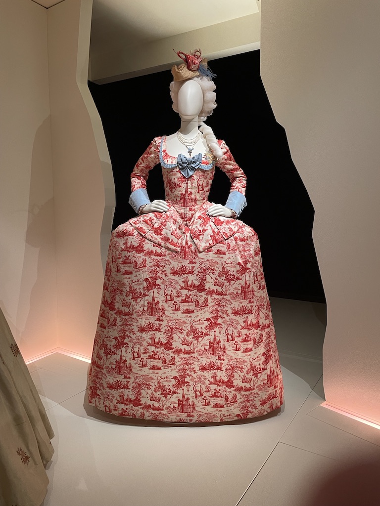
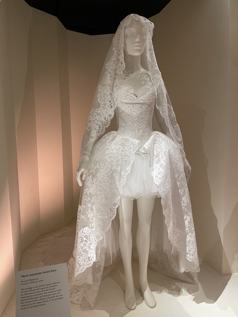
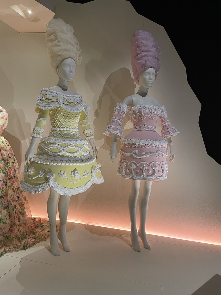
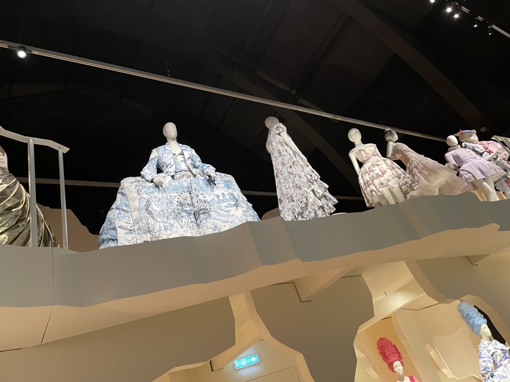
But her style lives on. It’s great to see how contemporary designers, in the years since her death, have found ways to represent her style using modern materials. I did love the Moschino wedding cake dresses designed by Jeremy Scott and Vivienne Westwood’s Marie Antoinette bridal dress.

The show is at the V&A until 22 March 2026.

Kiefer / Van Gogh – what a surprising and interesting show at the Royal Academy, London. I hadn’t realised that the German artist Anselm Kiefer was vastly inspired by the work of Vincent Van Gogh. It was fascinating to learn that, as young man, Kiefer travelled in the great artist’s footsteps, ending up in Arles, in the South of France, making sketches and paintings. He has produced great works which celebrate Vincent’s love of countryside and rural people. A small, but perfectly formed show and a good antidote to the visual excess of the Summer Exhibition which is on show in the main galleries.

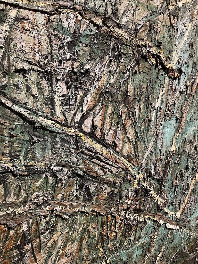
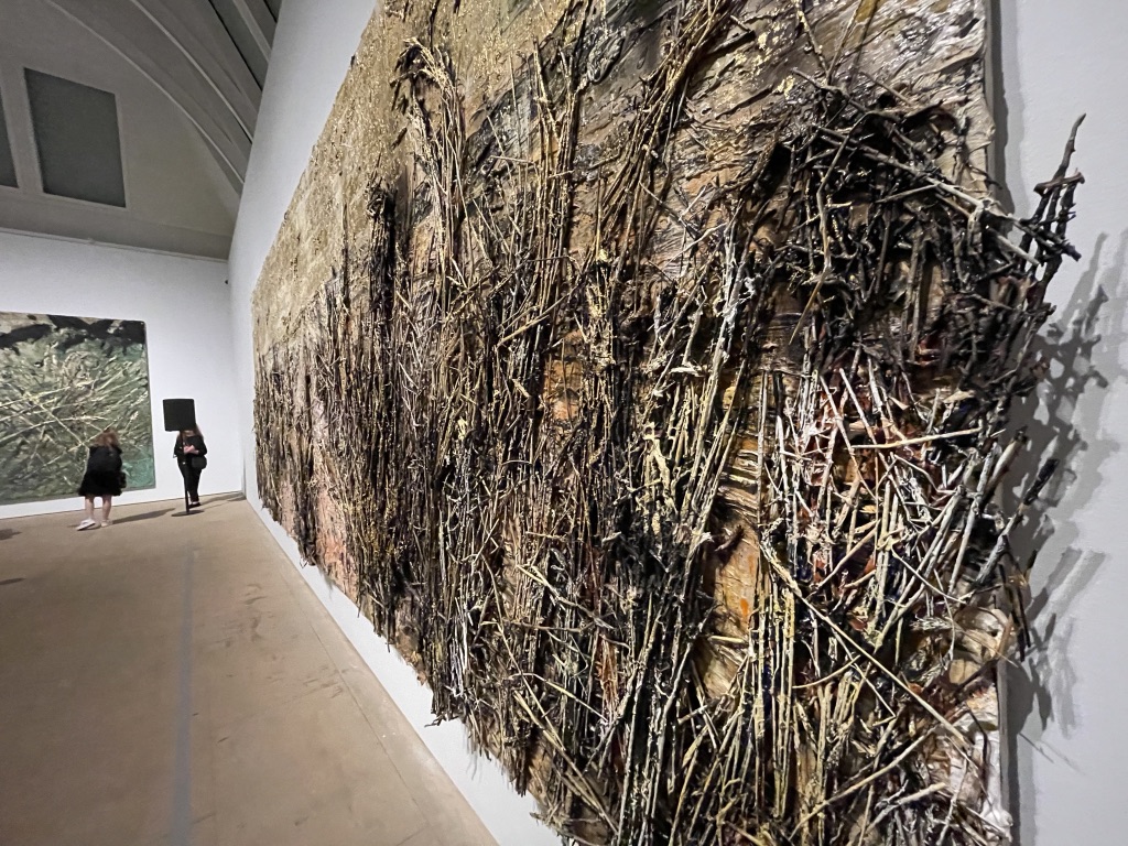
Kiefer is a texture artist. It’s worth seeing this show just for the chance to get really close to the canvas and see how much has been applied to the surface. There are layers of paint, straw, seeds, lead and gold leaf. In this painting, above, Kiefer is channelling Van Gogh’s Starry Night, but he uses a wild selection of materials to celebrate that famous work.

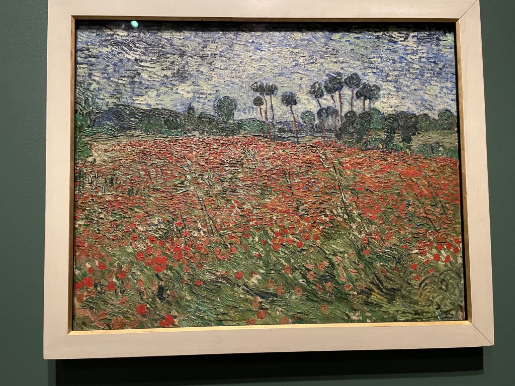
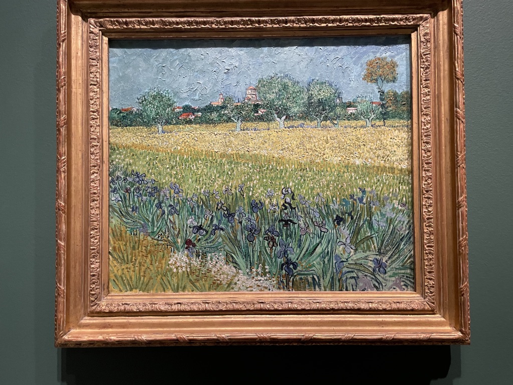
The show occupies three rooms and the central space is dedicated to a small selection of Van Gogh pantings and drawings of the countryside and the glories of nature. And yes, all that texture is there, but it’s done solely with daubs and layers of oil paint.

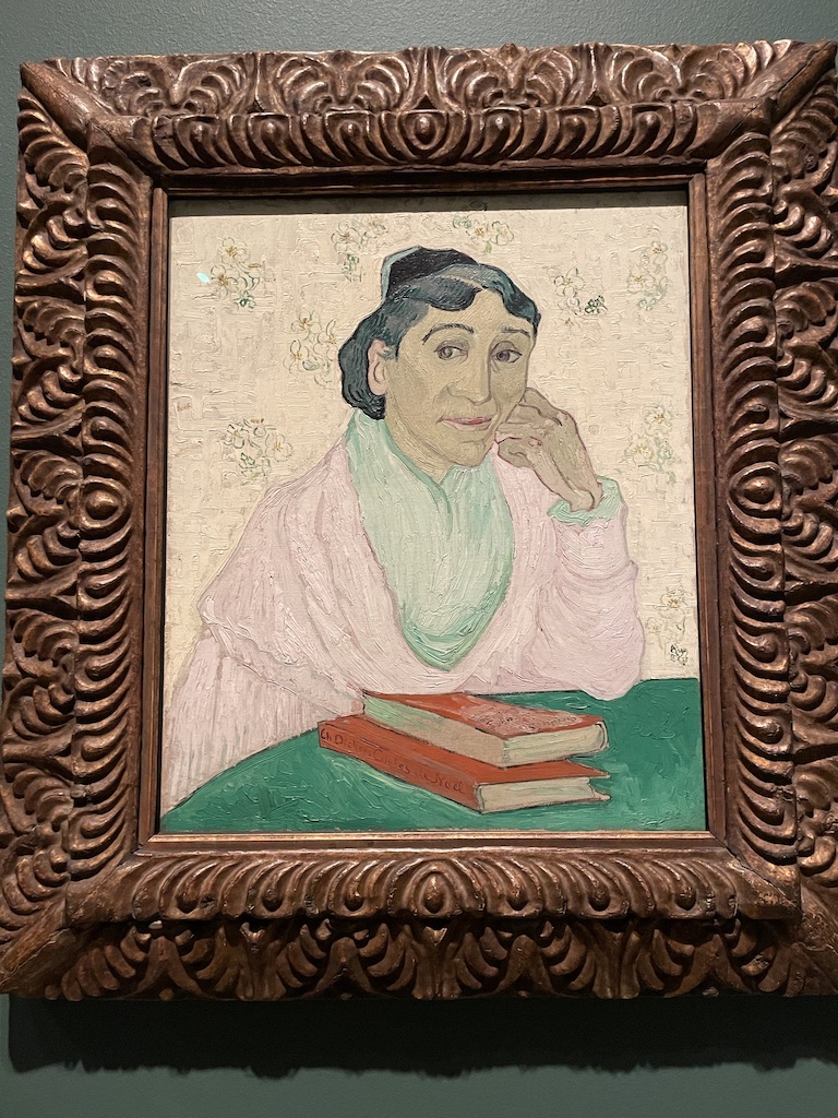
In his travels through Van Gogh’s landscape Kiefer was also interested by the people he encountered. Many of them were too busy working in the field or agricultural employment to pose for him but the few portraits in the show convey a similar simplicity of drawing and charm.

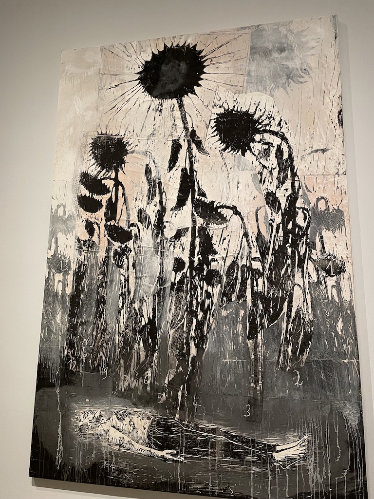
On the left is my detailed photograph of a huge work in the first room which shows the vigorous way the straw and chaff and has been fixed to the canvas and the addition of all the other materials. And on the right is Kiefer’s own homage to Sunflowers made from a collage of woodcuts on canvas with acrylic and shellac. For Kiefer, just as for Van Gogh, the sunflower is the symbol of our ‘condition of being’. The sunflower is connected to the stars and by day moves its head towards the sun. In the night the petals close and towards the end of its bloom it declines, bending its head towards the earth.

What an intriguing show. It’s on at the Royal Academy, London until 25th October 205

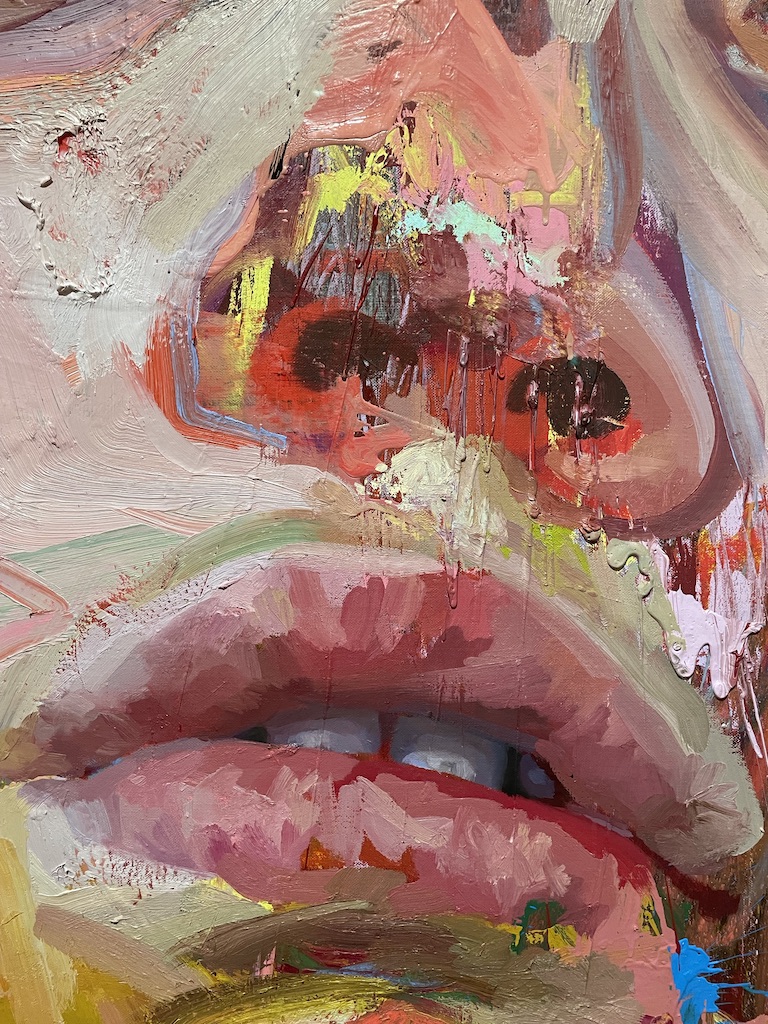
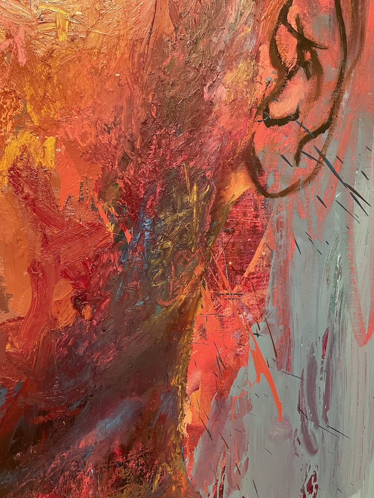
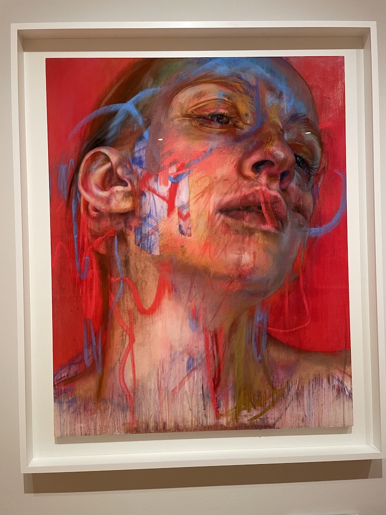
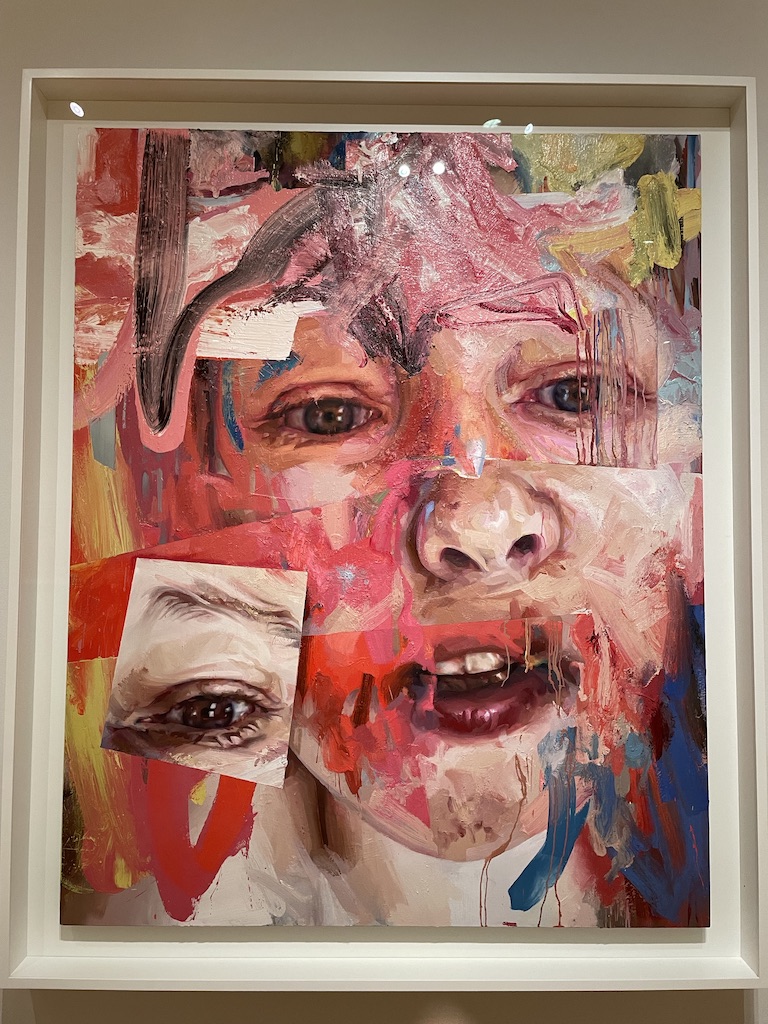
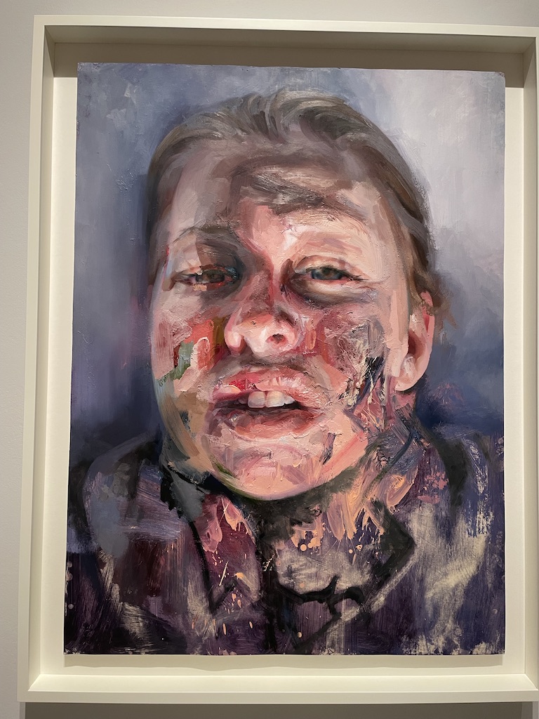
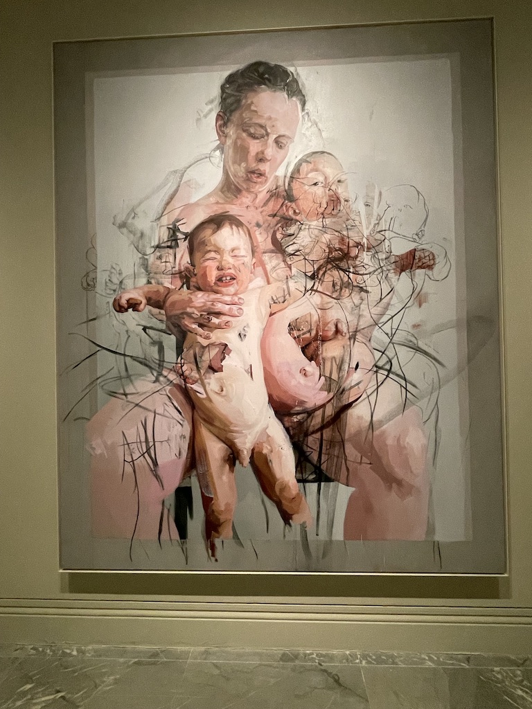
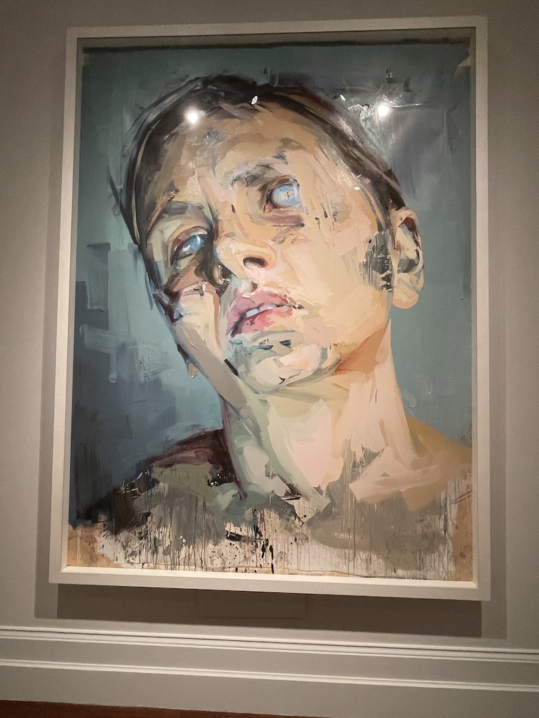
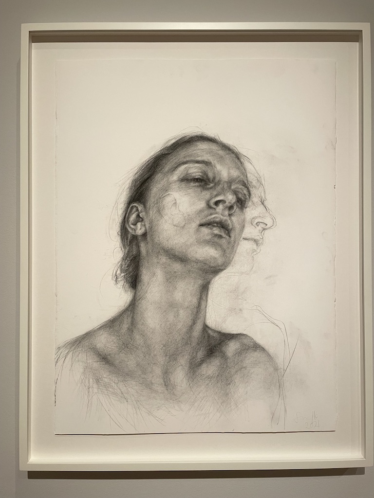
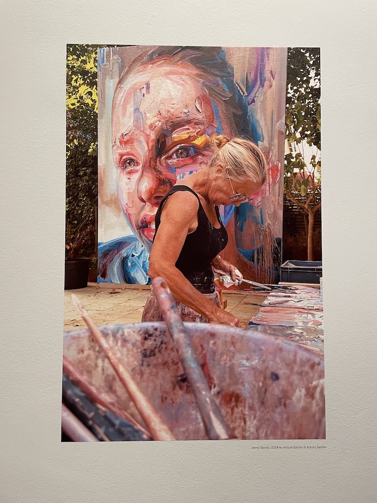
The stupendous Jenny Saville retrospective at the National Portrait Gallery is a joy to view. I’ve been an admirer of her work since she first burst onto the art scene as one of the YBA’s (Young British Artists) in the 1990s with her statement huge nudes boldly painted in oils. And this exhibition shows just how her prodigious talent has evolved.

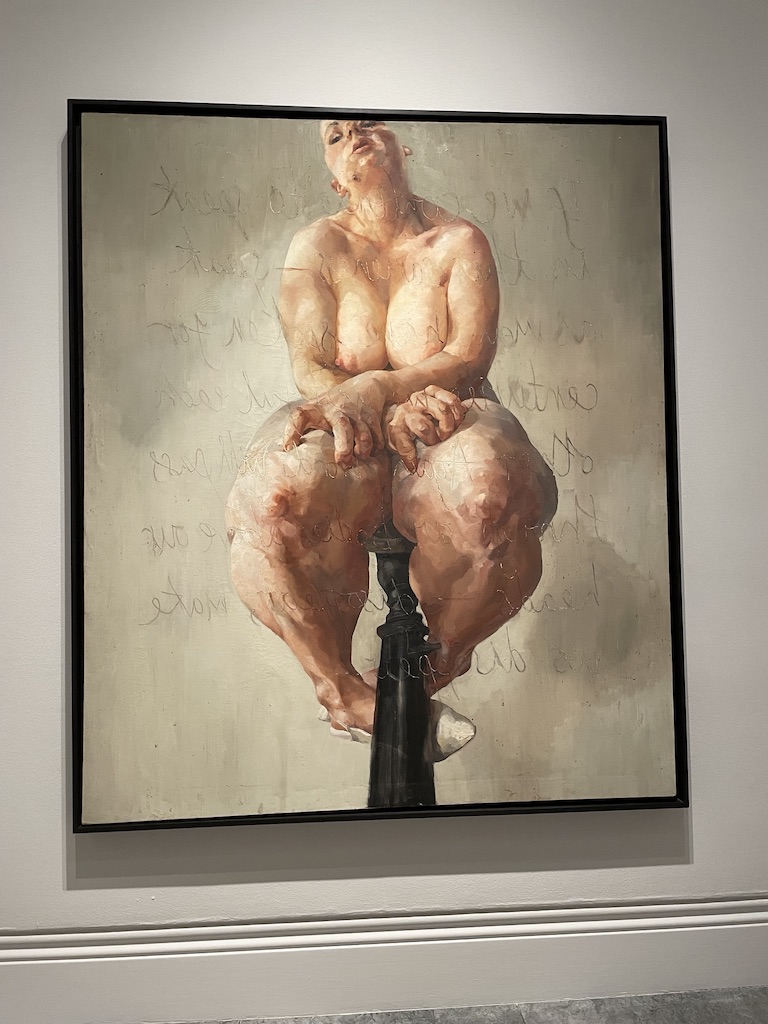
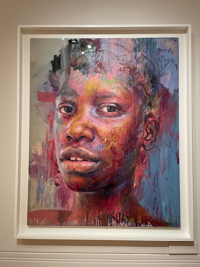
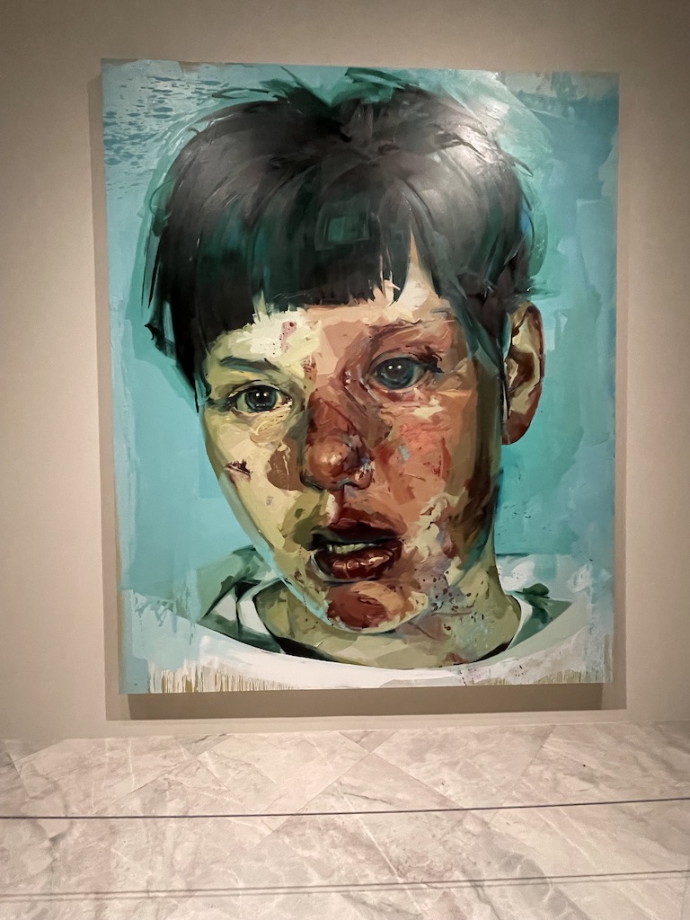
Above left is one of Jenny Saville‘s audacious and visually compelling nudes from the early 1990s which kick-started her career after graduation from Glasgow School of Art. She was ‘discovered’ by Charles Saatchi and her work was included in the seminal exhibition Sensation at the Royal Academy. And on the right is a bold and colourful portrait from 2020.

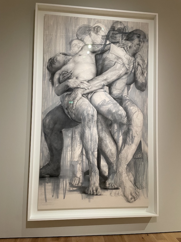
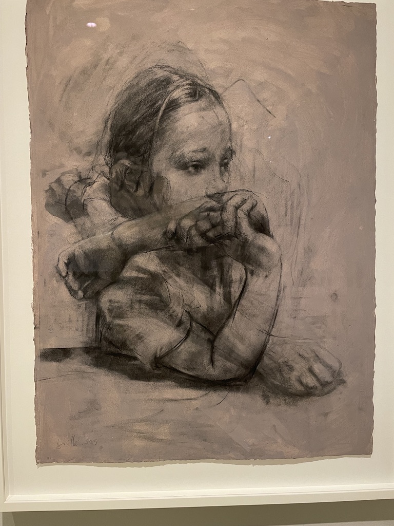
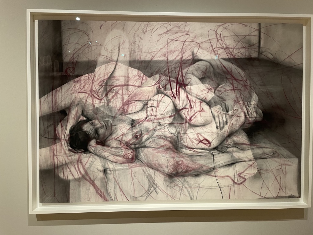
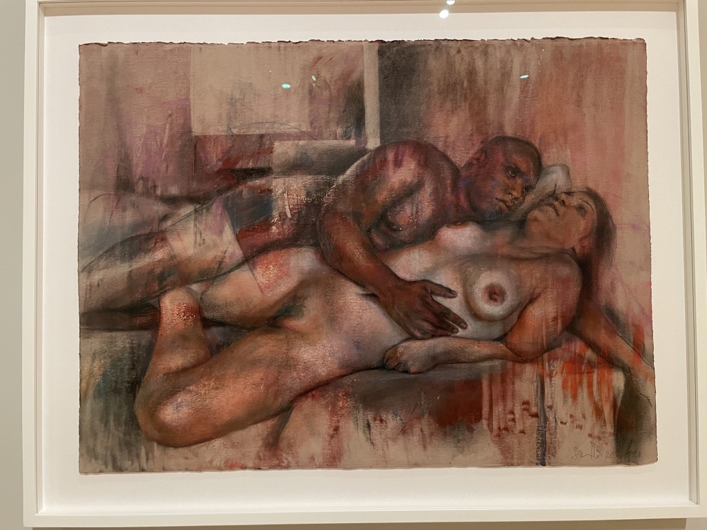
I was very impressed by the more recent charcoal and pastel on canvas works from 2019- 21. The influence of renaissance artists like Michaelangelo is clear to see but her execution of these monumental nudes is so confident and brave. Likewise, the smaller studies of heads and the wonderful ‘tangle’ of bodies with sgraffito are fabulously made.

I was fascinated by the variety of colour, technique and painterly styles used in the creation of the more recent portraits. There’s obvious layering of pigment and a wild bravery in then covering detail with bold brush strokes of single colour followed by scratching and squiggles of new colour on top.

The exhibition is presented chronologically with the more fleshy nudes and portraits at the start and then you can see the evolution into wild introduction of opposite colours, daubs, splashes and energetic, gestural strokes across areas of painting which other artists might consider as ‘finished’, but Saville finishes all her new pieces with wonderful bravura additions which give the final works such energy.

It’s a wonderful show and I urge anyone with an interest in contemporary art and figurative painting to visit the National Portrait Gallery and revel in this visual feast.

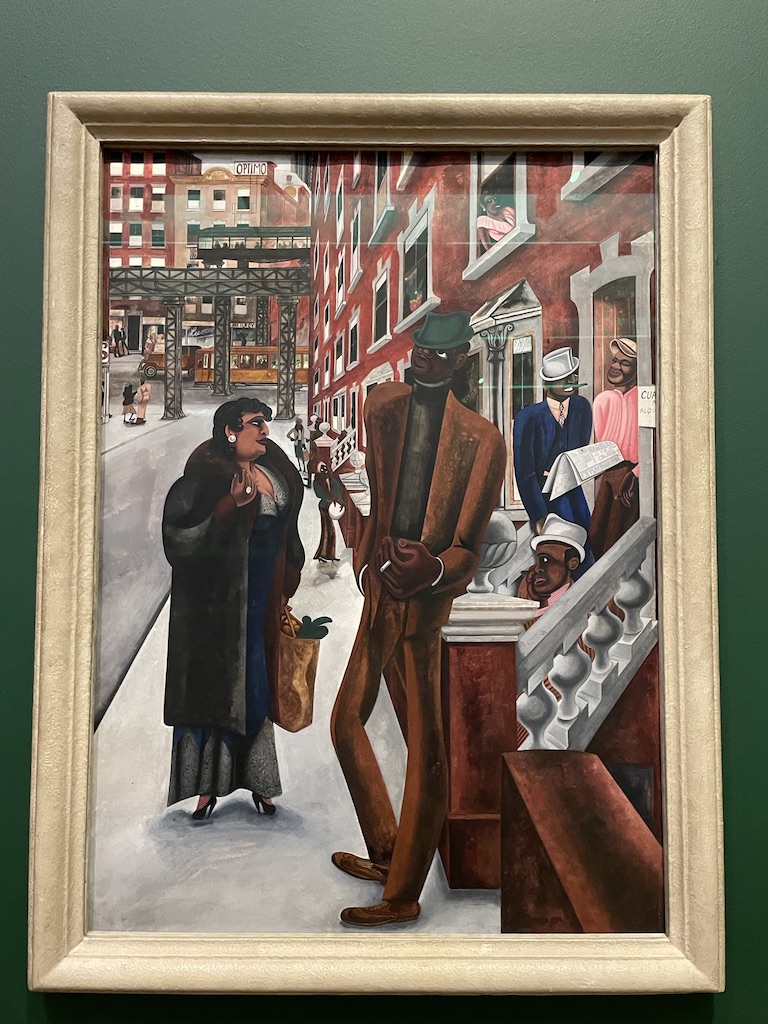
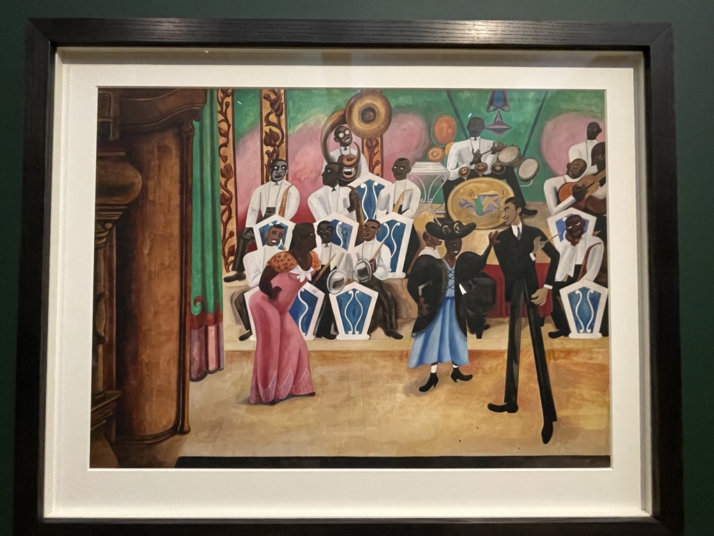
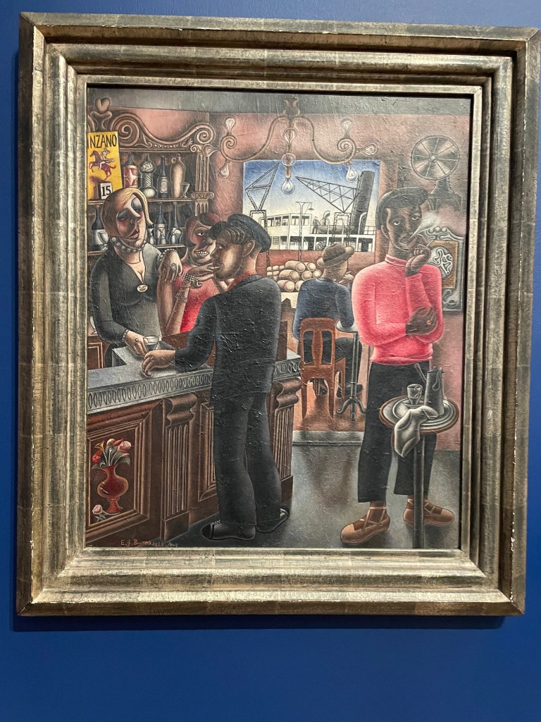
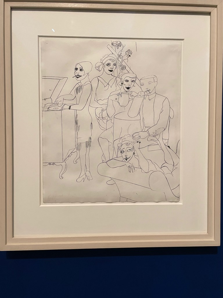
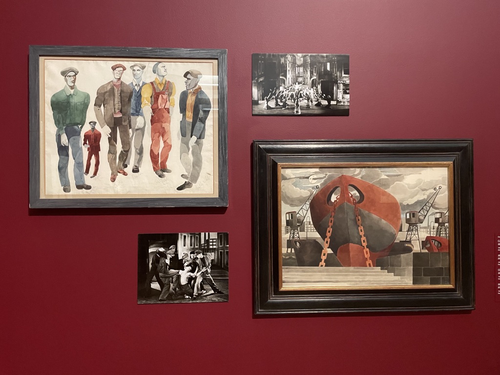
Oh, how I love Edward Burra’s work! And I’m so excited to recommend this wonderful retrospective at Tate Britain. Born in 1905 into an upper middle-class family in Rye, he was drawn to the flappers of the roaring 20’s in London, gay Paris, Harlem in New York, sailors in Toulon and Flamenco dancers in Spain. Depicting bars, gin joints, low life and high fashion. It’s all there, beautifully painted in watercolours with a strong narrative feel.

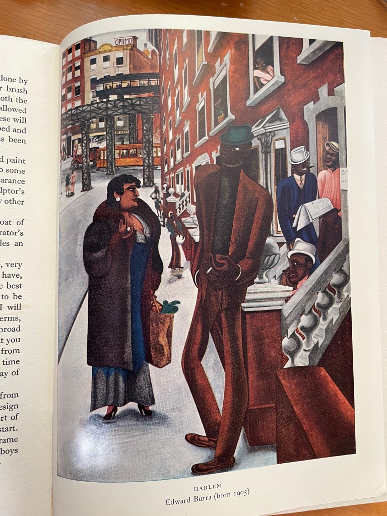
Oh, my delight at finally seeing Edward Burra’s amazing painting, Harlem, within the epic retrospective show which is on at Tate Britain.

As a child I used to pore over my copy of Drawing & Painting for Young People by Mervyn Levy which contained this picture. I was very drawn to the narrative feel of the picture and puzzled by the environment of which I had no understanding. The figures looked alien but intriguing and I used to wonder how the painting was made. Well, what a joy it was to see the image for real and to marvel, like a child, at the astonishing use of watercolour, the detailed drawing and amazing atmosphere.

Edward Burra suffered from rheumatoid arthritis and was in constant pain. He became an artist, and rather than using oils to paint at an easel, he made his work on paper while seated at a table. Born in 1905, the young Burra was drawn to London during the hectic 1920s, loved jazz clubs, gin joints, nightclubs and seedy pubs. He recorded the bohemian life in Paris, the Black area of Harlem in New York where he adored the jazz clubs. He loved the sailors in Toulon and Marseille, flamenco dancers and toreadors in Spain.

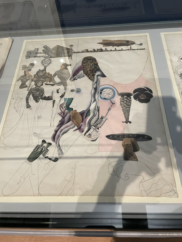
It’s fascinating to see his work close up and understand the detailed work that went into the creation of his pieces. Clearly he used magazines and photographs as reference and tended to collage images together to compose his paintings.

His enjoyment of ballet and theatre found form in commissions to create costumes.

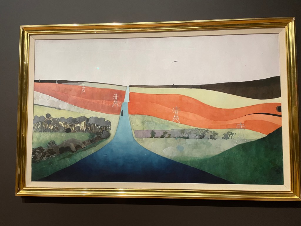
Towards the end of his life (he died in 1976 in Hastings) he concentrated more on impressions of the countryside and English life. His work became much larger, with pieces of A2 size paper pasted together.

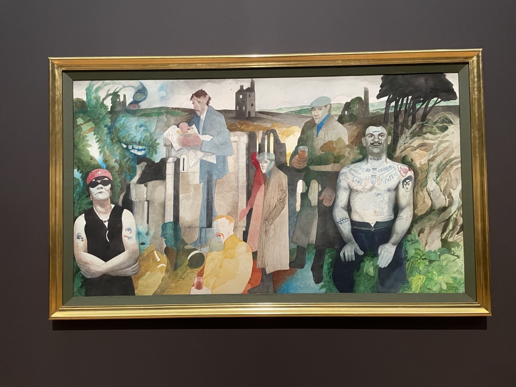
In one of his final works he places himself in the centre of the picture, eating a pasty, surrounded by people from the now disused tin mines in Cornwall. There are ‘ghostly’ figures whose images seem to ‘bleed’ through the contemporary figures.

This show offers a rare chance to review the work of a highly original and clever artist. I guess you’ll be right in thinking I admire Edward Burra! It’s on at Tate Britain until 19th October.

The 2025 Summer Exhibition at the Royal Academy opens on 17th June. I always enjoy the chance to attend the press preview and wander around the huge gallery space surveying the ‘pick and mix’ of art on show. The curators’ theme of ‘dialogue’ is apparent and illustrated by whole spaces devoted to certain topics or themes. However, I tend to prefer the walls which contain a random selection of art and see how they ‘jostle’ with each other to attract the viewer’s attention.

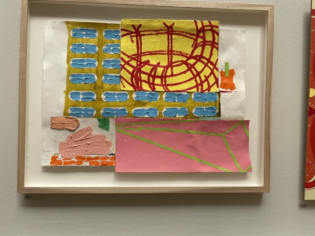
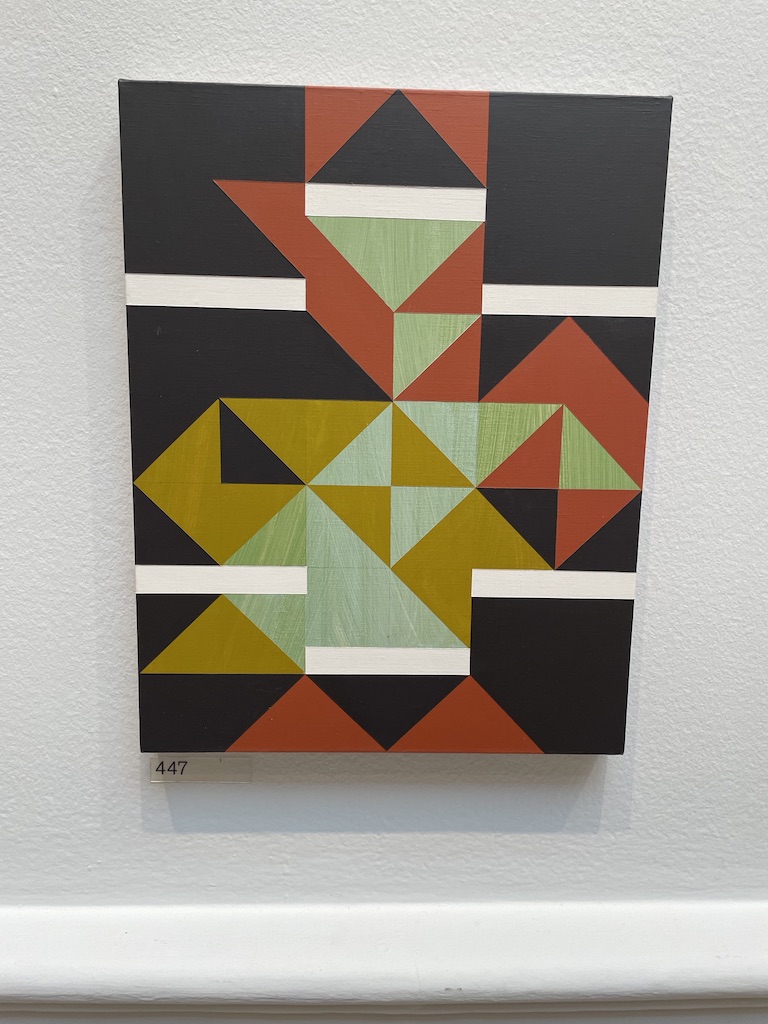
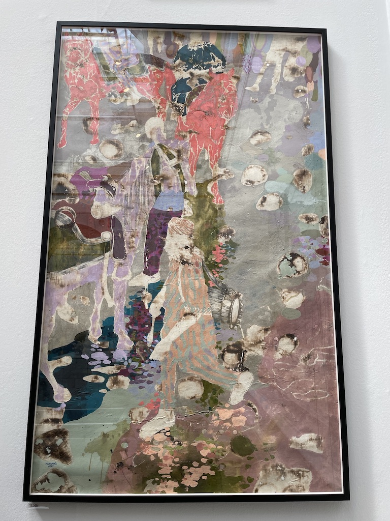
Above: Turning and Static by Stephen Cooper, Before the Rally, Jim Dine HON RA and Japanese Records and Responses No. I by Susan Marston.

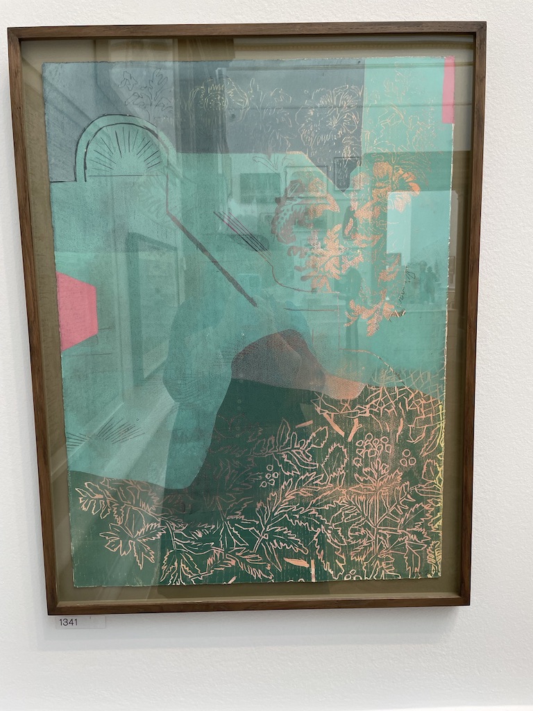
I’m always keen to spot works on paper, using paper or mixed media. I didn’t see as many examples this year but it’s a pleasure to come across imaginative use of paper and print.

Fun to see work made by friends. On the left is Francesca Simon’s abstract: Goaf Transition and on the right is We Can be Heroes by Helen David made with felt and beads.

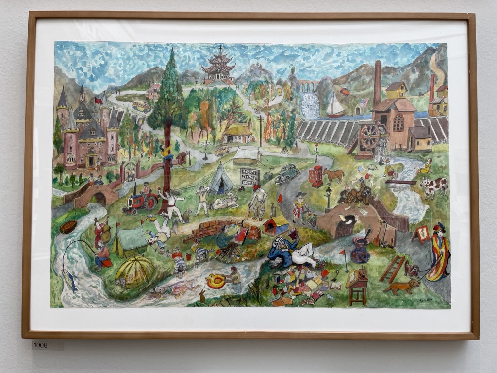
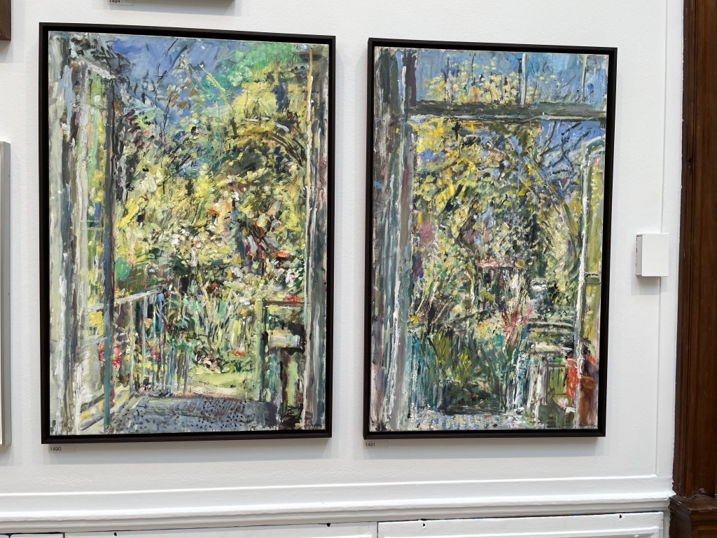
I enjoyed the lively narrative landscape by Chris or, the crazy cat map by Adam Dant and two cheerful pictures of the back door by Anthony Eyton RA.

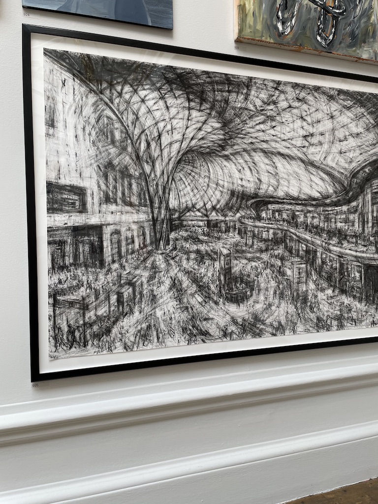
Above: Top left The Drummer Boy Modupeola Fadugba, Song Thrush by Humphrey Ocean, Curio XI by Alison Atkins Bottom left: Kings Cross Interior II Jeanette Barnes, Trace by Holly Schofield and a very bright landscape by Andreas Ruethi called La La Landscape (Coullioure)

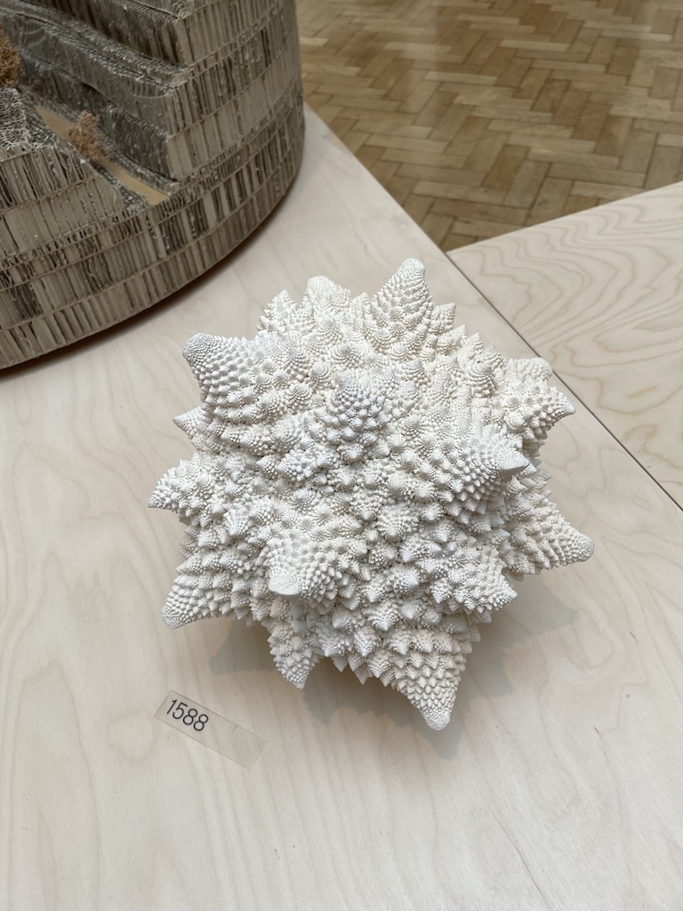
And finally, a very entertaining paper sculpture by Jane Hewitt named Dialogue with God, made of a recycled hymnal.

As ever, there is much to see, much to ponder and also entertain. Let’s hope all the artists find new homes for their pieces.

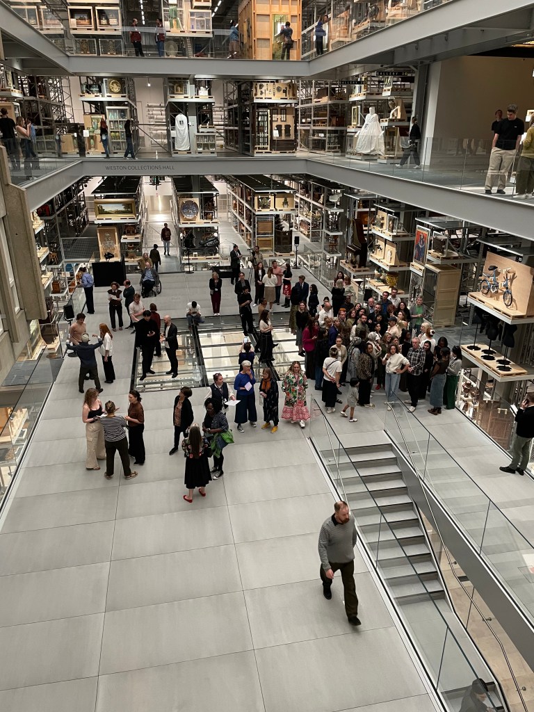
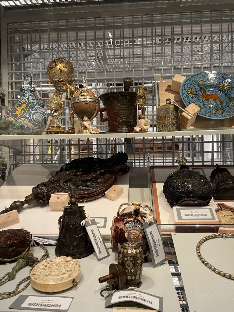
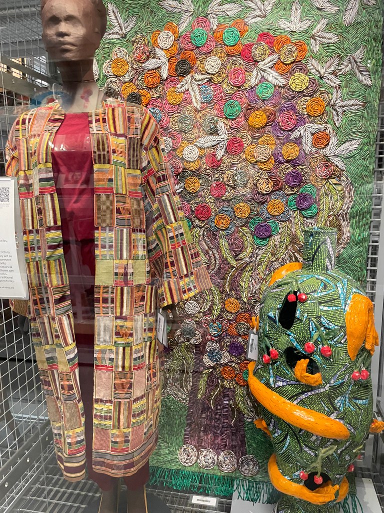
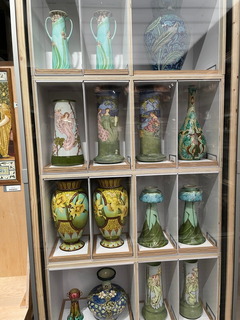
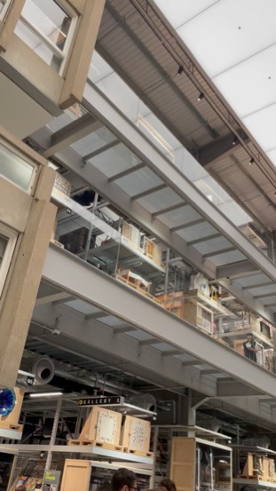
The fabulous new storage space for V&A East has opened in Stratford and it’s a ‘must see’ for any London visitor. Taking over the building created as a media centre during the 2012 Olympics, this space has been reimagined in the most original way as an exhibition/storage space for the Victoria and Albert Museum’s extensive collection. It’s like a giant cabinet of curiosities with so much to see.

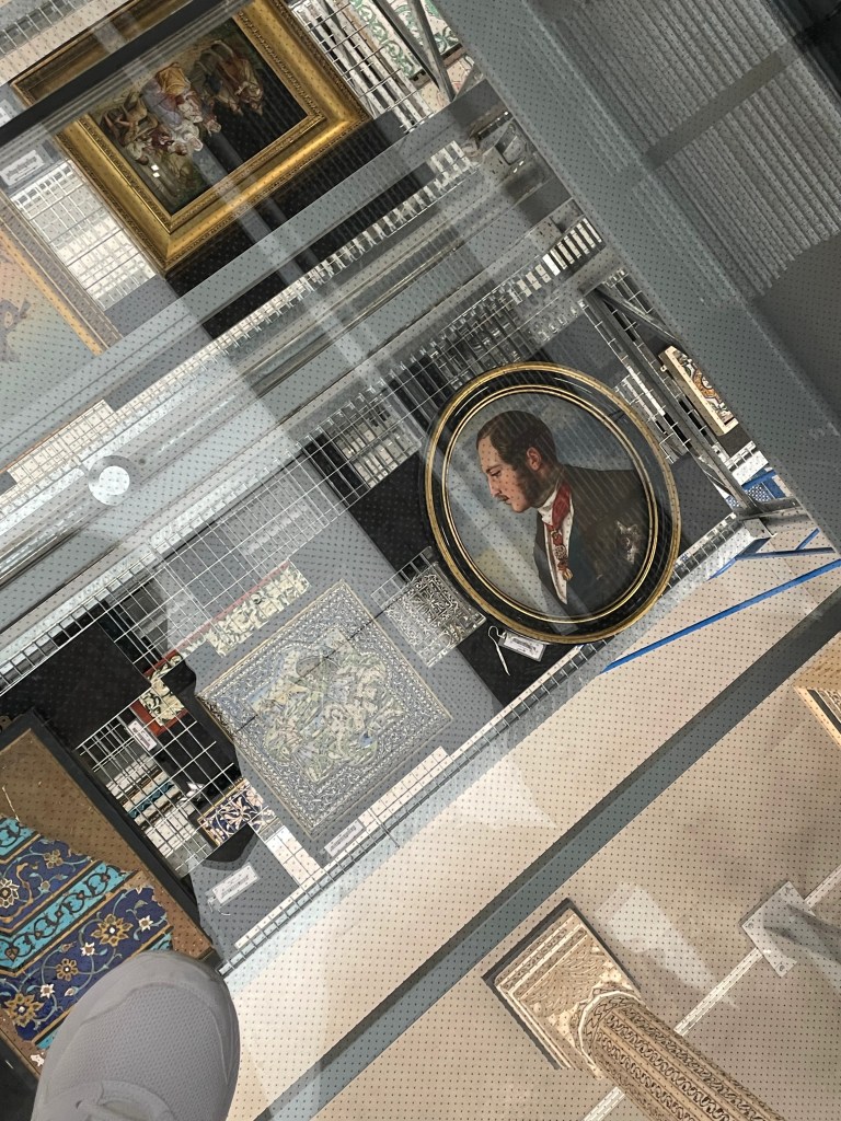
What a thrill to be part of the press preview at the opening of the new V&A East storage space in east London. It’s a most dynamic space – the most extraordinary storage unit ever imagined. There’s easy access to all the objects; they are not only on display, but if there’s something you are keen to see close up, you can make an appointment, come to the space and see it close up in the company of a curator.

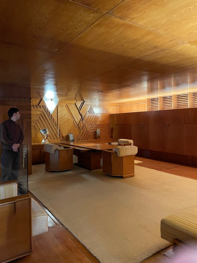
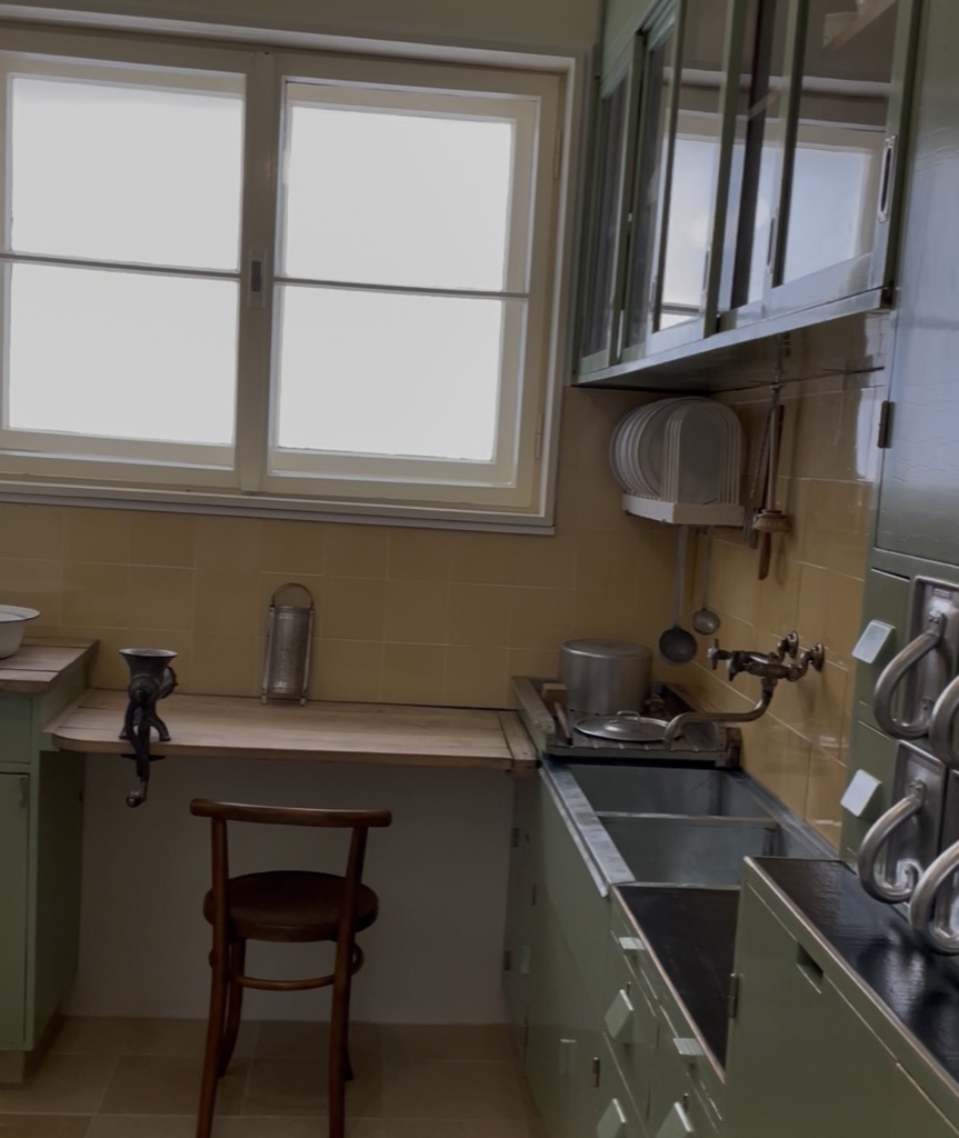
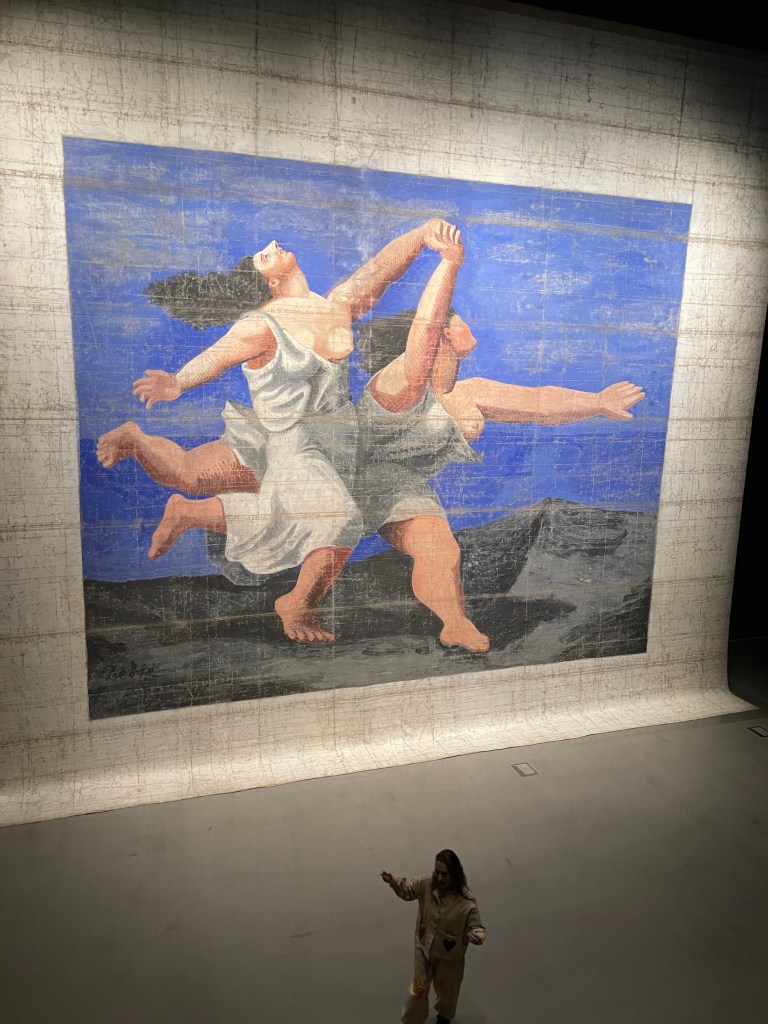
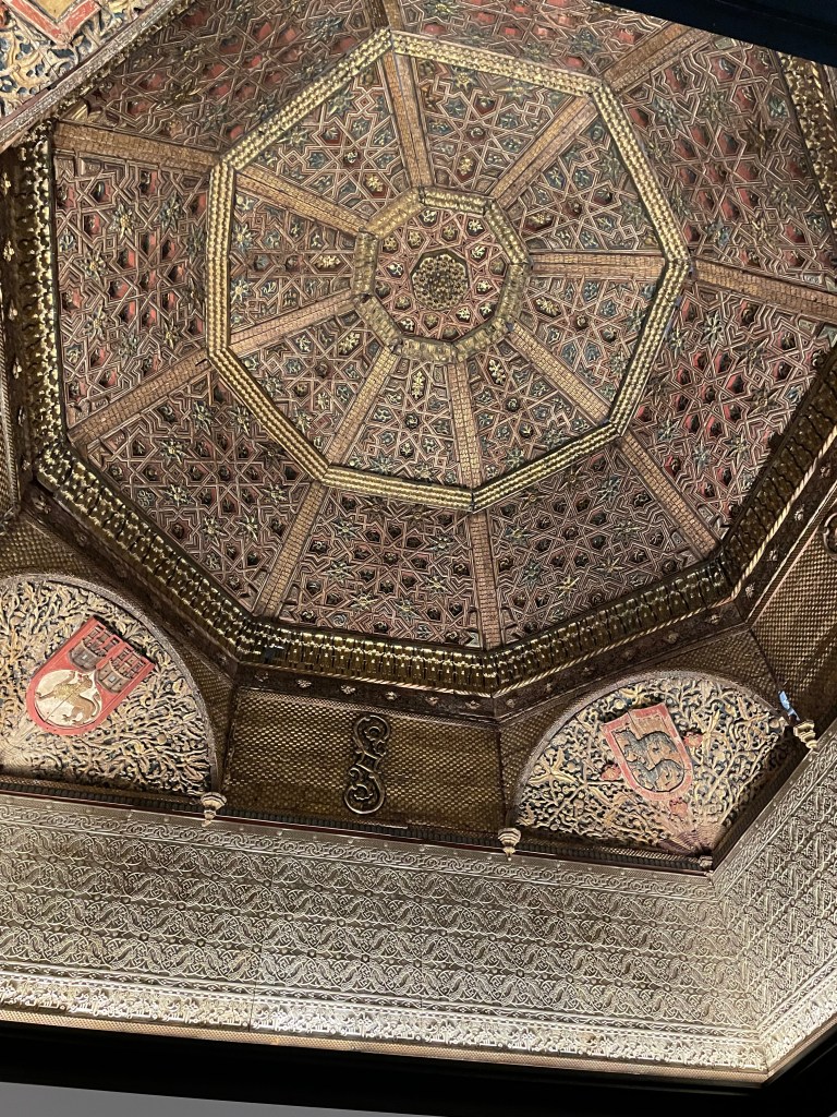
The objects are arranged on pallets, carefully lashed to their space and exude a wonderful confidence in their new environment. As well as objects from all eras, countries, cultures and faiths there are entire room sets. It was fascinating to see the complete kitchen from a Frankfurt apartment of the 1920s and the amazing Kaufmann Office designed by Frank Lloyd Wright. There’s a stunning Moorish ceiling and a giant theatre backcloth by Picasso.

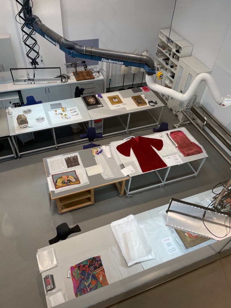
In architectural terms this new space is a joy. There is the luxury of a vast atrium in the centre of the storage unit which can be used for events, talks, concerts. The collection is displayed on five floors and seem to disappear down corridors into infinity. And the large space where the Picasso cloth was displayed provides much-needed opportunity for huge carpets and theatrical backcloths to be conserved, examined and displayed. You can also look into the conservation studios and see the work being done to restore all kinds of items, preparing them for display.

The V&A East is a short walk from Hackney Wick station and it’s exciting to see all the new buildings and attractive design which is pouring into this area. The whole Olympic Park repurposing is a shining example of legacy architecture, forward thinking and imaginative usage of the space. I’m impressed.

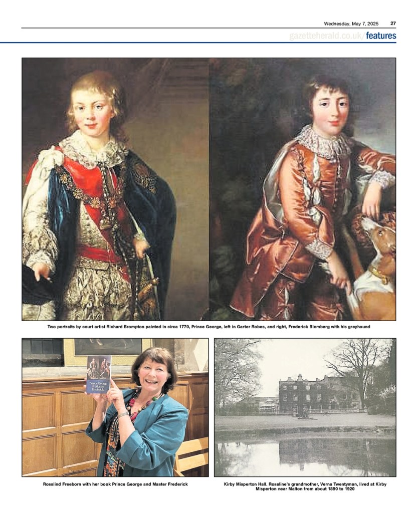
Whilst visiting Kirby Misperton in Yorkshire I was surprised and delighted to discover a picture depicting Frederick Blomberg who is a key character in my historical novel, Prince George & Master Frederick. My book is fiction but it is based on the story of real people and the relationship between two half-brothers – Prince George, the future regent and monarch and Frederick Blomberg who, as an infant, was adopted by King George III and Queen Charlotte and brought up as a prince.

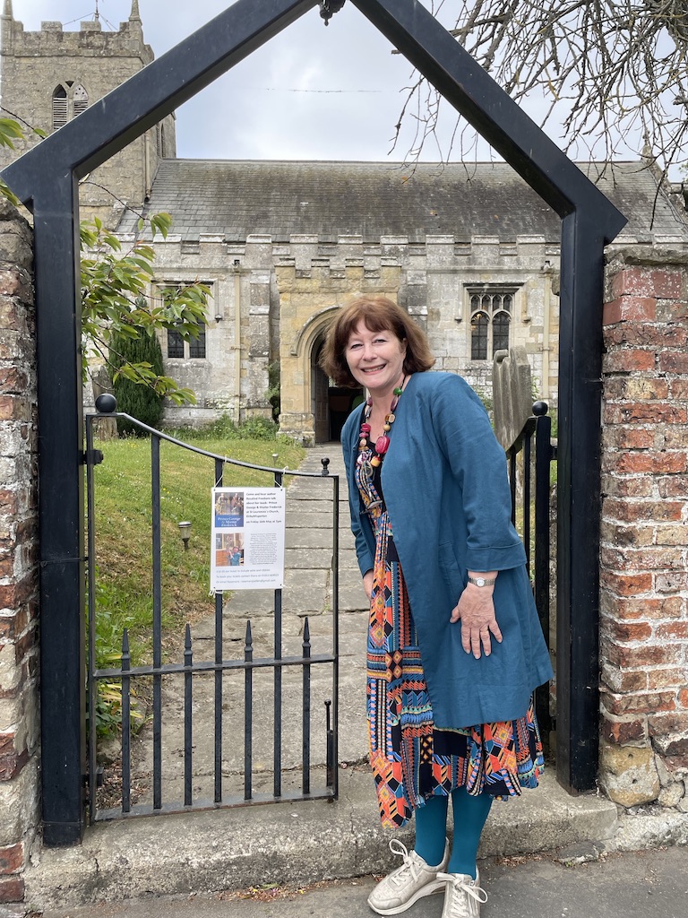
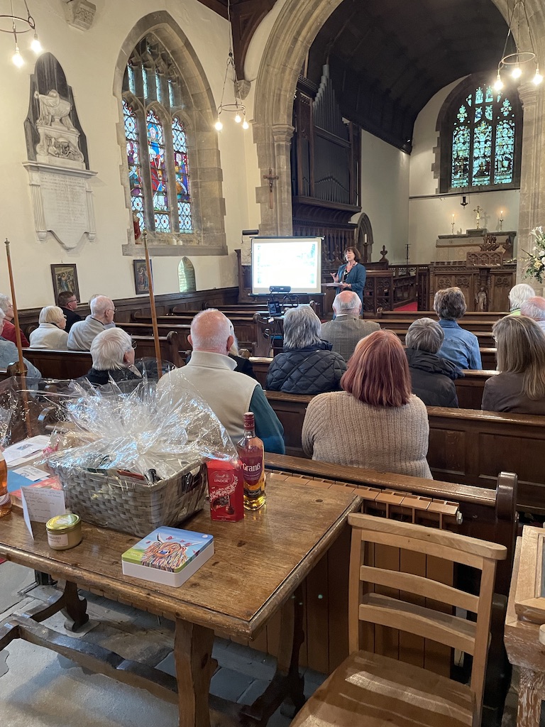
Having published my debut novel, Prince George & Master Frederick on 30th January with Alliance Publishing Press this year I’ve enjoyed a whirlwind of radio interviews, features in papers and magazines and history blogs. But, best of all, I’ve been invited to give talks to interested audiences. Possibly the most interested audience I could hope for, gathered in St Laurence’s Church in the village of Kirby Misperton, north Yorkshire on 16th May to hear my talk about the book.

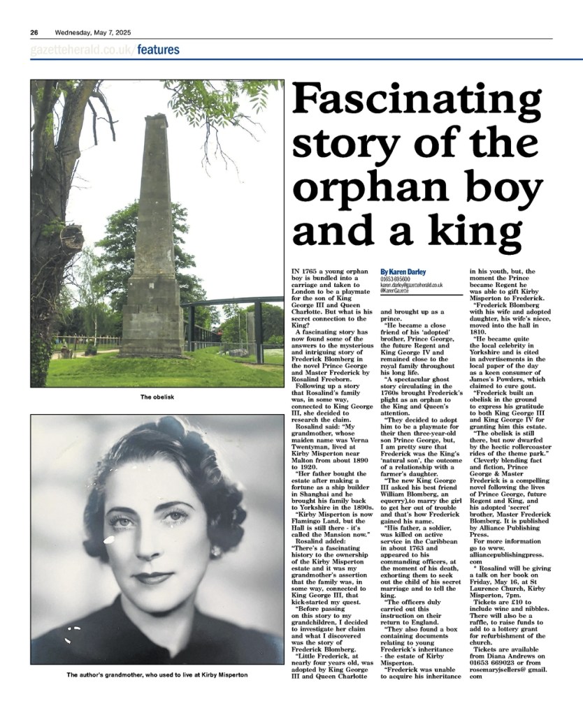
Kirby Misperton is a particularly important location for me, personally, and in relation to the book. My grandmother, Verna Twentyman, grew up in the Hall at Kirby Misperton. As a child I listened to her story about our family’s supposed royal connection. She told me: “King George III loved the countryside, and when he was a young man he came upon a farm in Kent, fell in love with a beautiful farmer’s daughter and there was a baby. To prevent a scandal for the young monarch, the king’s best friend and equerry, Major William Blomberg, married the mother and gave the baby a name.”

It was a very slender story but enough to pique my interest and it stayed with me long after she had died. I was about to tell my own grandchildren her story when I paused and decided to research her claim. Well, it turns out it was all true. The ‘accidental’ child of King George III was indeed called Frederick Blomberg. His mother died and his father was killed in action. When word of his orphaned state reached King George III and Queen Charlotte they decided to adopt Frederick. They already had two small sons and a third on the way. So, from the age of four Frederick was brought up within the royal household at Richmond Lodge and became best friends with his half-brother, Prince George, the future regent and King George IV.

I was so intrigued by the story that I felt compelled to write this novel: Prince George & Master Frederick

I was thrilled when the local paper, the Malton Gazette and Herald, gave it a front cover mention and double page spread in anticipation of my visit.

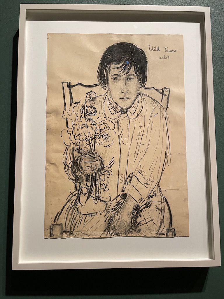
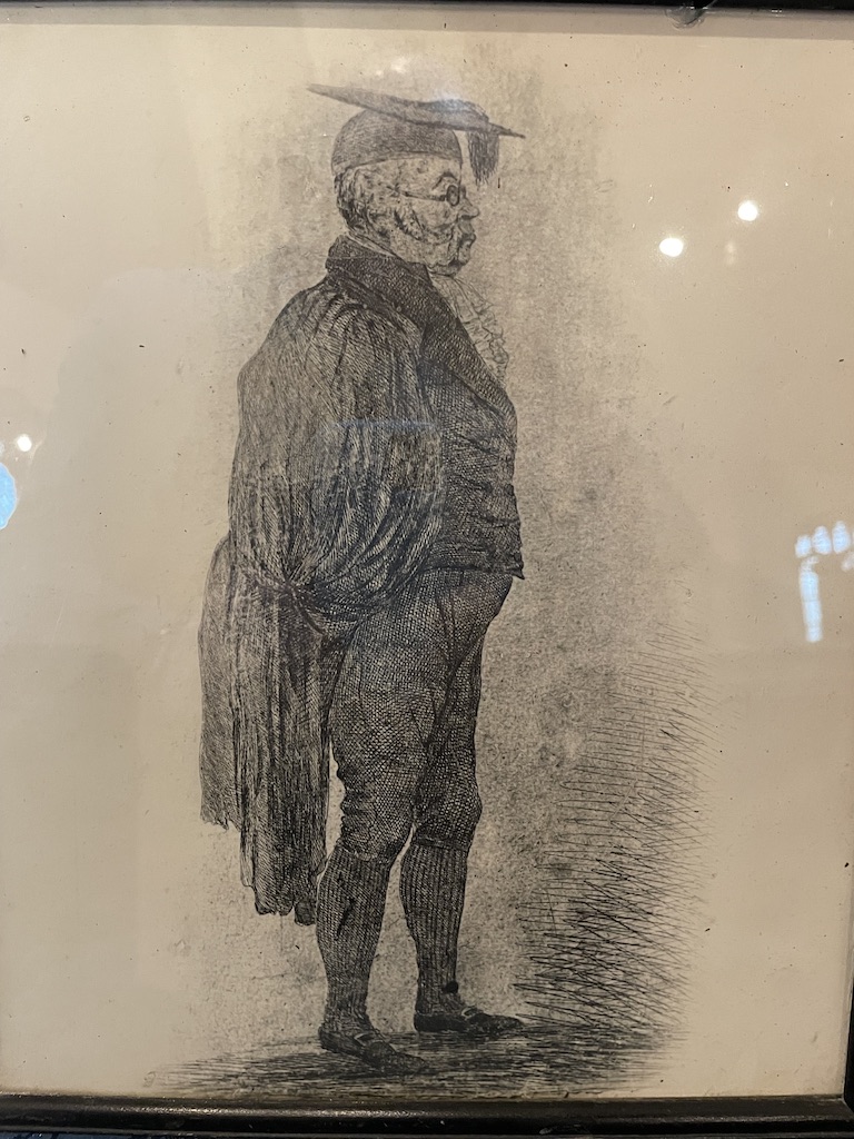
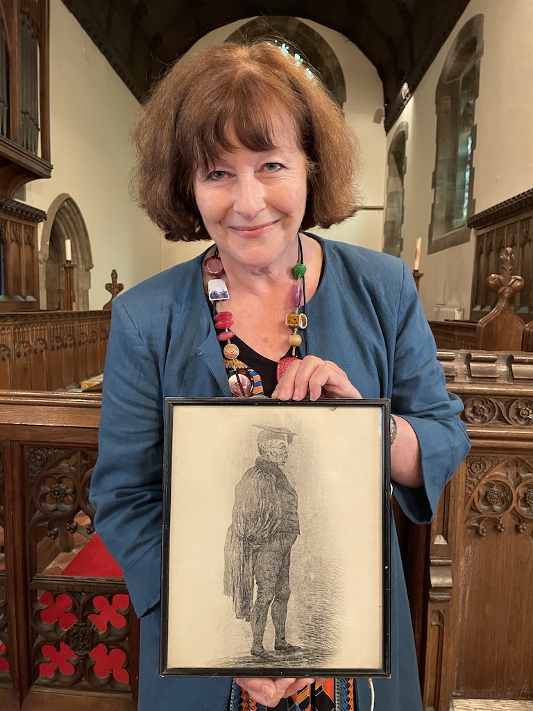
There was a great turnout for the talk on 16th May but, for me, the most exciting part of the evening was being shown a picture of Frederick Blomberg as an adult. Apparently this image had been hanging on the vestry wall for years and no body knew who it was or had taken it down to examine the back. On the reverse of the rather witty depiction of an academic in gown and mortarboard was an account of Frederick Blomberg’s life and a copy of his signature.

It’s quite a caricature image of the illustrious clergyman who had lived at Kirby Misperton. All through his youth Frederick had hoped to inherit this estate in Yorkshire but proving his claim was very hard for him.

As he grew up, it became clear that Frederick needed a profession. So King George III sent him to Cambridge University to study Divinity, he was ordained and became a clergyman. The king then granted him several lucrative livings (parishes where he could gain an income and have a rectory or vicarage to live in). However, he had to wait until his half-brother, Prince George, became Prince Regent in 1810 and was able to finally grant him the Kirby Misperton estate. So, in 1811, Frederick Blomberg became the owner of the estate and was known as Baron Blomberg. He also took services in St Laurence’s Church and became quite the local celebrity. He built an obelisk in the grounds with a plaque which says ‘Thank you’ to King George III and Prince George, the Prince Regent, for granting him this land, ‘long estranged’.

While researching the book I had seen images of Frederick as a child, but never as an adult. Imagine my excitement at finally seeing a sketch of him, albeit dressed in academic robes rather than depicted as a clergyman.

You can read more about Prince George & Master Frederick in my novel. It’s available in print form, via Amazon, on Kindle and on Audible. Or you can order it through your local bookshop. Please do let me know if you enjoy reading my book. Or order a signed copy directly from my author website And if, you are interested in inviting me to give a talk about my book please do get in touch. May 2025

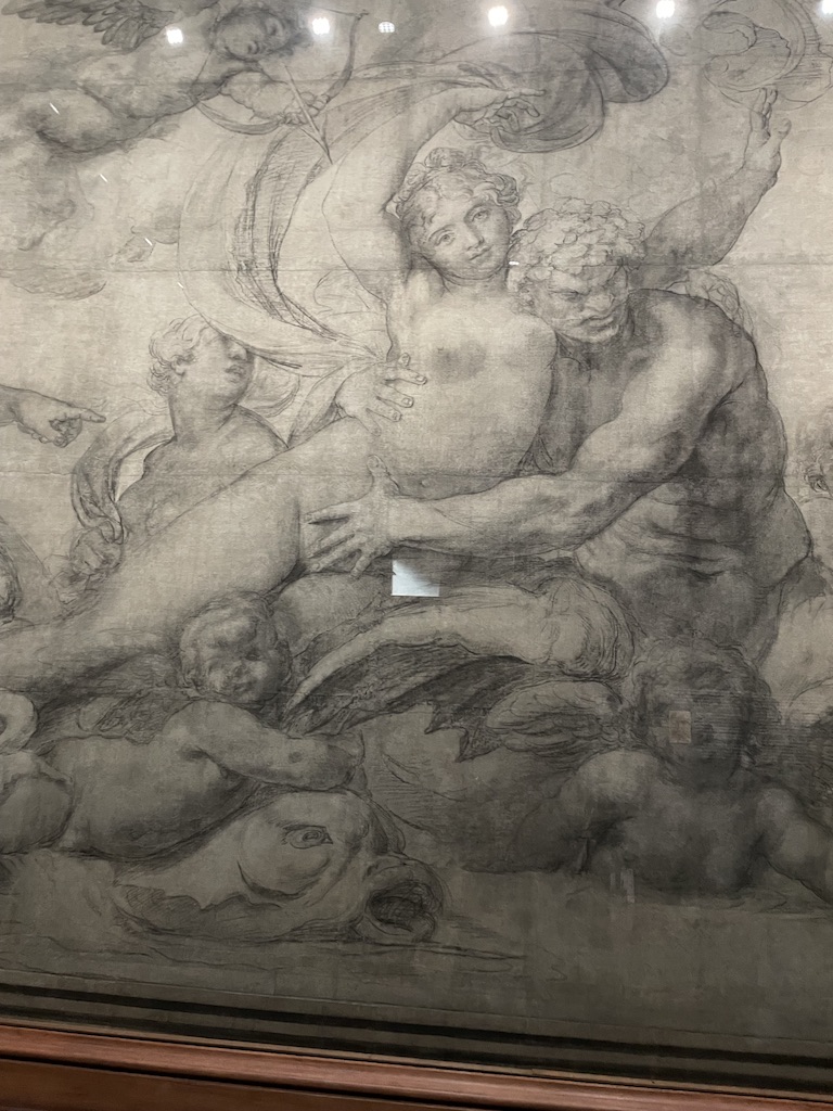
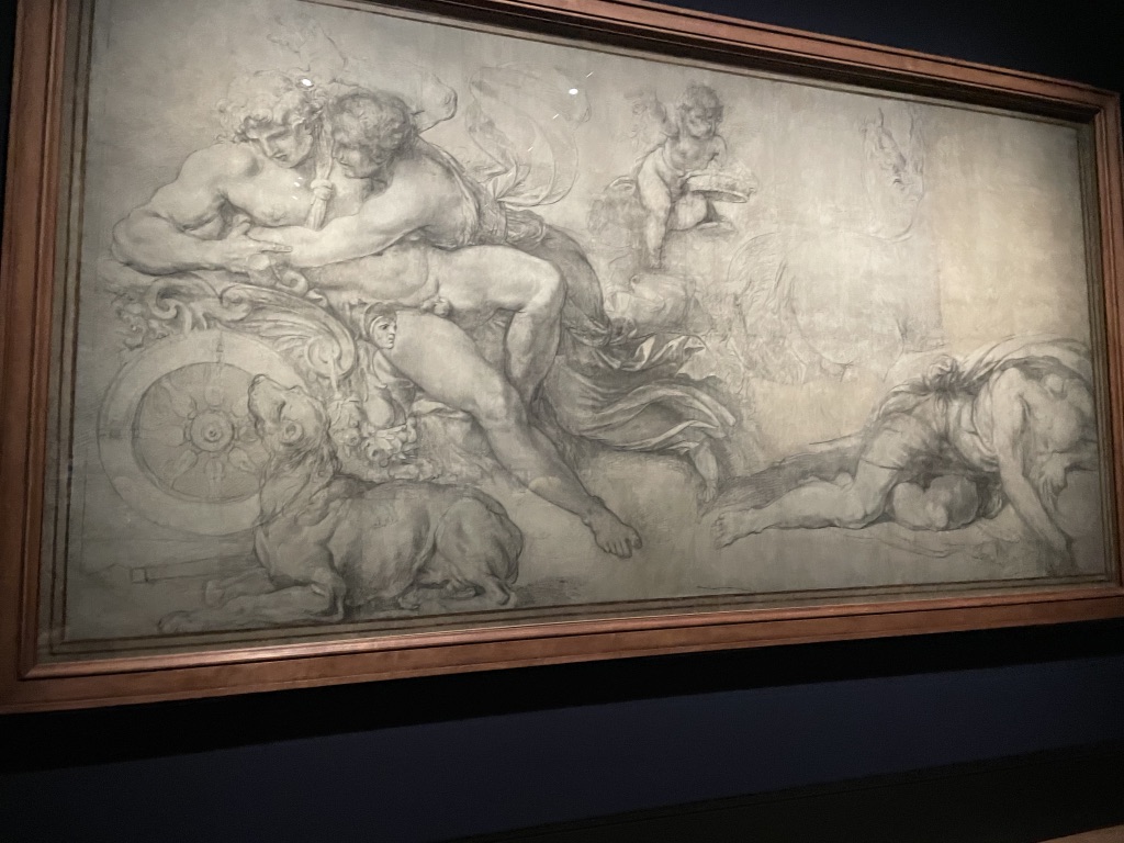
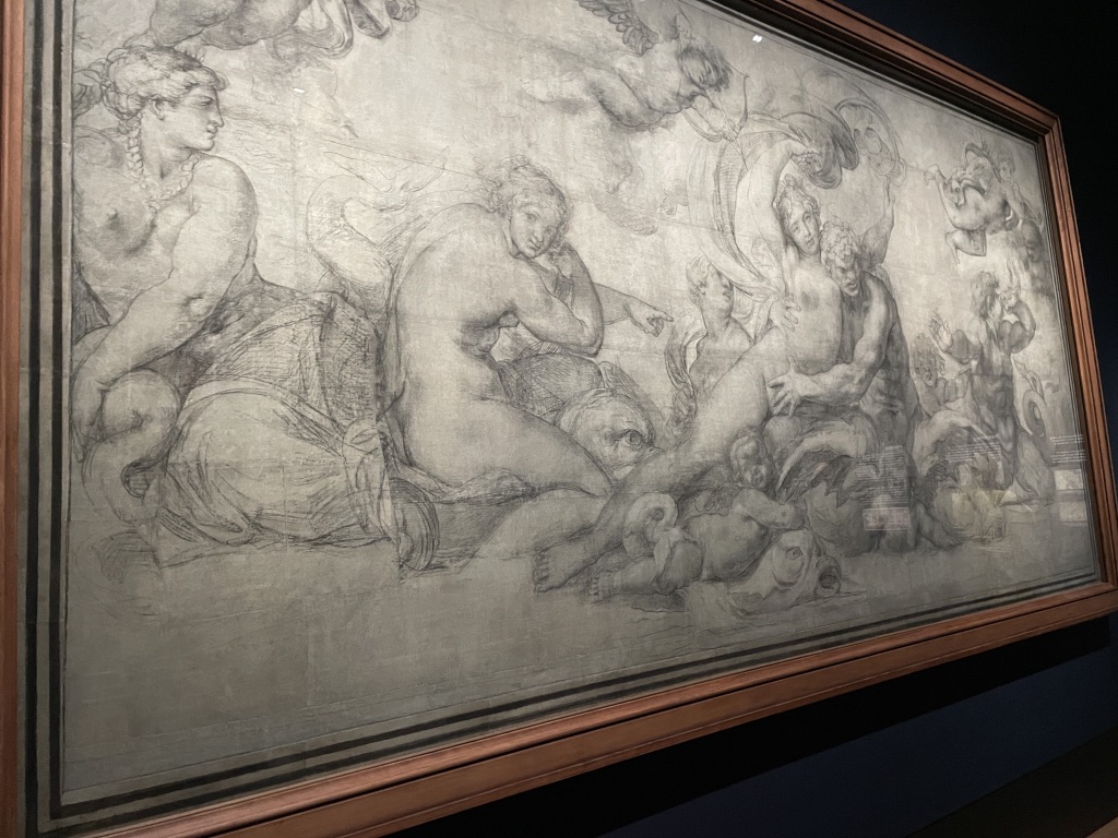
What a delight to see, close up, a remarkable survivor from the Renaissance – the two Carracci ‘cartoons’ created in the late 1590s in readiness for transfer to the ceiling of the Palazzo Farnese in Rome. You can see the joins, the cuts, the holes for the ‘pouncing’ and simply absorb the atmosphere of artists at work over four centuries ago. Stunning!

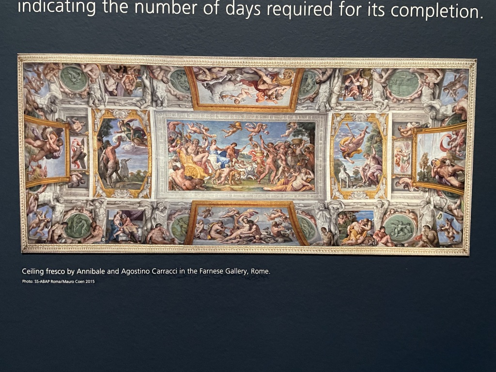
It was a thrill to enter the darkened space of Room 1 at the National Gallery and behold two massive, landscape-sized charcoal drawings by the artistic double act of the early 1600s, Annibale and Agostino Carracci. These huge cartoons were the preparatory works for two of the large paintings which adorned the spectacular gallery ceiling of the Palazzo Farnese in Rome. The work was commissioned by Alessandro Farnese who became Pope Paul III. The building is now the French Embassy so it’s not easy to see the amazing works.

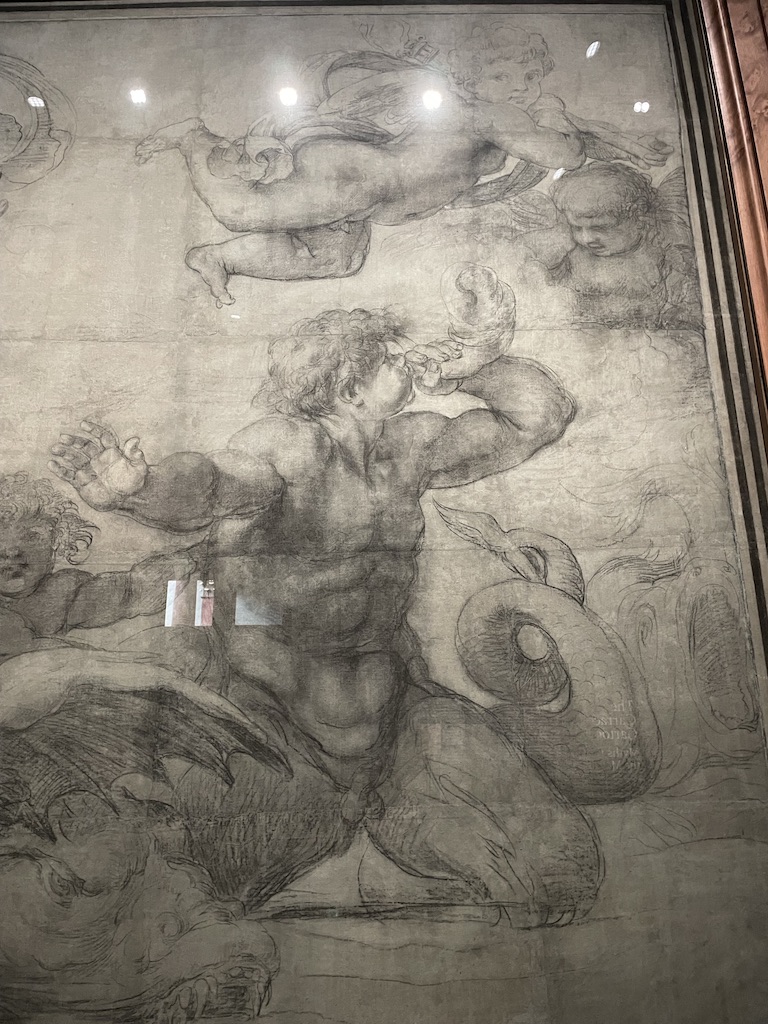
The two cartoons on show are the centre top and bottom images in the gilded fame. It’s spectacular to see these works close up. You can see the cuts, tears, reps and pin marks in the fragile paper. These cartoons were working documents, used to lay out the design, develop the artwork and then placed against the damp plaster of the ceiling surface to have the image pricked (pounced) and and traced onto the surface. Then the artists would labour at ceiling height on a scaffold to complete the frescoes.

It’s impressive to see these works close up and follow the lines and scratches made by artists over four centuries ago. It’s rare for these working documents to survive but, apparently, they were carefully pieced together again after the transfer process and kept safely. Maybe the idea was to reuse elements of them on future commissions.

There’s such vitality to the drawing and the clever composition There’s humour too. On the right, you can see a putti blowing a shell in the face of another putti who is covering his ears!

Above is a view of the gallery made by Francesco Panini, who appears in the bottom left of the gallery sketching the view.

Secrets of the Thames. What a treat to visit the London Museum Docklands, to see their new exhibition which celebrates the determined curiosity of generations of mudlarkers. Swishing around the river’s foreshore at low tide is clearly an addictive activity and the results are wonderful.

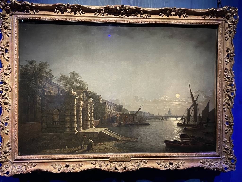
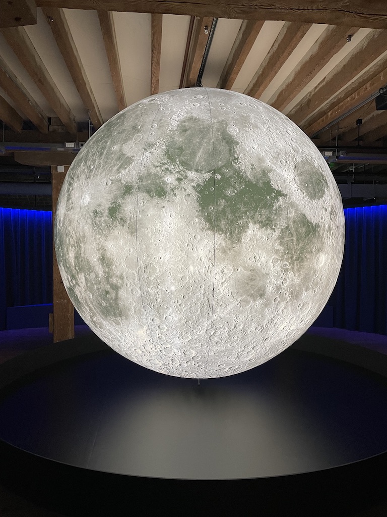
The exhibition opens with this spectacular painting by Henry Pether (around 1850) featuring mudlarkers searching the foreshore near York Water Gate, the Strand, by moonlight. Anyone living near the river will be aware of the constant rise and fall of the tide which is ordained by the moon. And there’s a fabulous sculpture of The Moon which you can circle, and peer at the extraordinary pitted surface.

You need a licence to be a mudlarker, along with sturdy shoes, waterproof clothes and a beady eye to spot potential treasure with in the mud of the river. It’s astonishing that every low tide will reveal items dropped, lost or hidden in the Thames. These pieces vary from the really ancient, pre-historic tools and items, jewels and coins, up to contemporary objects thought lost for ever.

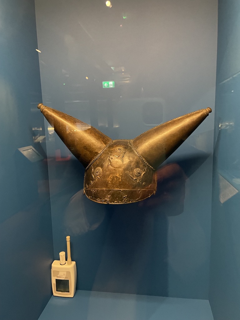
Above is a selection of figurines showing different gods and godesses from Roman times. They might have been offerings – the Romans revered water – or accidentally dropped into the river. And on the right is The Waterloo Helmet from 150 BCE. It’s the only Iron Age helmet found in southern England and the only one with horns ever found in Europe.

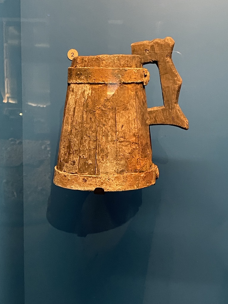
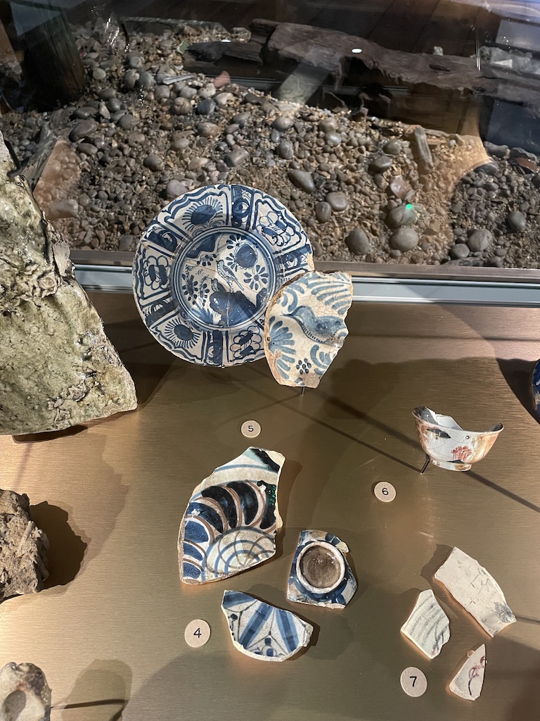
I do love seeing the everyday items which have been fished out. This wooden tankard must have been a thrilling find. It holds three pints – great for a very thirsty person, most likely a sailor. And it’s great to see these Delftware pots and dishes, even in fragments, giving you an idea of the household crockery in use from the mid 1500s to the 1800s.

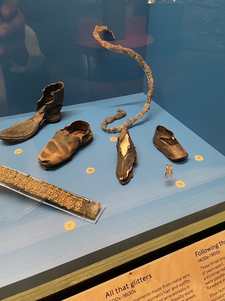
There’s something very touching about seeing children’s shoes. They have survived the centuries because the mud of the Thames is ‘anaerobic’ meaning it preserves the material from oxygen and it does not decay.

Mudlarking has been going on for centuries. For many early mudlarkers it was the coal and wood which they wanted, rather than the ‘treasure’.

The layout of the exhibition is fascinating. A very eye-catching recreation of the Thames foreshore has been recreated throughout, giving viewers an idea of how complicated it can be to sift through the detritus of the river and use just your eyes and experience to spot and uncover something exciting.

It’s a very stimulating and moving show. And impressive that so many of the items were discovered by dedicated mudlarkers and donated to the Museum of London so that they can be viewed and admired but visitors.

The exhibition at the London Museum Docklands is on until 1st March 2026. Well worth adding to your ‘must-see’ list!

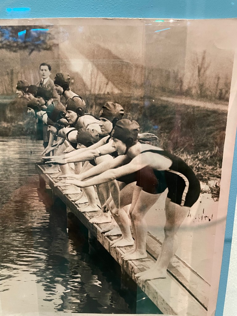
Splash! A century of swimming and style. This exhibition at the Design Museum is a celebration of fashion, technology and politics of water, swimming and messing around in ponds, rivers, pools and the sea.
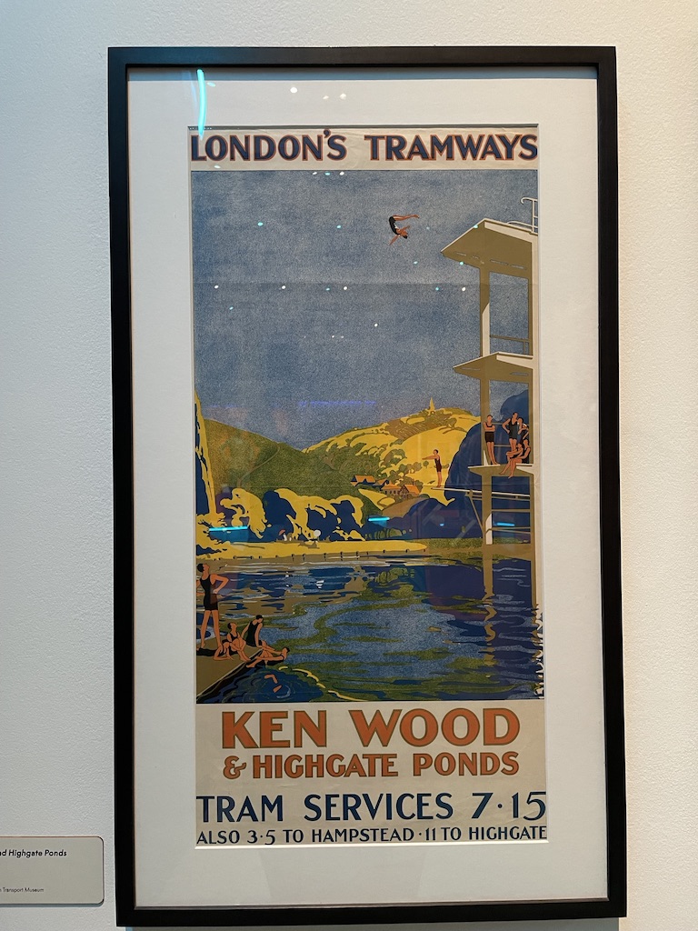
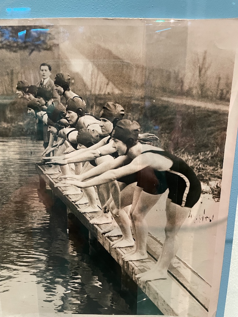
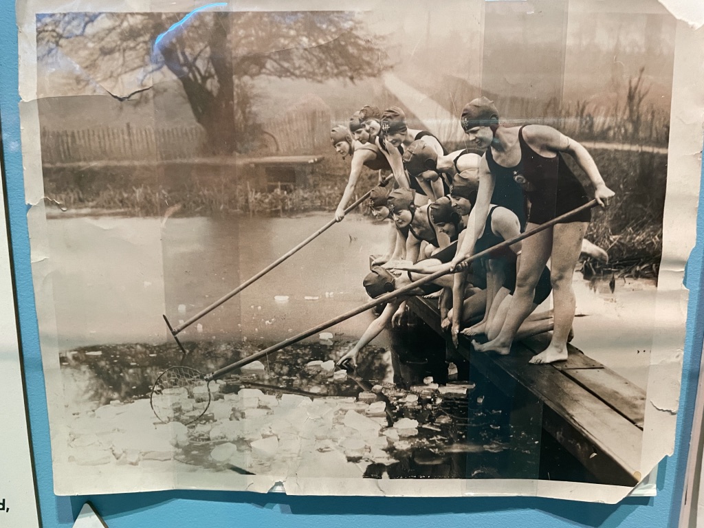
As a keen ‘pond dipper’ I was intrigued by this show and very pleased to see a reference to the Women’s Pond at Kenwood, a place I find very addictive during the summer months, but only once the water has inched its way towards at least 15 degrees and even better when it reaches a balmy 20 degrees. The poster showing Ken Wood suggests the pond nestles beneath high mountains. Hampstead Heath is not that high but I did like romance of the image.

There are a great many swimming costumes on show. I remember my mother describing the indignity of wearing a woollen swimsuit when she was a child in the 1930s. The thing just spread out in the water before slapping back against her body, dragging down to her knees when she emerged from the water covered in embarassment.

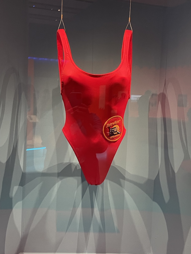
But what I’d really hoped to see was the type of swimming costume I wore as a child – blue nylon, ruched by criss-crossed elastic. I have such a strong memory of my swimsuit and the way the little triangles of fabric would fill with water, swell and then gradually empty on emerging from water. Alas, this curious garment was not represented. Instead the star of the show was the red swimsuit worn by Pamela Anderson in Baywatch.

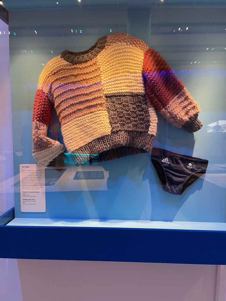
Fun to see the Gold Medal winning diver, Tom Daely’s scanty trunks and also the chunky sweater he knitted to occupy himself waiting for his moment at the Olympics.

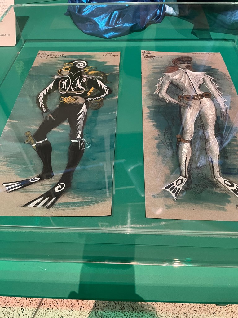
Good to see the costume designs for Captain Nemo and the Underwater City. They wouldn’t look out of place in a ballet.

My takeaway from the exhibition was that something had been missed. Because it was so much about the design of objects used in or near water we didn’t get a feel for the spiritual nature of water and the very human, primal desire to be close to the sea, rivers, ponds or expanses of water. We both fear and revere water. There’s a desire to be near it but not for it to come too close, univited and offend us by flooding our homes or disturbing our travel with dangerous high tides or inundated roads. Perhaps that’s something for a different show.

Splash! is on at the Design Museum until 17th August.